


Header
Overview
Let’s take a look at some of the options available in Enfold to create different types of Headers. If you like to take a quick look at some of the header styles that comes packed with Enfold please check out the overview section.
Not all websites are the same so the header requirements for each site can dramatically change. Some websites may have a small menu and others may require a huge list of menu items with widgets like the social icon, search bar or a custom widget to be added.
By default, Enfold comes with several header layouts and support header widget area which allow you to add your custom code in the widget area to display an affiliate banner or an extra element.
Header Setup
Let’s take a look at different header options available in the enfold theme.
Vertical or Horizontal Header
Choose between a vertical or horizontal header from
Enfold > Layout > Logo and Main Menu

Header Layout
Enfold comes with the following built-in header layouts which can be accessed from
Enfold > Header > Header Layout > Menu and Logo Position
- Logo left, Menu right
- Logo right, Menu Left
- Logo left, Menu below
- Logo right, Menu below
- Logo center, Menu below
- Logo center, Menu above
Header Width
By default, the width of the content inside the header is same as the width of the container which is set in Enfold > General Layout > Dimensions > Maximum Container width
Full-width header: To set up a header that takes up 100% width of the browser window so that the header contents like the logo and menu spread apart to the extreme left and right side of the header go to :
Enfold > Header > Header Behavior > Let logo and menu position adapt to browser window
Example: Take a look at our Gym demo and notice how the logo, menu and header widgets spread across the header.

Custom-width header: If your header design requires that the width of the header is different from the container width you can use the below CSS to change the width of the header content area:
/*--------------------------------*/

/* Custom header width           */

/*--------------------------------*/

/* Custom header width */
#top #header .container {
    width: 800px;
    max-width: 100%;
}
Header Height
Header height can be changed from Enfold > Header > Header Layout > Header Size ( Slim | Large | Custom Pixel Value )
If your design requires the header height to be of a custom value which is more than 300px please use the below CSS.
/*--------------------------------*/

/* Custom header height           */

/*--------------------------------*/

#header #header_meta .container {
    /* Top bar height */
    /*   height: 50px  !important;  */
}

#header #header_main .container {
    /*  Main header height  */
    height: 250px !important;
}

#top #main {
    /* Distance of page content from top is equal to total header height including the top bar */
    padding-top: 250px!important;
}
Mobile Header: The height of the header defaults to approx 80px in a mobile device layout. To change this
/*--------------------------------*/

/* Custom header height in mobile */

/*--------------------------------*/

@media only screen and (max-width: 767px) {
    #header #header_meta .container {
        /* Top bar height */
        /*   height: 50px  !important;  */
    }

    #header #header_main .container {
        /*  Main header height  */
        height: 90px !important;
    }
}
NOTE: To align the menu and logo please check the documentation of the respective elements.
Header Background, Border and other styles
Header styles such as background color, image, text color, link color, border can be changed from:
Enfold > General Styling > Logo Area
Header border, active menu indicators or drop shadow effects can be changed from:
Enfold > Header > Header Style
Header Background Color:
Enfold > General Styling > Logo Area > Logo Area background color
Header Background Image:
Enfold > General Styling > Logo Area > Background Image
Transparent or Glassy header can be activated from
Dashboard > Page/Post > Layout > Header visibility and transparency
To set transparency header styles go to
Enfold > Header > Transparency Options
Header Behavior
By default, the header will display on Top of the content. You can change this by setting any of the following types of header behavior from Enfold > Header > Header Behavior
- Sticky Header.
- Shrink Header on page scroll.
- Unstick topbar (The small top bar above the header will no longer stick to the top)
Extra elements
Extra elements mentioned below can be displayed in the header. To access the extra element’s settings go to
Enfold > Header > Extra Elements
- Social Icons
- Secondary Menu
- Header Phone Number/Extra Info
Shopping Cart Icon:
Enfold > Shop Options > Header Shopping Cart Icon
Show or Hide Header
Display header when a user scrolls the page
Dashboard > Pages/Posts > Layout > Header visibility and transparency
To show or hide header on selected pages go to
Dashboard > Pages/Posts > Layout > Header visibility and transparency
To hide the header on all pages at once we can use the below CSS
/*--------------------------------*/

/* Hide header on all pages */

/*--------------------------------*/

#header {
    display: none !important;
}
To hide header only in mobile on all pages please use the below CSS
/*--------------------------------*/

/* Hide header on all pages (mobile only) */

/*--------------------------------*/

@media only screen and (max-width: 990px) {
    #header {
        display: none !important;
    }
}
A mix and match of the above settings can produce various header styles. Below are some examples:
Header Layouts


Code Snippet
Customization
Adding a header widget area
Header widget area lets you add a custom text, banner image, icons or any other widget to the header area from
Appearance > Widgets
Step 1: Activate header widget area
Depending on the header layout you are using copy one of the code snippets to your child theme functions.php file to activate the header widget area in the theme.
To know the header layout you are using go to Enfold > Header > Header Layout > Menu and Logo Position
If any of the below header layouts is active
Logo left, Menu right
Logo right, Menu Left
Logo center, Menu above
Copy code:
//--------------------------------

// Header widget area

//--------------------------------

add_action( 'ava_after_main_menu', 'enfold_customization_header_widget_area' );
function enfold_customization_header_widget_area() {
dynamic_sidebar( 'header' );
}
In case you’re using a layout with the menu below in the header area
Logo left, Menu below
Logo right, Menu below
Logo center, Menu below
Copy this code instead:
//--------------------------------

// Header widget area for menu below

//--------------------------------

add_action( 'ava_main_header', 'enfold_customization_header_widget_area' );
function enfold_customization_header_widget_area() {
dynamic_sidebar( 'header' );
}
Step 2: Add code to functions.php file
Let’s add the header widget code to the bottom of the functions.php file
STEPS:
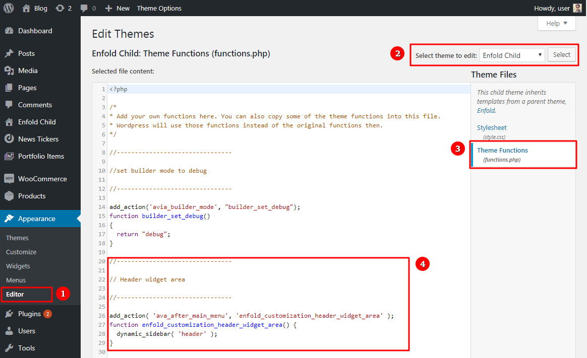
- Go to Appearance > Editor in your WordPress dashboard.
- Select the correct theme or child theme from the select theme option on top.
- After selecting the correct theme, you may notice a lot more files depending on the theme you have. Browse the file “Theme Functions” or “functions.php”. ( You can also use an FTP client and navigate to wp-content\themes\enfold-child\functions.php )
- Add the code to the bottom of the functions.php file as shown in the below example.
Step 3: Create a widget area and add your widgets
Lastly, we will create a widget area which will show in the header area and add our widgets.
- Navigate to Dashboard > Appearance > Widgets
- Create a new widget area named header
- Add a text widget with and some text in it such as “Header widget text” for testing purpose

If everything went well for you, the text you entered in the widget area “Header widget text” will appear in the frontend of your website close to the logo area.
Widget title, text and link style
Styling the header widget title, text and links:
Widget Titles can be styled from
Enfold > Advanced Styling > Widget Title
The widget background,text and links can be styled using the below custom CSS.
Code snippets:
CSS
/*--------------------------------*/

/* Header widget */

/*--------------------------------*/


/* Widget text and background */
#top #header #header_main .widget {
    line-height: 14px;
    color:#008374;
    background: #c4dff6;
}

/* Widget title */
#top #header #header_main .widget h3.widgettitle {
    color: #ff0000;
}


/* Widget link */
#top #header.header_color #header_main .widget a {
    color: #00aeff;
}

#top #header.header_color #header_main .widget a:hover {
    background: #000;
    color: #fff;
}
Header widget position
Previously, we created a header widget area. We can now use this widget area to display a custom text, Call to action buttons, Image banner or shortcodes from a plugin or theme elements like a news ticker, post slider, testimonials, Newsletter form, etc.
Using custom code we can change the header elements (Logo, Menu and Widget) size and order in which they appear and produce many variations of the header layout.
So how does it work?
The code snippet can be used to create different types of scalable headers. The code resets the width and height of the header and its elements like the logo, menu or widgets to make them responsive every time the browser width changes.
Header height: The header height is scalable if not a sticky header and is defined by the tallest header element or all of the elements together make up for the header height depending on the header layout.
Logo size: The logo will be displayed in the same size as uploaded by the user in large screens and responsively scaled down to a set min-height in the code. Define the logo max-width and min-width to scale the logo and adjust the height and width for different viewports.
Fixed headers: If a Sticky Header is activated, manually add the top padding for the page content “#main” in the “Fixed header” section of the code for different viewports.
Shrinking Header: The code automatically disables the shrinking header for some layouts. It is recommended to deactivate the shrinking header while using this code.

NOTE:
- Use the recommended theme settings provided in the examples.
- Clear the cache and remove any custom code/plugins that may cause a conflict.
- To use a plugin shortcode as a widget, you may need to add additional styling. It is outside the scope of our support to make third party widgets work with the theme.
- Depending on the size of the widget content, sometimes the menu items may run into the widget area.
- Almost all the example layouts use “Logo left, Menu right” as the logo and menu position in the theme settings. The order of the elements in which they appear is later changed using the flexbox CSS. Check out some basic use of flexbox below:
Flexbox Usage
Float: To float the header elements like the logo, widget or menu, define “margin-(left/right): auto” to move towards the left or right side of the header.
Width: Define “flex basis” and/or “flex-grow” value in “%” or “px” to set the width of the header elements like the logo, menu or widget area.
Clear: Define “flex-basis:100%; to make the header elements full-width and also move the element to a new row.
Height: Once the code is activated, header inherits its content height.
Example: If the height of a logo/widget image is 400px the header inherit the logo mostly in its original size and the header height will automatically change. To change the header height, upload your images in the correct dimension or define a width and height value for the header elements like logo/widget in the code snippet.
Position: Define “order:(different numeric value 1, 2, 3…)” to each element like the logo, menu or widgets to change the order in which the header elements
Example 1: A header layout in which Logo appears first, widget center and menu right.
Update the order and margin value in the CSS to:
.logo { order:1 }

.main_menu { order:3 }

.widget { order:2 }
Example 2: A header layout with the widget on the left followed by a menu floated to the left and a Logo on the right.
Update the order value to:
.logo { order:3 }

.main_menu { order:2; margin-right:auto; }

.widget { order:1 }
Widget on top
Widget on right
- Logo left, Menu center, Widget right
- Add a Facebook widget to your header
- Add a subscription form to your header
- Add button elements to your header
- Menu Left, Widget right, Logo right
- Center logo menu
- Menu left, logo center, widget right
Widget at the bottom
- Add a banner image below the logo and menu
- Full width text scroller below logo and menu
- Stack the logo, menu and widgets
- Overflow widget area.
Widget on left
- Widget left, Logo left, Menu right
- Widget Left, Logo center, Menu right
- Widget Left Menu center Logo right
- Widget Left Logo right Menu below
Widget center
- Logo left, Widget center, Menu right
- Menu left, widget center, Logo right
- Centered logo widget and menu
Logo and widgets
- Widget area next to the logo
- Widget area below the logo
- Full-width logo on top, Menu below
- Multiple logos above the menu
- Stacked widget, menu and overflowing logo
- Logo overflow
- Menu left, logo center (overflow), widget right
- Centered logo and menu
Multiple widgets
Depending on the widget content size, your widget area may run into the other elements. If you notice this issue on your website please try the following:
- Display a burger menu just before the menu items run into the widgets using custom CSS.
- Increase the width of the header in desktop screens to add more dynamic space between the header elements.
- Hide the widget area or other header elements on small screens using custom CSS.
Transparent sticky header
To make your sticky header transparent please use the below CSS.
 /* Transparent Sticky Header */
#header.header_color .header_bg {
    background: transparent;
}
Set transparent header as default header style
To set the transparent header as a default header style for all page and post please add the below code to your functions.php
add_action( 'after_setup_theme', 'enfold_customization_product_switch' );
function enfold_customization_product_switch(){
  add_filter('avf_builder_elements', 'avf_builder_elements_mod');
}

function avf_builder_elements_mod($elements)
{
  $counter = 0;
    foreach($elements as $element)
    {
    if($element['id'] == 'header_transparency')  {
            $elements[$counter]['std'] = 'header_transparent header_glassy ';
        }

        $counter++;
    }

  return $elements;
}
To select different header options replace “header_transparent header_glassy” in the below line with any of the following parameters:
$elements[$counter]['std'] = 'header_transparent header_glassy';- header_transparent
- header_transparent header_with_border
- header_transparent header_glassy
- header_transparent header_scrolldown
- header_transparent header_hidden
Top Bar
Styling the phone info
To style the phone number using custom CSS please use the below CSS.
/* Phone info font size */
.phone-info { font-size: 18px; }

/* phone link info styling */
.phone-info a { color: red; }
.phone-info a:hover { color: green; }
If you like to use multiple phone numbers:
Add the correct phone info in the below HTML and paste it in Enfold > Header > Extra Elements > Phone Number or small info text:
<a class="phone-info-top" href="tel:5555555555">Phone One  555-555-5555 </a>
<a class="phone-info-top" href="tel:5555555555">Phone Two  555-555-5555 </a>
Add the below CSS for multiple phone numbers to show up on same a line.
/* Phone info */
.phone-info-top {
  display:inline-block!important;
  padding:4px 10px;
}
Mobile Header
Transparent header on mobile
If you have activated the transparent header from the page/post > Layout > Header visibility and transparency by default on the mobile device the header is displayed above the content. If you like to display a transparent header on mobile please use the below CSS
/* Transparent Header For Mobile */
@media only screen and (max-width: 990px) {
.responsive.html_mobile_menu_tablet #top #wrap_all #header {
        position: absolute;
}
.html_mobile_menu_tablet #top #wrap_all .av_header_transparency {
	background: transparent;
}
}
Sticky header on mobile
To make the header sticky on mobile device please use the below CSS
/* Sticky header on mobile */
@media only screen and (max-width: 767px) {
  .responsive #top #main {
    /* Margin top value should be equal to header height*/
    margin-top: 180px;
  }
  .responsive #top #wrap_all #header {
    position: fixed;
  }
}