


Header layout: Multiple logos above the menu
- Update your header settings to match the header settings for this example.
- Disable script merging and clear the cache.
- Add the code snippet to your child theme.
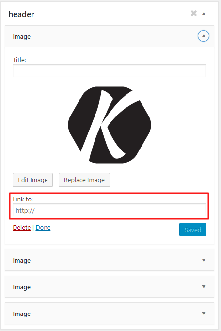
- Create a header widget area.
- Add an image/text widget to the newly created header widget area.
Header Settings
Enfold > Header > Header Layout > Menu and Logo Position > Logo left, Menu right
(* Rest of the settings are optional.)
CSS
/************************************

Multiple logos above the menu

*************************************


CSS Settings:

» Initiate Flexbox
» Topbar
» Header
» Logo
» Menu
» Widget
» Social icons
» Search
» Cart icon

***********************************/


/*--------------------------------

» Initiate Flexbox

--------------------------------*/


/* Header */
.responsive #top #header,
/* Top bar */
.responsive #top #header #header_meta,
/* Search icon */
.responsive #top #header #menu-item-search a,
/* Cart icon */
.responsive #top #header a.cart_dropdown_link,
/* Social icon */
.responsive #top #header #header_main nav .social_bookmarks,
/* Logo */
.responsive #top #header #header_main .inner-container .logo,
/* Main menu, cart and social icons */
.responsive #top #header #header_main .inner-container .main_menu,
/* Widgets */
.responsive #top #header #header_main .inner-container .widget,
/* Header inner container */
#top #header #header_main .container.av-logo-container .inner-container {
    display: flex;
    position: relative;
}


/*--------------------------------

» Topbar

--------------------------------*/


/* Top bar */

.responsive #top #header #header_meta {
    flex-basis: 100%;
}


/*--------------------------------

» Header

--------------------------------*/


/* Height outer container */

#top #header #header_main .container.av-logo-container {
    /* Do not change height here */
    /* Auto height: Header takes the height of the contents */
    height: inherit;
    line-height: inherit;
}


/* Header inner container */

#top #header #header_main .container.av-logo-container .inner-container {
    /* Define header height here */
    height: inherit;
    position: relative !important;
    flex-wrap: wrap;
    /* Define header padding */
    padding: 10px;
    justify-content: space-between;
}


/* Wrappers
--------------------------------*/


/* Main header ( logo, menu, widgets ) and topbar */

.responsive #top #header {
    flex-wrap: wrap;
}


/*  Logo, Menu, Social Icons and Widgets. */

.responsive #top #header #header_main {
    flex-basis: 100%;
}


/* Transparent header
--------------------------------*/

.responsive.html_header_transparency #top #wrap_all #header {
    position: absolute;
}

@media only screen and (max-width: 767px) {
    .responsive.html_header_transparency #top #wrap_all #main {
        /* Define padding value for transparent header in mobile */
        /*padding-top: 315px !important; */
    }
}


/* Fixed header
--------------------------------*/

.html_header_sticky.html_mobile_menu_tablet #top #wrap_all #header,
.html_header_sticky.html_header_transparency #top #wrap_all #header,
.html_header_sticky #top #wrap_all #header {
    position: fixed;
}

.html_header_sticky #top #header_main .container,
.html_header_sticky #top .main_menu ul:first-child>li a {
    height: inherit !important;
    line-height: inherit !important;
}


/* Main content padding value should be same as the fixed header height. */

.html_header_sticky:not(.html_header_transparency) #top #wrap_all #main,
.html_header_sticky #top #wrap_all #main {
    /* Define padding only if sticky header is active */
    /*padding-top: 262px ;  */
}

@media only screen and (max-width: 767px) {
    .html_header_sticky #top #wrap_all #main {
        /* Define padding value for sticky header on mobile */
        /*padding-top: 315px !important; */
    }
}


/*--------------------------------

» Logo

--------------------------------*/


/* Logo */

.responsive #top #header #header_main .inner-container .logo {
    display: none;
}

/*--------------------------------

» Menu

--------------------------------*/


/* Menu outer container: Menu with siblings cart and social icons */

.responsive #top #header #header_main .inner-container .main_menu {
    order: 2;

    /* Define menu width */
    flex-basis: 100%;

    align-items: center;
    align-self: center;
    height: inherit !important;
    justify-content: center;
}


/* Navigation */

#header .av-main-nav {
    display: flex;
    flex-wrap: nowrap;
}


/*  Activate burger menu  */

@media only screen and (max-width: 1100px) {
    #top #header .av-main-nav>li.menu-item {
        display: none!important;
    }
    #top #header .av-burger-menu-main {
        cursor: pointer;
        display: block!important;
    }
}

@media only screen and (max-width: 767px) {
    /* Mobile menu position fix */
    .responsive #top .av-logo-container .avia-menu {
        display: flex!important;
        align-items: center;
    }
}


/* Mega menu submenu position fix */

.responsive #top #header .avia_mega_div {
    /* Define megamenu submenu top value */
    /*   top: 300px;
   position: fixed;
   left: 50%;
   transform: translateX(-50%);*/
}


/*--------------------------------

» Widget

--------------------------------*/


/* Widgets */

.responsive #top #header #header_main .inner-container .widget {
    order: 1;
    flex-basis: 25%;
    padding: 0;
    clear: none!important;

    align-self: center;
    align-items: center;
    z-index: 1;
    max-width: 180px;
}


.responsive #top #header #header_main .inner-container .widget>div {
    width: 100%;
    line-height: 14px;
    padding: 0 10px;
    background: gold;
}


/*--------------------------------

» Social icons

--------------------------------*/


/* Flex support and position fix */

.responsive #top #header #header_main nav .social_bookmarks {
    top: auto;
    margin-top: 0;
    align-items: center;
}


/* Inherit height for flex alignment */

.responsive #top .av-logo-container .social_bookmarks li {
    height: inherit;
}


/*--------------------------------

» Search

--------------------------------*/


/* Your styles here */


/*--------------------------------

» Cart

--------------------------------*/


/* Cart position fix */

#top #header #header_main #menu-item-shop a.cart_dropdown_link {
    height: auto;
}

@media only screen and (max-width: 767px) {
    .responsive #top #menu-item-shop.cart_dropdown {
        display: flex;
        align-items: center;
    }
    .cart_dropdown .dropdown_widget .avia-arrow {
        display: none;
    }
}
NOTE: To display multiple logo images and align them as required, we need to first hide the default logo and upload the logo images as widgets from the header widget area. You can also link the logo images from the widget options.