


Header Layout: Logo left, Widgets right, menu below
- Update your header settings to match the header settings for this example.
- Disable script merging and clear the cache.
- Add the code snippet to your child theme.
- Create a header widget area.
- Add you widgets to the newly created header widget area.
Header Settings
Enfold > Header > Header Layout > Menu and Logo Position > Logo left, Menu right
(* Rest of the settings are optional.)
CSS
/************************************

Logo left, Widget center, widget right, menu above

*************************************


CSS Settings:

» Initiate Flexbox
» Topbar
» Header
» Logo
» Menu
» Widget
» Social icons
» Search
» Cart icon

***********************************/


/*--------------------------------

» Initiate Flexbox

--------------------------------*/


/* Header */
.responsive #top #header,
/* Top bar */
.responsive #top #header #header_meta,
/* Search icon */
.responsive #top #header #menu-item-search a,
/* Cart icon */
.responsive #top #header a.cart_dropdown_link,
/* Social icon */
.responsive #top #header #header_main nav .social_bookmarks,
/* Logo */
.responsive #top #header #header_main .inner-container .logo,
/* Main menu, cart and social icons */
.responsive #top #header #header_main .inner-container .main_menu,
/* Widgets */
.responsive #top #header #header_main .inner-container .widget:nth-child(3),
.responsive #top #header #header_main .inner-container .widget:nth-child(4),
/* Header inner container */
#top #header #header_main .container.av-logo-container .inner-container {
    display: flex;
    position: relative;
}


/*--------------------------------

» Topbar

--------------------------------*/


/* Top bar */

.responsive #top #header #header_meta {
    flex-basis: 100%;
}


/*--------------------------------

» Header

--------------------------------*/


/* Height outer container */

#top #header #header_main .container.av-logo-container {
    /* Do not change height here */
    /* Auto height: Header takes the height of the contents */
    height: inherit;
    line-height: inherit;
}


/* Header inner container */

#top #header #header_main .container.av-logo-container .inner-container {
    /* Define header height here */
    height: inherit;
    position: relative !important;
    flex-wrap: wrap;
    /* Define header padding */
    padding: 10px;
    justify-content: space-between;
}


/* Wrappers
--------------------------------*/


/* Main header ( logo, menu, widgets ) and topbar */

.responsive #top #header {
    flex-wrap: wrap;
}


/*  Logo, Menu, Social Icons and Widgets. */

.responsive #top #header #header_main {
    flex-basis: 100%;
}


/* Transparent header
--------------------------------*/

.responsive.html_header_transparency #top #wrap_all #header {
    position: absolute;
}

@media only screen and (max-width: 767px) {
    .responsive.html_header_transparency #top #wrap_all #main {
        /* Define padding value for transparent header in mobile */
        /*padding-top: 315px !important; */
    }
}


/* Fixed header
--------------------------------*/

.html_header_sticky.html_mobile_menu_tablet #top #wrap_all #header,
.html_header_sticky.html_header_transparency #top #wrap_all #header,
.html_header_sticky #top #wrap_all #header {
    position: fixed;
}

.html_header_sticky #top #header_main .container,
.html_header_sticky #top .main_menu ul:first-child>li a {
    height: inherit !important;
    line-height: inherit !important;
}


/* Main content padding value should be same as the fixed header height. */

.html_header_sticky:not(.html_header_transparency) #top #wrap_all #main,
.html_header_sticky #top #wrap_all #main {
    /* Define padding only if sticky header is active */
    /*padding-top: 262px ;  */
}

@media only screen and (max-width: 767px) {
    .html_header_sticky #top #wrap_all #main {
        /* Define padding value for sticky header on mobile */
        /*padding-top: 315px !important; */
    }
}


/*--------------------------------

» Logo

--------------------------------*/


/* Logo */

.responsive #top #header #header_main .inner-container .logo {
    order: 2;
    flex-basis: 33%;
    /*width: auto;*/

    /* Define scalable min width of the logo on small screens */
    min-width: 100px;

    z-index: 9;
    /* Define scalable max width of the logo on big screens */
    /* Logo width: (auto | 100% | px );  Set auto to display the uploaded image size */
    max-width: 180px;
}


/* Logo image size */

.responsive #top #header .logo,
.responsive #top #header .logo a,
.responsive #top #header .logo img {
    width: auto;

    /* Height specification is not required. It is proportional to the max width of the logo */
    height: auto;
    align-items: center;
    align-self: center;
    justify-content: center;
}


/* Vertically center transparency logo */

.responsive #top #header .logo span img {
    position: absolute;
    top: 50%;
    transform: translateY(-50%);
}


/*--------------------------------

» Menu

--------------------------------*/


/* Menu outer container: Menu with siblings cart and social icons */

.responsive #top #header #header_main .inner-container .main_menu {
    order: 1;

    /* Define menu width */
    flex-basis: 100%;

    align-items: center;
    align-self: center;
    height: inherit !important;
    background: #f1f1f1;
    justify-content: center;
    margin-bottom: 20px;
}


/* Navigation */

#header .av-main-nav {
    display: flex;
    flex-wrap: nowrap;
}


/*  Activate burger menu  */

@media only screen and (max-width: 1100px) {
    #top #header .av-main-nav>li.menu-item {
        display: none!important;
    }
    #top #header .av-burger-menu-main {
        cursor: pointer;
        display: block!important;
    }
}

@media only screen and (max-width: 767px) {
    /* Mobile menu position fix */
    .responsive #top .av-logo-container .avia-menu {
        display: flex!important;
        align-items: center;
    }
}


/* Mega menu submenu position fix */

.responsive #top #header .avia_mega_div {
    /* Define megamenu submenu top value */
    /*   top: 300px;
   position: fixed;
   left: 50%;
   transform: translateX(-50%);*/
}


/*--------------------------------

» Widget

--------------------------------*/


/* Widgets */

.responsive #top #header #header_main .inner-container .widget {
    flex-basis: auto;
    padding: 0;
    clear: none!important;

    justify-content: center;
    align-self: center;
    align-items: center;
    z-index: 1;
    margin: 0 10px;
}


.responsive #top #header #header_main .inner-container .widget>div {
    width: 100%;
    line-height: 14px;
    padding: 0 10px;
    background: gold;
}

/* Widgets areas */
.responsive #top #header #header_main .inner-container .widget:nth-child(3){
    order: 3;
    flex-basis: 33%;
}
.responsive #top #header #header_main .inner-container .widget:nth-child(4){
    order: 4;
    flex-basis: 33%;
}

/*--------------------------------

» Social icons

--------------------------------*/


/* Flex support and position fix */

.responsive #top #header #header_main nav .social_bookmarks {
    top: auto;
    margin-top: 0;
    align-items: center;
}


/* Inherit height for flex alignment */

.responsive #top .av-logo-container .social_bookmarks li {
    height: inherit;
}


/*--------------------------------

» Search

--------------------------------*/


/* Your styles here */


/*--------------------------------

» Cart

--------------------------------*/


/* Cart position fix */

#top #header #header_main #menu-item-shop a.cart_dropdown_link {
    height: auto;
}

@media only screen and (max-width: 767px) {
    .responsive #top #menu-item-shop.cart_dropdown {
        display: flex;
        align-items: center;
    }
    .cart_dropdown .dropdown_widget .avia-arrow {
        display: none;
    }
}
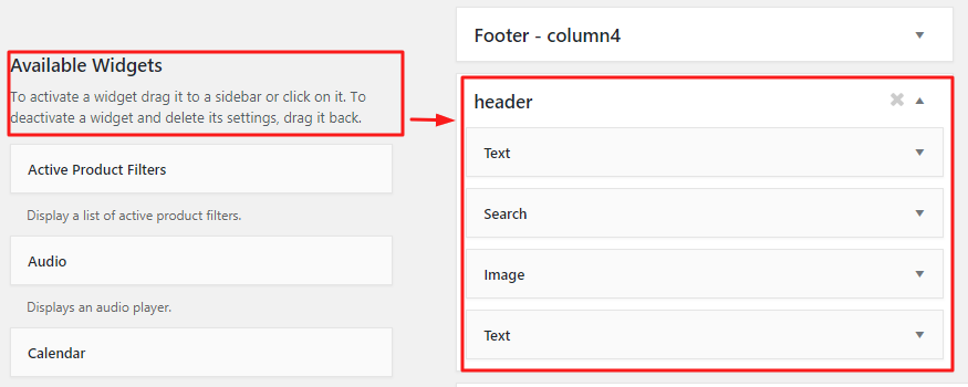
Steps to add multiple widgets to your Enfold header.
- Drag and drop your widgets from the list of Available Widgets (text, image, shortcodes or plugin widgets) to the Header Widget Area.
- To add multiple widgets (more than two) reference the “nth-child” in the code. Widgets are usually the 3rd child of the header container so we reference the widget in the header using the below code.
/* Widgets area 1 */ .responsive #top #header #header_main .inner-container .widget:nth-child(3) { /* Your style here */ } /* Widgets area 2 */ .responsive #top #header #header_main .inner-container .widget:nth-child(4) { /* Your style here */ } /* Widgets area 3 */ .responsive #top #header #header_main .inner-container .widget:nth-child(5) { /* Your style here */ } - Set your widget styles in the code to suit your design.
- On small screens, the elements may wrap to a new row. You can try hiding the widget area in mobile using the media query.