


Tab Section
Overview
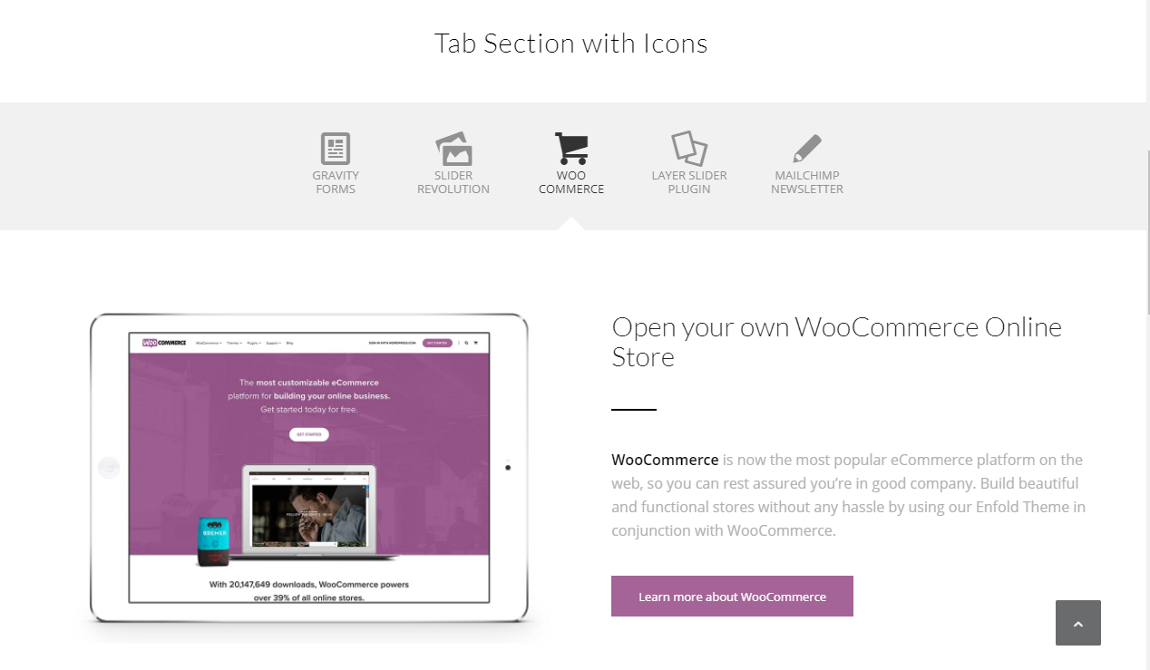
Tab section element is easy to setup from the advanced layout editor and displays the content and tabs in various styles (like text only, with the image, with an icon, above or below the tab section, etc). Tab element is a full-width section and hence if a sidebar exists on the page it will be pushed below.
Code Snippets
Shortcode
Shortcode
[av_tab_section transition='av-tab-no-transition' padding='default' tab_pos='av-tab-above-content' content_height='' tab_padding='default' initial='1' id='' av_element_hidden_in_editor='0' av_admin_tab_active='1' av-desktop-hide='' av-medium-hide='' av-small-hide='' av-mini-hide='' av_uid='av-uzv2e']
[av_tab_sub_section av_uid='av-qns8m'][/av_tab_sub_section][av_tab_sub_section av_uid='av-l7tge'][/av_tab_sub_section][av_tab_sub_section av_uid='av-h0y4m'][/av_tab_sub_section][av_tab_sub_section av_uid='av-7ypj2'][/av_tab_sub_section]
[/av_tab_section]
Customization
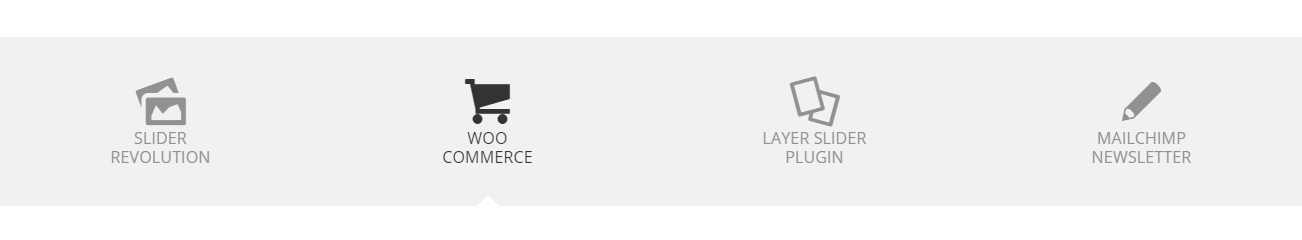
Tab Icons
Tab icon size:
/* CSS - Tab icon size*/
span.av-tab-section-icon:before {
font-size: 76px!important;
}
Tab Styles
Tab font slyles:
/* CSS - Tab font slyles */
.av-inner-tab-title {
    font-size: 13px;
    font-weight: 900;
    letter-spacing: .5em;
    line-height: 24px;
}
Tab font slyle on hover:
/* CSS - Tab font slyle on hover */
.av-inner-tab-title:hover {
    color: black;
}
Active tab font slyle:
/* CSS - Active tab font slyle */
.av-active-tab-title {
background:gold;
}
Tabs with equal space: Tabs are spread out across the width and share equal space between them.
/* CSS - Tabs with equal space*/
.js_active .av-tab-section-tab-title-container {
    display: flex!important;
    justify-content: space-around;
}
Tab Shapes
To create pill shape tabs, give your tabs section element a custom CSS class name “av-pill-tabs” and add the below CSS to your site.
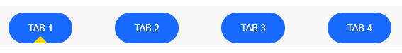
/*----------------------------------------
// CSS - Tabs pill shape
//--------------------------------------*/

    .av-pill-tabs .av-tab-section-tab-title-container a {
        background: #1869ff;
        border-radius: 50px;
        padding: 0!important;
        margin-top: -10px;
        overflow: hidden;
    }

    #top .av-pill-tabs .av-section-tab-title {
        margin-right: 60px!important;
        padding: 0!important;
    }

    .av-pill-tabs .av-outer-tab-title {
        padding: 0px!important;
        margin: 0 !important;
    }

    /* Tab Title */
    .av-pill-tabs .av-inner-tab-title {
        color: #FFF;
        margin-bottom: 0px!important;
        line-height: .2em;
        padding: 15px 0 5px 0!important;
    }

    /* Tab arrow */
    .av-pill-tabs .av-tab-arrow-container {
        top: 5px;
    }
    #top .av-pill-tabs .av-tab-arrow-container span {
        background: gold;
    }
To change the tabs shape to circle or round, please give your tab section element a custom CSS class name “av-round-tabs” and add the below CSS code in your site:
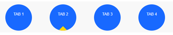
    /*----------------------------------------
// CSS - Tabs round shape
//--------------------------------------*/
.av-round-tabs .av-tab-section-tab-title-container a {
	background:#1869ff;
	border-radius:90px;
	padding:0!important;
	margin-top:-10px;
	overflow: hidden;
	width: 90px;
	height: 90px;
}

#top .av-round-tabs .av-section-tab-title {
	margin-right:60px!important;
	padding:10px 0!important;
}

/* Tab Title */
.av-round-tabs .av-inner-tab-title {
    color: #FFF;
    line-height: 1em;
}

/* Tab arrow */
.av-round-tabs .av-tab-arrow-container {
    top: 10px;
}
#top .av-round-tabs .av-tab-arrow-container span {
    background: gold;
}
Tab Animation
Add custom animation to tab text or icons:
/*----------------------------------------
// CSS - Tab Animation
//--------------------------------------*/
.av-section-tab-title.av-active-tab-title {
animation: shakeMe 0.250s linear 1;
-webkit-animation: shakeMe 0.250s linear 1;
-moz-animation: shakeMe 0.250s linear 1;
-o-animation: shakeMe 0.250s linear 1;
-ms-animation: shakeMe 0.250s linear 1;
}

/* Animation Effect */

@keyframes shakeMe {
25% {
transform: rotateZ(15deg);
-webkit-transform: rotateZ(15deg);
-moz-transform: rotateZ(15deg);
-o-transform: rotateZ(15deg);
-ms-transform: rotateZ(15deg);
}
50% {
transform: rotateZ(-15deg);
-webkit-transform: rotateZ(-15deg);
-moz-transform: rotateZ(-15deg);
-o-transform: rotateZ(-15deg);
-ms-transform: rotateZ(-15deg);
}
100% {
transform: rotateZ(15deg);
-webkit-transform: rotateZ(15deg);
-moz-transform: rotateZ(15deg);
-o-transform: rotateZ(15deg);
-ms-transform: rotateZ(15deg);
}}
Remove the Grayscale from the inactive tab
Remove greyscale effect from inactive tab icons/images.
/*-------------------------------------------------------------
// CSS - Remove greyscale from inactive tabs
//------------------------------------------------------------*/
.av-tab-section-image {
    filter: none!important;
}
Increase the tab spacing
Increase the space between tabs
/*------------------------------
// CSS - Increase tab spacing
//------------------------------*/
#top .av-section-tab-title {
    padding-right:60px!important;
}
Link to a specific tab on the tab section
When a link is clicked if you like to direct the user to a specific tab section it is possible by using a tab section ID in the URL as shown below:
http://domain.com/mypage/#tab-id-2
Limitations
Scrolling to the Tab Section using a direct link isn’t possible. This is a known limitation of the Tab Section element.