


Fullwidth Sub Menu
Overview and Settings
Full-width Submenu can be used to display additional menus on specific pages. Submenus can either scroll with the page or stays at the top until a new menu appears.
A working example of the Submenu element.
Fullwidth Sub Menu Settings
Submenu element settings will allow you to:
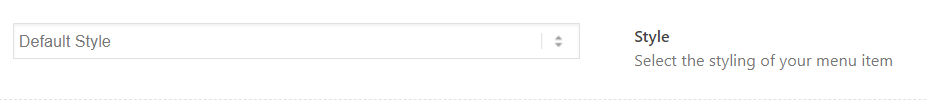
- Create or Select Menu
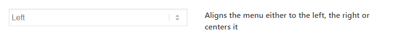
- Menu Alignment
- Colors Profile
- Sticky Submenu
- Mobile Behavior
Code Snippets
Shortcode
[av_submenu which_menu='center' menu='' position='center' color='main_color' sticky='true' mobile='disabled' mobile_submenu='' av_uid='av-e0wsf1']
[av_submenu_item title='Menu Item 1' av_uid='av-dvngtx']
[av_submenu_item title='Menu Item 2' av_uid='av-dogc4l']
[/av_submenu]
Customization
By default the Submenu element picks up the styles set up in the theme options. To add additional styles and make custom changes the following code snippets can be used.
Styling Links
To highlight a single menu item, use the button style option provided in the Submenu pop up options.
For the custom styling of a menu item, we can use custom CSS code. The code snippet below will style the last menu item added to the Submenu element and position it to the right. In the example below we have used a phone number as menu text:
Style – 1: Example of submenu with a phone number.
Custom Background
The background color for the Submenu element is inherited by the color scheme set up in the theme options. In the example below, we will look at adding a custom background color to the Submenu element to change the default style.
Style-2: Example of submenu with a custom background.
Alignment
The menu items can be aligned Left, Right or center from the Submenu option.
Custom CSS can be used to align justify, or make the menu items take up equal space and add a different background color to each menu item.
Style-3: Example of submenu items with equal space.
Add Icons to Menu Item
Let us take a look at creating a fullwidth submenu with icons as shown in the below example:
Style-4: Example of submenu with icons.
- Open a blank page and select your icons from the Advanced Layout Builder. Make sure to remove the default icon size so we can set this up later using custom CSS.

- Enable Debug mode and copy the icon shortcodes one by one for all menu items.
Note: Delete the size value if you still notice it in the shortcode.

- Go to Appearance > Menu and create a new menu with icon shortcodes with the menu “Link Text”.

- Add the below CSS to your site.
Code Snippet:
CSS
/*----------------------------------------

// CSS -  Fullwidth Submenu style - 4

//--------------------------------------*/
/* Icon style */
.submenu-style-4 .av-subnav-menu > li > a .av-icon-char:before {
color:#000;
font-size:24px;
transition: transform .3s;
}
.submenu-style-4 .av-subnav-menu > li > a:hover .av-icon-char:before {
color:#d33131;
}
.submenu-style-4 .av-subnav-menu > li > a .av-icon-char {
line-height:1em;
}
Horizontal submenu items
The submenu drop-down is by default stacked vertically. To make it a horizontal dorp-dowm menu we are going to use custom CSS as shown in the below example.
Style-5: Example of horizontal submenu.
Code Snippet:
CSS
/*----------------------------------------
// CSS - Submenu Horizontal submenu
//--------------------------------------*/
/* Submenu with horizontal submenu */
#top .submenu-style-5 .av-subnav-menu li {
position: static !important;
}
#top .submenu-style-5 .av-subnav-menu > li ul {
width: 100%;
text-align: center;
}
#top .submenu-style-5 .av-subnav-menu > li ul li {
display: inline-block;
}
Custom width submenu
As the name suggests a Fullwidth submenu is a fullwidth element but we can use custom CSS to change the width.
Style-6: Example of Custom width submenu.
Create a one page menu
In this tutorial, we are going to create a one-page menu and link it to different sections on the same page.
Example of onepage menu (same as the example of active menu highlight) we are going to create.
- Create a new page and add the full-width submenu element.
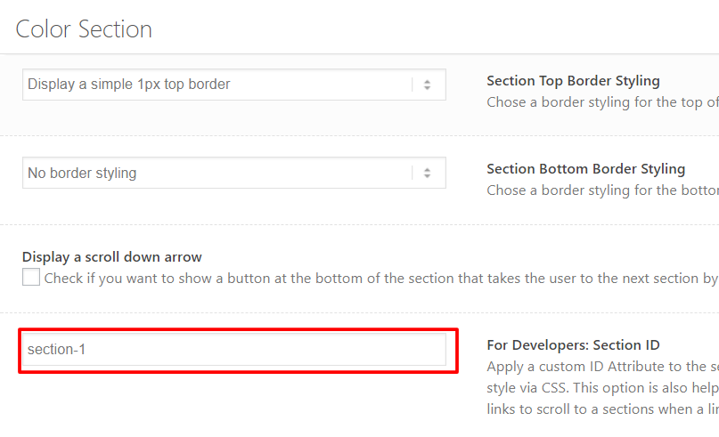
- Create the required sections on the page using the “Color Section” element.
- Give each section a unique ID in the developer ID field.
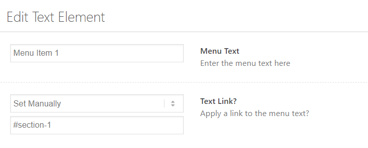
- Open the menu options and link the menu items to each of the section ID’s.
Active submenu highlight
Now that we have created a onepage menu, let’s take a look at how to highlight each menu item when the corresponding section reaches the top of the page. Example of one-page menu highlight we are going to create.
Start by assigning the full-width submenu a custom CSS class name “submenu-onepage“. And add the below code snippet to your website.
Code Snippet:
CSS
/*—————————————-
// CSS – Fullwidth Submenu highlight active menu
//————————————–*/
/* Active menu styles */
#top .submenu-onepage .active-menu-item,
#top .submenu-onepage .active-menu-item a {
background: #000 !important;
color: #FFF !important;
}
#top .submenu-onepage .av-subnav-menu > li > a {

border-left-style: none !important;

border-left-width: 0px !important;

}
JS Function
// Highlight one page nav

function activateMenuItem(){
?>
<script>
     jQuery(document).scroll(function() {
     var sections = jQuery('.avia-section'),
         menu   = jQuery('.av-submenu-container'),
         nav_height = menu.outerHeight();
         jQuery(window).on('scroll', function() {
            var cur_pos = jQuery(this).scrollTop();
            sections.each(function() {
                var top = jQuery(this).offset().top - 300,
                    bottom = top + jQuery(this).outerHeight();
                if (cur_pos >= top && cur_pos <= bottom) {
                    menu.find('li').removeClass('active-menu-item');
                    menu.find('a[href="#' + jQuery(this).attr('id') + '"]').parent('li').addClass('active-menu-item');
                }
            });
        });
    });

</script>
<?php
}
add_action('wp_head', 'activateMenuItem');
Onepage Dots Menu
One page dots menu is a simple menu with several dots and each dot links to a different section of the page and the dots menu stay fixed when the page scrolls.
In this tutorial, let’s take a look at modifying the “Fullwidth submenu element” to look and function like a one-page dots menu using custom CSS. Take a look at the demo of one page menu we are going to create.

To create a one-page menu, let’s start with the “Fullwidth Sub Menu” element.
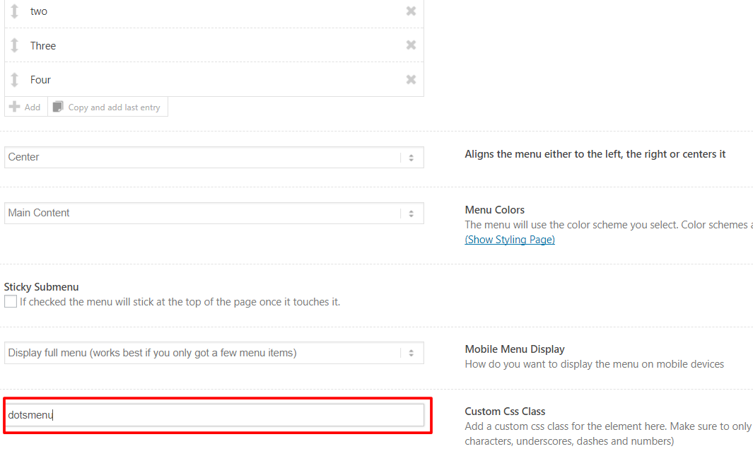
- Drag and drop the “Fullwidth Sub Menu” element and give it a custom class name “dotsmenu”.
- Create the number of sections you need using the “Color Section” element.
- Give each section a unique ID in the developer ID field.

- Open the menu options and link the menu items to each of the section ID’s.

- Add the custom CSS styles below to your site.
/*------------------------*/
/*       Dots menu
/*------------------------*/

#top .dotsmenu {
  background: transparent;
  position: fixed!important;
  right: 10px;
  top: 50%!important;
  transform: translateY(-50%);
  border: none!important;
  max-width: 30px!important;
}

#top .dotsmenu .av-subnav-menu > li {
    display: inline!important;
    margin: 10px !important;
}

#top .dotsmenu .av-subnav-menu li a {
  max-width: 20px;
  max-height:25px;
  border-radius:25px;
  overflow:hidden;
  padding: 0 !important;
  border: none!important;
  /* Dots Background color */
  background: #f3f4f7;
}

#top .dotsmenu .av-subnav-menu li a .avia-bullet {
  display: none !important;
}
#top .dotsmenu .av-subnav-menu li a .avia-menu-text {
visibility: hidden;
}

@media only screen and (max-width: 767px) {
.responsive #top .dotsmenu {
  background: transparent;
  position: fixed!important;
  right: 0;
  top: 50%!important;
  transform: translateY(-50%);
}}
Resource
Contributed video: