


Sidebar
Overview
Sidebar can be easily modified. To show/hide sidebar or to add/delete widgets please access the sidebar settings from:
- Enfold > Sidebar
- Page/Post > Layout > Sidebar Settings
- Appearance > Widgets > Sidebar
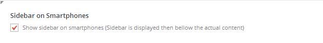
Show or Hide sidebar on Mobile devices
By default the Enfold theme will hide the left or right sidebar on mobile devices so that the content is simplified.
To change this there is an option in the Theme Options in the Sidebar tab. Go to the Enfold Theme Options>Sidebar and then look for the “Sidebar on Smartphones” title. Check the box to show sidebars on mobile devices.
Sidebar on top or bottom
To position the sidebar on top of the content we can add the below custom CSS.
Sidebar on top in Desktop:
CSS
       /* Sidebar on top in desktop and mobile */

        .container {

            display: flex!important;

            flex-direction: row;

            justify-content: space-between;

            flex-wrap: wrap;

        }
/* Sidebar */
#top .container aside {
order: 1;
flex-grow: 1;
}
/* Main Content */
#top .container main {
order: 2;
flex-grow: 1;
padding: 0 50px 0 0;
}
Sidebar at the bottom in Desktop:
CSS
       /* Sidebar at the bottom in desktop and mobile */

.container {

display: flex!important;

flex-direction: row;

justify-content: space-between;

flex-wrap: wrap;

}
/* Sidebar */
#top .container aside {
order: 2;
flex-grow: 1;
}
        /* Main Content */

#top .container main {

order: 1;

flex-grow: 1;

padding: 0 50px 0 0;

}
Sidebar on top in Mobile:
CSS
    /* Sidebar on top in mobile */

    @media only screen and (max-width: 786px) {
.container {
display: flex!important;
flex-direction: row;
justify-content: space-between;
flex-wrap: wrap;
}
/* Sidebar */
#top .container aside {
order: 1;
flex-grow: 1;
}
/* Main Content */
#top .container main {
order: 2;
flex-grow: 1;
padding: 0 50px 0 0;
}
}
Sidebar at the bottom in Mobile:
CSS
    /* Sidebar at the bottom in mobile */

@media only screen and (max-width: 786px) {
.container {
display: flex!important;
flex-direction: row;
justify-content: space-between;
flex-wrap: wrap;
}
/* Sidebar */
#top .container aside {
order: 2;
flex-grow: 1;
}
        /* Main Content */

#top .container main {

order: 1;

flex-grow: 1;

padding: 0 50px 0 0;

}

}