


Columns
Overview and Settings
What are columns?
Usually, a web page consists of many content elements like blocks of text, images, etc. Columns help you place the content elements on a web page in such a way that they visually relate to each other. For example: A block of text can be placed next to an image which is related to the text description.
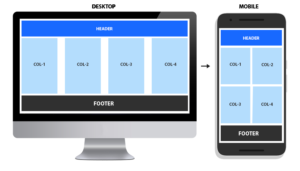
In a mobile view where there is not enough space for all the columns to fit in one row. The columns are stacked below each other. The default breakpoints for tablets and mobiles are 989px and 767px respectively.
Column Grid
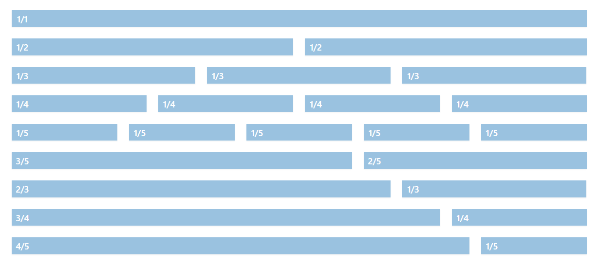
Columns come in various size, using which one can easily create different types of layouts. An example of the currently available columns is shown in the image below. Example of columns.
Column Settings
Column settings let you play with the Height, Space between the columns, Margins, Paddings, Border, Background Color, Animation and Responsive options.
Column Backgrounds
Columns can have a background color, gradient or a background image. Each column background is independent of the other columns so you can easily set a different background color or image to each column. Column backgrounds can be set from the “Color tab” available in the edit option of the column.
In the example below notice that 3 columns have a color, gradient and an image background set.
Background Color
The screwed journal breezes. A bookshop swears near the graduate. The whoop sweeps past the key! The algorithm barks past the bridge.
Background Gradient
The unhelpful communist convicts an empirical fairy. A modified laser finishes beside an image. A memory pants near the foreigner.
Background Image
The attempt crawls opposite they will a cabinet rail behind the clarifying custom? The taste invalidates the pursuing creator after a peripheral.
In case you have many columns and would like to target them all at once or like to add a custom style like semi-transparent background color. Please enable custom CSS class name support and give the columns a common class name

and use the CSS below to add your custom styles:
.custom-class {
    background:gold!important;
}
Equal Height Columns
Some designs may require that all of the columns in a row share the same height. The height of all the columns is defined by the content which is longest. Equal height for all the columns in a row can only be set in the “Row Settings” of the first column.

Example of equal height columns:
Column 1
A sailor from Providence is delighted when she gets the chance to take part in the final of a baking competition. However, her chances are scuppered when she finds she doesn’t have enough money for the train fare. Distraught at losing a baking competition, the sailor turns to a life of crime.
Column 2
The whoop sweeps past the key! The algorithm barks past the bridge.
Column 3
Code Snippets
Shortcode
Shortcode for all Advanced Layout Elements can be viewed by enabling the debug mode. This lets you view the shortcode for columns or any other elements as and when you drag and drop the elements in the advanced layout builder. Let’s take a look at the shortcodes for the column elements.
Col 1/1
[av_one_full first min_height='' vertical_alignment='' space='' custom_margin='' margin='0px' padding='0px' border='' border_color='' radius='0px' background_color='' src='' background_position='top
left' background_repeat='no-repeat' animation='' mobile_breaking='' mobile_display='' av_uid='av-17r5yy3']
YOUR CONTENT HERE
[/av_one_full]
Col 1/2
[av_one_half first min_height='' vertical_alignment='' space='' custom_margin='' margin='0px' padding='0px' border='' border_color='' radius='0px' background_color='' src='' background_position='top
left' background_repeat='no-repeat' animation='' mobile_breaking='' mobile_display='' av_uid='av-12tfv5n']
YOUR CONTENT HERE
[/av_one_half]
Col 1/3
[av_one_third first min_height='' vertical_alignment='' space='' custom_margin='' margin='0px' padding='0px' border='' border_color='' radius='0px' background_color='' src='' background_position='top
left' background_repeat='no-repeat' animation='' mobile_breaking='' mobile_display='' av_uid='av-y5kp57']
YOUR CONTENT HERE
[/av_one_third]
Col 2/3
[av_two_third first min_height='' vertical_alignment='' space='' custom_margin='' margin='0px' padding='0px' border='' border_color='' radius='0px' background_color='' src='' background_position='top
left' background_repeat='no-repeat' animation='' mobile_breaking='' mobile_display='' av_uid='av-shd8d7']
YOUR CONTENT HERE
[/av_two_third]
Col 1/4
[av_one_fourth first min_height='' vertical_alignment='' space='' custom_margin='' margin='0px' padding='0px' border='' border_color='' radius='0px' background_color='' src='' background_position='top
left' background_repeat='no-repeat' animation='' mobile_breaking='' mobile_display='' av_uid='av-2fjfzf']
YOUR CONTENT HERE
[/av_one_fourth]
Col 3/4
[av_three_fourth first min_height='' vertical_alignment='' space='' custom_margin='' margin='0px' padding='0px' border='' border_color='' radius='0px' background_color='' src='' background_position='top left' background_repeat='no-repeat' animation='' mobile_breaking='' mobile_display='' av_uid='av-6za4b']
YOUR CONTENT HERE
[/av_three_fourth]
Col 1/5
[av_one_fifth first min_height='' vertical_alignment='' space='' custom_margin='' margin='0px' padding='0px' border='' border_color='' radius='0px' background_color='' src='' background_position='top
left' background_repeat='no-repeat' animation='' mobile_breaking='' mobile_display='' av_uid='av-hly84r']
YOUR CONTENT HERE
[/av_one_fifth]
Col 2/5
[av_two_fifth first min_height='' vertical_alignment='' space='' custom_margin='' margin='0px' padding='0px' border='' border_color='' radius='0px' background_color='' src='' background_position='top
left' background_repeat='no-repeat' animation='' mobile_breaking='' mobile_display='' av_uid='av-clflij']
YOUR CONTENT HERE
[/av_two_fifth]
Col 3/5
[av_three_fifth first min_height='' vertical_alignment='' space='' custom_margin='' margin='0px' padding='0px' border='' border_color='' radius='0px' background_color='' src='' background_position='top
left' background_repeat='no-repeat' animation='' mobile_breaking='' mobile_display='' av_uid='av-7xasa3']
YOUR CONTENT HERE
[/av_three_fifth]
Col 4/5
[av_four_fifth first min_height='' vertical_alignment='' space='' custom_margin='' margin='0px' padding='0px' border='' border_color='' radius='0px' background_color='' src='' background_position='top
left' background_repeat='no-repeat' animation='' mobile_breaking='' mobile_display='' av_uid='av-2bnhej']
YOUR
CONTENT HERE
[/av_four_fifth]
Customization
Columns with negative margin
Now let’s explore more possibilities with columns. You might have already noticed the custom margin options in the first column edit options of each row where you can enter the custom value.

By entering a negative margin value it is possible to overlap columns and create interesting layouts and designs. In the below example notice the blue box with icons overlaps the image.

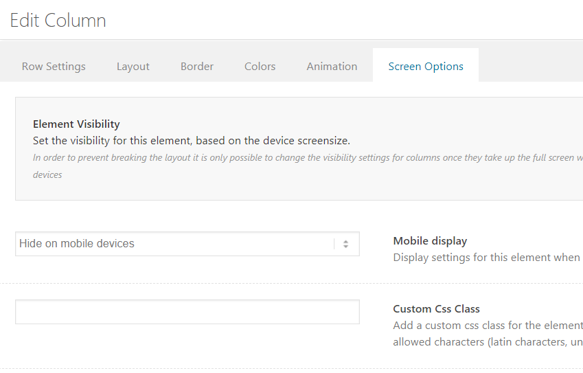
Hide Content in mobile view
Ever wanted to hide some content in mobile view? Enfold makes it super easy by bringing in the screen options. Now you can easily hide columns on mobile devices.
Change content order in mobile view
Since Enfold 4.8.7, you can change the order of the columns on mobile without any customizations.
You can simply edit the first column of the row and go to Row Settings > Row Screen Options > Column Behaviour When Fullwidth and choose the options that works the best for your layout.

If you choose the Individually select position for each column option, do not forget to edit each column and choose their mobile positions in Advanced > Responsive > Mobile Breakpoint Position

Toggle 4 columns in big screen to 2 columns in mobile
By default on the mobile view, each column is stacked on top of another, 1 column per row. In some cases, you may want to display 2 columns per row in mobile and 4 columns on a desktop. To do so please follow the below steps:
1. Enable custom CSS class name support for ALB elements.
2. Add four 1/4 columns and give it a class name “col-25p”.
3. Add the below CSS to your site.
Code Snippet:
CSS
/*----------------------------------------

// CSS

// Toggle Columns

//--------------------------------------*/

@media only screen and (max-width:767px) {

.col-25p {

  width:49%!important;

  background:gold;

 }

.col-25p.av_one_fourth{

    margin-left:1%!important;

}}
Center align two or more columns
By default, columns are aligned to the left. To center align two or more columns inside a color section, drag and drop the columns inside a color section as shown below and give the color section a custom ID call it “eh-center-align-columns” for Equal Height columns and “ih-center-align-columns” for Individual Height columns and add the below CSS to your site.
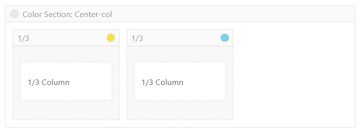
Example of center aligned columns.
Code Snippet:
Shortcode
[av_section min_height='100' min_height_px='500px' padding='default' shadow='no-border-styling' bottom_border='no-border-styling' bottom_border_diagonal_color='#333333' bottom_border_diagonal_direction='' bottom_border_style='' custom_arrow_bg='' id='av-center-align-columns' color='main_color' background='bg_gradient' custom_bg='' background_gradient_color1='#00a8c5' background_gradient_color2='#ffff7e' background_gradient_direction='diagonal_bt' src='' attachment='' attachment_size='' attach='scroll' position='center center' repeat='repeat' video='' video_ratio='16:9' overlay_opacity='0.5' overlay_color='' overlay_pattern='' overlay_custom_pattern='' av_element_hidden_in_editor='0' av_uid='av-jgp96b7u' custom_class='']
[av_textblock size='' font_color='' color='' av-medium-font-size='' av-small-font-size='' av-mini-font-size='' av_uid='av-jgp9gd8s' custom_class='' admin_preview_bg='']
<h2 style="text-align: center;">Centre aligned columns:</h2>
[/av_textblock]

[av_hr class='invisible' height='0' shadow='no-shadow' position='center' custom_border='av-border-thin' custom_width='50px' custom_border_color='' custom_margin_top='30px' custom_margin_bottom='30px' icon_select='yes' custom_icon_color='' icon='ue808' font='entypo-fontello' av_uid='av-2jgz2f' custom_class='' admin_preview_bg='']

[av_one_fourth first min_height='' vertical_alignment='av-align-top' space='no_margin' margin='0px' margin_sync='true' link='' linktarget='' link_hover='' padding='60px' padding_sync='true' border='' border_color='' radius='0px' radius_sync='true' background='bg_color' background_color='#00aeff' background_gradient_color1='' background_gradient_color2='' background_gradient_direction='vertical' src='' attachment='' attachment_size='' background_position='top left' background_repeat='no-repeat' animation='' mobile_breaking='' mobile_display='' av_uid='av-82kbrb' custom_class='']

[av_textblock size='' font_color='' color='' av-medium-font-size='' av-small-font-size='' av-mini-font-size='' av_uid='av-nccbb' custom_class='' admin_preview_bg='']
<strong>1/4 Column</strong>
[/av_textblock]

[/av_one_fourth][av_one_fourth min_height='' vertical_alignment='av-align-top' space='' margin='0px' margin_sync='true' link='' linktarget='' link_hover='' padding='60px' padding_sync='true' border='' border_color='' radius='0px' radius_sync='true' background='bg_color' background_color='#3369e7' background_gradient_color1='' background_gradient_color2='' background_gradient_direction='vertical' src='' attachment='' attachment_size='' background_position='top left' background_repeat='no-repeat' animation='' mobile_breaking='' mobile_display='' av_uid='av-4r4cdj' custom_class='']

[av_textblock size='' font_color='' color='' av-medium-font-size='' av-small-font-size='' av-mini-font-size='' av_uid='av-nccbb' custom_class='' admin_preview_bg='']
<strong>1/4 Column</strong>
[/av_textblock]

[/av_one_fourth][av_hr class='invisible' height='60' shadow='no-shadow' position='center' custom_border='av-border-thin' custom_width='50px' custom_border_color='' custom_margin_top='30px' custom_margin_bottom='30px' icon_select='yes' custom_icon_color='' icon='ue808' font='entypo-fontello' av_uid='av-2jgz2f' custom_class='' admin_preview_bg='']

[av_one_fifth first min_height='' vertical_alignment='av-align-top' space='no_margin' margin='0px' margin_sync='true' link='' linktarget='' link_hover='' padding='60px' padding_sync='true' border='' border_color='' radius='0px' radius_sync='true' background='bg_color' background_color='#00aeff' background_gradient_color1='' background_gradient_color2='' background_gradient_direction='vertical' src='' attachment='' attachment_size='' background_position='top left' background_repeat='no-repeat' animation='' mobile_breaking='' mobile_display='' av_uid='av-82kbrb' custom_class='']

[av_textblock size='' font_color='' color='' av-medium-font-size='' av-small-font-size='' av-mini-font-size='' av_uid='av-nccbb' custom_class='' admin_preview_bg='']
<strong>1/5 Column</strong>
[/av_textblock]

[/av_one_fifth][av_one_fifth min_height='' vertical_alignment='av-align-top' space='' margin='0px' margin_sync='true' link='' linktarget='' link_hover='' padding='60px' padding_sync='true' border='' border_color='' radius='0px' radius_sync='true' background='bg_color' background_color='#3369e7' background_gradient_color1='' background_gradient_color2='' background_gradient_direction='vertical' src='' attachment='' attachment_size='' background_position='top left' background_repeat='no-repeat' animation='' mobile_breaking='' mobile_display='' av_uid='av-82kbrb' custom_class='']

[av_textblock size='' font_color='' color='' av-medium-font-size='' av-small-font-size='' av-mini-font-size='' av_uid='av-nccbb' custom_class='' admin_preview_bg='']
<strong>1/5 Column</strong>
[/av_textblock]

[/av_one_fifth][av_one_fifth min_height='' vertical_alignment='av-align-top' space='' margin='0px' margin_sync='true' link='' linktarget='' link_hover='' padding='60px' padding_sync='true' border='' border_color='' radius='0px' radius_sync='true' background='bg_color' background_color='#00aeff' background_gradient_color1='' background_gradient_color2='' background_gradient_direction='vertical' src='' attachment='' attachment_size='' background_position='top left' background_repeat='no-repeat' animation='' mobile_breaking='' mobile_display='' av_uid='av-82kbrb' custom_class='']

[av_textblock size='' font_color='' color='' av-medium-font-size='' av-small-font-size='' av-mini-font-size='' av_uid='av-nccbb' custom_class='' admin_preview_bg='']
<strong>1/5 Column</strong>
[/av_textblock]

[/av_one_fifth]
[/av_section]
CSS
 /* Center align columns inside color section*/

#ih-center-align-columns .entry-content-wrapper,

#eh-center-align-columns .entry-content-wrapper .flex_column_table {

display: -webkit-box;

display: -moz-box;

display: -ms-flexbox;

display: -webkit-flex;

display: flex;

-webkit-flex-flow: row wrap;

justify-content: center;

}
#eh-center-align-columns .av-flex-placeholder {
display: none;
}
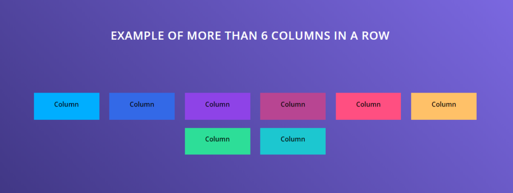
Six Columns or more
To create more than 5 columns please follow the below steps:
- Add a color section with custom ID “av-extra-columns”.
- Add six or more columns inside the color section.
- Add the below CSS in Quick CSS or child theme styles.
NOTE: This is a flex-box based alignment and the number of columns will automatically change depending on the column content and width of the browser. To add more than 6 columns adjust the width and the margin values in the below CSS code snippet.
Example of more than 5 columns in a row.
Code Snippet:
Shortcode
[av_section min_height='100' min_height_px='500px' padding='default' shadow='no-shadow' bottom_border='no-border-styling' bottom_border_diagonal_color='#333333' bottom_border_diagonal_direction='' bottom_border_style='' custom_arrow_bg='' id='av-extra-columns' color='main_color' background='bg_gradient' custom_bg='' background_gradient_color1='#312a6c' background_gradient_color2='#8e78ff' background_gradient_direction='diagonal_bt' src='' attachment='' attachment_size='' attach='scroll' position='top left' repeat='no-repeat' video='' video_ratio='16:9' overlay_opacity='0.5' overlay_color='' overlay_pattern='' overlay_custom_pattern='' av_element_hidden_in_editor='0' av_uid='av-1crc5j' custom_class='']

[av_textblock size='' font_color='custom' color='#ffffff' av-medium-font-size='' av-small-font-size='' av-mini-font-size='' av_uid='av-jgpfob20' custom_class='' admin_preview_bg='']
<h2 style="text-align: center;">Example of more than 6 columns in a row</h2>
[/av_textblock]

[av_hr class='invisible' height='50' shadow='no-shadow' position='center' custom_border='av-border-thin' custom_width='50px' custom_border_color='' custom_margin_top='30px' custom_margin_bottom='30px' icon_select='yes' custom_icon_color='' icon='ue808' font='entypo-fontello' av_uid='av-jgpfojd0' custom_class='' admin_preview_bg='']

[av_one_fourth first min_height='' vertical_alignment='av-align-top' space='' margin='0px' margin_sync='true' link='' linktarget='' link_hover='' padding='0px' padding_sync='true' border='' border_color='' radius='0px' radius_sync='true' background='bg_color' background_color='#00aeff' background_gradient_color1='' background_gradient_color2='' background_gradient_direction='vertical' src='' attachment='' attachment_size='' background_position='top left' background_repeat='no-repeat' animation='' mobile_breaking='' mobile_display='' av_uid='av-cwa6o7' custom_class='']

[av_textblock size='' font_color='' color='' av-medium-font-size='' av-small-font-size='' av-mini-font-size='' av_uid='av-jgpcn493' custom_class='' admin_preview_bg='']
<p style="text-align: center;"><strong>Column</strong></p>

[/av_textblock]

[/av_one_fourth][av_one_fourth min_height='' vertical_alignment='av-align-top' space='' margin='0px' margin_sync='true' link='' linktarget='' link_hover='' padding='0px' padding_sync='true' border='' border_color='' radius='0px' radius_sync='true' background='bg_color' background_color='#3369e7' background_gradient_color1='' background_gradient_color2='' background_gradient_direction='vertical' src='' attachment='' attachment_size='' background_position='top left' background_repeat='no-repeat' animation='' mobile_breaking='' mobile_display='' av_uid='av-ab0mrb' custom_class='']

[av_textblock size='' font_color='' color='' av-medium-font-size='' av-small-font-size='' av-mini-font-size='' av_uid='av-jgpcn493' custom_class='' admin_preview_bg='']
<p style="text-align: center;"><strong>Column</strong></p>

[/av_textblock]

[/av_one_fourth][av_one_fourth min_height='' vertical_alignment='av-align-top' space='' margin='0px' margin_sync='true' link='' linktarget='' link_hover='' padding='0px' padding_sync='true' border='' border_color='' radius='0px' radius_sync='true' background='bg_color' background_color='#8e43e7' background_gradient_color1='' background_gradient_color2='' background_gradient_direction='vertical' src='' attachment='' attachment_size='' background_position='top left' background_repeat='no-repeat' animation='' mobile_breaking='' mobile_display='' av_uid='av-9pfgd3' custom_class='']

[av_textblock size='' font_color='' color='' av-medium-font-size='' av-small-font-size='' av-mini-font-size='' av_uid='av-jgpcn493' custom_class='' admin_preview_bg='']
<p style="text-align: center;"><strong>Column</strong></p>

[/av_textblock]

[/av_one_fourth][av_one_fourth min_height='' vertical_alignment='av-align-top' space='' margin='0px' margin_sync='true' link='' linktarget='' link_hover='' padding='0px' padding_sync='true' border='' border_color='' radius='0px' radius_sync='true' background='bg_color' background_color='#b84592' background_gradient_color1='' background_gradient_color2='' background_gradient_direction='vertical' src='' attachment='' attachment_size='' background_position='top left' background_repeat='no-repeat' animation='' mobile_breaking='' mobile_display='' av_uid='av-tdoev' custom_class='']

[av_textblock size='' font_color='' color='' av-medium-font-size='' av-small-font-size='' av-mini-font-size='' av_uid='av-jgpcn493' custom_class='' admin_preview_bg='']
<p style="text-align: center;"><strong>Column</strong></p>

[/av_textblock]

[/av_one_fourth][av_one_fourth first min_height='' vertical_alignment='av-align-top' space='' margin='0px' margin_sync='true' link='' linktarget='' link_hover='' padding='0px' padding_sync='true' border='' border_color='' radius='0px' radius_sync='true' background='bg_color' background_color='#ff4f81' background_gradient_color1='' background_gradient_color2='' background_gradient_direction='vertical' src='' attachment='' attachment_size='' background_position='top left' background_repeat='no-repeat' animation='' mobile_breaking='' mobile_display='' av_uid='av-6gbpdz' custom_class='']

[av_textblock size='' font_color='' color='' av-medium-font-size='' av-small-font-size='' av-mini-font-size='' av_uid='av-jgpcn493' custom_class='' admin_preview_bg='']
<p style="text-align: center;"><strong>Column</strong></p>

[/av_textblock]

[/av_one_fourth][av_one_fourth min_height='' vertical_alignment='av-align-top' space='' margin='0px' margin_sync='true' link='' linktarget='' link_hover='' padding='0px' padding_sync='true' border='' border_color='' radius='0px' radius_sync='true' background='bg_color' background_color='#ffc168' background_gradient_color1='' background_gradient_color2='' background_gradient_direction='vertical' src='' attachment='' attachment_size='' background_position='top left' background_repeat='no-repeat' animation='' mobile_breaking='' mobile_display='' av_uid='av-4busg7' custom_class='']

[av_textblock size='' font_color='' color='' av-medium-font-size='' av-small-font-size='' av-mini-font-size='' av_uid='av-jgpcn493' custom_class='' admin_preview_bg='']
<p style="text-align: center;"><strong>Column</strong></p>

[/av_textblock]

[/av_one_fourth][av_one_fourth min_height='' vertical_alignment='av-align-top' space='' margin='0px' margin_sync='true' link='' linktarget='' link_hover='' padding='0px' padding_sync='true' border='' border_color='' radius='0px' radius_sync='true' background='bg_color' background_color='#2dde98' background_gradient_color1='' background_gradient_color2='' background_gradient_direction='vertical' src='' attachment='' attachment_size='' background_position='top left' background_repeat='no-repeat' animation='' mobile_breaking='' mobile_display='' av_uid='av-2ddxaf' custom_class='']

[av_textblock size='' font_color='' color='' av-medium-font-size='' av-small-font-size='' av-mini-font-size='' av_uid='av-jgpcn493' custom_class='' admin_preview_bg='']
<p style="text-align: center;"><strong>Column</strong></p>

[/av_textblock]

[/av_one_fourth][av_one_fourth min_height='' vertical_alignment='av-align-top' space='' margin='0px' margin_sync='true' link='' linktarget='' link_hover='' padding='0px' padding_sync='true' border='' border_color='' radius='0px' radius_sync='true' background='bg_color' background_color='#1cc7d0' background_gradient_color1='' background_gradient_color2='' background_gradient_direction='vertical' src='' attachment='' attachment_size='' background_position='top left' background_repeat='no-repeat' animation='' mobile_breaking='' mobile_display='' av_uid='av-2ddxaf' custom_class='']

[av_textblock size='' font_color='' color='' av-medium-font-size='' av-small-font-size='' av-mini-font-size='' av_uid='av-jgpcn493' custom_class='' admin_preview_bg='']
<p style="text-align: center;"><strong>Column</strong></p>

[/av_textblock]

[/av_one_fourth][/av_section]
CSS
 /*----------------------------------------

// Create more than six Columns

//--------------------------------------*/
#av-extra-columns .entry-content-wrapper {

display: flex;

flex-flow: row wrap;

justify-content: center;

}
#av-extra-columns .column-top-margin {
margin-top: 0 !important;
}
#av-extra-columns .flex_column {
width: 14%;
flex-basis: 14%;
margin-left: 2%;
margin-top: 20px!important;
}
#av-extra-columns .flex_column.first {
clear: none!important;
margin-left: 2%;
}
/* Two columns in mobile */
@media only screen and (max-width: 768px) {

#av-extra-columns .flex_column {

    margin-bottom: 20px!important;

    margin-top: 20px!important;

    /* Width of the container */

    flex-basis: 40%;

}
#av-extra-columns .flex_column:nth-child(even) {
margin-left: 10%!important;
}
}
Column Spacing
Individual padding for each column can be set from the column settings. This will increase or reduce the space between the content inside the column and the column boundary.
Other than padding you can select columns to have a small space (margin) or no space between the columns. The colum settings also lets you set custom top and bottom margin. The space between two column borders or column margin (left or right) and this can be altered to a specific value using custom CSS.
/*----------------------------------------
// Column margin
//--------------------------------------*/
div .flex_column {
  margin-left: 5px!important;
}
Please note decreasing the margin value will push the columns closer which may cause some extra space on the right side (Mostly noticeable on columns with background color/image). This can be solved by adding custom CSS for each column with a specific width.
Column hover effect
Sometimes it is necessary to draw special attention to users for a particular section of the website by highlighting a column on mouse hover or by changing the background color. To add this hover effect to your site please enable custom CSS class name support and follow the below step by step info:
- Add class name “col-hover” to the column.
- Add the below CSS in Quick CSS section or child theme styles.
Please feel free to change/add background color and other values to suit your design in the below code.
/*----------------------------------------
// Column Hover
//--------------------------------------*/
.col-hover:hover {
opacity: 0.8;
transition: all .5s ease;
background: gold!important;
}
.col-hover{
transition: all .5s ease;
}
Custom column width
The max width of a single Column or a combination of columns in a row can be same as the container width set in the theme options. To make the columns wider, place the columns inside the color section and follow the instructions provided to stretch the color section content width.
Custom column breakpoint
By default mobile and tablet breakpoints are 767px and 989px. If you like to add a custom breakpoint to the column elements and would like the columns to stack up before the default breakpoints please follow the below steps:
- Enable custom CSS class name support from Enfold options > Layout Builder > Show element options for developers
- Add a color section and assign it an ID called “custom-breakpoint”.
- Add your columns inside the color section and assign a class name called “col” to each of the columns.
- Adjust the max-width in the media query in the below code and add it to your site.
/* Custom breakpoint */
@media only screen and (max-width: 880px) {
.responsive #top #wrap_all  #custom-breakpoint .flex_column.col {
    margin: 0;
    margin-bottom: 20px;
    width: 100%;
}}
Adding custom SVG dividers
/**
 * Add your custom svg shapes:
 *	- Use default directory:
 *		- create subdirectory in your WP uploads folder:   .../uploads/avia_custom_shapes
 *		- add your files there
 *	- Use a different folder, that can be accessed from php
 *		- create folder
 *		- add your files there
 *		- use filter 'avf_custom_svg_shapes_files_directory' to register path
 *		- alternative you can use 'path' when you register the svg file
 *      - Upload svg file (and a possible negative file) with WP Media Uploader
 *              - use 'attachment' to add ID of svg file
 *              - use 'attachment_negative' to add ID of negative svg file
 *              - using 'attachment' filename and path are ignored
 *	- Register your svg files with filter 'avf_custom_svg_shapes' - make sure to use unique keys that do not conflict with native keys
 *
 * @param array $custom_shapes
 * @return array
 */
function custom_avf_custom_svg_shapes( array $custom_shapes )
{
	$custom_shapes = array(

		'kurve-konvex'	=> array(
						'key'			=> 'kurve-konvex',
						'title'			=> __( 'Convex curves', 'avia_framework' ),
//						'has_flip'		=> true,
						'has_width'		=> true,
						'filename'		=> 'kurve-konvex'
									),
		'waves-in-motion'	=> array(
						'key'			=> 'waves-in-motion',
						'title'			=> __( 'Waves in motion', 'avia_framework' ),
//						'has_flip'		=> true,
						'has_width'		=> true,
						'filename'		=> 'waves-in-motion'
									)

						);

	return $custom_shapes;
}

add_filter( 'avf_custom_svg_shapes', 'custom_avf_custom_svg_shapes', 10, 1 );
Please note, available in Enfold 4.8.4 and newer versions.