


Color Sections
Overview
The Color Section is a full-width element and always takes 100% width of the page container. It can be set to take up different heights. We can add content elements like sliders, text blocks, images, videos etc inside the color section. Multiple color section elements can be added to your page or post and each section can have a unique background like a solid color, image, parallax effect or a video and a unique ID to each section for development purpose.
Check out some examples of Color Section.
Note: If the sidebar is enabled on a page with a color section element, it is intended to push the sidebar to the bottom and take up 100% of the width. Other fullwidth elements like a fullwidth slider, tabs or grid rows cannot be placed inside a color section.
Color section setup
Now that you know how a Color section works. Let’s go ahead and add one on to the page or a post and see what we can create with it. It is easy and straightforward to set up and customize the color section to suit your design. Follow along the steps provided below:
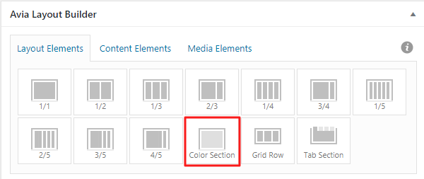
Add a Color Section element to your site
- Open an existing or a new page from your WordPress dashboard.
- Click on the “Advanced Layout Editor” button to view the page builder elements.

- Click or Drag and drop the “Color Section” element under the Layout Elements tab to add it on to your page or post.
Code Snippets
Shortcode
Color Section shortcode and parameters. The parameter values can be updated and the shortcode can be used on a new page to reproduce the elements.
Shortcode
[av_section min_height='' min_height_px='500px' padding='default' shadow='no-shadow' bottom_border='no-border-styling' bottom_border_diagonal_color='#333333' bottom_border_diagonal_direction='scroll' bottom_border_style='scroll' scroll_down='' custom_arrow_bg='' id='' color='main_color' custom_bg='' src='' attach='scroll' position='top left' repeat='no-repeat' video='' video_ratio='16:9' video_mobile_disabled='' overlay_enable='' overlay_opacity='0.5' overlay_color='' overlay_pattern='' overlay_custom_pattern='' av-desktop-hide='' av-medium-hide='' av-small-hide='' av-mini-hide='' av_element_hidden_in_editor='0' av_uid='av-18wj5b9'][/av_section]Width
We already know that a Color section will always take 100% width of the page container. There are few hacks using which we can manipulate the default behaviour of the color section.
Color section with 100% content width
A color section is intended to be a full-width element and occupy the entire width of the page layout. However, the content area inside the color section will only stretch as wide as the Container width set in the theme options Enfold > Layout > Dimension > Maximum Container width
The screenshot below demonstrates the default width of the text area inside a color section.

To increase or decrease the content width inside a color section. Assign a unique Section ID to the color section element. example: “section-container-width” and change the width value in the below code and add it to your site to achieve similar results as seen in the below screenshot.

Note: Changing the container width in the theme options will affect the entire site. If you are looking for a way to make changes to a specific selection please use the below CSS code:
Code snippets:
CSS
/* Color section container width */
#section-container-width .container {
  width: 100% !important;
  min-width: 100%;
  padding: 0;
  margin: 0;
}
Specific Color Section width
By now you must know that the color section is a fullwidth element and always takes up the entire width of the page container. Depending on your design you may want to make the color section take up less than 100% width of the page layout. To reduce the width of the color section. First, add a unique ID called “section-width” to the color section and use the below CSS.
Code snippets:
CSS
/* Specific color section width */

#section-width {
    max-width: 80%;
    left: 50%;
    position: relative;
    transform: translateX(-50%);
}
Height
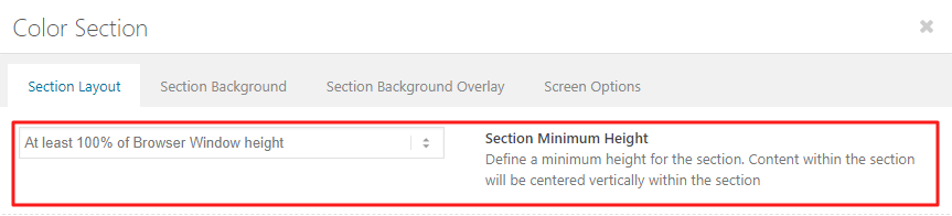
Section Minimum Height
The Section Minimum Height option allows you to control the height of the color section. Choosing “No minimum height” will stretch the color section to fit its content height. The color section height can be set to a different percentage of the browser window height or a custom height in the pixel can be set.
Specific Color Section height
Section height can be changed to a custom height value in % or px. To assign a custom height in % or px select the desired option from the dropdown list and assign the height value.
Padding
Color section padding
Section Padding: You can set the section padding from the options panel.

Custom padding
Custom Padding: To set a custom padding value, First, open the color section options panel and select “No Padding“. Then assign a unique Section ID to the color section element in the options panel where it says “For Developers: Section ID”.
Example: Add a unique ID called “section-container-padding” to the color section and use the below code:
Code snippets:
CSS
/*------------------------*/
/*  Section Padding        */
/*------------------------*/

#section-container-padding .container {
    /* Define custom padding value */
    padding:150px 100px !important;
}
Border
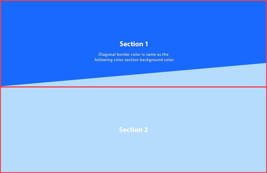
Diagonal Border
The diagonal border is applied to the bottom of each color section and it does not overlap the section next to it. To make it look like it is overlapping the next section we use the same background color for both the diagonal border and the section next to it.
Diagonal Border can be set from the Color Section > Options > Section Bottom Border Styling. There should be at least two or more color section elements on the page for the diagonal border to work. Please note the diagonal border cannot be applied to a color section which is last in order and aligns with the footer.

The effect below can be reproduced by adding a diagonal border with the same color as the background color of the next section. The first color section has a light blue diagonal border to match the light blue background color of the second color section.
How to add a diagonal border to a color section above the footer?
By default, the diagonal border cannot be applied to the section which is last in order or above the footer. In some cases depending on your design requirement if you need a section with a diagonal border above the footer area as seen below we do have a simple workaround for you.

The workaround is to add an empty section at the bottom with a transparent background and move it up by adding a negative margin to give an illusion that the section above the footer has a diagonal border.
- Add an empty color section at the bottom.
- Give it a custom height of 100px and select “No padding” from the padding option.
- Select the custom top and bottom margin option and add “-150px” to the top margin.
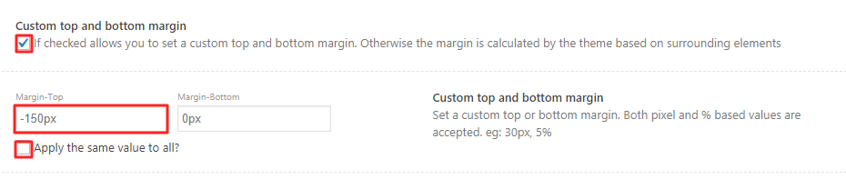
- From the background, options add a transparent background color.

How to change the angle of the diagonal border?
The diagonal border angle can be changed by adding a custom CSS code to your site. Please feel free to change the value of rotate(x) in the below code to suit your design.
Code snippets:
CSS
/*------------------------
 Diagonal border angle
--------------------------*/

.avia_transform .av-extra-border-element.border-extra-diagonal .av-extra-border-inner {
    -webkit-transform: rotate(5deg);
    transform: rotate(5deg);
}
Adding custom SVG dividers
/**
 * Add your custom svg shapes:
 *	- Use default directory:
 *		- create subdirectory in your WP uploads folder:   .../uploads/avia_custom_shapes
 *		- add your files there
 *	- Use a different folder, that can be accessed from php
 *		- create folder
 *		- add your files there
 *		- use filter 'avf_custom_svg_shapes_files_directory' to register path
 *		- alternative you can use 'path' when you register the svg file
 *      - Upload svg file (and a possible negative file) with WP Media Uploader
 *              - use 'attachment' to add ID of svg file
 *              - use 'attachment_negative' to add ID of negative svg file
 *              - using 'attachment' filename and path are ignored
 *	- Register your svg files with filter 'avf_custom_svg_shapes' - make sure to use unique keys that do not conflict with native keys
 *
 * @param array $custom_shapes
 * @return array
 */
function custom_avf_custom_svg_shapes( array $custom_shapes )
{
	$custom_shapes = array(

		'kurve-konvex'	=> array(
						'key'			=> 'kurve-konvex',
						'title'			=> __( 'Convex curves', 'avia_framework' ),
//						'has_flip'		=> true,
						'has_width'		=> true,
						'filename'		=> 'kurve-konvex'
									),
		'waves-in-motion'	=> array(
						'key'			=> 'waves-in-motion',
						'title'			=> __( 'Waves in motion', 'avia_framework' ),
//						'has_flip'		=> true,
						'has_width'		=> true,
						'filename'		=> 'waves-in-motion'
									)

						);

	return $custom_shapes;
}

add_filter( 'avf_custom_svg_shapes', 'custom_avf_custom_svg_shapes', 10, 1 );
Please note, available in Enfold 4.8.4 and newer versions.
Background
Background Color
Each section can have a different Background color.
To add a background color to any Color section, click on the color section element and open the Color Section options panel > Section Background > Custom Background Color.

Background Image
One of the most asked questions about the background image on our support forum is A part of my color section background image is not visible, what’s the correct image size to upload?
Unlike the early day’s of the computer age, today we have display devices of all possible screen size starting from a smartwatch to big screen LCD television on which a user can browse the internet. In order to accommodate the different screen size the browser will stretch or scale the background image accordingly. When an image is stretched to fill the container some parts of the images especially the sides are hidden.
It is inevitable that a part of the background image will be hidden so the best practice to follow while adding a background image is to keep the focus area of the image at the center and treat the edge of the image as a buffer area.
Once you have the image ready you can set the Background Image Position to be “Top Center” or “Center Center”. This way no matter what on any screen your focus area will be visible and the buffer area on the edges may or may not be visible.
Background Image can be set for each color section from Color Section options > Section Background > Custom Background Image.

The background image can be further adjusted by selecting the Background Position and Background Repeat options.

To add a gif or any custom background image to a color section element, First, give the section a unique ID called “#section-bg-image” and add the below code to your site and update the image path.
Code snippets:
CSS
/*------------------------
  Section background image
--------------------------*/

#top #section-bg-image {
    background: url(https://domain.com/image.gif) repeat;
}
Hide background image in mobile
If your website design requires you to hide the section background image on a mobile device. Start by assigning a unique developer ID to the color section and add the below CSS code to your site.
Example of color section with no background image on mobile.
In the below example we assign a unique ID “section-mobile-bg” to the color section and the below CSS.
Code snippets:
CSS
/* Section background on mobile */

@media only screen and (max-width: 767px) {
    #top #section-mobile-bg {
        background: none !important;
    }
}
Different background image in mobile
To change the color section background image or the image position on mobile device assign a unique developer ID “section-mobile-bg” to the color section and add the CSS code to your site. Please feel free to adjust the background position value to move the background image 🙂
Example of color section with a different background in mobile.
Code snippets:
CSS
 /* Section mobile bg image*/
@media only screen and (max-width: 767px) {
#top #section-mobile-bg {
   background-image: url(https://your-site.com/image.jpg)!important;
   background-position: 0% 50%!important;
}
}
Background image position
The background image position can be set in the color section options panel.

To adjust the background image position on desktop and mobile, add the below code to your site and change the X and Y axis value in pixel or percentage to position the background image to suit your design.
Code snippets:
CSS
/* Section mobile bg image*/

/* Desktop */
#top #section-mobile-bg {
   background-position: 50% 100%!important;
}

/* Mobile */
@media only screen and (max-width: 767px) {
#top #section-mobile-bg {
   background-position: 0% 0%!important;
}}
Background Video
Background Video for each color section can be applied from Color Section > Section Background > Background Video. You can upload your own self-hosted video or from streaming sites like YouTube or Vimeo. By default videos don’t autoplay on some mobile devices to prevent bandwidth problems for users. It is recommended to substitute the video with a still image on mobile devices.

Parallax Effect
To set up a parallax background effect, First, insert a background image to enable the Background Attachment options and select Parallax.

Overlay
Section Overlay
A color section overlay can be added from the color section options panel > Section Background Overlay. An overlay can be a solid color or an image with an opacity option. If you like to add gradients or any other custom overlay style, first, give your section a unique ID “custom-overlay” and use the below CSS.
Code snippets:
CSS
/*------------------------
  Section overlay
--------------------------*/

#top #custom-overlay .av-section-color-overlay  {
    background: linear-gradient(135deg,rgba(213,134,243,.8),rgba(0,255,221,.9))!important;
}
Overlay image position
By default, the overlay background image repeats itself to cover the entire section. However, the default behaviour of the background image can be controlled using custom CSS.
Code snippets:
CSS
/*------------------------
  Overlay Image
--------------------------*/

#top .av-section-color-overlay {
	opacity: 1 !important;
	background-position: 50% 50%;
	background-repeat: no-repeat !important;
}
Scroll down arrow
The scroll down arrow color can be changed from the color section options panel. However, if you need to add custom style, please use the below CSS code.
Code snippets:
CSS
/*------------------------
  Scroll down arrow
--------------------------*/
#top .scroll-down-link {
background: red;
color: blue;
}
Content Alignment
The content inside a color section is by default aligned vertically center. In some cases, if you like the content to appear at the top or bottom of the color section please use the code below in the Quick CSS or child theme styles.
Example of color section content aligned to the top

To align the content at the top position of the color section, give your color section a custom ID “section-content-top”:
CSS
/*------------------------
  Content alignment
--------------------------*/

#section-content-top .container .content {
  vertical-align: top;
}
To align the content at the bottom of the color section, give your color section a custom ID “section-content-bottom”:
CSS
/*------------------------
  Content alignment
--------------------------*/

#section-content-bottom .container .content {
  vertical-align: bottom;
}
Resources
Examples of some websites which have taken the usage of the color section to the next level:
Contributed video:
Color section tutorial