
Parallax Effects in Web Design: Introduction, Implementation and 7 Standout Parallax Websites
Parallax effects have made a big impact over the last number of years in both WordPress and beyond. Used judiciously, they’re an elegant visual solution that can add depth and nuance to any design.
As with any trend however, it’s a pudding that can easily be over-egged and there’s been no shortage of people decrying its overuse over time.
After four years in the web design mainstream however – and recent incorporation in technologies such as Apple TV – it’s an approach that is clearly going to stick around for quite some time to come.
In this article, we’ll cover a little of the technique’s history and some background on how it is typically implemented under the hood. We’ll then move on to our pick of seven standout sites that showcase parallax effects at their best in 2015.
Let’s start with a look at the basics.
What Is Parallax Scrolling?
The idea behind parallax scrolling is straightforward. Put simply, it involves scrolling background images slower than foreground images in order to lend an illusion of depth to 2D scenes – a low-tech approach that turns out to be surprisingly effective in practice.
Though it’s attracted a lot of attention online of late, it’s an animation technique with roots stretching as far back as the late 1920s in early shorts such as Steamboat Willie. You’ll see it on display in any number of classic cartoons from that period onwards.
Old-school gamers will also recognize its use in thousands of 2D titles such as Super Mario Bros. over the years.
The technique first started making a splash online around 2011 with sites such as Frank Chimero’s Lost World Fairs (Atlantis), the original Nike Better World site and Dangers of Fracking all winning plaudits for the smoothness of their implementations.
If you want to dive a little more deeply into early online examples of the trend, there’s a great retrospective at Above the Fold Book. There’s also a solid introduction to the visual principles involved in parallax scrolling over at Tech Republic.
As with any design trend, there have been some criticisms along the way. Parallax scrolling made a big initial impact in the context of a desktop environment. However, its tendency towards page bloat with heavy use of images and JavaScript – along with various early iOS glitches – cast early doubts on its usefulness for mobile.
The association of parallax effects with one-page websites also raised SEO concerns with a suspicion that discoverability was being sacrificed for visual impact.
These issues are certainly worth taking on board but sparing and appropriate use of the technique is likely to continue to prove popular in the near future.
What’s Going on Behind the Scenes?
We’ve covered a bit of background on the parallax phenomenon but what’s typically going on under the hood when it’s deployed?
Though CSS-only solutions are edging into view, parallax effects typically rely on a mixture of CSS3, HTML5 and some flavor of JavaScript to control relative positioning and the animation of effects.
Andy Shora has a great breakdown of the implementation basics of parallax over at his site, complete with interactive examples and code samples to explore. If you don’t fancy starting from scratch with parallax scrolling, a huge number of jQuery parallax plugins exist to handle the heavy lifting for you.
Specific options for WordPress are, naturally, also available. CodeGeekz have a good breakdown of the most popular current WordPress parallax plugins over on their site. If you’re looking to test the waters on the theming side of things, there’s a useful roundup of free parallax-enabled WordPress themes over at WPMU DEV.
The reliably top notch Dev Tips also have a great nine-part series on Parallax on the Web if you’re interested in taking a deep dive on the topic in general.
Kriesi’s own Enfold theme also supports parallax options of course and that’s where we’ll briefly turn our attention to next before getting into our showcase sites.
Enfold and Parallax
Parallax backgrounds have been available Enfold since version 2.5 back in 2013. You can see an example in action on this Enfold demo page. You can also check out the effect being demonstrated live in the clip below.
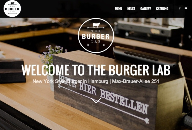
The team at Winning WP recently put together an impressive list of showcase Enfold sites and the parallax effect is on display in several of the examples chosen such as The Burger Lab, Renov8 and Boat Trip Turkey.
Let’s move on to our pick of seven standout sites showing parallax effects at their best.
1. The British Legion’s Poppy Spend Project
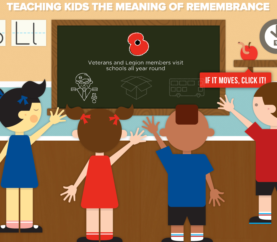
The Poppy Spend section of the British Legion site is a classic example of using parallax effects to illustrate a timeline to site visitors.
In this case, it’s an animated walkthrough of exactly where donations to the charity are spent – an excellent way of getting across a complex sequence of events in as short a time as possible.
The engaging parallax touches throughout encourage the user to keep progressing, while a series of smoothly embedded multimedia pieces leave plenty of room to stop and explore as you scroll.
2. Tomato Can Blues at the New York Times

The New York Times’ digital team have been pushing the envelope of parallax effects since 2012’s Snowfall project and their interpretation of Mary Pilon’s story Tomato Can Blues is more than up to their usual standards.
In this case, the focus is on the superb Attila Futaki illustrations dotted throughout the piece, each subtly animated with parallax effects across several dimensions as you scroll through the story. It’s a highly effective way of adding visual depth to an already excellent piece of fiction without overwhelming the text.
3. You Gotta Love Frontend
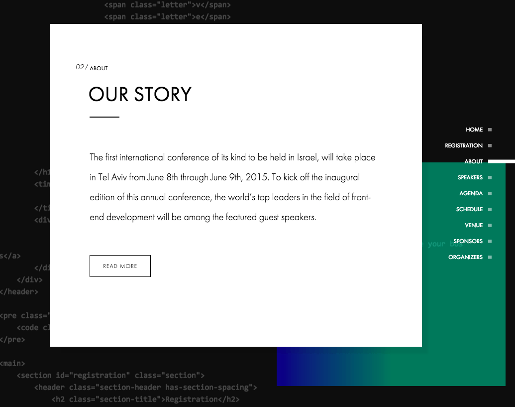
The organizers of 2015’s Tel Aviv Front End Conference went for a slickly implemented parallax design with subtly animated background elements referencing the site’s underlying code and structure.
It’s a low-key – but perfectly on-topic – visual solution for a website aimed at attracting front end practitioners to participate in the conference.
4. Apple’s Retina iMac
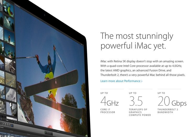
Apple are used to leading from the front when it comes to design and their implementation of the iMac’s Retina 5K display page is a great example of how effective parallax effects can be when applied sparingly in the context of high-class visuals and copy.
In this case, things are kicked off with a brilliantly executed transition from primary image to the actual device on offer. This is then followed by strategically employed parallax text effects throughout, all serving to keep the potential buyer’s attention focused exactly where it should be at all times.
5. Beagle
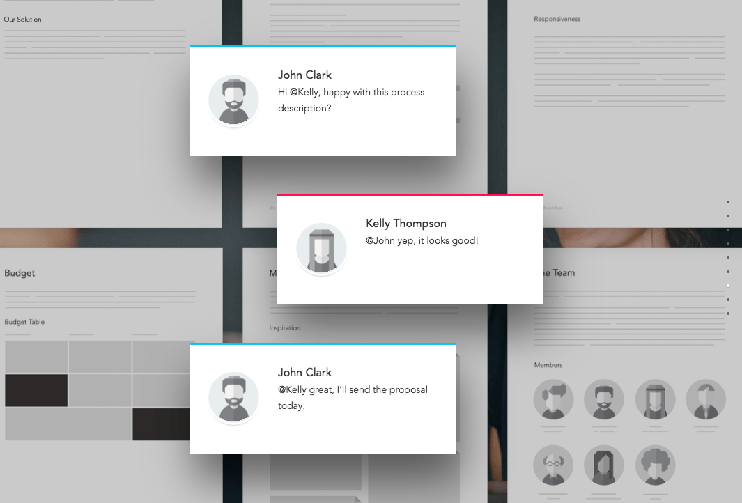
The teaser site for Podio’s soon-to-launch proposal tool Beagle makes use of a series of scroll-driven animations to set out its stall. It’s an incredibly slick presentation with parallax effects deployed to provide visual depth throughout.
If the eventual app is put together with even half as much attention to design detail as the initial site, this could be one to keep an eye on for the future.
6. McWhopper
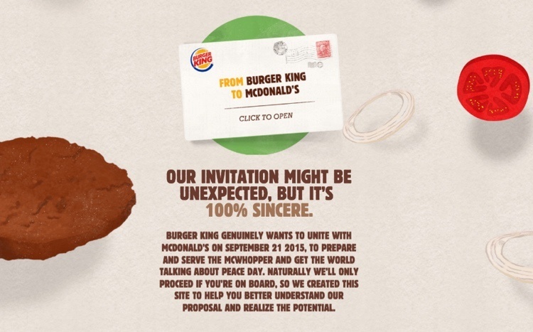
Worth a place on any list for sheer cheekiness alone, Burger King’s recent McWhopper proposal not only attracted headlines, it also provided a top-class example of parallax effects in use.
The move itself may have been largely written off as a marketing stunt but the slick microsite outlining the offer popped off the page with a series of illustrated elements creating a real sense of depth through parallax techniques.
7. Make Your Money Matter
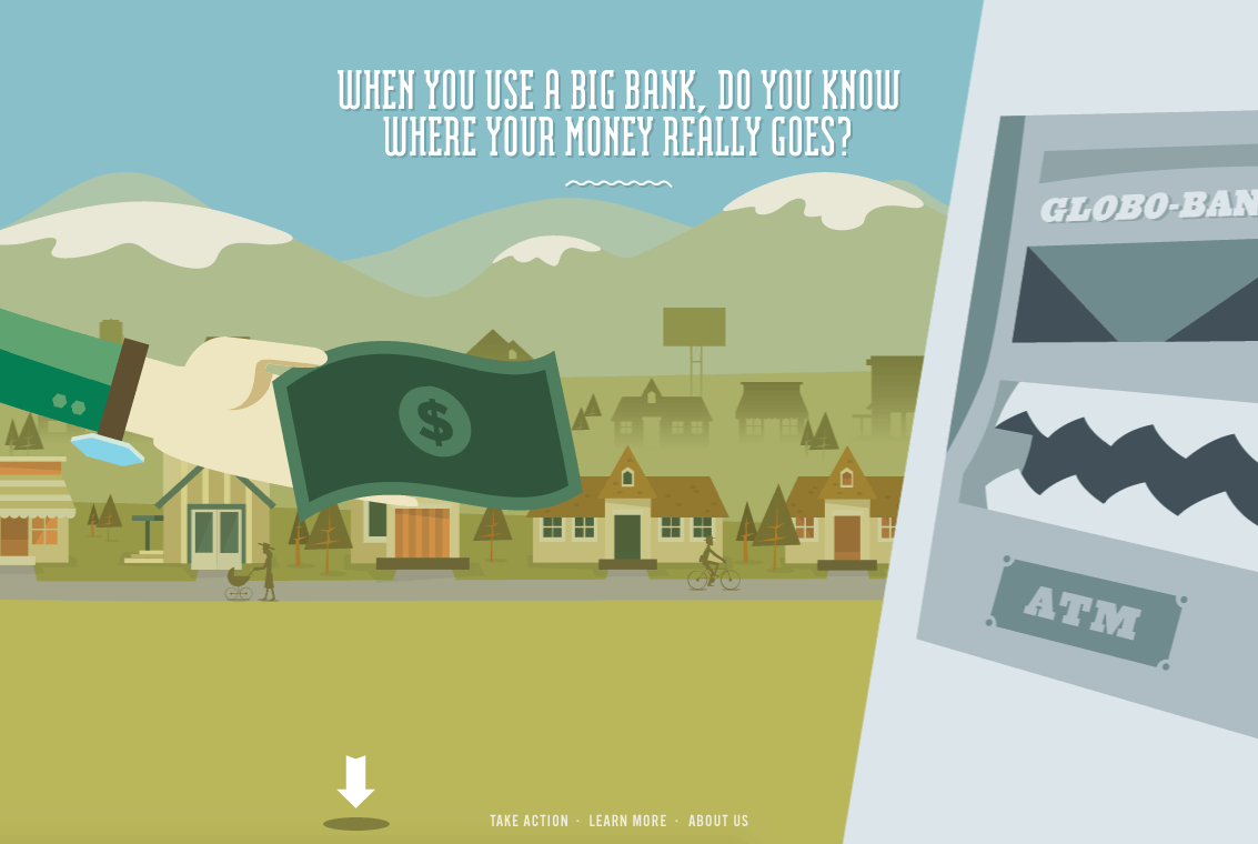
Make Your Money Matter – our final showcase site – makes use of the full parallax bag of tricks with sideways scrolling morphing into vertical as the viewer is taken on a beautifully animated trip through the various advantages of using a credit union.
Conclusion
Parallax effects have been part of the standard animation toolset for decades for good reason – they’re simple and they work.
If you want to get up and running with their use on your own WordPress site, you have two basic options available:
- Make use of one of the many WordPress parallax plugins available.
- Take advantage of a parallax-enabled theme such as Enfold.
As our range of current high-profile examples illustrates, the technique is in use on everything from world-class product pitches to contemporary fiction layout. Used appropriately, there’s no reason it can’t be employed to lend a little extra depth and polish to your own offerings.
The sites we’ve selected are just seven out of many excellent implementations out there. We’re curious to hear if there are any we’ve missed that have particularly caught your attention?
Get in touch in the comments section and share your thoughts!
Liked the article? You should follow me on Twitter


You mention that Enfold support parallax scrolling but it looks like it was removed from the theme for mobile devices and that there are no plans to add it back in:
https://kriesi.at/support/topic/parallax-scrolling-isnt-working-on-iphone/
Can you comment on if you do have plans to support parallax on mobile in the future?