
WordPress Web Design in 2015: Everything You Need to Know
As we are approaching the end of the year here is a review of some of the more notable WordPress trends
As we’re all painfully aware, web design in general – and WordPress theme development in particular – is exceptionally detail-orientated work.
And, like any calling that requires focus on the minutiae of things, it can be tricky finding time to step back and look at wider trends in your own industry and beyond.
This is particularly true when it comes to a multi-disciplinary tool such as WordPress. The pace of change is relentless, and brand new approaches, technologies and trends seem to spring to life from multiple sources every other week.
In this article, we’ll take a look at some of the more notable 2015 web design trends in WordPress and beyond, with a view to giving you context and inspiration for both your own sites and client work.
Before we start examining this year’s trends in detail though, let’s take a quick trip down memory lane.
How We Got Here
In terms of design and usability, WordPress and the wider web have come a long way in the last twelve years.
The horrors of mystery meat navigation, Flash intros and wanton drop shadow abuse are largely in the past. Web design as a vibrant design discipline has never been in better shape.
The last few years have been dominated by a number of overarching trends which have continued on into 2015. Chief among them are the flat design movement and a heavy focus on responsive design. Specific recent trends from 2013/2014, such as ghost buttons and full-width image headers, have also largely stayed the course.
Advances in browser and device standards are driving increasingly confident approaches to the use of imagery and typography, picking up on decades – and in some cases centuries – of best practices in print design.
Overall, the feel of 2015 so far has been one of consolidation and iterative improvement, rather than the adoption of revolutionary new approaches.
The Sea That WordPress Swims In
Things have been relatively quiet on the design front in WordPress core so far in 2015, with backstage features such as the Menu Customizer attracting most of the headlines. However, the looming integration of the REST API into core could have significant design implications down the line. We’ll touch more on that later in the article.
Moving slightly further afield, 2015 has seen the emergence of truly heavyweight competition to WordPress in the CMS and web publishing spaces.
Design-oriented competition is hotting up.
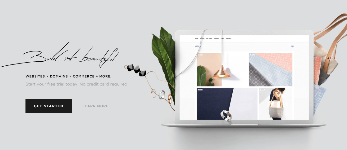
Well-funded competitors such as Squarespace and Medium, along with interesting projects such as Ghost, are providing genuine alternatives for people.
Design features have been a key selling point of all these platforms, and their emergence has given WordPress core developers, and the theming community, some long overdue food for thought. In 2015, default design quality is very much a key market differentiator.
Another huge design influence is the dominant role of apps in the digital world. 82% of mobile media time is now consumed by apps. The knock-on effect on web design has been enormous, and a renewed focus on simplicity of purpose and presentation is making itself felt across the board.
With those general points in mind, let’s examine the major themes of the year so far in a little more detail.
Responsive Is Mandatory
The jury on this one is very much in. The mobile tipping point has long since passed and there’s no putting the toothpaste back in the tube – online design in 2015 means responsive design.
For any designers or developers still swimming against the tide, Google’s recent announcement of penalties for non-responsive websites – the so-called Mobilegeddon – should be enough to drive the point home.

The Guardian’s 2015 responsive redesign.
The Guardian’s long-awaited responsive overhaul was just one in a series of high-profile, mobile-orientated redesigns of major sites taking place in 2015.

The BBC’s new responsive site
Following a year of testing, the BBC also flicked the final switch on its own responsive reboot in early 2015. Even the White House has started getting in on the act, with a responsive design review slowly rolling out over the year.

The WordPress ‘2015’ default theme.
In the world of WordPress, Twenty Fifteen set the mobile-first tone for theme developers worldwide, and it’s increasingly rare to come across new themes that aren’t responsive by default.
Flat Is the New Flat
One pattern repeats itself over and over in the history of online design: Every couple of years, Apple will unveil a fresh look for some or all of their products and – as night follows day – the worldwide design community will scramble to adjust their own sensibilities.
With the launch of iOS7 two years ago, that trend was flat design. In this instance though, Microsoft have arguably got there first with their work on the Metro design language.
Google have taken the movement a substantial step further of late with their ongoing work on the Material Design project.
With some of the largest companies in the world on board, flat design remains a dominant trend in 2015 and shows no signs of disappearing, though its use is increasingly nuanced.
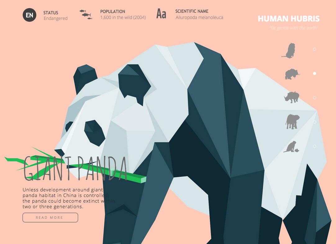
The Human Hubris Project.
Flat design is an excellent solution for smaller devices, and increasing browser support for SVG graphics is another plus point for its ongoing usage.
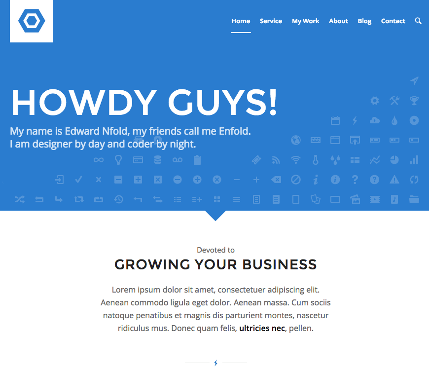
The Enfold Business Flat theme variation.
WordPress theme designers have of course not been slow to respond to this trend and our own Enfold Business Flat theme variation is an excellent example of a multi-purpose, modern implementation.
Farewell Sweet Fold
Readers of a certain vintage may recall the glory days of the fold – a time when 1024 x 768 px screen resolutions were considered displays of ostentatious luxury, and Java applets roamed the earth.
In 2015 it’s very tempting to say that the fold is officially dead.
There are holdouts to this view of course, but – beyond the screamingly obvious fact that what comes at the top of any page will carry more visual significance – it’s hard to argue that the fold is particularly relevant in a multi-device world.
Scrolling is increasingly touted as the new clicking and the continued popularity of one-page themes bears witness to the fact that users have no problem at all diving below the line.
Simple and Fast
Hand-in-hand with several of the trends we’ve highlighted so far, the twin themes of simplicity and speed have also come to the fore in 2015.
Google have been tracking site speed for the better part of five years, and the prevalence of mobile devices these days has put a renewed focus on performance as a design concern.
Whether in the form of hidden menus for maximum efficiency on smaller devices, or an increasingly confident use of negative space, web designers are embracing constraints and putting the emphasis on simple and bold choices.
One notable consequence of this – enabled by the availability of web fonts and responsive typography – has been the increasing primacy of text. Large, bold text choices are a trend that came to the fore in 2014 and has continued on into 2015.
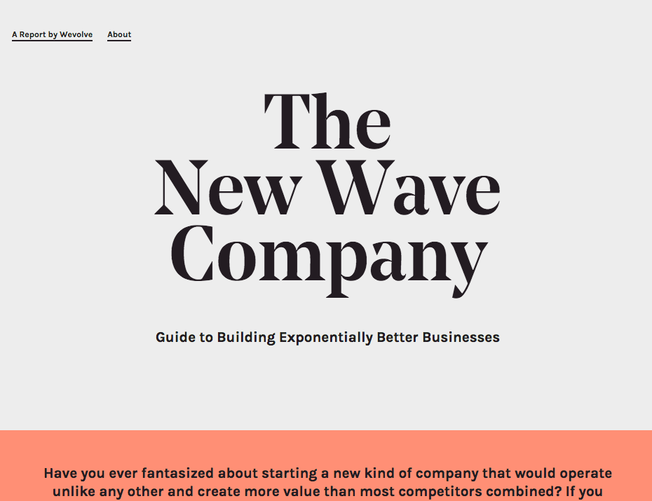
The New Wave Company
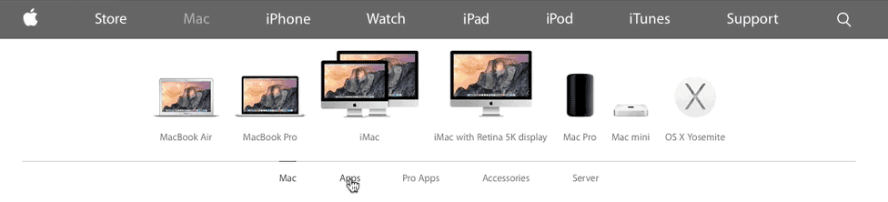
With a renewed focus on text, there has also been a continued questioning of the relevance of design elements such as sidebars. The power of one-column implementations – such as Apple’s iPhone 6 page –show just how effective this can be.
Things Are on the Move Again
A resurgence in kinetic design has also been evident in 2015. It’s no secret that both users and marketers are deeply in love with video content, so its increased use should come as no surprise.
The use of video backgrounds – first started in 2013 – has continued to rise and, though there’s a price to be paid in terms of bandwidth and potential distraction, there’s no doubting the impact video has on users.
Animation, after a rough couple of years disentangling itself from associations with Flash, has also made a return in the form of subtle UI transitions and animations. Animated design cues that users are familiar with from the world of apps are now becoming very much part of the lingua franca of the web.
As always, you can have too much of a good thing in this department but 2015 has seen some great implementations.
Nathan Huening over at New Media Campaigns has put together an excellent roundup of contemporary examples, including the Apple.com navigation example above.
Magazine Standards Are Finally Being Met
Much has been made online of how the web has been relentlessly surpassing various forms of traditional media over the last decade. However, the truth in terms of visual design – until very recently – was that it still lagged quite far behind.
Attracted by the web’s power, ubiquity and potential, users were prepared to accept standards of graphic design and typography they would have found laughable in a traditional offline publishing context.
There’s a good case to be made that 2015 is the year those standards are finally being met.
The rise of retina-enabled devices and web fonts – along with increased browser sophistication and dramatically improved standards of both custom and stock imagery – mean the web is an increasingly mature design environment.

Slick eCommerce design from Bellroy
Evidence for this is everywhere you look, whether in the case of slick eCommerce sites such as Bellroy, historical projects such as Warsaw Rising, or agency sites such as The Impossible Bureau.
JavaScript Continues to Eat the World
The technology powering a huge number of the design trends mentioned above is of course JavaScript. The ongoing maturation of frameworks such as Angular and React is enabling many of the more progressive design trends that are emerging.
The potential downsides of JavaScript in terms of design and user experience have also started to be seriously discussed in 2015. Analyses of advertising-fuelled page bloat on sites such as The Verge show the potential dark side of JavaScript’s ubiquity.
For WordPress theme developers, the biggest JavaScript related change is yet to come. The impending full-scale arrival of the REST API will signal the official technical uncoupling of the theming layer.
Expect to see a wave of JavaScript-led design solutions emerging in this space and a trend towards increasing ‘appification’. Initial experiments such as Automattic’s Picard theme and Yoren Chang’s Angular explorations show the direction we may be heading in.
Conclusion
It’s a great time to be a WordPress theme developer. Browser wars are largely a thing of the past, the platform itself is increasingly dominant, and integration with the wider web is just around the corner via the REST API.
The design trends of 2015 that we’ve covered above put users first, and are refreshingly focused on simplicity and ease of use.
Let’s recap them briefly:
- Responsive is here to stay.
- Flat design remains an ideal mobile-first solution.
- Nothing beats simple and fast.
- Kinetic design is making a comeback.
- Magazine standards are being met.
- JavaScript continues to drive design innovation.
We’d love to hear your thoughts on design trends so far in 2015 – what has caught your eye and what you think is coming down the line. We also welcome feedback on our recent releases in the context of design. Tell us what’s working and what you’d like to see more of!
Liked the article? You should follow me on Twitter


Great statement, thank you.
Do you guys from KRIESI.at plan new themes in the near future?
Good summary with great examples. But what do you think comes 2016?
Good design very useful for me.
How about your prediction to 2016?
Regards,
Ucw
http://id.ucw88.com