3 Reasons Why Good Typography is Vital to Great Web Design (Plus 3 Important Tips)
We have all heard this cliché: “A picture is worth a thousand words”, but is it always true in the world of web design?
Many designers are visually-minded people, and it does of course make sense to have a good eye for color, form and proportion in this line of work. Although the rules of typography are taught in design schools, these principles often take second place when planning the psychological impact of a web-design. The focus is on the overall visual effect, and typography is sometimes added as an afterthought.
This is an oversight that could have a negative impact on the effectiveness of your work. With that in mind, in this post I am going to share three reasons why good typography is vital to great web design, and give you three tips for making the most of the power of typography.
1. Text Trumps Images and Videos
The folks at the Nielsen Norman Group spend a lot of time studying the eye movements of average web users. They use heat maps to track the points on web pages that are viewed more often than others. Their research uncovered some interesting facts. For example, one study revealed that while 22% of initial eye-fixations were on graphics, 78% were on text.
This particular study was related specifically to news readers, and arguably there is a good reason why they are more interested in words than in pictures, but this is not an isolated example. People searching through multiple pages looking for something specific tend to show similar patterns of eye-fixation. Generally there is an “F” shaped pattern, where readers first focus on headlines, and then scan the page looking for what they need. When they find something interesting, the pattern changes to a more predictable block shape, showing that they are reading through a paragraph or two.
Studies done on the memory retention of information are also interesting. When comparing information recalled from text versus information from multi-media, people tended to have better retention when reading than when watching videos. One test showed between 88% and 96% recall from text versus only 38% to 70% from video. This all points to the fact that words are at least as important as images on web pages.
2. Typography Affects People’s Perceptions
Errol Morris conducted an interesting experiment in the New York Times in July 2012 related to typography. He quoted a passage from David Deutsch’s The Beginning of Infinity, dealing with the probability of an asteroid strike on planet earth, and then asked readers to rate their own feelings of credulity, or confidence in Deutsch’s claims. He ran the same test using six different typefaces to find out whether or not people’s minds can be changed simply by choosing a font.
More than 100,000 people clicked on the page, and approximately 45,000 people took the quiz. The results were conclusive. Out of the six fonts, Baskerville generated the most (perceived) trust, followed by Computer Modern, Georgia, Trebuchet and Helvetica which fostered progressively less and less confidence in the claims. Can you guess which font came in last? In last place, with the least amount of perceived credibility, was Comic Sans.
Which surprised exactly 0% of people.
In other words, font choice is about more than just readability or visual impact.
3. Typography Affects People’s Moods
The American Psychological Association (APA) interviewed Kevin Larson, PhD – who works at Microsoft Headquarters – researching the way typography affects the minds of readers.
His studies showed the negative impact on readers caused by those annoying typographical blunders: poor contrast and font sizes less than 12pt leading to eye fatigue. He also points out the benefits of good typography, explaining that people are encouraged to read more when the font style is psychologically pleasing. In other words, a happy reader keeps reading.
Typography is more than the sum of its parts.
Microsoft spent a lot of time developing their Clear Type font based on this research. It was aimed specifically at on-screen reading rather than print, and used an approach based on the human eye – rather than just pixels on the screen – to set brightness values. This makes fonts both crisper and smoother, and easier and more enjoyable to read. Microsoft agrees; typography is very important.
3 Tips for Better Typography
It is clear why typography should not be forgotten. Even though well-designed graphic elements and audio visual content may draw more eyes to the page, what people really want is clear and easily digestible information.
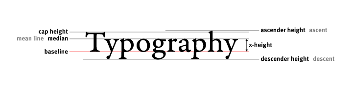
Besides all the standard typographical rules about kerning, leading, size and weight, here are three tips to improve the impact of your words on the page.
1. Consider the Psychological Context
Typography isn’t just eye-candy. The right typographical approach is to suit your choice of font, size, weight, color and leading to the message that the actual words convey.
So take a moment to consider the impact that your typeface choice will make on the reader. Will it be calming or energizing? Where will the eyes be drawn, and what is the message that the reader will get when looking there? What subliminal clues are you providing with your choice of style? Let those considerations determine your choice of font.
2. Consider Hierarchy
Bear in mind the typical “F” shape that your average page viewer uses to quickly scan your design. Most readers will scan your header then move down the left margin, rapidly skipping over the first words in each section.
With that in mind, use weighting and size intelligently to make it easy for someone to find the information they need quickly.
If your page has too many links, bright, flashing headings, and bold sections of text all competing for attention, the overall effect is to make the reader a little anxious, and think: “Great! Another annoying ad!”

You probably have your own perceptions of these popular fonts.
3. Consider Popular Perception
While you might personally find one type of lettering more pleasing than another – and have your own reasons for your choice – it is wise to consider the fact that certain typefaces have become associated with certain ideas in popular culture.
For example, curly scripts are perceived as feminine, while blockier fonts are considered more masculine. Antique style typefaces might look out of place in a modern context, and futuristic styles don’t fit with old-fashioned values.
If your aim is to come across as authoritative, take a hint from the New York Times experiment and go with Baskerville. But whatever you choose, know why you are choosing it.
Conclusion
In the end, the right choice of typography will be a compromise. It will satisfy your own sense of aesthetics while appealing to the emotions and subtly enhancing the text.
So when planning out your next design, give a moment’s thought to how you will structure your typography for maximum impact, and keep the principles explored in this article in mind. It could make a big difference.
If you have any questions about typography as it relates to web design – or anything else that happens to pop into your head – fire away in the comments section below!
Photo Credit: Torley
Liked the article? You should follow me on Twitter


thanks for the tips regarding typography!!
Typography is the hasdest thing on web design.
(>_<)
The font type can change entire experience of the site.
Nice post. I learn something new and challenging
on sites I stumbleupon everyday. It’s always helpful to read through content from other authors
and practice something from their web sites.