Forum Replies Created
-
AuthorPosts
-
hm – yes no cookies but … all that google stuff :
this is an iframe embedded youtube video an the no-cookie version.
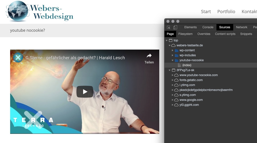
i think – no – not only on GDPR (DSGVO on german spoken Countries) Reasons.
With a selfhosted video this could be done.
https://webers-testseite.de/mute-unmute/
Besides these infos – the browsers do it all their own way.
Look (Listen) here on Enfold Fullwidth Easy Slider – it starts muted – and you can turn up the volume on player controls. https://webers-testseite.de/vimeo/
Listen here in a codeblock and with iframe – but it does not autostart on firefox (chrome does) : https://webers-testseite.de/vimeo-2/Guess Both ( second footer widget row and socket widget area ) is not needed.
Contrary to my intention to keep me a little in the background here, I wanted to update the old post again.
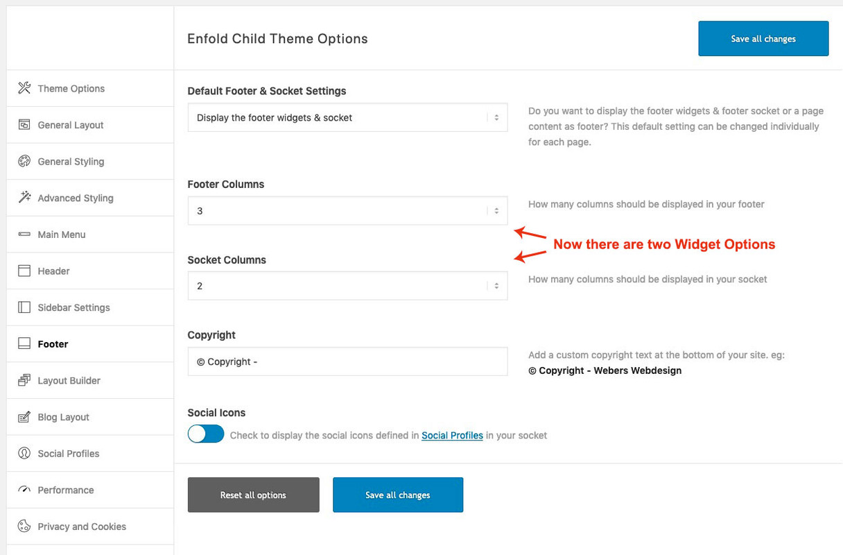
See in action: https://webers-testseite.de/guenni/#footerthis here is only needed if you like to have 6 Columns for Original Footer Widget too
the 6th column is sometimes set in the source code, sometimes not.
f.e. in the originally footer there is allready a case 6 prepared.
but on the /includes/admin/register-admin-options.php not (only 5 for original footer columns) – you can add it there ( from line 4346ff)$avia_elements[] = array( "slug" => "footer", "name" => __("Footer Columns", 'avia_framework'), "desc" => __("How many columns should be displayed in your footer", 'avia_framework'), "id" => "footer_columns", "required" => array( 'display_widgets_socket', '{contains_array}all;nosocket' ), "type" => "select", "std" => "4", "subtype" => array( __('1', 'avia_framework') =>'1', __('2', 'avia_framework') =>'2', __('3', 'avia_framework') =>'3', __('4', 'avia_framework') =>'4', __('5', 'avia_framework') =>'5', __('6', 'avia_framework') =>'6'));then you can do in /includes/admin/register-widgets-area.php:
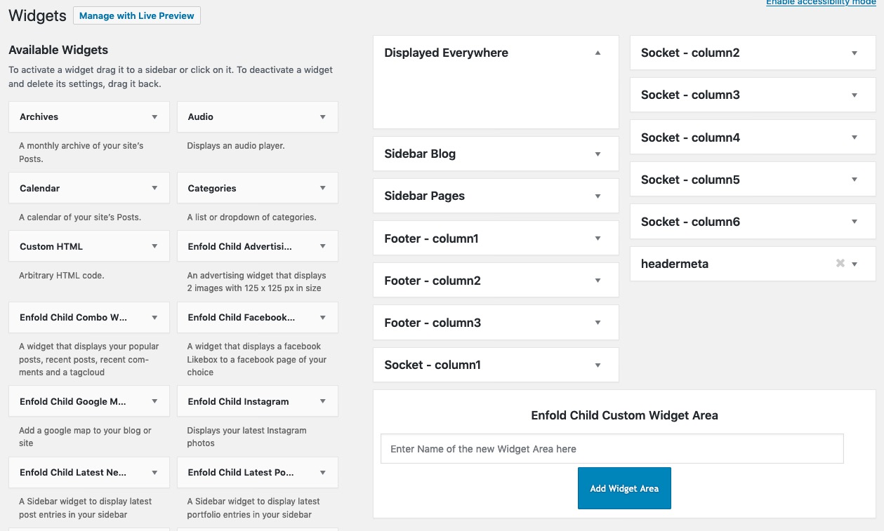
	//dynamic widgets

	#footer
	$footer_columns = avia_get_option( 'footer_columns', '6' );

	for ($i = 1; $i <= $footer_columns; $i++)
	{
		register_sidebar(array(
			'name' => 'Footer - column'.$i,
			'before_widget' => '<section id="%1$s" class="widget clearfix %2$s">',
			'after_widget' => '<span class="seperator extralight-border"></span></section>',
			'before_title' => '<h3 class="widgettitle">',
			'after_title' => '</h3>',
			'id'=>'av_footer_'.$i
		));
	}
and if you want to make it perfect – you can style the dummy widget data on the bottom for both ( socket and footer widgets) for case 6
by the way – here are the old files to have a second widget-area row in the footer from above ! ( the old ones are deleted)
See: Footer.php
Download: footer.php
Register via child-theme functions.php:function my_avf_option_page_data_add_elements( array $avia_elements = array() ) { $slug = 'footer'; $id = 'footer_columns'; $new_element = array( "slug" => "footer", "name" => __("Second Row of Footer Columns", 'avia_framework'), "desc" => __("How many columns should be displayed in your footer", 'avia_framework'), "id" => "footer_two_columns", "required" => array( 'display_widgets_socket', '{contains_array}all;nosocket' ), "type" => "select", "std" => "4", "subtype" => array( __('1', 'avia_framework') =>'1', __('2', 'avia_framework') =>'2', __('3', 'avia_framework') =>'3', __('4', 'avia_framework') =>'4', __('5', 'avia_framework') =>'5', __('6', 'avia_framework') =>'6')); $found = false; $index = 0; foreach( $avia_elements as $key => $element ) { $index++; if( isset( $element['id'] ) && ( $element['id'] == $id ) && isset( $element['slug'] ) && ( $element['slug'] == $slug ) ) { $found = true; break; } } if( ! $found ) { $avia_elements[] = $new_element; } else { $avia_elements = array_merge( array_slice( $avia_elements, 0, $index ), array( $new_element ), array_slice( $avia_elements, $index ) ); } return $avia_elements; } add_filter( 'avf_option_page_data_init', 'my_avf_option_page_data_add_elements', 10, 1 ); /*** Register new footer widget areas */ function footer_two_widgets_init() { $footer_two_columns = avia_get_option( 'footer_two_columns', '6' ); for ($i = 1; $i <= $footer_two_columns; $i++) { register_sidebar(array( 'name' => 'Second-Footer - column'.$i, 'before_widget' => '<section id="%1$s" class="widget clearfix %2$s">', 'after_widget' => '<span class="seperator extralight-border"></span></section>', 'before_title' => '<h3 class="widgettitle">', 'after_title' => '</h3>', 'id'=>'av_footer_two_'.$i )); } } add_action( 'widgets_init', 'footer_two_widgets_init' );about socket widget columns:
i needed this for a customer – and if you like to know how – very similar to the procedure above:
here is the download of the edited footer.php : PasteBin
here you can see before for i have done: https://pastebin.com/u8yuxcK6to register then the new widget areas and admin options etc. you had to insert this to your child-theme functions.php
function my_avf_option_page_data_add_elements( array $avia_elements = array() )
{
  $slug = 'footer';
  $id = 'footer_columns';

  $new_element =  array(
	"slug"	=> "footer",
	"name" 	=> __("Socket Columns", 'avia_framework'),
	"desc" 	=> __("How many columns should be displayed in your socket", 'avia_framework'),
	"id" 	=> "socket_columns",
	"required"	=> array( 'display_widgets_socket', '{contains_array}all;nofooterwidgets' ),
	"type" 	=> "select",
	"std" 	=> "3",
	"subtype" => array(
		__('1', 'avia_framework') =>'1',
		__('2', 'avia_framework') =>'2',
		__('3', 'avia_framework') =>'3',
		__('4', 'avia_framework') =>'4',
		__('5', 'avia_framework') =>'5',
		__('6', 'avia_framework') =>'6'));

  $found = false;
  $index = 0;


  foreach( $avia_elements as $key => $element )
	{ $index++;
	    if( isset( $element['id'] ) &&  ( $element['id'] == $id ) && isset( $element['slug'] ) && ( $element['slug'] == $slug ) ) {
	      $found = true;
	      break;
	   	}
  	}
		 if( ! $found ) {
				$avia_elements[] = $new_element;
		 }
		 else {
		    $avia_elements = array_merge( array_slice( $avia_elements, 0, $index ), array( $new_element ), array_slice( $avia_elements, $index  ) );
		 }
  return $avia_elements;
}
add_filter( 'avf_option_page_data_init', 'my_avf_option_page_data_add_elements', 10, 1 );

/*** Register new socket widget areas */
function socket_widgets_init() {
	$socket_columns = avia_get_option( 'socket_columns', '6' );
	for ($i = 1; $i <= $socket_columns; $i++)
	{
		register_sidebar(array(
			'name' => 'Socket - column'.$i,
			'before_widget' => '<section id="%1$s" class="widget clearfix %2$s">',
			'after_widget' => '<span class="seperator extralight-border"></span></section>',
			'before_title' => '<h3 class="widgettitle">',
			'after_title' => '</h3>',
			'id'=>'av_socket_'.$i
		));
	}
}
add_action( 'widgets_init', 'socket_widgets_init' );
this will end up in this Enfold Options Dialog:
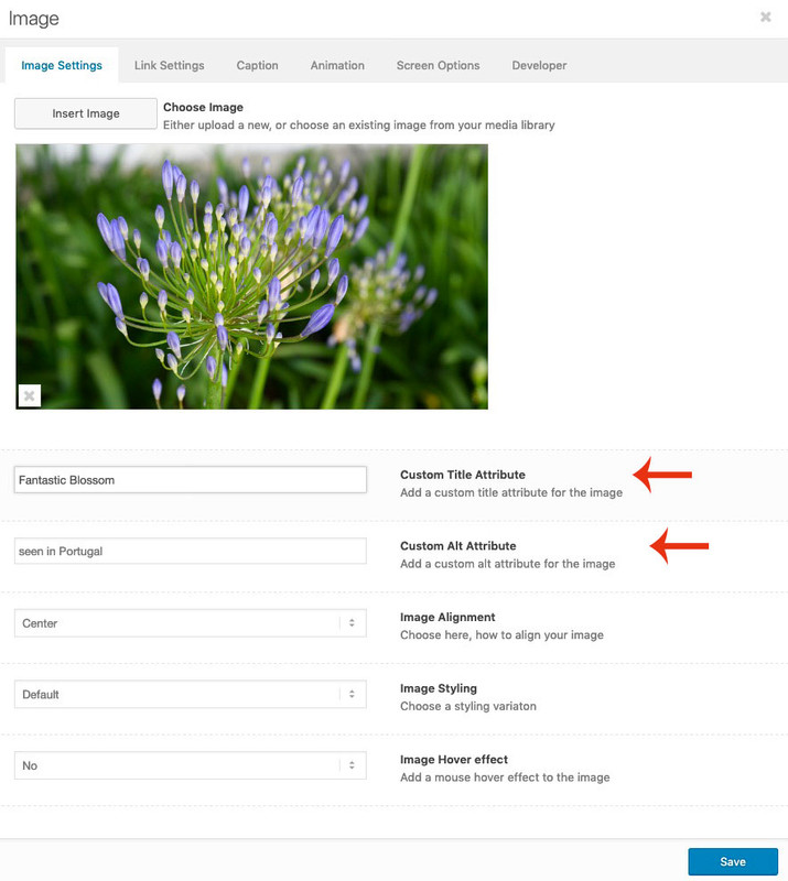
 November 14, 2019 at 8:48 am in reply to: set image alt tag and title in image media element #1156680
Sorry –
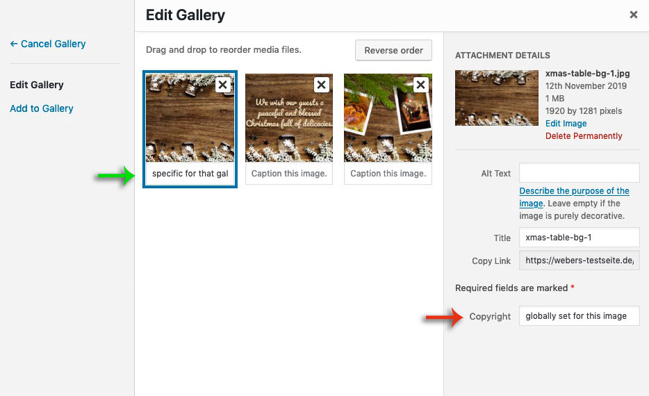
If you create a gallery ( masonry gallery ) there is that point where you can insert under each image a “Captiion” – this will only affect the caption for that specific gallery – so it will be added specifically only here to the image.
i tested it now and the “Caption Input Field” is set globally too ( green arrow )
I have mistakenly believed that this is an idividual set entryThat “Caption” will end in a data-avia-tooltip for the image and is used as title for the a-tag ( to show on lightbox under the image )
so if i create two new input fields – then they must not affect the media properties globally.
The place where the input fields could be placed is already there under the green arrow – but as I said I can’t find the place where I could place the input fields in the codeNovember 14, 2019 at 8:34 am in reply to: set image alt tag and title in image media element #1156676Thanks Ismael : what i mean is if i put something in the copyright field – it will change the copyright for all pages where this image is used – and that makes sense – this is a global property.
An Alt or Title attribute can differ depending on how and where it is used. Just when I think of the use on multilingual pages. Yes, I know that WPML achieves this by providing an additional plugin (Media Translation) for the different languages. But it has the disadvantage that it creates duplicate images and inflates a backup.
If you create a gallery ( masonry gallery ) there is that point where you can insert under each image a “Captiion” – this will only affect the caption for that specific gallery – so it will be added specifically only here to the image. There I thought I could create two additional input fields, which would add the attributes here similarly only for the use of the image.
 November 13, 2019 at 6:15 pm in reply to: set image alt tag and title in image media element #1156465
Yes but this will add it permanently.? – so it will change everywhere the image is placed.
but we want to be able to set alt- and title-attributes as needed without triggering an entry in the media library.
As far as i know the copyright field goes to the attachements.As you can see in the image.php i created – the alt and title attributes are set but do not change the alt and title entries on attachment.
November 13, 2019 at 12:52 am in reply to: Filling 1/2 container with multiple, full width images/slideshow #1156235Well this is my layout:

but after that – open the cell with the easy slider – it seems that the cell got a padding on default of 30px – you had to remove this.
https://webers-testseite.de/grid-row-with-slide-show/but i guess that images in landscape will be best. And text on the other cell is less high than the slide-show
November 12, 2019 at 4:38 pm in reply to: set image alt tag and title in image media element #1156042You are welcome. It would be nice to have this for the galleries too! but my abilities and times are limited.
by the way – there are comments in the php to see what is new or changed – so you can see how it is done
The crux of the matter is that one can distinguish same selectors by counting.
But be careful because it is counted over all.
So if div, p, ol, ul tags appear , then it is counted over all.
Sometimes it is advisable to go over nth-of-type: The :nth-of-type(n) selector matches every element that is the nth child, of a particular type, of its parent.https://css-tricks.com/the-difference-between-nth-child-and-nth-of-type/
see the markup from: “Let’s say our markup changed to this:” there you can see that nth-child will not work as wanted.
Most people do forget to set these helpfull headers. Many of the known attack possibilities ( man in the middle , cross-site-scripting etc.) are almost impossible then.
It just needs some reworking, since everyone wants to have different features on his site; (Google Maps, Google Analytics, Youtube, Vimeo, CDNs to present media files).What I’m only surprised about is that some things I thought were covered by the ‘self’ setting, which is not the case (script loading and stylesheet loading). To have normal outlook of Enfold options i had to set for:
script-src ‘self’ ‘unsafe-eval’ ‘unsafe-inline’
style-src ‘self’ ‘unsafe-inline’So I allow scripts and stylesheets to be loaded insecurely inline (http).
My guess was that some of these get parameters ( https://codex.wordpress.org/Determining_Plugin_and_Content_Directories ) are causing insecure loading. Because i force my whole site to be https by wp-config entry – i have these inconsistancies – like the image above shows you.
November 11, 2019 at 5:18 pm in reply to: Masonry to display posts – better way to order them? #1155669and if you know what you like to have use a filter : https://kriesi.at/documentation/enfold/masonry/#change-the-sort-order-of-masonry-elements
or this child-theme functions.php snippet ( or is it deprecated in 4.6.3.1 ? )
https://kriesi.at/documentation/enfold/blog-post/#how-to-add-an-orderorderby-option-to-the-blogpost-sliderportfoliomasonry-grid-elementNovember 10, 2019 at 10:55 am in reply to: set image alt tag and title in image media element #1155310Besides the working edited image.php – : hm for masonry gallery and gallery ? – i do not see where Enfold sets this Input Field for Caption. Maybe it is possible to add here a custom Title / Alt Inputfield
Many hosters are now forced to switch to higher php versions. Most notify you that the 5.6 versions will now be disabled, but not all. I don’t remember when the enfold versions needed newer php versions higher than 7, but maybe that’s the reason.
Then: did you disable Gutenberg (Block Editor)? I only use the Classic Editor setting with Enfold:
Enfold (Child) – Theme Options – Select Your Editorthe easiest way is to colorize it is f.e. in Photoshop et.al.
all other methods would influence the whole column – or do not work on all browsersbackground-blend-mode f.e. : https://caniuse.com/#search=background-blend-mode
with your example – you have to overwrite the inline rules – because the background image is set as background..page-id-63 #banner { background-image: url("https://www.surfschool.net/wp-content/uploads/2019/07/beginner-surfboard-rentals-huntington-beach-banner.jpg") !important; background-size: cover !important; background-repeat: no-repeat !important; background-position: center !important; padding: 45px 35px 45px 35px; border-radius: 15px; background-color: rgba(0,60,255,0.4) !important; background-blend-mode: multiply !important; }or background-blend-mode : soft-light is nice too – but IE and Edge do not support this – the mobile browser too etc. pp.
the first thing when activating Enfold as theme i do insert this to my child-theme functions.php:
function admin_head_mod() {
  echo '<style type="text/css">
  #avia_quick_css .avia_description {float: none;margin-bottom: 20px !important;padding-left: 0 !important;width: 98%}
  #avia_quick_css .avia_control {float: left;max-width: 98% !important;width: 98% !important}
  .avia_footer_links li {float: left;padding-right: 20px}
  .avia_footer .avia_footer_save {float: left}
  .avia_reset {pointer-events: none !important }
  #avia_options_page { max-width: 3000px!important}
  </style>';
}
add_action('admin_head', 'admin_head_mod');
or in that code abbove set .avia_reset to display:none
it disables the reset button and let the quick css field and the whole options page grow to max width.
The quick css is to narrow for some selectors.November 8, 2019 at 1:40 pm in reply to: set image alt tag and title in image media element #1154993i added custom title attribute aswell.
see here: https://pastebin.com/ehe0nEuK
Download here: https://pastebin.com/dl/ehe0nEuKsorry : both sites
a) https://www.bellarinepeninsulaaccommodation.com.au/
b) https://www.greatoceanroadaccommodation.directory/I’m sorry I’m saying this now, you think you should play it safe and start over.
So-called Nulled Themes can also put code into other folders (of course also into the wp-content folder etc.).
For me the risk would be too high. Therefore : even the database should be completely rebuilt. And also upload a new WordPress. Sounds paranoid, but it would be too unsafe for me to invest too much work and then be blocked by Google because the site sends tons of spam.November 7, 2019 at 5:30 pm in reply to: set image alt tag and title in image media element #1154690https://kriesi.at/support/topic/set-image-alt-tag-and-title-in-image-media-element/#post-642918
And for multilanguage sites it could be nice to set different langage specific alt and title attributes.
Allthough f.e. with WPML this is possible in media library too – the easier way is to set it manually.Based on image.php of last Enfold Version 4.6.3.1
I needed this by myself – so i can share this here.
This Custom Alt input field overwrites the Alt attribute from the Media Library only in this case. If the field remains empty, you have the Media Library Alt attribute – if that doesn’t exist – you have an empty Alt attribute.
Maybe you should even add something like : Image Alt or something similar for SEO reasons.
;)
https://pastebin.com/dl/ehe0nEuK ( no support on that – those who do not know how to use edited ALB in Child-Themes should read in the documentation )
Please do upload a complete new Enfold Folder like here: https://kriesi.at/support/topic/some-hints-and-advice-to-update-enfold/#post-1056107
Because: Pirated (Nulled) Themes do often includes malware or spyware.
so to be sure that there is no additional code in your enfold folder – this was my advice.PS both sites are still on older versions: the one on 4.0.5 the other on 4.4.1
Why is it necessary to set the script-src to ‘unsafe-inline’ and ‘unsafe-eval’ – in content security policy ?
without it does not work – same thing with style-src .
My whole website is https – i force it via wp-config and on htaccess there are entries too!
But when i set the given CSP to only ‘self’ a lot of things do not work.so these settings works very well – but had to be always adjusted to your website.
The best would be to start with a Standard Entry in htaccess file# Extra Security Headers <IfModule mod_headers.c> Header set X-XSS-Protection "1; mode=block" Header always append X-Frame-Options SAMEORIGIN Header set X-Content-Type-Options nosniff Header set Strict-Transport-Security "max-age=31536000; includeSubDomains; preload" Header set Referrer-Policy no-referrer Header set Feature-Policy "camera 'none'; microphone 'none'; payment 'none';" Header set Content-Security-Policy "default-src 'self'; img-src 'self' http: https: *.gravatar.com;" </IfModule>Do not insert this between the standard Entry of WordPress itself:
Between # BEGIN WordPress and # END WordPressAfter that you look to your site and open the developer tools of your browser – goto console log and look for errors.
If you have a youtube film – f.e. you have to exclude these sources from the Content-Security-Policy
you see that on the code above f.e. the gravatar.com is excluded from img-src .
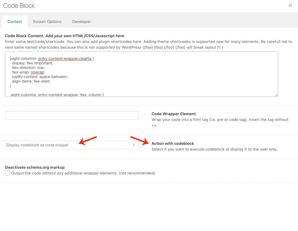
Google Maps needs to have contact to api etc. pp.the code-block alb is correct : but do you have set the : “Action with codeblock option” . ?
Yoast does it right if it does not count the backgrounds as images. these are in css not in the DOM as img tags.
Yoast only looks if all img tags have alt attributes.November 5, 2019 at 9:14 am in reply to: Button formatting not displaying properly with PDF link #1153899on that page f.e: https://campcarysbrook.com/fees-registration/camper-forms/ the little icons are inserted by a plugin or via script.
Maybe this tries to insert on the same way a pdf icon before the enfold button and destroyes the structure.
There are ways via quick css to replace the enfold icon with your: https://campcarysbrook.com/wp-content/plugins/mimetypes-link-icons/images/pdf-icon-16×16.pngthe thing is – that background-images do not have alt tags – or do you see in your source code an image tag?
i can not believe that a seo tool (i use for bigger sites Yoast Seo – and others for smaller sites ) would find this as fault.
May i see the concerning site?besides the script problematic – see your source code some entries in the body tag – etc. pp ( Google Analytics code etc)
(how did you insert your Analytics Code >? f.e.)maybe that causes my hypothesis:
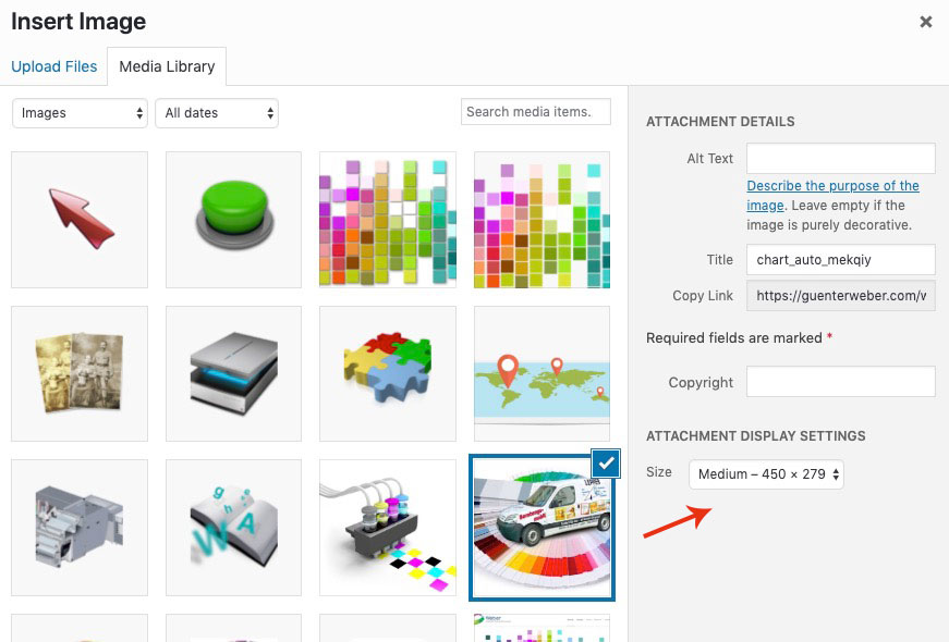
try to select some “invisible” text – this seems to be white font on white background. Because i see the spell check working in your screenshot.but you are sure, that you have inserted the higher resolution to your site?
on The image Alb element or other image based ALB Elements of Enfold – you can choose what resolution is shown f.e.:
-
AuthorPosts