Forum Replies Created
-
AuthorPosts
-
Bitte lies auch mal was ich so schreibe!
Warum das CSS deine Seite zerstört:
Der “Sticky-Footer”-Killer: html, body { height: -webkit-fill-available } zwingt das gesamte Dokument dazu, genau so hoch wie der Bildschirm zu sein. Das bricht oft das natürliche Scrollverhalten.Die “Tab-Bar-Überdeckung”: Dass der Footer unten überdeckt wird, liegt am Konflikt zwischen -webkit-fill-available und 100svh. Das iPhone rechnet bei fill-available oft die untere Leiste (die Browser-UI) nicht korrekt ab, wodurch der Content “hinter” die Safari-Buttons rutscht.
Die Weißflächen: min-height: -webkit-fill-available !important in Kombination mit height: auto !important zwingt Sektionen, die eigentlich klein sein sollten, dazu, den gesamten Screen zu füllen – selbst wenn sie mitten im Content stehen.
Daher: notiere dir die bestehenden CSS Rules – und lösche diese:
html, body {
    height:-webkit-fill-available
}

#wrap_all {
    min-height:-webkit-fill-available
}

@supports (-webkit-touch-callout: none) {
    .av-minimum-height, .fullsize {
        min-height: -webkit-fill-available !important;
        height:auto !important
    }
}

@supports (-webkit-touch-callout: none) {
    .av-fullscreen, .av-minimum-height {
        min-height:100svh !important
    }
}
und versuche mal diese hier:
/* 1. Globalen Zwang für html/body nur auf Mobilgeräten aufheben */
/* Nur für Mobile + Safari (iPhone/iPad) */
.avia-safari.avia_mobile #wrap_all,
.avia-safari.avia_mobile html,
.avia-safari.avia_mobile body {
    /* Wir heben den globalen Zwang auf, der das Scrollen und die Footer-Sichtbarkeit stört */
    height: auto !important;
    min-height: 0 !important;
}

/* 2. Gezielter Fix für die Weißflächen und Footer-Überdeckung auf iOS Safari */
@supports (-webkit-touch-callout: none) {
    /* Nur wenn Enfold Safari und Mobile erkennt */
    .avia-safari.avia_mobile .av-minimum-height,
    .avia-safari.avia_mobile .fullsize,
    .avia-safari.avia_mobile .av-fullscreen {
        /* Nutze dvh (Dynamic Viewport Height) für korrekte Footer-Berechnung */
        min-height: 100dvh !important;
        height: auto !important;
        /* Verhindert den Geister-Weißraum durch fill-available */
        -webkit-fill-available: stretch;
    }
}

/* 3. Sicherstellen, dass der Footer nicht von der unteren Tab-Bar verdeckt wird */
.avia-safari.avia_mobile #main {
    padding-bottom: env(safe-area-inset-bottom) !important;
}
@supports (-webkit-touch-callout: none) {
    .avia-safari.avia_mobile #wrap_all {
        /* Erzeugt einen Puffer unten, damit der Content nicht unter der Leiste klebt */
        padding-bottom: env(safe-area-inset-bottom) !important;
    }
}
Ob du den fixierten “Einwilligung verwalten” da lassen solltest – oder lieber hinter dem Footer verschwinden lässt ist dir überlassen.
Setze mal :#socket{ z-index: 10005; }They seem to be targeting Enfold right now.
PS: fernab von deinem White Space on iPhone Problem – sehe ich das du oft diesen Trenner mit den drei linien einsetzt.
bist du eigentlich vertraut damit eigene svg Divider in Enfold zu haben?
dein Trenner mit den drei linien ließe sich gut umsetzten mit:

nicht wundern bei Enfold stehen die svg Trenner auf dem Kopf – der scharze Teil ist das was nachher durch die Anschlussfarbe ersetzt wird.
Großer Vorteil : responsiv sorgt vector-effect=”non-scaling-stroke” dafür das die Stroke-weite über alle screen-breiten gleich bleibt (also gut sichtbar ist) :
https://webers-testseite.de/j-und-s/Edit: OK now – i see that it is your Enfold file because you liked to reflect the Janisch & Schulz by js and renaming your child-theme to J&S ( or parared did it) –
so you can overwrite that rule inside quick css by the rule above – or find that rule inside your settings and remove it.ich frage mich nur woher dieses /wp-content/uploads/dynamic_avia/js.css kommt. Denn ich glaube nicht das es eine Enfold Datei ist. Eventuell gehört die zu einem Plugin? Vielleicht kann da einer der Mods näheres zu sagen.
du kannst auch nur diese Regel überschreiben ohne auf andere Devices Einfluss zu nehmen:
in das Quick css :
@supports (-webkit-touch-callout: none) {
    #top .av-minimum-height, #top .fullsize {
        min-height: 0 !important;
    }
}
_____________
I’m just wondering where this /wp-content/uploads/dynamic_avia/js.css comes from. Because I don’t think it’s an Enfold file. Maybe it belongs to a plugin? Perhaps one of the mods can say more about this.
You can also just override this rule in js.css without affecting other devices: see above
ok – man bekommt das wirklich nur raus, wenn man einen mac mit safari zur verfügung hat, und dort die XCode nebst iOS Simulatoren installiert.
Dann hat man nämlich dev Tools für die iPhone zur Verfügung ;)es ist ein spezieller Hack, der aber hier dazuführt, das dieser extreme Leerraum ensteht:
height: -webkit-fill-availableteste doch mal im Quick css:
zunächst mal nur für diese Selektoren:#top .av-minimum-height, #top .fullsize { min-height: 0 !important; }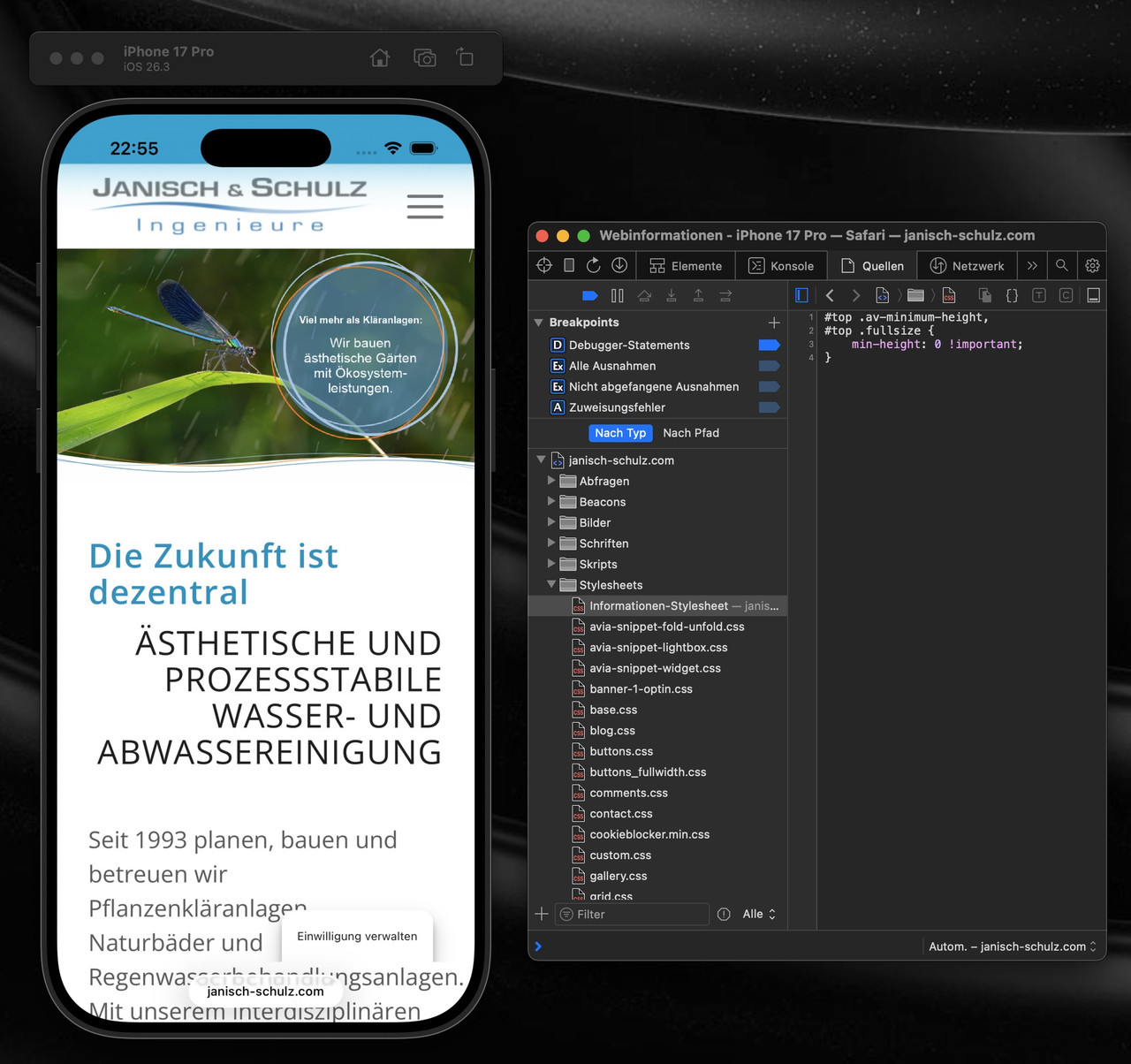
_____________
OK – you can only find this out if you have a Mac with Safari and have installed XCode and iOS simulators.
Then you have dev tools for an iPhone at your disposal ;)It’s a special hack, but it leads to this extreme empty space:
height: -webkit-fill-availableTry testing it in Quick CSS:
First, just for these selectors: see aboveSicher, dass es nicht nur ein Caching ist? Du hast WP-Rocket am Start. Cleare mal den Cache dort. Und deaktiviere dann WP-Rocket temporär.
Dann – falls aktiv, mach noch einen Refresh der css und js files in Enfold ( Enfold-Child / Performance ) ganz unten “Delete Old CSS And JS Files?”Aus irgendeinem Grund ( und auch nur auf realen iPhones ) wird dieser full-width button den du am Desktop zeigst trotzdem mit berücksichtigt. Es wird nur der Anchor ausgeblendet – die Wrapper bleiben sichtbar. Daher:
Versuche mal folgendes : setze den Full-Width button in eine eigene Color-Section und blende diese dann für kleine Screens aus.
PS: das ganze ist übrigens auf allen seiten dann auch der Fall – wo du unterhalb der Slider auch immer einen Full-Screen Button setzt.dies wird auch auf realen iPhones gezeigt:
 March 9, 2026 at 9:46 pm in reply to: Multi Columns (4 and more) in Post-Module (Blog) doesn’t work #1495902
by the way – do all of your portfolios have a german translation ? If there are only 3 tranlated Portfolios – that could be one reason for it.
i guess you have a page with fixed header – even on mobile too?
The problem is that Safari shrinks the tab bar when scrolling, which changes the visible area. If your header is fixed with top: 0, but the calculation of the spacing is messed up by the changing browser UI, this ‘gap’ is created, through which the content flashes.
This is especially noticeable when you display the tabs at the top in iOS Safari. As these shrink when scrolling, the viewport height changes.
For me it would be nice to see the page. Then i can try to give you better advice.ok – the only difference is that you only allow in this case : br-tags; p-tags and span-tags
try in your child-theme functions.php:
function my_avf_masonry_loop_entry_content($loop_excerpt, $entry) {
  $loop_excerpt = $entry->post_excerpt;
  return $loop_excerpt;
}
add_filter('avf_masonry_loop_entry_content', 'my_avf_masonry_loop_entry_content', 10, 2);
or maybe better only allow some tags that are not stripped:
function my_avf_masonry_loop_entry_content($loop_excerpt, $entry) {
  $loop_excerpt = strip_tags( ($entry->post_excerpt) , '<br><p><span>'  );
  return $loop_excerpt;
}
add_filter('avf_masonry_loop_entry_content', 'my_avf_masonry_loop_entry_content', 10, 2);
March 6, 2026 at 1:13 pm in reply to: LayerSlider not updating despite latest Enfold version #1495817I’m not sure whether the update to version 8.x is included in the package included with Enfold. The dev team would have to comment on that. I would find it a shame if that were not the case. Because that is also an important part of the theme.
ich frage mich allerdings warum du es Dir so schwer machst die Layouts zu setzen.
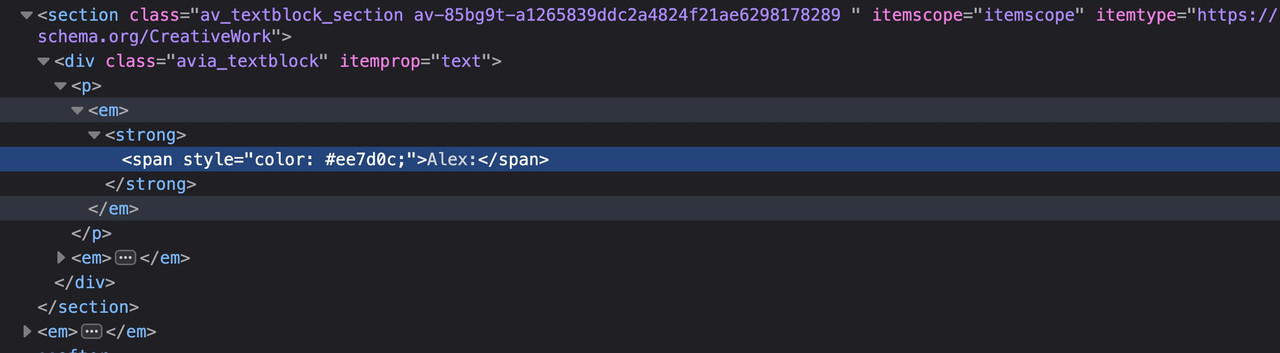
Warum nicht in der 1/2 Column : heading ; image; text-blockEDIT to your next comment: I can’t entirely believe that, because it wasn’t old content that was presented, but rather there were several em tags as wrappers for existing content, as well as several empty em tags. There must have been at least one other reason.
aber du siehst im DOM schon das dort p-tag em-tag strong-tag dann dein span-tag.
im Anderen eben nicht
wenn du im Bearbeitungsmodus bist – klicke mal oben rechts den Code-Modus an- was siehst du da?
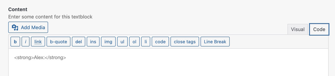
EDIT: Aber du hast Recht. Deine Ganze seite ist mit meist leeren<em></em>tags übersäht. Daher muss das an etwas anderem liegen.
Hast du einträge in deiner child-theme functions.php?also wenn ich mir in den DEV Tools diese Stelle ansehe, dann sehe ich schon em-tags:
da es ein Textblock element ist, müssen die schon aktiv gesetzt worden sein.btw:
Das HTML-<em>-Tag (Emphasis) hebt Textteile semantisch hervor, indem es sie meist kursiv darstellt. Es signalisiert Browsern, Screenreadern und Suchmaschinen eine betontere Bedeutung, was die Zugänglichkeit und SEO verbessert. Es ist ein Inline-Element, das Wörter oder Phrasen betont, ohne einen neuen Absatz zu beginnen.
Wichtige Fakten zum <em>-Tag:

    Semantische Bedeutung: <em> vermittelt, dass der Textteil wichtig ist oder betont werden soll, im Gegensatz zum <i>-Tag, das nur kursiv darstellt.
    Anwendung: Das <em>-Tag wird im Textfluss verwendet, z.B. <p>Dies ist <em>wirklich</em> wichtig.</p>.
    Darstellung: Standardmäßig wird der Inhalt vom Browser kursiv dargestellt.
    Barrierefreiheit: Screenreader nutzen das <em>-Tag, um den Text mit geänderter Betonung vorzulesen.
    Unterschied zu <strong>: <em> steht für eine sanfte Betonung, während <strong> für starke Wichtigkeit (meist fett) steht.
March 5, 2026 at 11:15 am in reply to: CopyTrack wants me to show a license for an image included in the demo #1495771PS: Have you responded to their letter yet? If not, I would give a friendly but firm reply, asking to see their justification for sending such letters to the author.
_______________
BUT : definitly we need those copies of the licenses
It looks like the author has removed their image from https://photodune.net/, but it is available on other stock image sites. You can find it by searching the Licensor’s Author Username and Item Title.
It would be even better if each of the demo pages had photo credits for the images on their individual imprint pages (which do not yet exist).
Just because the author now offers the images to other stock photo agencies does not mean that licenses that have already been issued lose their validity.In general, you should consider—and devote yourself to the task—replacing all demo images with royalty-free images.
March 5, 2026 at 10:53 am in reply to: CopyTrack wants me to show a license for an image included in the demo #1495770It seems to be quite common with these services (iStock, Shutterstock, etc.) to register with a nickname rather than using your real name. Given the degree of overlap between the images from genious2000de and Francesco83, I would assume that they are the same person.
March 4, 2026 at 10:27 pm in reply to: CopyTrack wants me to show a license for an image included in the demo #1495745I would generally recommend hosting the fonts yourself. And even turning off Enfold support for Google Fonts.
It’s more flexible because you can choose the font styles you specifically need, and this is probably the only correct way to be GDPR compliant.
To hamper Google Fonts Support on Enfold – put this to your child-theme functions.php:function my_output_google_webfonts_script( $activate ){ return false; } add_filter( 'avf_output_google_webfonts_script', 'my_output_google_webfonts_script', 10, 1 );For selfhosted Fonts – use the Enfold Font Manager – with its upload.
You upload zip files to that font-manager f.e.:
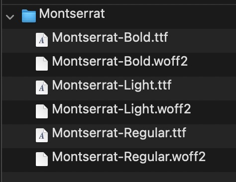
my recommendation is to use definitly woff2 fonts – but maybe as fallback the ttf Variants.
On zipping the Folder (Montserrat) – pay attention if you do that on Mac OSX. Because there are hidden files in there. You had to avoid that.You are using the Montserrat Font from the drop downlist of Enfold Typos?
Are you familiar with inspecting your page with a browser dev tools? Then you can check if this Montserrat font has all those font-weights you like to use.
Or do you have uploaded your own Montserrat font by self hosting it? What kind of Montserrat did you upload then – the static files or the varialble Font?March 1, 2026 at 6:04 pm in reply to: CopyTrack wants me to show a license for an image included in the demo #1495642btw: , under German law, copyright is a highly personal asset. You cannot simply issue a warning to someone just because you see them stealing a third party’s image – even if you are a direct competitor.
Here is a breakdown of who is allowed to do what:
1. “Active legal standing” (who is allowed to sue?)
Only those whose own rights have been infringed may demand cessation. In copyright law, these are:- The author themselves: The creator of the work.
- The exclusive rights holder: For example, a publisher or agency to whom the sole rights have been transferred. (Shutterstock, iStock etc.)
- Authorized representatives: A lawyer or an association (e.g., GEMA), but these act on behalf of and with the authority of the author.
Therefore, ask whether COPYTRACK (and the internet is full of complaints about them) has the right to issue warnings on behalf of the author.
March 1, 2026 at 5:27 pm in reply to: CopyTrack wants me to show a license for an image included in the demo #1495639That would be too risky for me—in this case, just get the license for €9 and you’re done. Link iStock
or shutterstock LinkOtherwise, take a look at free image providers (pixabay, pexels, or Unsplash).
or you can use AI to create images:
 February 28, 2026 at 11:40 am in reply to: Please help! How do I make Button link, open the side Elfsight Form? #1495599
where do you want to use it? as standalone text. or inside a text-block?
you can style a button this way (i used x-large button for that) – and even the padding you can have on button element itself – including border-width and border-radius.
Only css is needed if you like to have a min-width for that button.https://webers-testseite.de/bemo-button/
on the right – that is your screenshot image.
February 27, 2026 at 12:48 pm in reply to: Lightbox Caption Showing Filename – How do I change that? #1495567please change the snippet – i replaced the selector to a masonry specific one:
$('.av-masonry .lightbox-added').each(function(){
so there is no influence on other img links
and if you use the flexible masonry – it has to be:
$('.av-masonry .lightbox-added img').each(function(){February 27, 2026 at 12:21 pm in reply to: Lightbox Caption Showing Filename – How do I change that? #1495566there is one problem with your links on that masonry – the titles are often the same as the file-names
your alt attribute is always the same for that gallery: 7106 Bluff RunNext : on the element itself – where you set the option to show lightbox images. – there is underneath a dropdown with an option what to show as bottom-bar text:
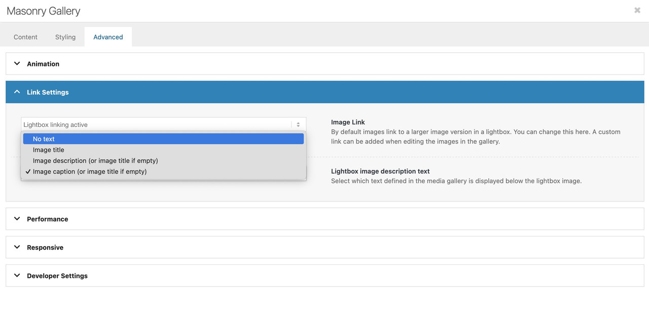
But if you have forgotton to show this on multiple masonry galleries – then you can place a little snippet instead in your child-theme functions.php:
function masonry_title_fix(){
?>
<script>
(function($){
    $(window).load(function() {
        $('.av-masonry .lightbox-added').each(function(){
            var lin = $(this).attr('alt');  /* === or choose title here === */
            $(this).attr('title',lin);
        });
    });
})(jQuery);
</script>
<?php
}
add_action('wp_footer', 'masonry_title_fix');
because you have the masonry perfect grid – you have no imgs inside but you can change it for the anchor tag.
Your description of the whole thing is quite unclear.
Which Enfold element did you use? Portfolio Grid? ( When I searched for avia_post_grid in the Enfold folder, I only found portfolio.php as an element with such an entry. )Then you selected “Open in Lightbox” for link handling.
You can set the preview image size in the “Styling” tab – Grid settings:
To do this, you must first select “Select the grid image size manually” under “Portfolio Grid Image Size”—a second drop-down menu will then open where you can specify the grid image size.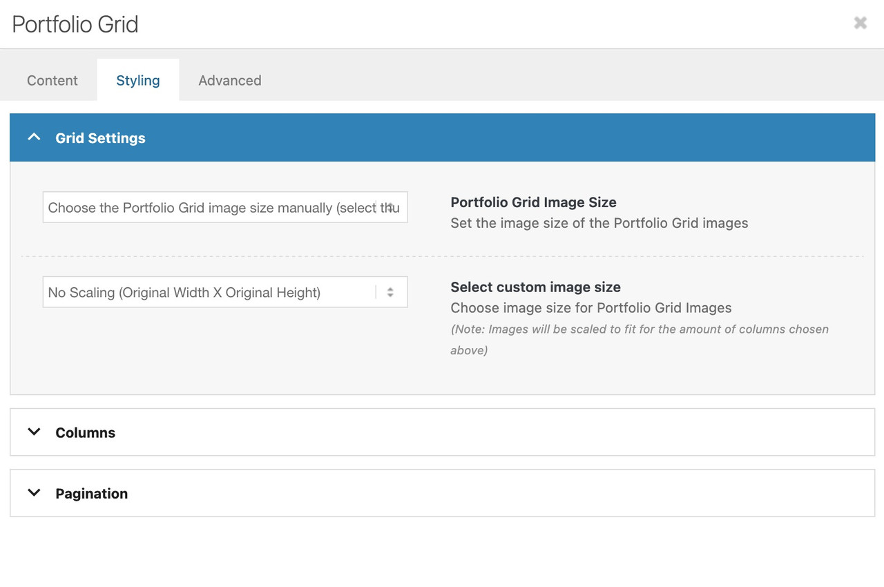
Do you like to change something on the lightbox images – or the bottom-bar text?
but btw. why don’t you use the video element and set your image as preview /fallback image on that element?
On advanced privacy settings (on the video element itsself) you can choose to show the video in the lightbox.maybe this helps you on that:
only to show that you can have video, websites or images in one lightbox group.
INFO: due to GDPR ( DSGVO in Germany ) i can not show the working script for video content – it is hard to block this – playing videos from a masonry or from an image linked to a video.
or not only for masonries:
https://kriesi.at/support/topic/lightbox-pdf-not-working-shows-up-black-multiple-solutios/#post-1495451February 24, 2026 at 10:07 pm in reply to: Lightbox Pdf not working – shows up black multiple solutios #1495451can you try this:
place that snippet inside your child-theme functions.php:function lightbox_with_mixed_content_type() { ?> <script type="text/javascript"> window.addEventListener("DOMContentLoaded", function () { (function($){ $('.mixed-contenttype a').each(function(){ var anchorLink = $(this).attr('href'); if (/\.(jpg|png|gif|webp|jpeg)$/.test(anchorLink)) { //console.log(anchorLink + " is an image link"); } else { $(this).attr('rel', 'lightbox').addClass('mfp-iframe'); } }); })(jQuery); }); </script> <?php } add_action('wp_footer', 'lightbox_with_mixed_content_type', 999);on your page place a button and give that custom class to the elment (or to one parent element) : mixed-contenttype
now link to your pdf.
See: https://webers-testseite.de/pdf-in-lightbox/
But: Not all browsers will display this, especially mobile browser variants.INFO: due to GDPR ( DSGVO in Germany ) i can not show the working script for video content – it is hard to block this – playing videos from a masonry or from an image linked to a video.
i guess you only want to influence the lightbox images source. And because Enfold uses on default the large image. This does not always uses the original aspect ratio.
I would not influence the thumbnail sizes of the gallery. Only the lightbox source image.
If you are usiing the gallery element try:function custom_alb_lightbox_image_size( $size, $context ){ if( $context == ('av_gallery' || 'avia_masonry') ){ return 'original'; } return $size; } add_filter( 'avf_alb_lightbox_image_size', 'custom_alb_lightbox_image_size', 10, 2 ); -
AuthorPosts