Forum Replies Created
-
AuthorPosts
-
The plugin allows you to add code snippets to your WordPress installation. Therefore, there must be an input field that contains code snippets. Just look at what you have tried to implement there. You can also insert such code snippets directly via child-theme functions.php. So if you don’t have a child theme, it would also explain the need for such a plugin.
In the meantime, I no longer use a captcha solution at all. There are very good honeypot versions that reduce spam to almost zero. I personally use the extended version of WP-Armour. However, the free version is also very effective. Over 300000 installations and over 1000 – 5 star ratings speak for themselves: Link
June 28, 2025 at 9:53 am in reply to: Bug Report: Gallery Image Subtitle Changes to “null” on Scroll / Reload #1486068if it is a script like this:
function temporary_removal_title_tags(){
?>
<script>
  window.onload = function() {
    var elementsWithTitle = document.querySelectorAll('a, img, *[title]');
    for (var i = 0; i < elementsWithTitle.length; i++) {
        var element = elementsWithTitle[i];

        element.setAttribute("data-original-title", element.title);

        element.addEventListener("mouseenter", function() {
            this.title = "";
        });

        element.addEventListener("mouseleave", function() {
            this.title = this.getAttribute("data-original-title");
        });

        element.addEventListener("mousedown", function() {
            this.title = this.getAttribute("data-original-title");
        });
    }
  };
</script>
<?php
}
add_action('wp_footer', 'temporary_removal_title_tags');
then the mousedown (click) should bring the title back to the element. And lightbox had to show it.
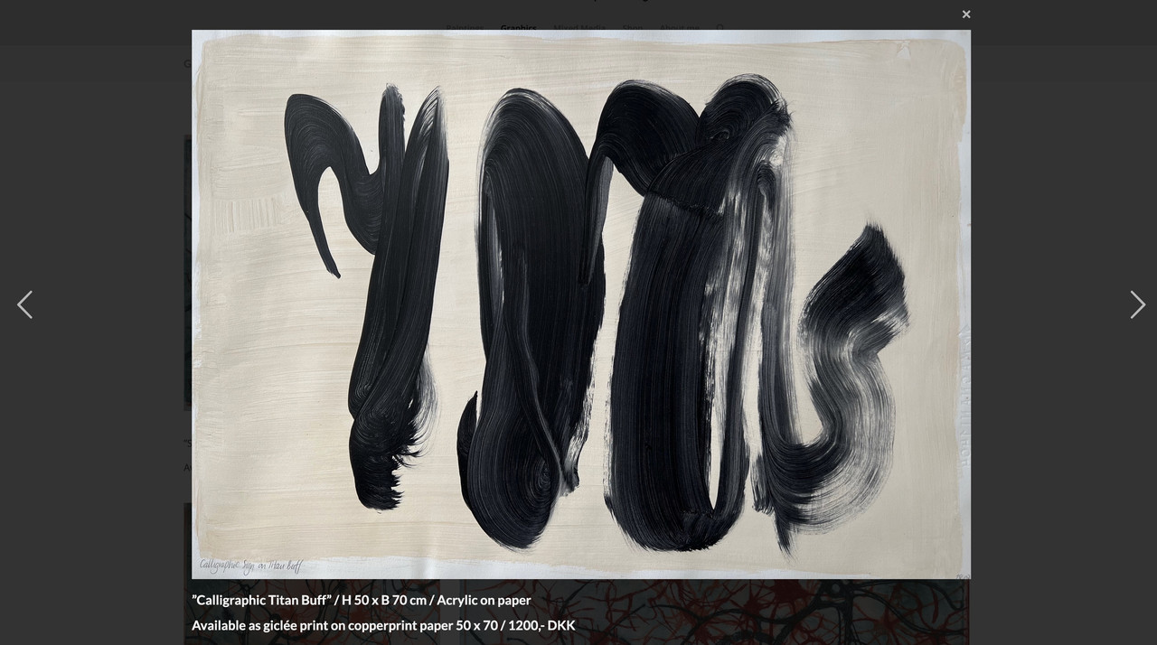
by the way – sometimes the original image is missing – f.e. :
https://www.ullaheegaard.dk/stg_6019f/wp-content/uploads/2018/01/Tillid.jpg
– only thehttps://www.ullaheegaard.dk/stg_6019f/wp-content/uploads/2018/01/Tillid-700x700.jpgexists.
Therefore, I changed the code above so that it only displays the full resolution of images in the lightbox if they are available.the code snippet will work on your page for all images. Even on that graphics page.
But if you create these images in a different way – and i see some Enfold Lightbox on paintings page we had to find then a different solution.
But if you use the same way like on mixed media and graphics page – the code will work there too.But as mentioned – it would be nice to have a fallback for the bottom-bar title on lightbox. my advise – and not only for seo purpose – give an alt tag to your images via media library.
and use that snippet with fallback alt -tag as title inside bottom-bar:
Edit
this checks if original image is present and if widget-text or alt is present :function mixed_media_lightbox() { ?> <script type="text/javascript"> window.addEventListener("DOMContentLoaded", function () { (function($){ $('.widget_media_image').magnificPopup({ delegate: 'img', type: 'image', removalDelay: 500, // to allow animated closing in ms mainClass: 'avia-popup mfp-zoom-in mfp-image-loaded mixed-media', midClick: true, gallery: { enabled:true, preload: [1, 1] , }, image: { titleSrc: false, markup: '<div class="mfp-figure">'+ '<div class="mfp-close"></div>'+ '<div class="mfp-img"></div>'+ '<div class="mfp-bottom-bar">'+ '<div class="mfp-title"></div>'+ // '<div class="mfp-counter"></div>'+ '</div>'+ '</div>', }, callbacks: { elementParse: function(item) { var originalSrc = item.el.attr('src'); var fullSizeSrc = originalSrc.replace(/-\d+x\d+\./, '.'); // Create a temporary image object to check whether the full resolution exists var img = new Image(); img.onload = function() { item.src = fullSizeSrc; }; img.onerror = function() { item.src = originalSrc; }; img.src = fullSizeSrc; item.src = originalSrc; }, markupParse: function (template, values, item) { var title = ''; // Initialize title as an empty string. This is our default fallback. // 1. Highest Priority: Check for content from a nearby .widget_text element var textWidget = item.el.closest('.panel-grid-cell').find('.widget_text'); if (textWidget.length && textWidget.html().trim() !== '') { title = textWidget.html(); } else { // 2. Second Priority: If no text widget, check the image's alt attribute var altAttribute = item.el.attr('alt'); if (altAttribute && altAttribute.trim() !== '') { // Checks if exists AND has non-empty content title = altAttribute; } else { // 3. Third Priority: If no alt, check the image's title attribute var titleAttribute = item.el.attr('title'); if (titleAttribute && titleAttribute.trim() !== '') { // Checks if exists AND has non-empty content title = titleAttribute; } } } // Finally, assign the title to values.title, wrapping it in <h3> ONLY if there's content if (title) { values.title = '<h3 class="heading">' + title + '</h3>'; } else { values.title = ''; // If no title was found at all, ensure nothing is displayed } }, }, }); })(jQuery); }); </script> <?php } add_action('wp_footer', 'mixed_media_lightbox', 9999);And
#top .mixed-media .mfp-image-holder .mfp-content { max-width: 1200px; box-sizing: border-box; padding-bottom: 90px; vertical-align: middle; } #top .mixed-media .mfp-bottom-bar { margin-top: -36px; position: absolute; top: 100%; left: 0; width: 100%; cursor: auto; background-color: rgba(0,0,0,0.3); backdrop-filter: blur(4px); padding: 5px 10px; } #top .mixed-media .mfp-bottom-bar .mfp-counter { right: 5px } #top .mixed-media .mfp-content img.mfp-img { width: auto; max-width: 100%; max-height: 90vh !important; height: auto; display: block; line-height: 0; box-sizing: border-box; padding: 40px 0 40px; margin: 0 auto; } #top .mixed-media .mfp-content .mfp-title .heading * { font-weight: 400 !important; } #top .mixed-media .mfp-content .mfp-title .heading p { margin: 0.3em 0; } #top .widget_media_image img { cursor: pointer; }Now – what you have to do. : not all your images do have that widget_text
See Paintings Page. Or you have tried to do it with enfold lightbox implementation there. ?the script is working – but the shown title is not allways defined. the reason – see above.
Best would be to set an alt or title tag as fallback to all of your images. For SEO purpose it might be better to use the alt tag.
then you had to change the else condition to:values.title = '<h3 class="heading">' + item.el.attr('alt') + '</h3>';this is the main crux:
elementParse: function(item) {
          item.src = item.el.attr('src').replace( /-\d*x\d*\./, '.' );
},
in the callback function. The image link comes now from the src attribute.
because of that extra class on mainClass you can individually set :
see final solution at: https://kriesi.at/support/topic/lightbox-issues-2/#post-1486042not familiar with site origin – but with the magnificPopup script ;)
but you can have your own lightbox script for those pages – using the magnificPopup :
Edit: see final solution at: https://kriesi.at/support/topic/lightbox-issues-2/#post-1486042
your img tags have no title nor alt attributes – but we can use the following description.
You are still using an outdated version of Enfold there. You should update the theme to match the current WordPress version, which uses a newer jQuery. You might want to get help with this. Enfold 4.5.7 and 7.1.1 are quite different, so you may need to customize it further then. At the very least you should have a full backup of your site. I recommend updating as follows: https://kriesi.at/support/topic/some-hints-and-advice-to-update-enfold/#post-1056107
see here example with “burger” always visible – and with #footer-page as overlay.
https://basis.webers-testseite.de/
if you are interested in that – i gave you a step by step guide.
see here an example page ( only with a color-section on that page that represents the footer-page )
https://webers-web.info/navigation/
for that menu item in the main nav i gave a custom-class to that menu-item: pseudoburger and used the label :
<span class="av-hamburger custom-burger av-hamburger--spin"><span class="av-hamburger-box"><span class="av-hamburger-inner"></span></span></span>– this is exactly the usage of the enfold burger icon – plus a custom-class (custom-burger).the color-section got the ID: pseudoburger. (#pseudoburger)
( or if you use the footer-page for that – then you had to adjust all to that ID : #footer-page )i placed now a snipptet to my child-theme functions.php:
function a_pseudo_burger_menu(){
?>
<script type="text/javascript">
	(function($) {
		$('body').on('click', '.pseudoburger > a',  function() {
			$('#pseudoburger').toggleClass('visible-page');
			$('.custom-burger').toggleClass('is-active');
		});
	})(jQuery);
</script>
<?php
}
add_action('wp_footer', 'a_pseudo_burger_menu');
and on quick css:
#top #pseudoburger { position: fixed; top: var(--enfold-header-height); left: 0; z-index: 50; height: 100%; opacity: 0; visibility: hidden; transition: opacity 1s ease; } #top #pseudoburger.visible-page { opacity: 1; visibility: visible; transition: opacity 1s ease; } #top .header_color .custom-burger.is-active .av-hamburger-inner, #top .header_color .custom-burger.is-active .av-hamburger-inner::before, #top .header_color .custom-burger.is-active .av-hamburger-inner::after { background-color: darkblue !important; }to get a “footer-page” with dynamically feed menues – you can use the menu shortcode :
function custom_named_menu_shortcode( $atts ) {
    extract( shortcode_atts( array(
        'name'  => '', // Default to an empty menu name
        'class' => 'custom-menu', // Default CSS class
        'depth' => 0, // Default depth (0 for unlimited)
        'title' => '', // New: Default to an empty title
        'title_tag' => 'h2', // New: Default title HTML tag
        'title_class' => 'menu-title', // New: Default title CSS class
    ), $atts ) );

    $output = ''; // Initialize output variable

    // If a title is provided, add it to the output
    if ( ! empty( $title ) ) {
        $output .= '<' . esc_attr( $title_tag ) . ' class="' . esc_attr( $title_class ) . '">' . esc_html( $title ) . '</' . esc_attr( $title_tag ) . '>';
    }

    if ( ! empty( $name ) ) {
        $output .= wp_nav_menu( array(
            'menu'            => $name,
            'menu_class'      => $class,
            'container'       => 'nav', // You can change this to 'div', false, etc.
            'container_class' => $class . '-container',
            'echo'            => false, // Important: returns the menu HTML instead of printing it
            'depth'           => $depth,
        ) );
    }
    return $output; // Return the accumulated output
}
add_shortcode( 'named_menu', 'custom_named_menu_shortcode' );
it is used like this:
[named_menu name="your-menu-name" class="my-custom-menu" depth="2" title="Our Main Menu"]then you can setup your layout with codeblock elements – each of them represents a menu ( or different shortcode – f.e. social-media )
but for that i wouldn’t use the enfold burger icon – instead i would place a custom Button – perhaps a fixed button to toggle a class to hide/show this page.
Look to your example page of thedive.com – its footer is exactly the burger content ;)
so maybe styling a footer-page and redeclare the hamburger icon with a different event that brings that footer to fullscreen and to fixed position ( left: 0 ; top: var(–enfold-header-height) ) is a possible solution. ( no automatic menü – but that way you like to have it)if you like to bing those arrows to the center of the gallery height:
#top div .avia-gallery { position: relative; } .avia-gallery.av-slideshow-ui .avia-slideshow-arrows { width: 100%; height: 60px; top: calc(50% - 30px); } #top .avia-slideshow-arrows a { top: 0; }have you refreshed all cachings (maybe you got a caching/optimization plugin) – did you “Delete Old CSS And JS Files?” on Enfold – Performance?
Next Hint:
These settings are nearly the last that are loaded – even after quick css – so if you got a mistake on quick css ( missing closing brackets , komma instead of semicolon etc. they will be not loaded. So check your quick css.If you got a link to that page – we can check what happens.
maybe put each of those elements in a separate 1/1 container. The icon-box and the gallery.
or try in quick css:
#top div .avia-gallery { position: relative; }or – more flexible in styling for complete control over the whole screensize ranges – working with grid layout:
#top #wrap_all .avia-custom-gallery .avia-gallery-thumb {
  display: grid;
  grid-template-columns: repeat(auto-fit, minmax(180px, 1fr));
  grid-auto-flow: row;
  gap: 20px;   /*** if you like to have a space between the images ***/
}

#top #wrap_all .avia-custom-gallery .avia-gallery-thumb a {
  width: unset !important;
}
when images are less than 180px – a new row will be created
on 6 items besides each other the setting vor less than 767px is allready set to 33% – and this looks nice to me.
Maybe you only like to influence the range inbetween:
@media only screen and (min-width: 768px) and (max-width: 989px) { #top .avia-custom-gallery .avia-gallery-thumb a { width: 25% !important; } }best would be to have a custom class on that element f.e. bg-colored-sub-menu
#top .av-submenu-container.bg-colored-sub-menu {
  background-color: lightblue;
}
this will only have an effect on the submenu – if you like to have the same bg-color for the list items:
#top .av-submenu-container.bg-colored-sub-menu a { background-color: lightblue; color: #000; border-color: darkblue }is it a gallery or a masonry gallery?
Rikard’s code should do the job – but the specificity is the same as the original rule. So you need to be more specific in your selector or override it with !important.
@media only screen and (max-width: 767px) {
   #top .avia-gallery .avia-gallery-thumb a {
     width: 50% !important;
   }
}
or
@media only screen and (max-width: 767px) {
  #top #wrap_all .avia-gallery .avia-gallery-thumb a {
    width: 50% ;
  }
}
if you do like to have it only on that gallery – use a custom class to that element.
That was exactly my impression, which is why I provided the code above.
__________________________
for masonry it is not that complicated because inside the helper : class-avia-masonry.php there is only one instance of that filter. And no extra_args are needed:function my_masonry_customize_heading_settings( array $args, $context){ if( $context == 'avia_masonry' ){ $args['heading'] = 'h2'; } return $args; } add_filter( 'avf_customize_heading_settings', 'my_masonry_customize_heading_settings', 10, 2 );Eventuell wird es dir auf dieser Seite deutlicher. https://webers-testseite.de/sticky-sidebar/
Das unmittelbare Elternelement zu dem Sticky Element ( bei Columns in einer Color-Section ist es der entry-content-wrapper ) muss der Flex-Container sein. Und auf deiner Seite muss gelten:
.responsive #top {
    overflow-x: visible;
}

 #top #wrap_all {
    overflow: visible;
}
Da es nur Sinn macht, wenn die Columns nebeneinander liegen, setzt man die Flex Bedingung am besten nur für diesen Fall ein; also für screens die größer sind als der Umbruchpunkt (768px oder 990px)
i guess you are talking about the usage of the filter on line: 1156 – the other lines ( 3times that filter is set inside portfolio.php) allready do have h2 as default.
Can you show us that page it belongs too? You are definitly using the portfolio element to show those portfolios? Because there are many ways to show them even as masonry with portfolio-entries.these filters are used on a different context (see line 698) too – maybe try:
function my_portfolio_heading_settings( array $args, $context, array $extra_args = array() ){ if( $context == 'avia_post_grid' && is_array( $extra_args ) && in_array( 'not_one_column_template_special', $extra_args )){ $args['heading'] = 'h2'; } return $args; } add_filter( 'avf_customize_heading_settings', 'my_portfolio_heading_settings', 10, 3 );but you do not belong to the up and down of “Kia Ora!” section?
This comes from the slider above – that has 3 Groups and the last only got 4 items. So it’s height is less than the others.
June 19, 2025 at 8:47 am in reply to: Fullwidth Easy Slider only works in smartphone and tablet, not desktop #1485664what do you mean by “only works” is it present but does not show prev. next slides ? or is there no slider at all?
the element itself got an option on Advance Tab to show/hide the slider for responsive cases:

are there any checkmarks checked inside your slider?
June 18, 2025 at 7:54 am in reply to: Can you please consider adjusting the Quick CSS section? #1485619Did it solve your problem, or did you find it to be less important than you thought?
ok – then a link to a page to which the question refers would have been helpful.
http://wordpress.p691093.webspaceconfig.de/portfolio_entries/harfen-treppen/I had understood him differently. For example, if he opens the page : Link via the menu, then it should open directly in the opened ajax style.
Versuch doch mal das in der child-theme functions.php:
function trigger_click_on_ajax_categories(){
?>
<script>
(function($){
    $(window).on('load', function(){
        // Prüfen, ob das Element mit der Klasse 'grid-links-ajax' auf der Seite existiert
        if ($('.grid-links-ajax').length > 0) {
            setTimeout(function() {
                // Sicherstellen, dass das erste Element vorhanden ist, bevor der Klick ausgelöst wird
                const firstGridItem = $(".grid-links-ajax .grid-entry.first");
                if (firstGridItem.length) {
                    firstGridItem.find('.grid-image').trigger('click');
                }
            }, 300);
        }
    });
})(jQuery);
</script>
<?php
}
add_action('wp_footer', 'trigger_click_on_ajax_categories');
eventuell musst du das timing etwas erhöhen.
#menu-item-2351 {
  margin-left: 5px;
}
#av-burger-menu-ul .menu-item-2351 {
  margin-top: 10px !important;
}
if you like to have more distance in hamburger menue too.
-
AuthorPosts