Forum Replies Created
-
AuthorPosts
-
see here an example page with different scenarios.
on the centered flipbox there is backside first ! so you can see what the height of the flipbox determines ( if you have not choosen a min-height on the options).
See on the last flipbox – what happens if you have a big original image inserted – but with no-repeat – no stretch.Now, please could you explain how this is supposed to work with a responsive layout, where the width of the grid cells changes according to the width of the screen?
The size of the Flipbox depends on your content, not the images (as these are defined as background images).Firstly, please explain where the images are located. Are they on the front or back? It is also important to specify which element should be displayed first. You also have the option of displaying the back first and then the front on hover.
What options did you choose on background-image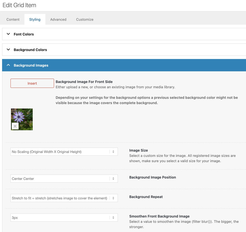
maybe you can make the link public – that even me and other participants can inspect the problem.
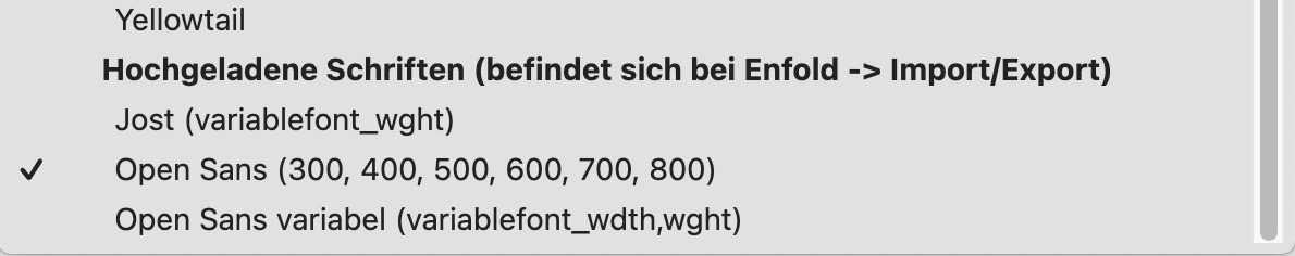
btw: using variable fonts can be very interesting – but there are a lot of new css declarations to know – see here a playground:
https://variablefonts.io/about-variable-fonts/Wenn du also doch lieber mit einem selbstgehosteten OpenSans arbeiten möchtest. Dann sag bescheid – welche Schriftschnitte du brauchst, dann lade ich das file auch hoch.
PPS: übrigens OpenSans ist ja noch harmlos, RobotoFlex ist ein Super Variabler Font mit mehreren Axen die bedient werden können:
Firefox (Developer Version) hat für Schriftarten einen eigenen Reiter, an dem man herumspielen kann mit diesen Einstellungen. Wenn man dann mit dem Resultat zufrieden ist, geht man zurück zum Regelsatz, und kann sich das als css heraus kopieren:
(das Element für das du dann rumgespielt hast, muss dann noch durch den eigentlichen Selektor ersetzt werden)Element { font-size: 140px; line-height: 1.1em; letter-spacing: 5px; font-weight: 612; font-stretch: 113%; font-variation-settings: "opsz" 8, "GRAD" 87; font-style: oblique 7.45deg; }In this context, I would like to ask you a general question. The following picture shows what happens when you uploaded the font.

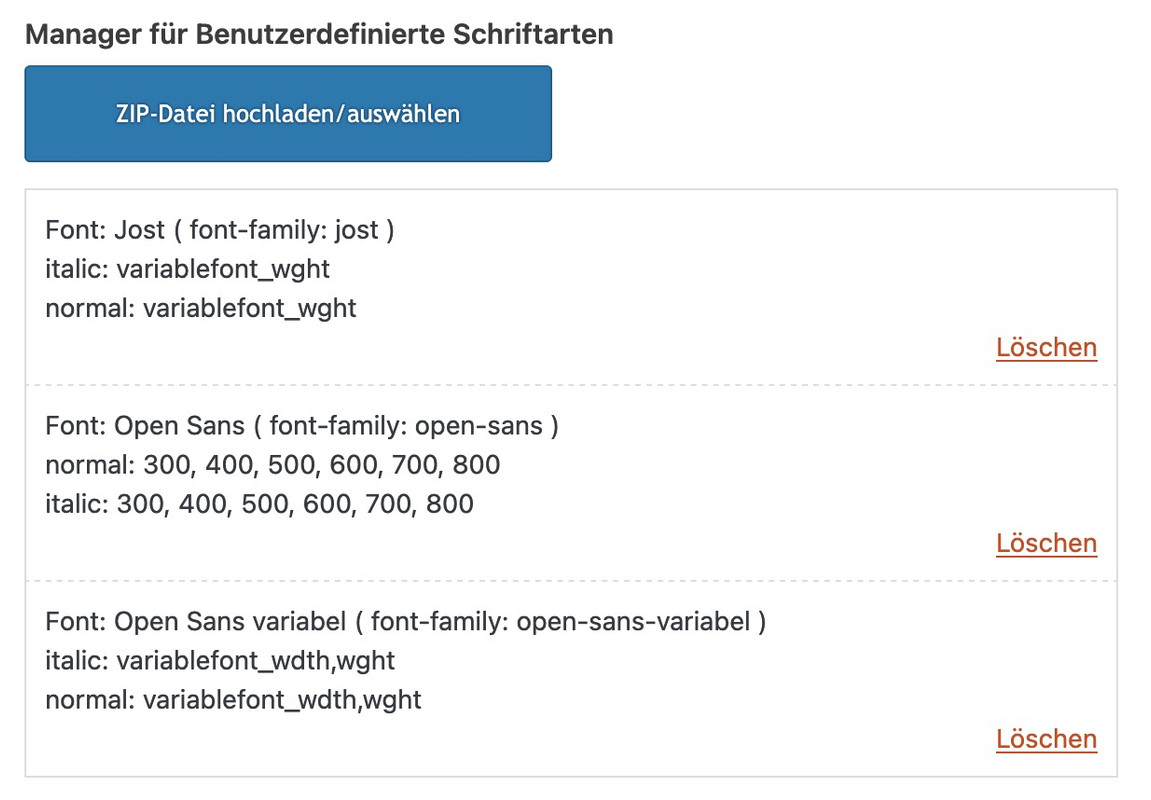
If I want to use variable fonts, I upload static and variable fonts in separate ZIP files.
and:
You can then use the variable font style only for your page and, as the name suggests, define the weight and width variables for Open Sans, for example. There are predefined settings internally. So, if you are still using the old designations, such as ‘Condensed Semibold’ then would be wght: 600; wdth: 75%
This means that the font is rendered as font-weight:600 and the letters would be 75% wide.In the meantime, it seems to be justifiable to use only the variable font.
However, if you only need a few font styles, it may be more performant to upload only the few static font styles. For example, just one zip file containing only OpenSans 300, 400 and 700. With many fonts, the italic font rendered by the browser differs only slightly from the dedicated italic font (this is mainly the case with serif fonts)PS: So my advice is. Upload only the varialbe font. Make sure that the woff2 files are included in the zip. They are even smaller as a file and are rendered faster by the browser.
And here is the problem: Google only offers ttf as font files. I created with a comandline tool the ttf to woff2 files:
OpenSans-Variable.zipSomething like that makes me sad, when a solution is presented and there is no response since the question was posted.
July 17, 2025 at 11:40 am in reply to: How do I add a class to an image so it has rounded corners #1486926How did you create this image with text underneath?
See here : https://webers-testseite.de/mie-2/
Mailer: Other SMTP
SMTP Error: data not accepted.SMTP server error: DATA END command failed Detail: Spam message rejected
SMTP code: 554 Additional SMTP info: 5.7.1______
i use smtp mail very often – and if your settings are ok. there are no errors at all.
As mentioned above – check your DNS settings of the concerning Domain.see here : Listpoints 3,4,5,6
https://www.courier.com/error-solutions/smtp-error-554Whether an email is considered spam or not depends on the recipient. If the SPF record is missing, some recipients will accept it, while others will immediately classify it as spam. The same applies to DMARC1.
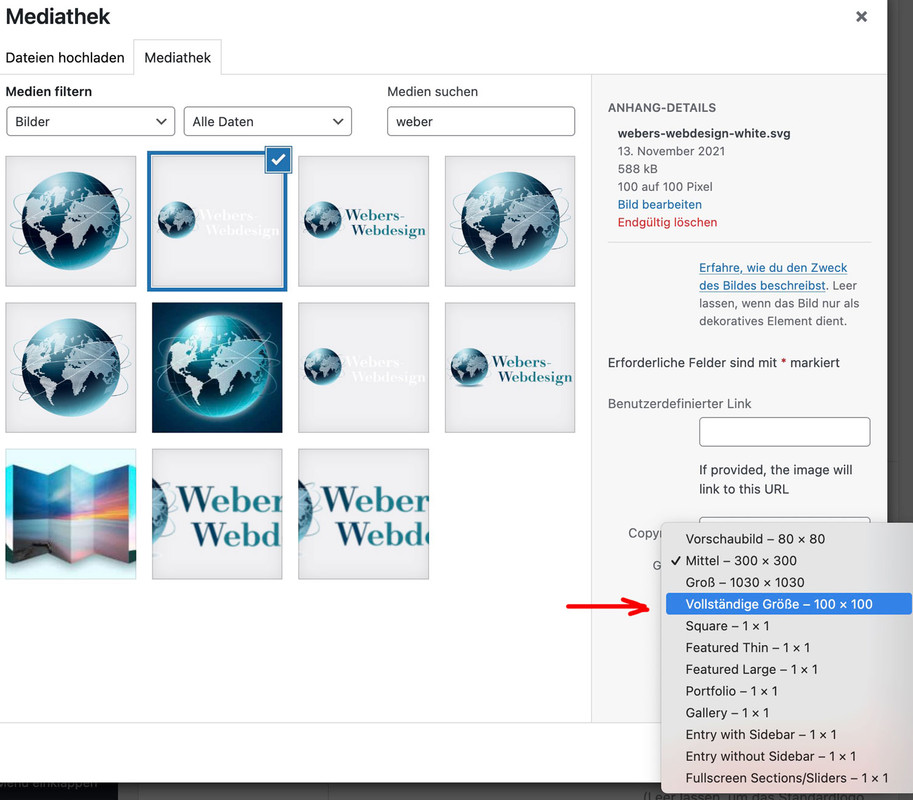
bei dem grünen Logo bitte auch die original Größe einsetzen!
July 16, 2025 at 4:01 pm in reply to: Stretch background image to edge of screen on half column #1486884maybe this is helpful – use your idea of grid-row.
my page setting is 1510px – so half width is 755px ( that is the value you see on that example page )
(there has to be the same padding left/right as section container) see comment in code. – If you break the cells at 989px than media query had to be adjusted.
diese beiden png’s sind im Original so klein (gemeint ist die file Größe – die hier kleiner als 60kb ist). , das du bei der Auswahl ruhig die originale einsetzten kannst. Also wenn das mediathek Fenster öffent dann das File auswählen und rechts dann die original Größe auswählen und einsetzen. ( eben nicht die kleingerechnete mittlere Variante ) – dann wird es auch schärfer.
PS: damit das weiße Logo auch ein wenig mehr heraussticht, könntest du dem einen Schatten hinzufügen – das hier in das Quick CSS Feld einsetzen:
#top .alternate.avia-standard-logo { filter: drop-shadow(2px 2px 3px #000); }we do not need to edit the section.php
maybe it is enough to have a child-theme footer.php to have no main tags inside the page that is the footer-page.
find:$content = Avia_Builder()->compile_post_content( $post );after that line add :
// NEW: Remove <main> tags AND the role="main" attribute from the compiled content of the footer page
// Step 1: Replace opening <main> tag (with any attributes) with <div and preserve attributes, but remove role="main"
// This regex specifically targets 'role="main"' within the attributes and removes it.
$content = preg_replace('/<main([^>]*)role="main"([^>]*)>/is', '<div$1$2>', $content);

// Step 1b (Fallback): If role="main" was not present, or if it's the only attribute,
// simply replace <main...> with <div...>
// This ensures that if the main tag didn't have role="main", it still gets converted to div
$content = preg_replace('/<main([^>]*)>/is', '<div$1>', $content);

// Step 2: Replace closing </main> tag with </div>
$content = str_replace('</main>', '</div>', $content);
it will replace the main tag with div tag – and removes the role=”main”
use that edited footer.php inside your child-theme root directory.__________
shortform without the comments:
$content = preg_replace('/<main([^>]*)role="main"([^>]*)>/is', '<div$1$2>', $content); $content = preg_replace('/<main([^>]*)>/is', '<div$1>', $content); $content = str_replace('</main>', '</div>', $content);The solution of Ismael will work – but it would be nice to have this only for the page used as footer-page.
Enfold uses that main sometimes in a bit different way : as id=”main” and with role=”main”
if there is a main tag – enfold sets it to role=”main”
see here some thought to it. https://developer.mozilla.org/en-US/docs/Web/Accessibility/ARIA/Reference/Roles/main_role
But as with the main tag, the main role should only be used once in the document!Edit: yes – now i see that on using a page as footer – there is another main tag. …
versuch mal diese beiden : https://webers-testseite.de/Andrea.zip
das weiße dann für die Transparenten Header:
weisses LogoDamit du das Logo größer bekommst, solltest du das png nicht mit soviel Freiraum ausstatten:
Wenn du es so anlegst, dann wird es schon klappen:
https://i.postimg.cc/cLBm3N8R/Bildschirmfoto-2025-07-16-um-13-28-59.jpgkannst Du den Link zu der entsprechenden Seite öffentlich machen?
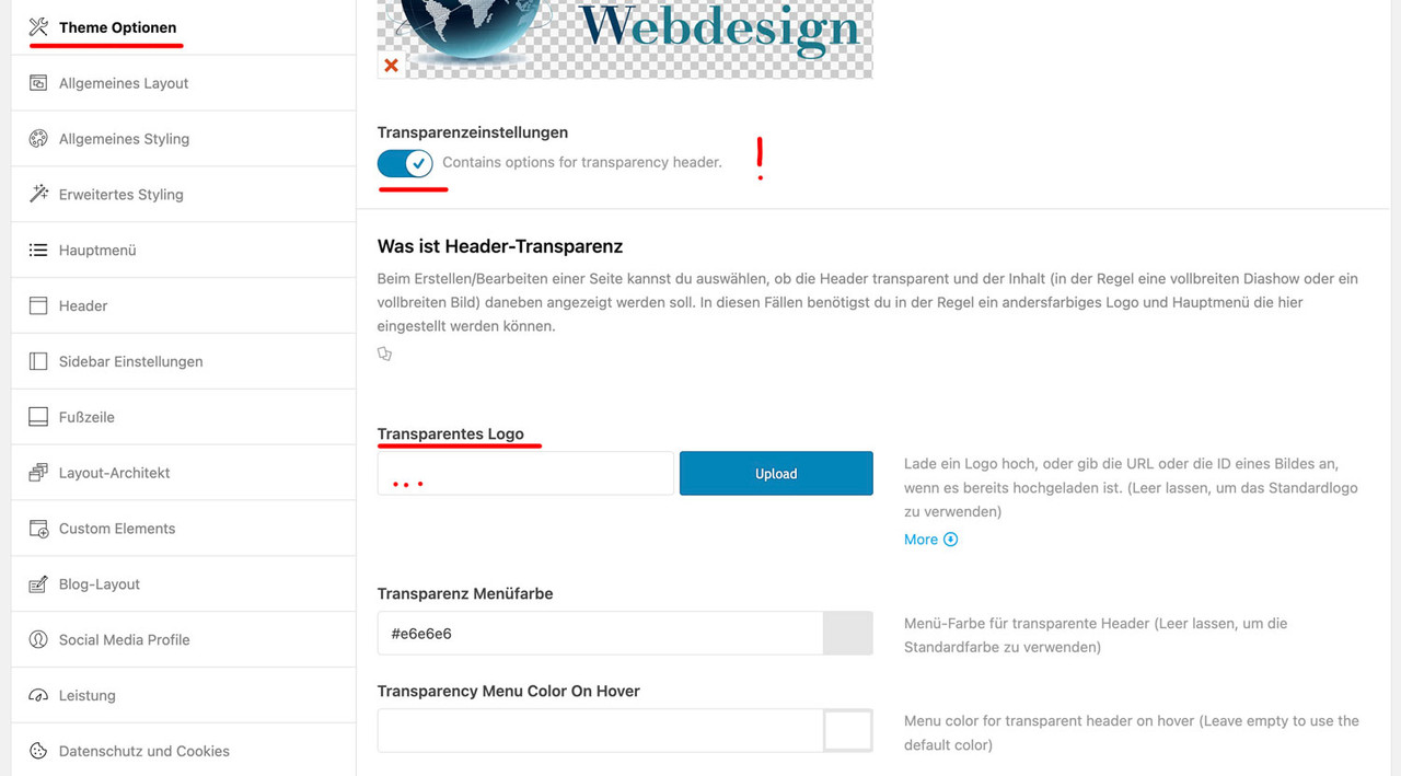
Das erleichtert einiges. Als Mitstreiter sehe ich die Links im private content nicht.Ich vermute mal, das die Seite wo noch ein Enfold Logo gezeigt wird solche sind bei denen der Header transparent ist.
Für diese Option, die man auf den entsprechenden Seiten im Editor rechts einstellen kann, gib es ein alternativ Logo.
Das setzt man unter Enfold ( Enfold-Child falls du das eingerichtet hast) – Theme Optionen – Transparenzeinstellungen
aktivier den Switch (“Contains options for transparency header.”) – dann kannst du die Felder sehen, wo das Logo für die Transparenten Seiten eingefügt wird.klicke es um es zu vergrößern:
what kind of form is it? If you are using contact form 7 you can listen to wpcf7mailsent and after a time you can close the popup with it.
maybe your form got something similar.for example you can close a magnificPopup by adding this to your popup function:
document.addEventListener( 'wpcf7mailsent', function( event ) { setTimeout(function() { $.magnificPopup.close(); }, 1000); }, false );you are shure about your smtp server address? – and Password – and how do you connect SSL or TLS ?
What provider is it?On wp smtp mail there are tools – email test : did you send a test-mail ? “Send a Test Email”
next : did you edit your Domain DNS and have you set the – spf-record ; DMARC and maybe DKIM ?
The place where you can insert the favicon to enfold options – there is a comment on the right side:
Specify a favicon for your site.
Accepted formats: .ico, .png, .gif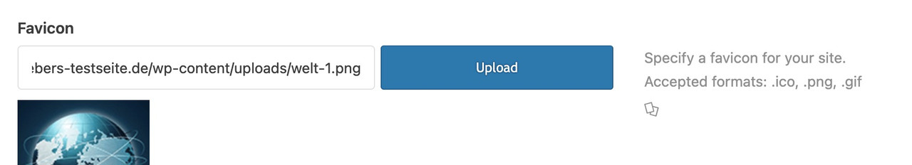
if you follow that link ( that two cards icon) you will see the browsersupport.
on the bottom :
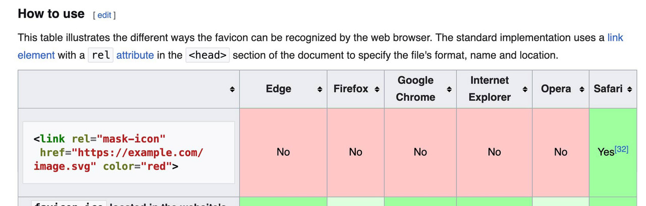
so: better do not use svg as favicon!
if you like to use svg have a fallback solution: https://css-tricks.com/svg-favicons-and-all-the-fun-things-we-can-do-with-them/Obviously, you have more faith in a moderator than in an experienced participant. There is no danger of trying one of them – and if that doesn’t work, testing the other solution.
A full-width slider is responsive by default, so there’s no reason to define heights or minimum heights here. Only if the content of the color section gets bigger in height than the height of the background-video (or background-image). See here for example – there a min-height would be nice: https://kriesi.at/themes/enfold-wedding/I can’t provide any more proof of this than the video, which shows a screen width of 320px.
So if you say that you have removed this minimum height from the color section, and have removed this one rule from the quick css; have saved everything, then it can actually only be due to a caching tool or to the Enfold own (merged or minified css) settings that I still see these settings in your source code.
I’m going to take a break from here.
Last hint – you can force my results if you place inside your quick css instead:
#top.home #wrap_all #full_slider_1, #top.home #wrap_all #full_slider_1 .avia-slideshow, #top.home #wrap_all #full_slider_1 .avia-slideshow-inner, #top.home #wrap_all #full_slider_1 .avia-slide-wrap { min-height: unset !important; height: unset !important; }and you inserted that video with code-block element as described.
Please send me the link to your page. ( contact under my avatar )___________
Solution for color-section and background-video:
First – you had to know what aspect ratio is your selfhosted video!
you had to insert this to the color-section when you fill out the elements options:
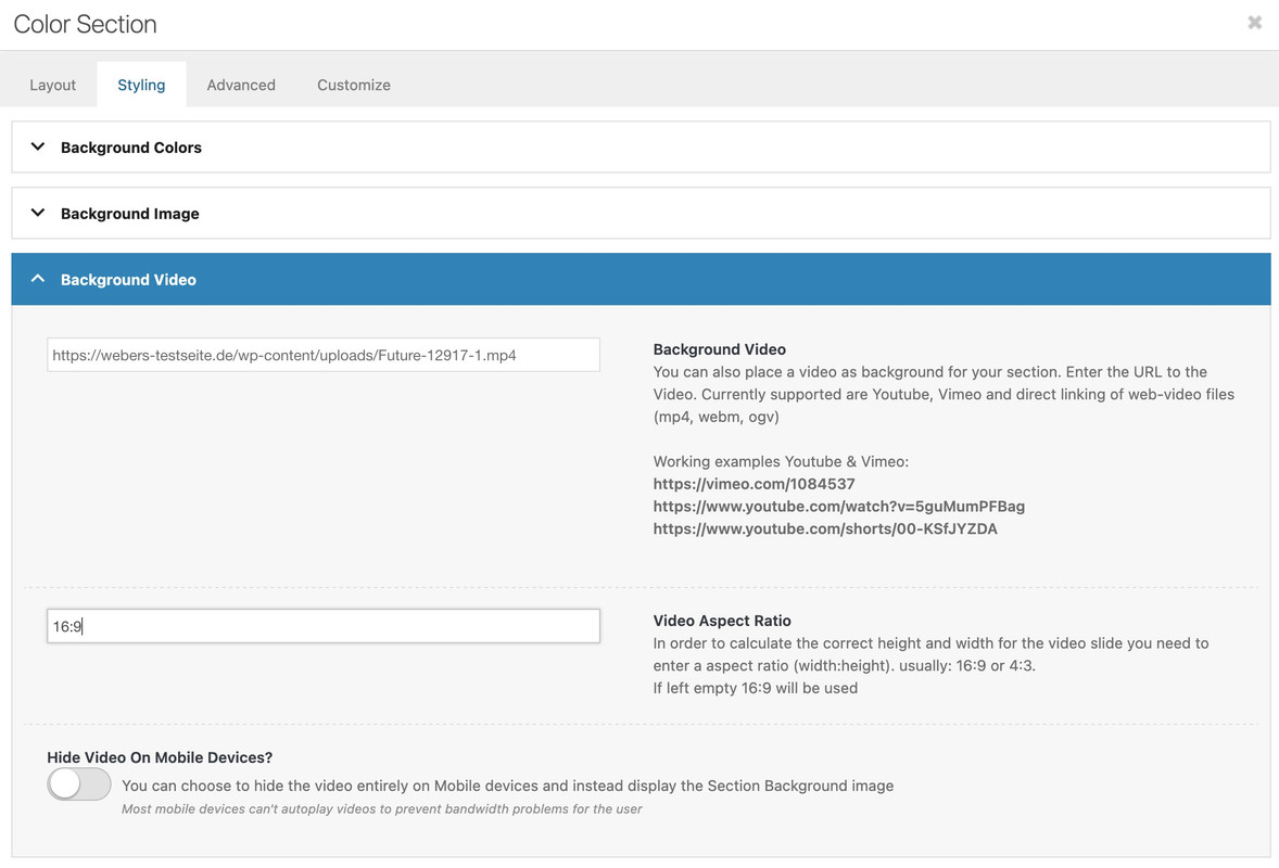
in most cases it will be a 16/9 video aspect ratio. – if not you can insert there a different value.
then have a look to: https://webers-testseite.de/html5-video-ben/
but you have read the instruction:
this is the content of my code-block element inside a color-section
custom class on that color-section is: html5-videothe css code isn’t all needed if you do not want to have an overlay over the video ( other enfold elements )
this is then sufficient:#top .html5-video .responsive-video { width: 100%; height: auto; display: block; } .responsive #top #wrap_all .html5-video .container { max-width: 100% !important; width: 100%; padding: 0; } #top .html5-video .content { padding: 0; }But i will make a color-section solution with background video and the needed css for you now
See what happens – when i switch off these height / min-heigt settings in dev-tools :
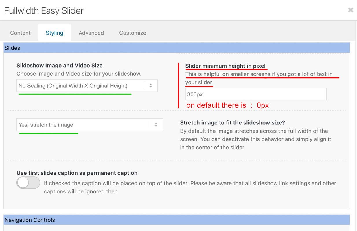
any height and min-height is not necessary here – remove everything that is noted in your CSS regarding this slider; or is set in the element itself!
This setting only exists because the background must fulfill the height of the content. See the comment next to the min-height setting:Slider minimum height in pixel
This is helpful on smaller screens if you got a lot of text in your sliderHowever, this is not the case here, which is why you can drive responsively up to very small screens.
you got still in – i guess quick css:
@media only screen and (max-width: 479px) {
  .home #full_slider_1,
  .home #full_slider_1 .avia-slideshow,
  .home #full_slider_1 .avia-slideshow-inner,
  .home #full_slider_1 .avia-slide-wrap {
    min-height: 300px;
  }
}
and an inline svg for that element:
is setting it to :Element { padding: 0px; height: 300px; transition: none; transform: translateZ(0px); }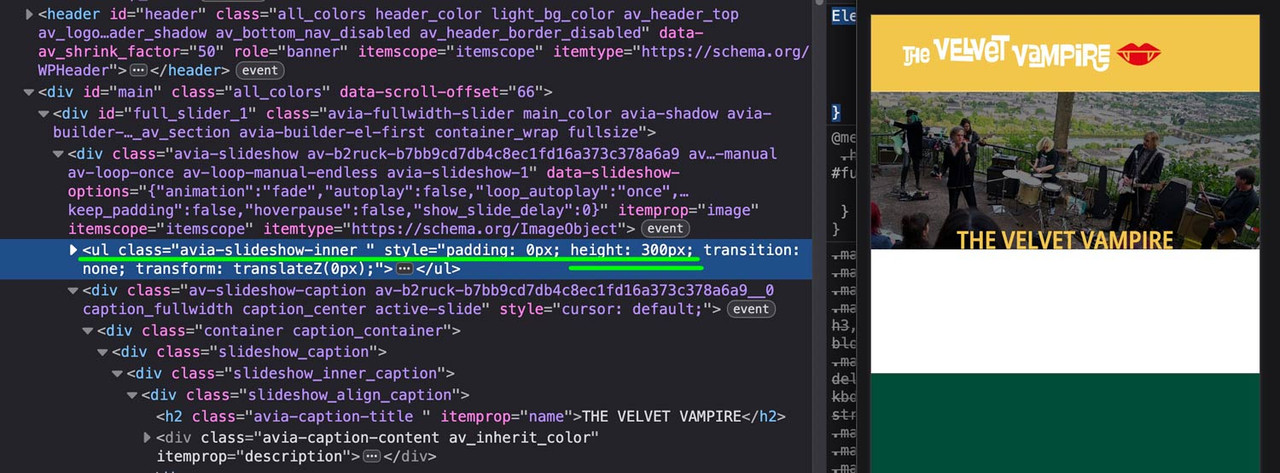 July 10, 2025 at 8:05 am in reply to: Header widget showing above logo on mobile and tablet – how to reposition #1486573
btw. i optimized those rules a little – and you do not need to shrink the menu items font-size – because it breaks to burger menu earlier.
So : better remove all the code from above – and insert instead:
#top #header .av-main-nav > li > a { font-size: 16px !important; padding: 0 12px !important; } @media only screen and (min-width: 1430px) { #header #header_main { width: 1430px; margin: 0 auto; } } @media only screen and (min-width: 990px) { #header #header_main { display: flex; flex-flow: row wrap; justify-content: space-around; } #header #header_main > * { flex: 1 1 auto; align-self: center; width: unset; } #header #header_main .av-logo-container { flex-basis: calc(100% - 170px); flex-grow: 1; order: 1; max-width: unset; } #header #header_main .widget { margin-right: 50px; flex-grow: 0; flex-basis: 120px !important; order: 2; display: flex; justify-content: center; } #header #header_main #header_main_alternate { flex-basis: 100%; order: 3; border-top: none; } } @media only screen and (max-width: 989px) { #header #header_main { display: flex; flex-flow: wrap column-reverse; } #header #header_main .widget { margin-top: 0px; padding: 10px 0 !important; } #header_main .av-logo-container { height: 150px !important; } #header_main .inner-container { display: flex; justify-content: space-between; align-items: center; height: 150px; } #header_main .inner-container > * { align-self: center; } #header_main .inner-container .main_menu { display: flex !important; align-items: center; } #header_main .inner-container .avia-standard-logo { width: 215px } #header_main .inner-container .main_menu .social_bookmarks { top: 0; margin-top: 0 !important; } } @media only screen and (max-width: 767px) { .responsive #top #wrap_all .main_menu { position: relative !important; } }so your video is inside media library ? and should be placed as html5 video!
you can force even background-videos inside color-sections to be that way – or video element inside a color-section – but my prefered way is to use codeblock element. – if you do not like that solution- tell me how you like to do it.
see here example and code to use:
https://webers-testseite.de/html5-video-embed/
or
https://webers-testseite.de/html5-video-bhe/and after doing that – try:
@media only screen and (max-width: 479px) { .html_header_transparency #top .avia-builder-el-0 .container, .html_header_transparency #top .avia-builder-el-0 .slideshow_caption { padding-top: 25px; } @media only screen and (max-width: 476px) { #top .avia-caption-content { display: none!important } } }All you need is to get rid of the min-height option – the fullwidth slider is a responsive slider !
for the caption it might be neccessary to have for very small screens smaller font-sizes – or to set a part (f.e. the avia-caption-content to display:none )
you got a rule :
@media only screen and (max-width: 489px) {
  .avia-slideshow li img {
    width: 100%;
    background-size: cover;
    height: 200px;
    object-fit: cover;
    left: 30px !important;
    position: relative;
    overflow: visible;
  }
}
Remove the rules given to you by ismael first because …
remove the left position – and height – otherwise you will have a gray bar on the left ;)
then there are some min-height properties:
inline-styles
@media only screen and (max-width: 489px) {
  .home #full_slider_1, .home #full_slider_1 .avia-slideshow,
  .home #full_slider_1 .avia-slideshow-inner, .home #full_slider_1 .avia-slide-wrap {
    min-height: 200px;
    height: 200px !important;
  }
}
and enfold css:@media only screen and (max-width: 479px) { .home #full_slider_1, .home #full_slider_1 .avia-slideshow, .home #full_slider_1 .avia-slideshow-inner, .home #full_slider_1 .avia-slide-wrap { min-height: 300px; } }don’t know where they come from. But if you like to see the full width of the image – these settings are suboptimal.
July 9, 2025 at 1:16 pm in reply to: Header widget showing above logo on mobile and tablet – how to reposition #1486512my solution – a little adjust of css from ismael – but easiest way is to remove it – and remove please the rule:
#header_main .widget {
  display: flex;
  align-items: center;
  margin-left: 85%;
  margin-top: 2%;
  position: absolute;
}
now try:
@media only screen and (min-width: 1430px) {
  #header #header_main {
    width: 1430px;
    margin: 0 auto;
  }
}

@media only screen and (min-width: 990px) {
  #header #header_main {
    display: flex;
    flex-flow: row wrap;
    justify-content: space-around;
  }
  #header #header_main > * {
    flex: 1 1 auto;
    align-self: center;
    width: unset;
  }
  #header #header_main .av-logo-container {
    flex-basis: calc(100% - 170px);
    flex-grow: 1;
    order: 1;
    max-width: unset;
  }
  #header #header_main .widget {
    margin-right: 50px;
    flex-grow: 0;
    flex-basis: 120px !important;
    order: 2;
    display: flex;
    justify-content: center;
  }
  #header #header_main #header_main_alternate {
    flex-basis: 100%;
    order: 3;
    border-top: none;
  }
}

@media only screen and (max-width: 989px) {
  #header #header_main {
    display: flex;
    flex-flow: wrap column-reverse;
  }
  #header #header_main .widget {
    margin-top: 0px;
    padding: 10px 0 !important;
  }
}
sadly we loose with this the border-top of #header_main_alternate – or you can live with it that the border-top does not have the full screen-width.
then remove that border-top: none line.July 9, 2025 at 11:15 am in reply to: Header widget showing above logo on mobile and tablet – how to reposition #1486506which hook do you use to have that widget?
____________
next hint: header_main_alternate is an ID so use as selector #header_main_alternate
and you do not need to put it in account because in responsive case it is at display: noneso you do not need to set order!
it is enough if you go and set flex-direction to column-reverse to bring the button below logo container.@media only screen and (max-width: 989px) { #header #header_main { display: flex; flex-wrap: wrap; flex-direction: column-reverse; } }btw. it is a good practice if you choose even values for min-width and odd values for max-width.
-
AuthorPosts