Forum Replies Created
-
AuthorPosts
-
If you changed it to that. – without bg-fixed extra class.
we had to style your settings on layerslider in between content. and full-screenslider needs a higher z-index too:as i said above – your setting is different to that of the topic starter post.
This custom class is for changing backgrounds in color-sections.
you set your background to a class:i did it as you have done it via main-color class and not to have it on my domain globaly i included page-id:
.page-id-37336 .main_color {
    background-image: url(https://webers-testseite.de/wp-content/uploads/main-background-90.jpg);
    background-repeat: no-repeat;
    background-attachment: fixed;
    background-size: 0 !important;
   /**** clip-path: inset(0 0 0 0);   get rid of that ****/
}
and set the background-size to 0
( on that case the clip-path has to go )now we create the pseudo container for it:
.page-id-37336 .main_color:before {
  background-image: inherit !important;
  background-repeat: no-repeat !important;
  content: "";
  position: fixed;
  width: 100%;
  height: 100%;
  top: 0;
  left: 0;
  background-size: cover;
  will-change: transform;
}
now we need to rise the z-index of the container for that page:
.page-id-37336 .container {
   z-index: 5
}
see here my test page: https://webers-testseite.de/multiple-color-sections/
-
This reply was modified 5 years, 11 months ago by
Guenni007.
yes now i can see : on home 2 in which color-section or section is a link which does not work?
To give advice – i had to see the issue – so put in the class again please –
or make a copy of the site and place the class there and send me the link.Edit: i can see now that the background-image on that page does not come from the color-section itself ( color-section options dialog) it is a css
to .main_color
and it shold work the whole page where main-color is used.
i try to create a page that is nearby yours. but this is definitely a different starting point-
This reply was modified 5 years, 11 months ago by
no link on your post –
the links in private content i can not see !!! only mods can see these links ( and the author)
The private data field is not visible for other participants – that is the intention.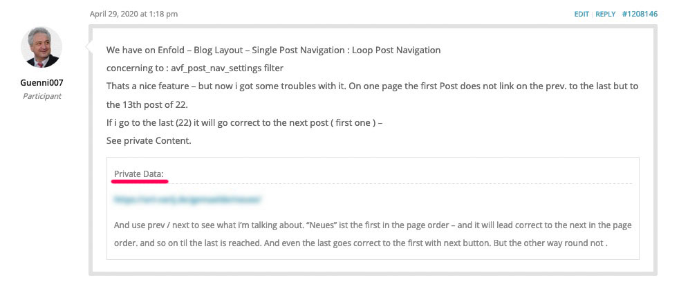
i tested it on my site: https://webers-testseite.de/background-fixed/
you see an image gallery works – even a heading with linki’m participant as you are – so i do not see any private content.
this will work but that hook goes as first child in header_main.
Where in the DOM you like to insert that html?add_action('ava_main_header' , 'add_libsyn_header'); function add_libsyn_header() { ?> <div style="display: none">Libsyn</div> <?php }maybe the ava_after_body_opening_tag is a good place for you? otherwise tell us where you like to place it exactly.
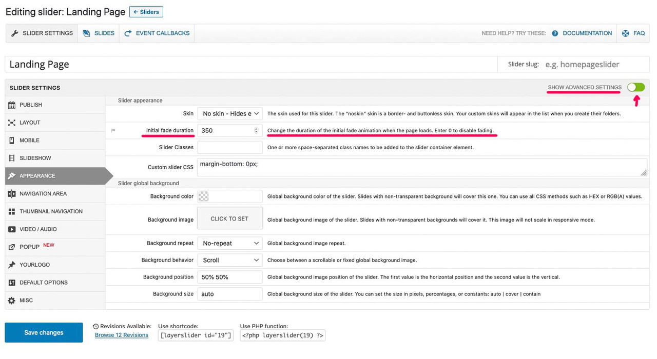
or to have a child-theme header.php with that entry directly after wrap_all opensi would follow the advice from victoria given on top ( the background-images got a setting for that on color-section options too) – but even if you are playing with the advanced layerslider there is a setting for that.
Go to slider settings and choose on the right side the “show advanced settings”
then there is on the tab : appearance the setting for : “initial fade duration”
this is on default by 350ms
 May 6, 2020 at 9:12 pm in reply to: Featured image by default in post with Avia, possible ? #1210480
or better to preserve the meta box setting – see image above even for ALB created Posts and Portfolios
because on the most cases it makes no sence on showing the featured image on a post or portfolio created with advanced layout builder
add_filter('avf_template_builder_content', 'avf_template_builder_content_postimage_mod', 10, 1);
function avf_template_builder_content_postimage_mod($content = "")
{
  if(
  	is_singular('post') && ( '1' != get_post_meta( get_the_ID(), '_avia_hide_featured_image', true ) )
  	|| is_singular('portfolio') &&  ( '1' != get_post_meta( get_the_ID(), '_avia_hide_featured_image', true ) )
    )
  {
    $featuredImage = get_the_post_thumbnail( $the_id, 'entry_with_sidebar' );
    $content = $featuredImage . $content ;
  }
  return $content;
}
May 6, 2020 at 8:34 pm in reply to: Featured image by default in post with Avia, possible ? #1210470if you are styling the post with the classic editor you have the opportunity to choose – that the featured image is shown on the post:
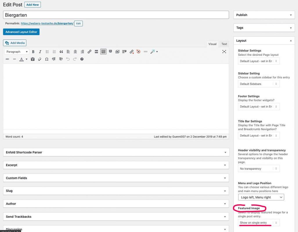
Allthough you can set this even if you style your post with the advanced layout builder (alb) – this setting has no influence and the featured image isn’t shown on the single post!
The code for your child-theme functions.php sets this as default behavior.
May 6, 2020 at 5:03 pm in reply to: Featured image by default in post with Avia, possible ? #1210393see here the topic: https://kriesi.at/support/topic/beitragsbild-eines-blogbeitrags-automatisch-anzeigen/#post-1202606
You mean if you are using the alb even for posts.
In that solution put into your child-theme functions.phpadd_filter('avf_template_builder_content', 'avf_template_builder_content_postimage_mod', 10, 1); function avf_template_builder_content_postimage_mod($content = "") { if(is_singular('post') || is_singular('portfolio') ) { $featuredImage = get_the_post_thumbnail( $the_id, 'entry_with_sidebar' ); $content = $featuredImage . $content ; } return $content; }you have the choice what image you like to have instead of entry_with_sidebar
just replace that from the list out of : widget, square, featured, featured_large, extra_large, portfolio, portfolio_small, gallery, magazine, masonry, entry_with_sidebar, entry_without_sidebar________________________________
Excerpt from the functions.php concerning the sizes.$avia_config['imgSize']['widget'] = array('width'=>36, 'height'=>36); $avia_config['imgSize']['square'] = array('width'=>180, 'height'=>180); $avia_config['imgSize']['featured'] = array('width'=>1500, 'height'=>430 ); $avia_config['imgSize']['featured_large'] = array('width'=>1500, 'height'=>630 ); $avia_config['imgSize']['extra_large'] = array('width'=>1500, 'height'=>1500 , $avia_config['imgSize']['portfolio'] = array('width'=>495, 'height'=>400 ); $avia_config['imgSize']['portfolio_small'] = array('width'=>260, 'height'=>185 ); $avia_config['imgSize']['gallery'] = array('width'=>845, 'height'=>684 ); $avia_config['imgSize']['magazine'] = array('width'=>710, 'height'=>375 ); $avia_config['imgSize']['masonry'] = array('width'=>705, 'height'=>705 , $avia_config['imgSize']['entry_with_sidebar'] = array('width'=>845, 'height'=>321); $avia_config['imgSize']['entry_without_sidebar']= array('width'=>1210, 'height'=>423 );-
This reply was modified 5 years, 11 months ago by
sorry i was sure that on former enfold versions this is a menu-item that stays visible in this manner.
In addition to the above add to the quick css:
.html_burger_menu_active .menu-item-avia-special {
    display: block !important;
}
and if you like to change the positions:
.av-main-nav li {
    float: right;
}
maybe here is an important too needed – but test it first without
-
This reply was modified 5 years, 11 months ago by
What I do not quite understand is that your entire body remains scrollable. With the New Enfold, I thought that was fixed. It means Lightbox window is only scrollable if content is too big and background is fixed.
Did you change anything about that?
You can see here behavior of lightbox images what i mean: https://webers-testseite.de/abcdef/Actually I didn’t want to give any more advice when the right click is blocked. Why are you making it hard on the one who wants to help?
Anyway: for the lightbox image size there are some snippets depending on what is shown :
in your child-theme functions.php you can try this:
function avia_change_masonry_thumbnail_link($size){
  return "full";
}
add_filter('avf_avia_builder_masonry_lightbox_img_size', 'avia_change_masonry_thumbnail_link', 10, 1);
or that:
function avia_change_gallery_thumbnail_link($link, $attachment, $atts, $meta){
    $link = wp_get_attachment_image_src($attachment->ID, "full");
    return $link;
}
add_filter('avf_avia_builder_gallery_image_link', 'avia_change_gallery_thumbnail_link', 10, 4);
then the full image is taken instead of the large one!
if you like to enlarge the lightbox window – we will see when the above is done.can you read further on : https://kriesi.at/support/topic/drag-drop-not-working/
do you know how to give a custom class to your menu items?
On Dashboard – Appearance – Menus
you can see on the top right postion of your browser window a slide-out button : “Screen Options”
Click that button.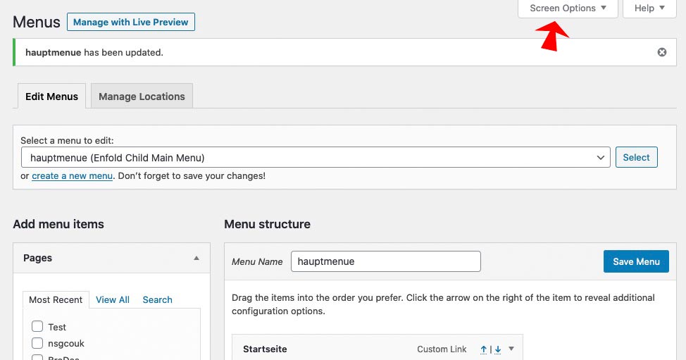
On “Show advanced menu properties” mark “CSS Classes”
Then you will have on each menu item an input field for class!
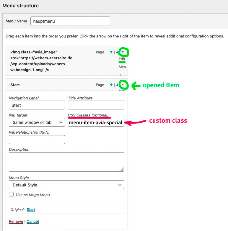
Enter for your “What sets up appart” a class: menu-item-avia-special
and see where it is shown on your menu.-
This reply was modified 5 years, 11 months ago by
it seem that getting influence via these filters the loop option is lost.
so here is the more precise question: how do I achieve a change in the sorting option while retaining the “Loop Post Navigation”.
and this ( these plugins ) are usually sufficient for smaller collections.
These Plugins enables the possibility to drag and drop posts/portfolio/pages in the list-view to a given position : page order.
It works perfectly – except for the prev. button of the first post, when I select the rotating mode it does not go to the last post but to the oldest post ( date ).
I need this option to have a manuall order ( as in the other posting – with woocommerce products )But i think with the knowledge of the filter: get_previous_post_sort and get_next_post_sort or because it seems to be deprecated filtername and now the : get_{$adjacent}_post_sort is used.
If I need help, I’ll be contacting you again
May 6, 2020 at 8:45 am in reply to: Recaptacha JS files to load only on pages which use Forms #1210251Why do you change the name of the filter with the same functionality and – yes, it is now no longer “disable” but “prohibited” ?
That you generally wanted to change the name of the filter to avf- is understandable, but that was already given here.
I have to go and check now my installations, where I used the old filter name.To those who are interested to use this filter with contact-form-7 too:
that one line :
$prohibited = ( false !== strpos( $content, '[av_contact ' ) ) ? false : true;
has to be replaced by:
$prohibited = ( false !== strpos( $content, '[contact-form-7 ' ) || false !== strpos( $content, '[av_contact ' ) ) ? false : true;May 5, 2020 at 6:12 pm in reply to: How to change -Tag of post title on Category List + Changing -Tag #1210046Das hat schon seinen Grund weshalb der andere Weg besser wäre. Denn jQuery ist Clientseitig. Dadurch sehen die Bots immernoch die alten tags!
Wenn man es vor der Entstehung also regeln könnte wäre es denke ich besser.________
There is a reason why the other way would be better. Because jQuery is client-side. So the bots still see the old tags!
So if you could fix it before it is created I think it would be better.May 5, 2020 at 5:54 pm in reply to: How to change -Tag of post title on Category List + Changing -Tag #1210038i had to look if the filter : avf_customize_heading_settings will work on this too – then this would be a better way!
Or : avia_default_title_filteryou find the place to influence on helper-post-format.php line 60
$default_heading = is_singular() ? 'h1' : 'h2';May 5, 2020 at 5:43 pm in reply to: How to change -Tag of post title on Category List + Changing -Tag #1210033Bei der Seite gehe ich jetzt mal davon aus, dass ich die Antwort in deutsch geben kann.
ich hatte da mal ein kleines script geschrieben, welches unter beibehaltung aller Attribute und Klassen das Tag ändert.
Je spezifischer die Quelle gesetzt ist um so selektiver arbeitet das auch.Kleiner Denkanstoß: auch wenn es eventuell oldfashioned ist – vermeide ich persönlich das vorhandensein von mehr als einer h1 pro Seite.
Nun zu der Umsetzung – dies in die child-theme functions.php:function replace_tags_with_tags(){ ?> <script> (function($) { function replaceElementTag(targetSelector, newTagString) { $(targetSelector).each(function(){ var newElem = $(newTagString, {html: $(this).html()}); $.each(this.attributes, function() { newElem.attr(this.name, this.value); }); $(this).replaceWith(newElem); }); } replaceElementTag('.entry-content-header h2.entry-title', '<h1></h1>'); // weitere Zeilen anfügen durch semicolon getrennt replaceElementTag('.category-term-description p', '<h6></h6>'); }(jQuery)); </script> <?php } add_action('wp_footer', 'replace_tags_with_tags');Durch den Kommentar siehst du wie du weitere Tag Ersetzungen erreichen kannst.
Yes – it is lost in translation :) the formal is identical to the informal
the term : Entschuldigung, aber kein Eintrag erfüllt Deine Suchkriterien is on 4.5.7 : Entschuldigung, aber kein Eintrag erfüllt ihre SuchkriterienBut you do know that in the first line there is a toggler to have the second line?
hi Ismael – does it work on default with shortcodes in the menu – or do we need to activate the shortcode option by:
add_filter('wp_nav_menu_items', 'do_shortcode');
Edit: seems to work without extra activation.A new german menu : Link
I can say this, I’m German. ;)I can’t help you here anymore. I think a mod should log in to see why the aside is in the wrong container.
I changed on that page above ( private Content ) now manually to a date sort which works – but that would be nice to have a filter here too for orderby in combination with looping in same category.
i try to use my old plugin for that “intuitive custom post order” – and now a advice from Günter: “Simple Custom Post Order” – it works great – but not on looping the prev – next – for the first in the order to go back to the last.
https://kriesi.at/support/topic/is-it-possible-to-loop-the-post-navigation/#post-1096125
It would be nice to have here an orderby option too!
Falls es darum geht, die Sortierreihnfolge zu ändern (z.B. von post date auf title) – das geht momentan nicht.
even if i change in functions-enfold.php line 726 the orderby to menu_order it does not have any effect.
-
This reply was modified 5 years, 11 months ago by
Is there a page where we can see the intention?
If you can’t make the page public, can we see it on the Enfold demo pages?maybe you have done something wrong here: https://kriesi.at/support/topic/category-product-filter/#post-1000181
-
This reply was modified 5 years, 11 months ago by
-
AuthorPosts