
-
AuthorPosts
-
September 24, 2019 at 1:16 pm #1141375
Hello Everybody,
On mobile view, my fulscreen slider doesn’t display entirely my photos. I would like It to display like the easy slider I use actualy on mobile.
Look links in private.
Thanks for helping,Iceman
September 24, 2019 at 6:06 pm #1141495Hey ICEMAN,
The portrait mode of the mobile phones does not allow to show the images you want to show in full, it has a very different aspect ratio.
Best regards,
VictoriaSeptember 24, 2019 at 6:19 pm #1141504so why don’t you use the full-width slider then?
it shows all of the image always – even on small screens.September 25, 2019 at 9:46 am #1141706Thank you to all,
On my home, I use actually full screen slider on large screen and easy slider for mobile but the problem is that I have two slider and even if I hide full screen for mobile and easy slider for large screen, the two are loaded everytime and it’s too heavy (bad for seo and bad for user experience).
Easy slider for mobile works perfectly for mobile (It’s exactly what I want) and I would like to have full screen slider with the entirely image, even in portrait mode.If there is no solution, maybe it’s possible to keep the actual solution if you have a way to not load the easy slider in large screen and full screen slider in mobile view. In this way, a single slider would be loaded and not two for eah screen size.
Maybe a functions.php solution ?-
This reply was modified 4 years, 7 months ago by
ICEMAN.
September 25, 2019 at 10:42 am #1141735Besides the performance problem you have when you put two sliders on the page, and only show one then depending on the screen width –
think a little bit about your request – how should this work?
The height is the starting point for the image.
This height must fill the screen height, so you have automatically cropping with a landscape image ( If the aspect ratio is not the same as the screen dimensions.)
This is also the case with large screens.
Only the Full Width slider shows you (almost) always the whole image without trimming.September 25, 2019 at 11:15 am #1141747I am sorry Guenni007 for my language error, when I said “easy slider” I mean ” full width easy slider”.
I use it for mobile and hide it for large screen and medium screen
and I use “Full screen slider ” for large screen and hide it for small screen and very small screen.It works perfectly like that but the two sliders are loaded each time watever the screen size so I would like not to load the useless slider when it’s not necessary.
-
This reply was modified 4 years, 7 months ago by
September 25, 2019 at 5:55 pm #1141891Does anyone know how to avoid the loading of one of the two sliders to start ?
-
This reply was modified 4 years, 7 months ago by
September 25, 2019 at 6:56 pm #1141935Hi ICEMAN,
Unfortunately, it would require quite some time and customization of the theme to achieve this, so I am sorry to tell you that this is not covered by our support. However, if it’s really important for you to get this done, you can always hire a freelancer to do the job for you :)
Best regards,
VictoriaSeptember 26, 2019 at 9:37 am #1142165Hi Victoria,
Thanks for your kindness.
I understand Victoria. I will continue to search. Do you think a function in php could do the job ?
Look the link in private, maybe a way to follow ?
-
This reply was modified 4 years, 7 months ago by
September 26, 2019 at 11:06 am #1142212Hi ICEMAN,
This function has to be theme-specific since it has to work with the Advanced Layout Builder. So it has to be custom written.
I will write to our dev team, maybe the screen options will work better in the future, but I cannot really help you with this at the moment.
Best regards,
VictoriaSeptember 26, 2019 at 11:55 am #1142230That’s nice of you Victoria, I really would like to find a solution for that.
Hope to read you soon :)
Regards,
IcemanSeptember 26, 2019 at 12:54 pm #1142247Well i think the one possibility to have on mobile only one and on desktop only one is possible.
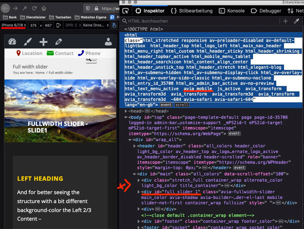
But on resize the screenwidth it is hard to get back the removed slider.see here an example page ( you have to look on a real device or on a good browser simulation – and reload the page )
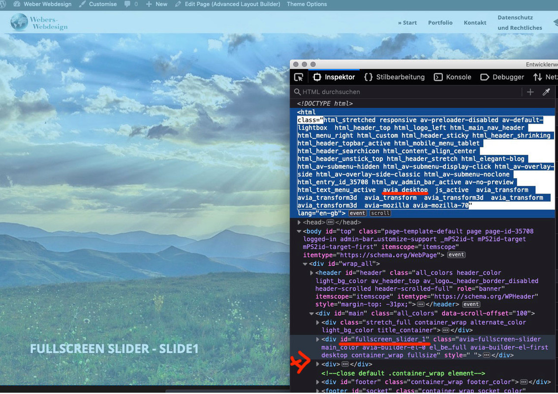
(this is only for that example page 35708) : https://webers-testseite.de/full-width-slider-2/function only_one_slider(){ if( is_page(35708) ) { ?> <script> (function($){ $('html.avia_mobile #fullscreen_slider_1').remove(); $('html.avia_desktop #full_slider_1').remove(); })(jQuery); </script> <?php } } add_action('wp_footer', 'only_one_slider');you see that enfold got on html for the device an extra class: avia_mobile and avia_desktop
maybe we could start a reload of the page on resize when it is under a given screen-width value. Then we had to work with custom class f.e. on the sliders.
I check that ( but a debounce function should be included – because otherwise this would be a function high in performace)-
This reply was modified 4 years, 7 months ago by
Guenni007.
September 26, 2019 at 1:48 pm #1142267The function above is ok – only in dependence to the device but a function with resize and reload etc. ?Anyway – I think such a script reduces the performance more than loading two sliders – especially since the images are probably identical and in the cache.
September 26, 2019 at 3:17 pm #1142294Thanks Guenni007 for your help.
I tried your function but GTmetrix test is exactly the same about the values so I think maybe the two sliders are loaded in the same time whatever the device.
In the GTmetrix report, I still have 2 separate images, the full screen slider has the original JPEG file and the full width slider has the same image with x21708 (look the screen capture). It’s the same for all the photos so the loaded is doubled.
September 26, 2019 at 6:04 pm #1142437this is the result on that page : https://gtmetrix.com/reports/webers-testseite.de/H1Qv5gQ2
no error on that!
This page is a testpage with a child-theme functions.php with 2180 lines
( thats the reason for F’s because of a lot of extra javascript in it)
the quick css has 3000 lines ! my absolute text environment.you see my test page . -look to the DOM :
it is only one slider at a time there
 September 26, 2019 at 10:56 pm #1142507
and another question – did you adjust the code above to your needs ( did you change the page-id ?
is the class the same as on my end ?September 27, 2019 at 10:27 am #1142643Guenni007, thanks for helping !
I check the class and page-id and it’s ok at my side. Maybe I can send you my website link by mail if you want to chek where the problem is ? The GTmetrix test is exactly the same with or without the function.September 27, 2019 at 12:20 pm #1142714under my nick or avatar there is all info you need
September 27, 2019 at 12:48 pm #1142739Guenni007, i sent you my website link by email. Regards
September 28, 2019 at 12:11 pm #1142984Yes but i could do things for you only since Monday – my doughter has birthday party today.
September 28, 2019 at 2:23 pm #1143000Ok, Guenni007, It’s nice of you to help, I wish both, your daughter and you, an happy birthday party !
Your function seems to work, I let you verify by yourself. I am looking to optimize my home because it still too heavy for SEO and user experience.
Have a beautiful day !Iceman
September 30, 2019 at 7:03 am #1143230can you please resent your E-Mail – perhaps it is gone to spam filter of my mail-washer.
September 30, 2019 at 10:32 am #1143269it’s done ;)
September 30, 2019 at 11:34 am #1143305ok – now i got it.
first – there is over the header a full-screen slider too! Did you insert this via functions.php? – and a header widget?Edit: ok i see the insertBefore on your functions.php
maybe put my code above too in a document ready option:
function only_one_slider(){
if( is_page(2) ) {
?>
<script>
(function($){
    $(document).ready(function(){
        $('html.avia_mobile #fullscreen_slider_1').remove();
        $('html.avia_desktop #full_slider_1').remove();
    });
})(jQuery);
</script>
<?php
}
}
add_action('wp_footer', 'only_one_slider');
and we see then whats happening
September 30, 2019 at 11:50 am #1143322but i think we had to combine these two functions in one.
you have to have the full-screen slider before header on desktop case and full-width slider is removed
on mobile case there is always the full-width slider – full-screen slider is gone.September 30, 2019 at 11:58 am #1143332Guenni007, thanks for helping !
My full screen slider is above header because of my logo and menu bar location. If not, my logo and menu move next to the slider.-
This reply was modified 4 years, 7 months ago by
September 30, 2019 at 12:04 pm #1143337no i see that you are taking the one and shift it over the header – but these two functions are working a little on the same thing.
But the one is waiting til the document is ready – so the other one could not do what it has to do.Try this : Backup your child-theme functions.php.
Then delete both rules – mine and the one that insertBefore Header rule
i mean this one here:(function($){ $(document).ready(function($){ var is_mobile=false; if($('.responsive #scroll-top-link').css('display')=='none'){is_mobile=true;} if(!is_mobile){$("#main > .avia-fullscreen-slider").insertBefore("#header");} }); })(jQuery);and insert instead this one
function only_one_slider(){
if( is_page(2) ) {
?>
<script>
(function($){
    $(document).ready(function(){
        $('html.avia_mobile #fullscreen_slider_1').remove();
        $('html.responsive.avia_mobile #scroll-top-link').css( "display", "none");
        $('html.avia_desktop #full_slider_1').remove();
        $('html.avia_desktop #fullscreen_slider_1').insertBefore("#header");
    });
})(jQuery);
</script>
<?php
}
}
add_action('wp_footer', 'only_one_slider');
we will see then if it works.
September 30, 2019 at 12:05 pm #1143339see a previews post “setting menu display” for explaination
-
This reply was modified 4 years, 7 months ago by
September 30, 2019 at 12:15 pm #1143342I done it, it’s work well.
However GTMetrix report is exactly the same.-
This reply was modified 4 years, 7 months ago by
September 30, 2019 at 12:19 pm #1143346i do not see effects- both snippets are in the functions.php as single snippets.
maybe you had to clear all cachings if you use a caching tool.But you have to be aware that an ipad is a mobile device too !
-
This reply was modified 4 years, 7 months ago by
-
AuthorPosts
- The topic ‘Full screen slider display’ is closed to new replies.