How to Create Your Own Awesome Landing Pages with Enfold
You never get a second chance to make a first impression and that’s nowhere truer than online.
User attention spans are notoriously short and competition has never been fiercer. Sooner or later, every site owner will be forced to bite the bullet and start building landing pages.
We recently covered five key lessons to be learned from classic landing page implementations here on Kriesi. This time around, we’re going to move from admiring the work of others to actually using the power of Enfold to build your own.
We’ll briefly recap the key points you should be hitting with landing pages, break down the Enfold demo landing page, and introduce the power and flexibility of Enfold’s layout builder to create your own solutions from scratch.
Let’s kick things off with a reminder of the boxes your landing page needs to tick.
Key Points Landing Pages Should Hit
Each landing page will naturally differ in terms of its exact requirements, but there are certain basics the vast majority of implementations should be hitting straight out of the gate. We covered real-world examples of these in our previous landing page piece, but it’s worth recapping the highlights here to set the stage for what we’ll be discussing. A well-designed landing page should contain most of the following:
- An engaging headline: Headlines are the key that unlocks the door of your visitor’s attention. Their importance cannot be over-stated.
- Eye-catching imagery or video: Humans are visual creatures. The higher the quality of supporting images and video that you can include on landing pages, the better. Images boost conversion and creative implementations can seriously improve your sales.
- Clearly stated benefits: Some people are fanatical about features, but everybody wants to know what’s in it for them. Clearly stated benefits should be front and center.
- Put the most important elements first: This is a screamingly obvious point but the amount of landing pages that ignore it is astonishing. The most important elements of your landing page should come first. Don’t bury items such as call to action buttons down at the foot of your page.
- Avoid distracting links: You’re looking for action rather than exploration on a landing page. Strip away as many extraneous navigation options as you can.
- Testimonials: Social proof makes the world go around when it comes to convincing people of the merits of your products or services. Include real testimonials from people if at all possible on your landing page.
- A strong call to action: Landing pages live or die on how many concrete actions they drive. Your landing page simply has to be centered around one primary action you want the user to complete.
A Breakdown of the Enfold Demo Landing Page
As part of showcasing the variety of use cases Enfold can be turned to, we’ve included a Landing Page demo here on the Kriesi site. It’s by no means a masterpiece in terms of actual copy, but it’s a great example of how cleanly Enfold enables you to hit all of the points we mentioned in the previous section. Let’s briefly highlight some of the options on display in the demo page.
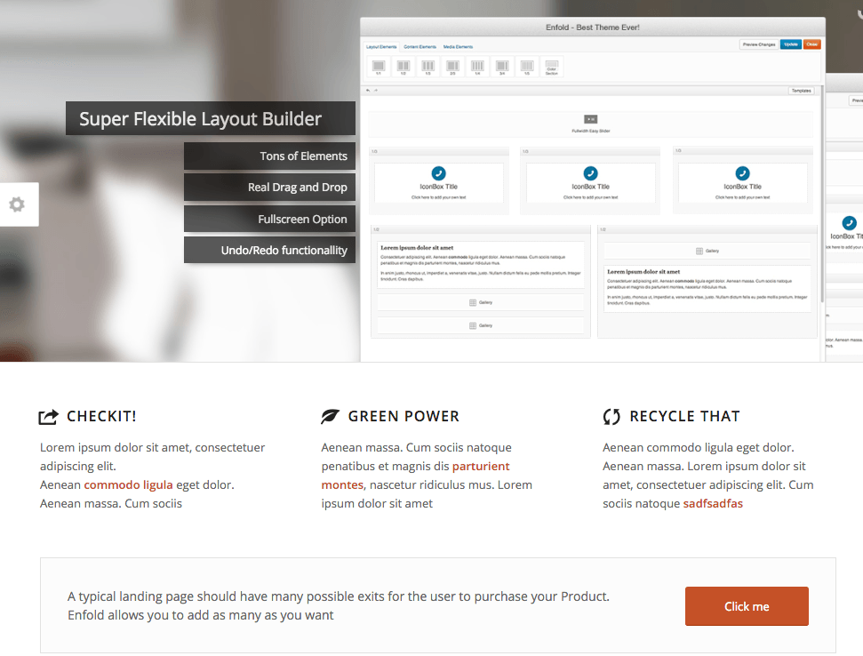
Even a quick look at the above the fold content here shows we can simply implement a few core items straightaway. Effective imagery with engaging transitions, standout benefits and clear calls to action are all immediately on display.
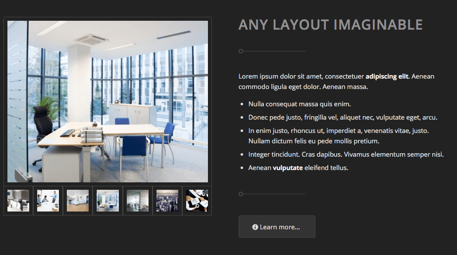
Moving a little further down the page, you can see that incorporating alternating graphic approaches such as different colored backgrounds is not going to be a problem. You’ll also be able to cram a lot of visual information into tight spaces via judicious use of galleries.
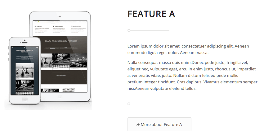
Attractive images help seal the deal when you’re getting specific in terms of features and Enfold gives you a variety of options for incorporating this smoothly on your landing pages.

Ideally, people want to see real-world testimonials on landing pages to build trust and help convince them to take the action you’re looking for. Enfold’s powerful testimonial grid options make implementing this according to best practices a breeze.
Using the Power of the Template Builder
The secret sauce that makes this all possible is, of course, Enfold’s incredibly intuitive layout editor.
The layout editor gives you all the tools you need to quickly put together the bones of an appealing landing page. The key point to note here for site owners is that it enables users of all levels of technical experience to swiftly spec out a page by simply dragging and dropping.
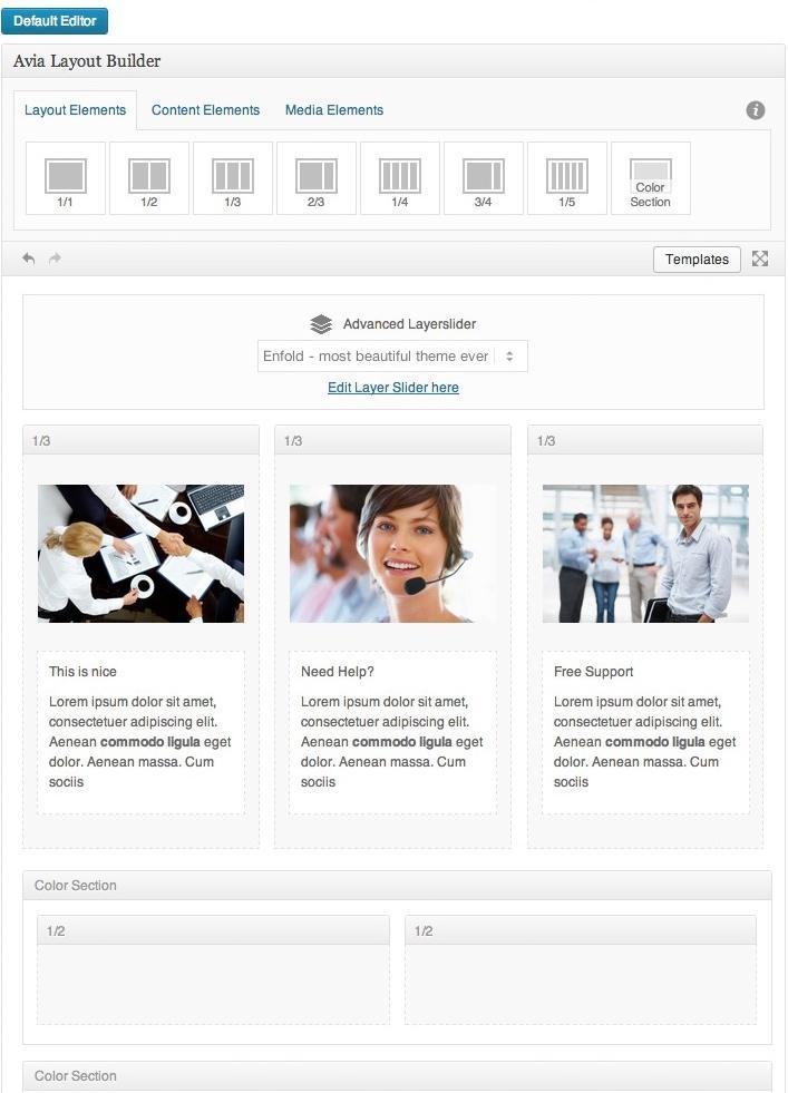
It’s hard to overstate the value that this brings in terms of quickly prototyping landing pages and previewing and editing pages. You’re really only limited by your imagination here. Let’s step through options in a little more depth.
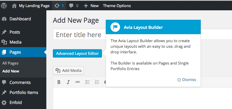
Add a new page to your Enfold site and you should see a handy prompt reminding you that the full power of the Avia Layout Builder is sitting there just begging to be put to use.
A quick look at the options here shows we’ve got a full toolset available for laying out a huge variety of possible pages. Layout elements enable you to control the overall skeleton of the page with ease.
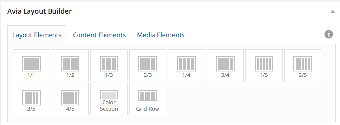
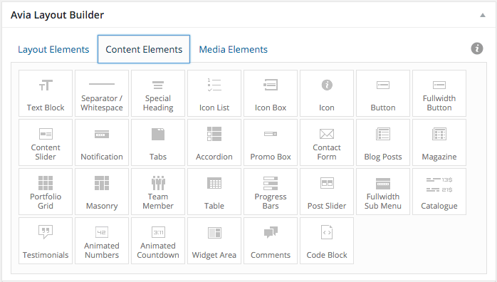
Content elements give you options for incorporating a wide variety of specific content types such as text blocks, buttons, tabs, testimonial blocks and much more.
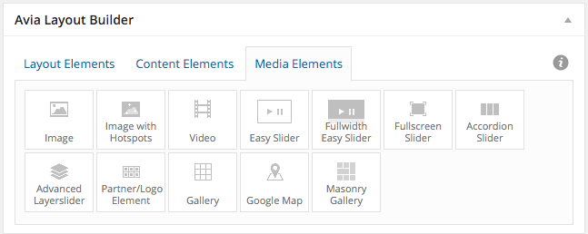
Finally, the media elements tab enables you to introduce images, sliders, galleries, maps and videos exactly where you want.
From here, a little creative combination is all that’s required to match either the quality of the Enfold demo landing page or any of the examples we covered in our previous survey of landing pages to learn from.
Conclusion
Landing pages are a feature that any successful site will have to tackle sooner or later. Implemented correctly, they will become one of the most valuable components of any website.
Take the demo Enfold landing page, and the examples of other great implementations that we previously discussed, as a starting point and you’ll soon have a solid set of ideas for creating your own.
Remember to keep our core principles of successful landing pages in mind and then get to work using the options Enfold’s layout editor makes available – you’ll soon have prospects beating down your virtual door via the landing page you create!
We’d love to hear more about how you create landing pages. Is there a particular layout you’ve had success with? Or options you’d like to see us include in future releases? Get in touch via the comments and let us know!


