-
Search Results
-
Finally I bought the item and find it fantastic and I am very happy in all browsers except IE.
I’m testing the initial version with your “dummy data” loaded on my website:
http://www.escalamas.com/cms1 and not see properly with IE10.
http://imageshack.us/a/img856/6718/kqnq.png
http://imageshack.us/a/img823/1973/i1a8.png
The columns and other elements seems as if not addressed properly in this browser, but errors are widespread throughout the web.
My version of browser and OS.
http://imageshack.us/a/img43/3807/drlo.png
In the specifications set that is compatible from version IE8, IE9 and IE10.
And IE10 is the last … do you look this, please?, Many customers use IE and would have to be compatible ..
Thank you very much!
Xavier.
Topic: Search Results in Enfold
I want to be able to search products through the search function embedded in the header however the default wordpress search engine spits out posts and the date they were posted. I tried relevanssi but it does not suffice for my needs. I want something along the lines of how the REPLETE theme by Kriesi where all products with images of the products show up. Would I need to purchase the REPLETE theme for this? Can I just exchange my current license for ENFOLD FOR REPLETE? or is there a work around for this? I’ve tried woocommerce predictive search (which did absolutely nothing for me) and went through extensive amounts of threads but I could not find the answer to my question..
help!!!
On the Enfold theme preview (http://kriesi.at/themedemo/?theme=enfold), this image is shown as the featured image in grid format for a blog post.

Under Latest News in the footer, this cropped image is shown as a thumbnail.

On my blog, the featured image isn’t cropped into a thumbnail for the News widget, it’s squished into a distorted square. How do I fix that so it looks like the Enfold theme?
Topic: Wrap image around text
Is there an easy way to wrap an image around text and make sure the image is responsive and adapts to the screen?
http://oinsulation.wpengine.com/a-test-page (hosted on WPengine) – currently have 3 columns setup to make the image resize
Ideally I want the image wrapped around the text but when I do this the image doesn’t re-size and it looks bad on tablet portrait view.
Hi and thanks once agaun for a fantastic theme, my #1 choice!
I wonder if Enfold uses a different stylesheet in order to make sure product images is displayed beautifully also on mobile devices or if you what lightbox you use in order to achive this?
you see, I have a custom wp site and even if it can never come close to the master piece you have developed, I must deliver to client a version that is also looking good on mobile devices, and so far the lightbox is not adjusting to iphone scfreen but “cut off” – hence my question.
1 million thanks for answereing this question that might be a little bit out of scope, any advice appreciated highly!
this is the site so far showing lightbox on mobile not as good asenfold does: joveniajuveler.intelligentsolutions.se/jewellery/
I just opened my website in IE8 and there are a TON of things that are broken. The menu overlays the logo, the text is stretched, the blog preview images are stretched on my homepage, and all of the buttons are transparent with no blue background. I tried the fix listed in this topic: https://kriesi.at/support/topic/buttons-in-ie8, but nothing changed. This is a bit urgent as we’re doing a soft launch of the website tomorrow. Advice?
Here’s a link: http://goo.gl/jGUCw
Thanks!
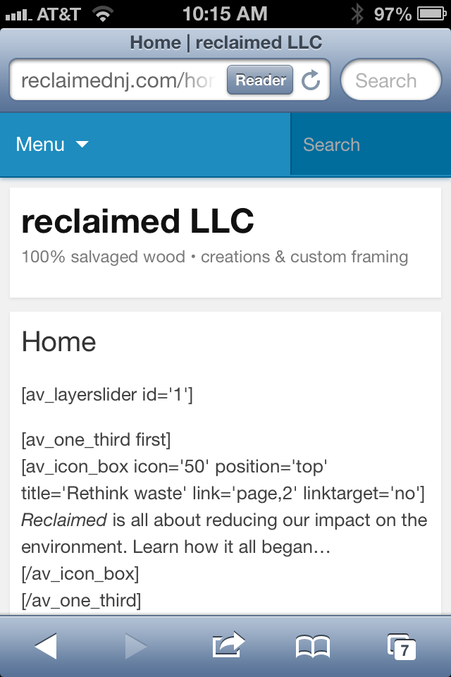
Topic: Avia layout builder issues
Hey there, I’m new to this theme and have built out most of my WP site using the Enfold theme. On a Mac/PC my site looks amazing using this theme, but on a mobile I keep having issues with it showing up properly. Here is what I’m seeing on my iPhone: http://reclaimednj.com/wp-content/uploads/2013/07/image-1.png
It’s really weird too. The other day it was working, then again today it is not…
Thanks in advance for the help!!
-Ben
this is a child of https://kriesi.at/support/topic/how-to-add-captions-to-gallery-thumbs#post-127924 this issue.. but I thought appropriate to add a new topic..
1. When adding a single column gallery with say a 300×300 px image…or a 2 column with two 300px images, how can you get the images to align to the center of the column you have placed it in ?
Check the alignment here .. http://shoutkey.com/am
first 3 pictures are diff sizes but not aligned. second 2 pics are using a spacer image..
Images seem to left justify along with their captions. I would like to have multiple galleries in a page – some with 2 images, some with 3, mostly the same size but aligned to center of the page.. I tried adding a spacer image for 3 columns using 2 main images but the space is padded far too much…
2. captions underneath the thumbnails.. if adding 2 images to a 3 column layour – the captions move directly to the right side of the image.. depending on the size of the thumbs, the captions sometimes appear underneat, sometimes break half underneat and half on the side.
3. Is is possible to align the captions to center underneath the thumbnail, not just left justified.
I tried `/*caption align*/
.visible-caption{
text-align:center;
}
` with no joy..
Thanks again
I am haing some issues with this theme
1. The images for galleries are still not showing even though I have added code into custom css you have told me to add from previous support ticket.
http://latishawoodonline.com/body-paintings/
http://latishawoodonline.com/fashion/
It works on galleries that have not that many images like – http://latishawoodonline.com/drawings/ but the images are shown at like 40% opacity on the galleries that have a lot of images and only show full opacity once user has scrolled.
2. The gallery is not responsive… When I resize the browser the thumbnail images all keep their same height and adjust only their width causing a distorted thumbnail image that looks really bad. The entire thumbnail should resize.
I own may Kriesi themes and this one seems to have more issue than the other ones.. Hopefully you can resolve this gallery issue soon and add an updated theme to themeforest so I can use for future projects…
Here is the custom css I have added that you have given me from other support tickets.
#top #wrap_all .avia-gallery-1 .avia-gallery-thumb a {
width: 25%;
max-height: 147px;
height: 147px;
}
#top div .avia-gallery img {
height: 100%;
max-height: 100%;
}
Can you please help fix this or send me new theme pages or css code since the photo gallery is the most important part of this website I am doing and it currently has multiple issues.
Thank you
I’m new to this excellent theme, and I edited the default slide #1, putting in my background image, and removing all but one text layer. I then duplicated that layer, made some small changes to the text, position and sliding, etc. Both layers show fine in preview mode, but on the actual page, my duplicated layer does not appear at all.
I deleted it, and added a new layer, but the result is the same. It looks perfect in preview, but won’t show on my page. Please advise
Thanks!
Hello,
first of all thank you for the wonderfull template, it’s realy high end!!
I just have a problem with my gallery when i resize the browser window:
1. I uploaded Pictures with the sizes 650 x 400 px
2. I have chosen the settings: no scaling
Right now everything looks fine as long as i watch the gallery image while the browser is full sized.
When i start to resize the browser window on a certain point the images start getting blurry.
Can you tell me how to solve the problem?
Hi,
Is there anyway to add a transparent background behind a text box?
I have a color section with a background image and two 1/2 column layouts. The second 1/2 column has a text box with a form. I need the text and form to stand out on top of the image and i’m not sure what to do.
Thanks.
I know this is a question that is outside the scope of typical support, so I don’t expect a resolution, . . . but I’m just curious if it’s possible to customize elements similar to the example (link) I’ve attached (torn-paper look) applying CSS or another method. I’m an expert at photoshop, so creating the images would be easy if it came to that. I just wouldn’t know how to implement it into the theme elements. Hope I’m making sense.
http://www.fascinationstreet.se/
Regardless, I’m very excited to be trying out the Enfold theme. Wow! So many beautiful features!
-Patrick
Viewing 30 results - 104,191 through 104,220 (of 106,396 total)
