Forum Replies Created
-
AuthorPosts
-
these settings could be done by simple css – but if you want to style hover state or some transitions. It will be better to not have input but f.e. button tag here.
See example-page and hover this input-button: https://webers-testseite.de/pureinstall/alb-testseite/if you realy need this i do only see for now a plugin solution. There are a lot of good – especially for fotographers – that have this option on sorting by caption.
See Envira or NextGen Gallerywell – with filter : avf_header_setting_filter it may be possible.
what kind of header setting you like to have. Maybe show an example page on demo pages : https://kriesi.at/themes/enfold-overview/or – you replace the img src svg with the inline svg.
and then you can go and style the fill colors:function replace_logo_with_svg() { ?> <script type="text/javascript"> (function($) { function a() { $( ".logo a img" ).remove(); $.get('/wp-content/uploads/YOUR-LOGO.svg', function(svg){ $( ".logo a" ).html( svg ); }, 'text'); } a(); })(jQuery); </script> <?php } add_action('wp_footer', 'replace_logo_with_svg');after you have the inline svg file – you had to change some display options for logo
set it to display flexi will check – if it is done by enfold settings. sorry.
can you try:
.avia_ajax_form .button { border-radius: 5px; text-transform: uppercase !important; }-
This reply was modified 5 years, 9 months ago by
Guenni007.
June 12, 2020 at 7:38 pm in reply to: Mobile Darstellung PARALAX und FIXIERTE Backgroundfotos #1222167yes – I guess you’re right. But for now you can help yourself by giving this class to the Color-Section and leaving the background image on scroll in the options of the Color-Section.
By initially leaving it on scroll you prevent the mobile devices from creating this extra parallax container.June 12, 2020 at 7:22 pm in reply to: Animate text on page so it pops up/fade in when you scroll. #1222163have you seen your hamburger menu on ipad portrait ?
Maybe it is just a mediaquery problem. ( 768px til 1118px ) the menu must be styled.
It is hard to find out on a merged css with developer tools.
i guess that problem is more urgent than the popup on scroll.With this scroll problem I will build a page, and see if it does not work.
-
This reply was modified 5 years, 9 months ago by
yes – of course – if there is a better syntax let me know.
I changed a little bit the code – with better markup – because it is better to have mfp-title is Title – that’s not so confusing then-
This reply was modified 5 years, 9 months ago by
what maybe a nice thing to have here is – if that button is clicked an automatic theme settings file will be generated and f.e. saved in dynamic_avia folder.
-
This reply was modified 5 years, 9 months ago by
can you try this in your child-theme functions.php:
and upload the edited file to your child-theme/js/ folder ( on default there is no folder js – create one )
( although in this case it would not be necessary to use the folder structure of the parent theme i think it looks more logical. )add_action( 'wp_enqueue_scripts', 'wp_change_lightbox_script', 100 ); function wp_change_lightbox_script() { wp_deregister_script( 'avia-lightbox-activation' ); wp_enqueue_script( 'avia-lightbox-activation-child', get_stylesheet_directory_uri().'/js/avia-snippet-lightbox.js', array('avia-default'), $vn, true); }PS: do not forget to include:
a[href*=".webp?"]– similar to their syntax.but i believe that the asterisk selector
a[href*=".webp"]will be enough and includes :a[href$=webp]-
This reply was modified 5 years, 9 months ago by
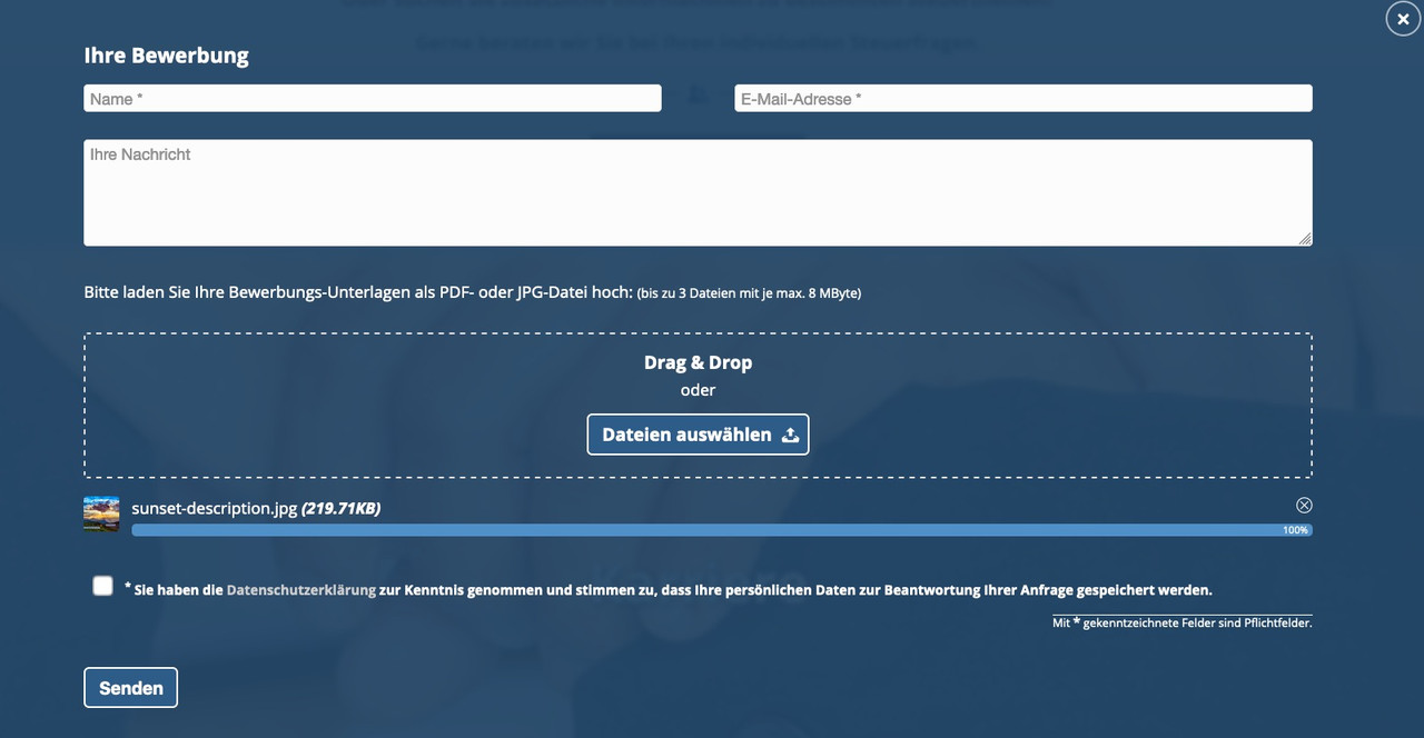
Best would be to install Contact Form 7 – it has that implemented allready in a way that it is more save than other methods.
You can set a limit for upload depending on file format – you can limit fileformat there too – ( f.e. only pdf , jpg , png files are allowed) etc. pp.
You can even style it as drag&drop field with preview image below:
-
This reply was modified 5 years, 9 months ago by
could be too many things – best would be to see the page it concerns
Best would be to the site it concerns.
these are parameters to wp_query: https://developer.wordpress.org/reference/classes/wp_query/#order-orderby-parameters
so i guess no direct chance to have it here– see this site here: https://webers-testseite.de/cynthia/
i make a svg image that is near to your image divider.This code in child-theme functions.php:
function insert_dividers(){
?>
<script>
(function($){

// just give a custom-class to the color-section or the slider : divider
// and a custom class for top or bottom position: top / bottom
// so there is in that input field f.e.:  "divider bottom"
  $('.avia-section.divider.top').prepend('<svg version="1.1" class="top" title="big_arrow" xmlns="http://www.w3.org/2000/svg" xmlns:xlink="http://www.w3.org/1999/xlink" x="0px" y="0px" width="100%" height="200px" viewBox="0 0 1500 200" preserveAspectRatio="none"><path class="jan" d="M766.69,192.84c-10.94,2.88-22.43,2.88-33.37,0L0,0h0v200h1500V0L766.69,192.84z" fill="#EEEEEE"/></svg>');
  $('.avia-section.divider.bottom').append('<svg version="1.1" class="bottom" title="big_arrow" xmlns="http://www.w3.org/2000/svg" xmlns:xlink="http://www.w3.org/1999/xlink" x="0px" y="0px" width="100%" height="200px" viewBox="0 0 1500 200" preserveAspectRatio="none"><path class="jan" d="M766.69,192.84c-10.94,2.88-22.43,2.88-33.37,0L0,0h0v200h1500V0L766.69,192.84z" fill="#EEEEEE"/></svg>');
  $('.divider.top .avia-slideshow .avia-slideshow-inner').after('<svg version="1.1" class="top" title="big_arrow" xmlns="http://www.w3.org/2000/svg" xmlns:xlink="http://www.w3.org/1999/xlink" x="0px" y="0px" width="100%" height="200px" viewBox="0 0 1500 200" preserveAspectRatio="none"><path class="jan" d="M766.69,192.84c-10.94,2.88-22.43,2.88-33.37,0L0,0h0v200h1500V0L766.69,192.84z" fill="#EEEEEE"/></svg>');
  $('.divider.bottom .avia-slideshow').append('<svg version="1.1" class="bottom" title="big_arrow" xmlns="http://www.w3.org/2000/svg" xmlns:xlink="http://www.w3.org/1999/xlink" x="0px" y="0px" width="100%" height="200px" viewBox="0 0 1500 200" preserveAspectRatio="none"><path class="jan" d="M766.69,192.84c-10.94,2.88-22.43,2.88-33.37,0L0,0h0v200h1500V0L766.69,192.84z" fill="#EEEEEE"/></svg>');
})(jQuery);
</script>
<?php
}
add_action('wp_footer', 'insert_dividers');
this to quick css:
.avia-section.divider {
    position: relative !important;
}

.avia-section.divider .container a {
    z-index: 10;
}

.avia-section.divider svg {
    position: absolute;
    z-index: 5;
    width: 100vw;
}

.avia-section.divider svg.top {
    top: -2px !important;
    height: 150px;
    -webkit-transform: rotate(180deg);
    transform: rotate(180deg)
}

.avia-section.divider svg.bottom {
    bottom: -2px !important;
    height: 100px;
}
Now – how to insert the dividers:
you only have to give to a color-section – or a slider the class f.e. : divider bottom
then the divider will be inserted as inline svg. On that you can influence the fill color:.avia-section.divider svg.top path { fill: #fff; } .avia-section.divider svg.bottom path { fill: #fff; }e.g. on that example page you see the section with the button “get in touch”
the following color-section has a different background-color!
just solve this by:#av_section_3 svg.bottom path { fill: #c5e3ea; }or on top i gave to that color-section the custom-classes: divider top bottom
so there are two dividers in the same sectionthe image above is a rgb image.
Are you using a child-theme ?ok – now i see – and that was my suggestion – this image is a cmyk jpg !
Rendering of cmyk images with browsers tend to have a cast.by the way: i would take a png file and let the top area transparent – then you can even have on the previous section a background-image.

-
This reply was modified 5 years, 9 months ago by
on all my browsers here on OS X Catalina – ( Chrome, Firefox Developer, Safari ) i do not have that blue cast.
The overlay color is a pure gray. What do you want to accomplish with the overlay color?June 11, 2020 at 10:16 am in reply to: How do I create H1 tag from the Caption Title in Fullscreen Slider element? #1221599@DimaP : this is long time ago – why don’t you use the alb itself and goto Advanced Tab of the Slide Image:

can we see the site please.
or upload that image on an image hoster like: https://postimages.org/
I have a hunchwe are posting nearly the same time : please read again my comment above.
Best would be to have a custom-class on those img – but you can select them this way too:
img.avia_image[src*="anbwhite"] {
-webkit-filter: drop-shadow(2px 2px 0 black) drop-shadow(-2px -2px 0 black);
    filter: drop-shadow(2px 2px 0 black) drop-shadow(-2px -2px 0 black);
}

img.avia_image[src*="vrwslogonoyearwhite"] {
	-webkit-filter: drop-shadow(2px 2px 0 black) drop-shadow(-2px -2px 0 black);
    filter: drop-shadow(2px 2px 0 black) drop-shadow(-2px -2px 0 black);
}
here you can have 4 drop-shadows similar to the heading above – but performance is important too.
First : if you need help and on creating a page – could you please do not hamper the context menu of the mouse.
Working with developer tools- without the right click is much more complicated.about which headings you are talking? The things above i mentioned aren’t headings by the meaning of Enfold these are pngs and no letters (font) at all.
So about which “headings” do you talk?
( click to enlarge the image )

So : believe me – the filter option is a nice one – but it is performance intensive ! : https://css-tricks.com/breaking-css-box-shadow-vs-drop-shadow/
Hardware accelerated in browsers that support it. It’s a heavy lift without it.
- so my advice is to change that to font and real headings – use instead of the image alb a heading alb ( and yes this would be nice to set here a class )
- or prepare the png in a image editor to have an outline

-
This reply was modified 5 years, 9 months ago by
With new DOM Elements ( mfp-top-bar) and for the mfp-bottom-bar a callback function with new content.
here is my magnific popup script written for that page here: https://webers-testseite.de/pureinstall/masonry-gallery/See popup script code on that page please.
______
Off Topic : i just realized that a masonry with fixed size got a totaly different markup than the flexible masonry – so code must be changed.
-
This reply was modified 5 years, 9 months ago by
But you are talking about an image gallery?
Or have you an masonry_entries ( a blog or portfolio etc )June 11, 2020 at 3:34 am in reply to: How to set up Google Maps to use basic embedded maps and not dynamic #1221489what is always a good way and even on GDPR Reasons is to show the map in an iframe.
This is “outside” your site and you do not need an api key for it.
Click the image:

besides that i will have a look what i have for maps : Maps Javascript API only is needed.
-
This reply was modified 5 years, 9 months ago by
June 10, 2020 at 6:58 pm in reply to: How to set up Google Maps to use basic embedded maps and not dynamic #1221333Every month I get an invoice from Google for 0Euro – what kind of traffic do you have on your site?
By the way Yigit – using an image f.e. a screenshot of a google map will come into conflict with copyright law! So be carefull.____________
A clear distinction must be made here between the screenshots from Google Maps or Google Earth and the API (“application programming interface”) offered by Google for the Google Maps service.
As far as we know, Google itself does not have exclusive rights to the map material or satellite images. Google itself obtains the content from other third parties that produce the images. Google is therefore not the decisive rights holder, but only has a corresponding licence for use, so that the respective third party companies are quite likely to issue warnings about the further use of their images or maps – e.g. through screenshots.
For example, the aerial image provider Geocontent had already issued a warning in 2006 to an entrepreneur who used images from Google Earth for her company blog.
hm – i can not confirm to this: on my opinion the poor rendering is given on firefox – chrome and safari are very near to each other.
Click to enlarge the images:

left to right: firefox, chrome, safariwhat makes me wonder is that on firefox it shows a jpg but on info about that image there is webp
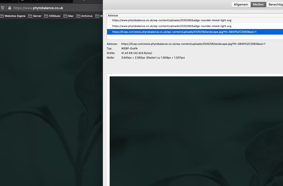
besides this it seems to be a high compression : an image of that dimension with only 48kb !
Lieber Franz – kann ich nicht, da ich auch nur Teilnehmer hier wie Du bist. ;)
if these are headings then yes – might be done this way.
But as far as i can see is “Vacation Rental World Summit” and “A new beginning” etc. pp a png file and no text.easiest way and not so performance intensive as f.e. filter : drop-shadow : just edit your images as png files with an outline in f.e. Photoshop.
you can see with drop-shadow :
.avia-image-overlay-wrap .avia_image {
   -webkit-filter: drop-shadow(2px 2px 0 black) drop-shadow(-2px -2px 0 black);
    filter: drop-shadow(2px 2px 0 black) drop-shadow(-2px -2px 0 black);
}
but you had to find a custom selector on your page. Bring a custom class to those containers.
-
This reply was modified 5 years, 9 months ago by
-
AuthorPosts