Forum Replies Created
-
AuthorPosts
-
June 19, 2020 at 10:47 am in reply to: Lightbox not working (appears for a second and then redirects to the image file) #1224012
i have some customers who would like to have such tools at the start. Apart from the GDPR problem and the performance losses of the site, there are also few who evaluate such things themselves and use them for changes on their site. So it is more to the benefit of the producer of these tools than the user. Or do you think Google does this out of pure human kindness?
By the way – on that page i have only in account the scroll event. If it should be perfect there had to be an onresize event too. Because on resize the offsetTop changes. But i didn’t want to make it too complicate on that page.
Because on resize function are very performance intensive. So a debounce function had to be prepared too.
Etc. pp.yes you had to style the #main padding-top too.
i have written a new script that also adds a class to the #main container which will be added or removed at the same time.
So if the navigation is fixed, it is outside of the markup and this height has to be added to the padding-top on #main.function sticky_on_top() { ?> <script> window.onscroll = function() {myFunction()}; var header = document.getElementById("header_main_alternate"); var main = document.getElementById("main"); var sticky = header.offsetTop; function myFunction() { if (window.pageYOffset > sticky) { header.classList.add("stickynav"); main.classList.add("pad"); } else { header.classList.remove("stickynav"); main.classList.remove("pad"); } } </script> <?php } add_action('wp_footer', 'sticky_on_top', 9999);you can than correct the “missing height” of the navigation in quick css by:
on that page i do it only for non responsive case@media only screen and (min-width:768px) { #header_main_alternate.stickynav { width: 100%; position: fixed; top: 0; background: #fff; box-shadow: 0 3px 10px -3px #aaa } #main.pad { padding-top: 50px; } }see working example here: https://webers-testseite.de/pureinstall/negele/
this page was originally intended to show if a slider can be set above the whole.
Below I realized exactly that.-
This reply was modified 5 years, 9 months ago by
Guenni007.
June 18, 2020 at 9:39 pm in reply to: Blog Posts ALB with Portfolio – do not work as expected #1223885Not instead portfolio – Webdesign is just one “Portfolio Category”
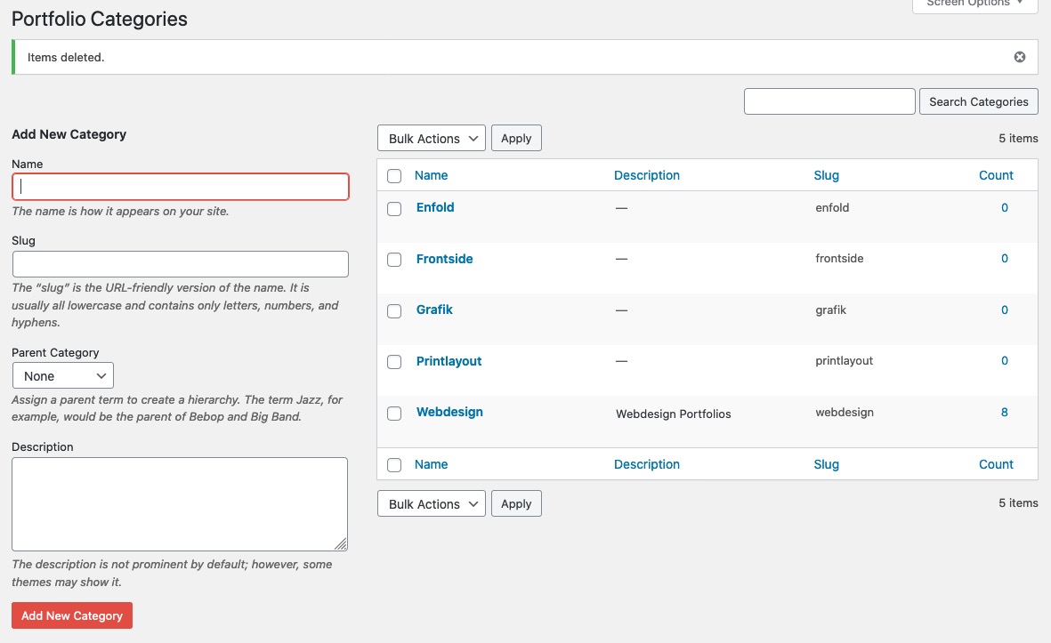
and as i said above All new added portfolios in that category are shown even on the list style directly. But the old one – only one –
and that one what is shown – has a wrong link on read-more button.So the bug is on older existing posts from far away ( no backward compatibility ) in the list style. The grid-style shows all post on that category. And the bad thing is even that I can’t fix it by recalling these posts and saving them again.
you can see here that the masonry or grid view shows all 8 entries – but the list not ! https://webers-testseite.de/blog-posts-in-list-view/
June 18, 2020 at 9:25 pm in reply to: Logo in the middle and burger menu on the right in desktop mode #1223882because i do not see your page – you had to adjust yourself the padding-top, min-height, margin-top etc to your settings
It works with my logo best because it is set to shrink to the center – it is a svg file – and you can set it in the svg code to shrink this way.June 18, 2020 at 9:21 pm in reply to: Logo in the middle and burger menu on the right in desktop mode #1223881if you have : logo center, menu below
and : menu show as burger always
and : show search in menu
then we are nearby:
after that : you can see on my test-page for that: https://webers-testseite.de/cynthia/
a little quick css:@media only screen and (min-width: 990px) { .html_header_top.html_logo_center #header_main_alternate .main_menu #avia-menu { display: inline-flex !important; width: 100%; flex-flow: row nowrap; justify-content: space-between; } .html_header_top #top .av_header_stretch .container.av-logo-container { width: 60%; z-index: 101; } #header_main_alternate { margin-top: -60px; border: none; position: relative; min-height: 58px; } .html_header_top.html_header_sticky.html_large.html_bottom_nav_header #main { padding-top: 116px; } } @media only screen and (max-width: 989px) { .responsive.html_header_top #top .av_header_stretch .container .inner-container .logo { width: 50% !important; z-index: 101; position: relative; left: 50%; transform: translateX(-50%); } .main_menu { width: 100% !important; } .av-main-nav-wrap { width: 100% !important; } .av-main-nav-wrap > ul { display: inline-flex !important; width: 100% !important; flex-flow: row nowrap; justify-content: space-between; } .responsive #top #wrap_all #header .container { width: 95% !important; max-width: 95% !important; } }If you like to have the burger symbol on the left and the search on the right you only had to change the flex-flow to:
flex-flow: row-reverse nowrap;if you like to have the burger slide out from the left then – please do a search this is often asked.
June 18, 2020 at 7:36 pm in reply to: Colour section layout problem in very wide screen and h1 problem in home page #1223868what can we expect from a
margin : 0 ?the default setting is f.e:
.avia-section .container {
	position: relative;
	max-width: 1310px;
	width: 100%;
	margin: 0 auto;
	padding: 0px 50px;
	clear: both;
}
the margin : 0 auto
means that it has top/bottom 0
and left/right auto – so it centers itself – a margin 0 on that would cause a left margin of 0 because the container is not allowed to grow.that test page is gone to heaven :)
but the solution on https://kriesi.at/support/topic/diagonal-background-image/#post-912999 is a nice starting point.June 18, 2020 at 2:09 pm in reply to: Lightbox not working (appears for a second and then redirects to the image file) #1223702As always, one should look at the problems that the theme supposedly causes first of all to eliminate the other parameters that might play a role.
So please deactivate all plugins and disable the merging and caching tools.
If the problem still exists, – please report again and provide the mods here in the private content with the access data.
If it’s fixed, activate one plugin after the other and see what might be involved – and tell here what is responsible for that behavior. Maybe there is a solution for that.you can do that for quick css only – it has an own ID so :
If your developers have all admin right – you might want to have it globalyfunction admin_head_mod() { echo '<style type="text/css"> #avia_quick_css { display: none !important } </style>'; } add_action('admin_head', 'admin_head_mod');you can place a container as you like – best place on a fullwidth slider might be the avia-slideshow-inner container:
style a div as you like to have. Copy that html code.
clean up the html code to remove spaces between tags (inside a tag you can have it)for better select i gave the slideshow alb element a custom-class: ads-in-slider
here is an example page: https://webers-testseite.de/bemodesign/
here is the jQuery Code for it – put it in child-theme functions.php:function insert_to_a_fullwidth_slider() { if(is_page(37941)){ ?> <script> (function($){ $( '.avia-fullwidth-slider.ads-in-slider .avia-slideshow-inner' ).append('<div class="add-in-slider" style="background-color: #21495d; padding:0 20px 10px 20px; border-radius:0px 0px 30px 0px ; "><section class="av_textblock_section " itemscope="itemscope" itemtype="https://schema.org/CreativeWork"><div class="avia_textblock av_inherit_color " style="color:#ffffff; " itemprop="text"><p><img class="alignnone" src="https://webers-testseite.de/wp-content/uploads/rhino-on-blob.png" alt="rhino-logo" width="150"></p><div class="hr hr-short hr-left" style="margin: 10px 0;"><span class="hr-inner"><span class="hr-inner-style"></span></span></div><p>Skip your<br>security deposit<br>with <a href="https://guenterweber.com" target="_blank" rel="noopener noreferrer">Rhino</a></p></div></section></div>'); })(jQuery); </script> <?php } } add_action('wp_footer', 'insert_to_a_fullwidth_slider');i gave a custom-class to the inserted div too : add-in-slider
sorry sounds equal but isn’t – change it to your needs.then some options for the inserted div in quick css:
.page-id-37941 .add-in-slider { position: absolute; border: 1px solid #fff; display: inline-block; z-index: 10; top: -1px; left: -1px; box-shadow: 3px 3px 20px #fff; }If you have downloaded the svg – you can open the svg in a good text editor.
F.e. on OSX with sublime text or on Windows notepad++you can see that the structure of a svg file is similar to a html code. There are styling infos and a heading part. etc. pp.
on illustrator you can group objects. You can have layers and you can place images f.e. that man as a png file with transparent background – and place it where you like.
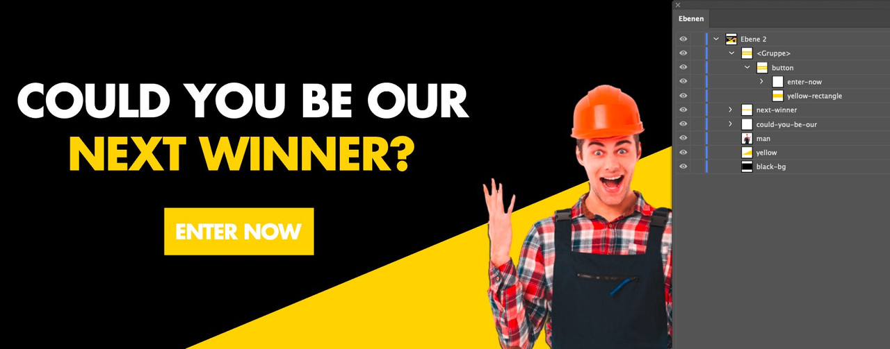
On saving as svg you can decide if the image is embeded (as base64 png file) or just link to it. For your usage the embedded image is best.
But makes the svg bigger.The groups in illustrator are in the svg code represented by the
<g>– tag and can have on that ID and classes.
If a group is surrounded by an<a xlink:href="https://webers-testseite.de/" > … </a>they can link to what you like.See f.e. this svg: https://webers-testseite.de/pureinstall/wp-content/uploads/test2.svg
it is nearly the same as the svg above – but has a little info in head area of svg:
preserveAspectRatio="xMinYMin meet"
that means the svg shrinks to the top left corner xMidYMid would be the center center etc. pp.And you do not like to use the advanced layerslider on that?
______
Next hint: if you are in illustrator – why don’t you save the image as svg ( and embed images – this man in overalls )
then use the svg as inline svg – you can have links in areas – on headings etc. pp in your svg – that is the
<a xlink:href="url" > svg group </a>option
look at – and hover the enter now on this: https://webers-testseite.de/pureinstall/wp-content/uploads/test.svg
-
This reply was modified 5 years, 9 months ago by
i often remove the import demo options for non admins. Because importing a demo removes all other content and settings.
If you like to completely obfuscate the options styling try this.
those who know where to find aren’t hampered to use it anyway. But on exidentily usage maybe this is helpful:function admin_head_mod() { if(!is_admin()){ echo '<style type="text/css"> #avia_options_page .goto_styling, #avia_options_page #avia_styling { display: none !important } </style>'; } } add_action('admin_head', 'admin_head_mod');June 17, 2020 at 12:30 pm in reply to: Function to limit number of charcaters in a specific textblock #1223339well i guess the excerpt codes could be transformed to a given selector f.e.:
function limit_character_length(){
?>
<script>
(function($){
	$(window).load(function(){
	    $('.av_textblock_section').each(function() {
	     	$(".avia_textblock > p").text(function(index, currentText) {
	     		return currentText.substr(0, 50);
			});
	    });
	});
})(jQuery);
</script>
<?php
}
add_action('wp_head', 'limit_character_length');
i guess its best to see your site to give better advice.
i think it would be best to have on text editor a character counter.
Unfortunately the word counter has also disappeared when using the Advanced Layout Builder in the Text Editor.June 17, 2020 at 11:22 am in reply to: Function to limit number of charcaters in a specific textblock #1223315There are some usefull codes to limit excerpt length ( characters or word count ) but for a normal textblock I can’t think of anything right now for a specific content – f.e. for a given content in a textblock with id or class etc.
if you use that png above from my post : allthough it is set to #eeeeee it is rendered as : #ececec
so if you do not like to see a difference you can change the color-section background to that #ecececNext: you had to replace every background-image on your page. You did it only for the first one.
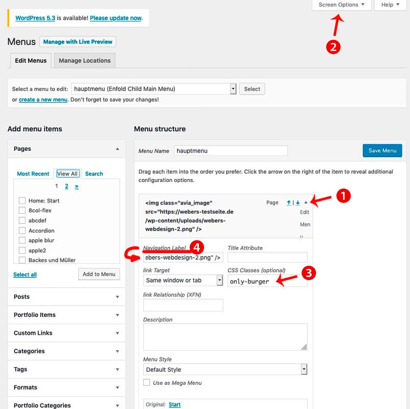
- add to your main menu two home links
- open the top home link (1) to see the menu-item settings by clicking on that little arrow on the right of the menu list point
- you can now enter on navigation label (4) an img src html like:
<img src="/wp-content/uploads/logo.png" alt="logo" /> - if you can not see in that menu item settings dialog the classes – you had to open on top of your window that flyout “Screen Options” (2) and mark the needed fields ( custom classes )
- that first home link (1) menu item gets now a meanigfull name f.e.: only-burger
- just a bit in quick css:
#avia-menu .only-burger.menu-item { display: none !important } - now to get rid of second home link on hamburger menu – you know what to do?
f.e. give a custom-class to that home menu-item : only-desktop - so you have now for both :
#avia-menu .only-burger.menu-item, #av-burger-menu-ul .only-desktop { display: none !important }
Solution is private :) ;)
June 16, 2020 at 3:18 pm in reply to: Lightbox not working (appears for a second and then redirects to the image file) #1223063First a very fundamental question: you went from a very early version to the current one?
Because the lightbox has a lot of changings in the header.php file – so if your child has an older header.php file you had to update that child-theme file first.
If this is not the case – then we had to look what could cause the error._____________
Have you checked in enfold theme-options the Lightbox Modal Window

because i do not see in your source code the loading of the avia-snippet-lightbox.js script
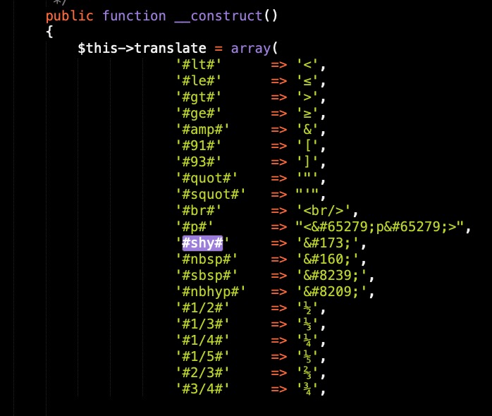
this is a problem on many wordpress themes – Günter here wrote a little plugin for it: https://github.com/KriesiMedia/enfold-library/tree/master/integration%20plugins/Enfold/Special%20Character%20Translation
It is based on the usage of entities – but even if you can use on those places an entity – you will not see it after editing in your backend.
f.e. you can use a softhyphen to set on headings a “predetermined breaking point” for long headings. But if you want to edit again – this sign is lost.so this little plugin sets a softhyphen when it comes to a : ###shy###
on that link above you see a translation.txt – there you got some replacements.
The only thing i changed is not to have 3# before and 3#after and i have added some special characters.
this is my list in that plugin:
But you had seen my answer – and have followed the link above?
https://kriesi.at/support/topic/lightbox-gallery-captions-not-showing/page/2/#post-1221506
and if you like to have all in the bottom bar, just change the markup on top – and move the mfp-title div to the bottom bar.there are a lot of settings – some you can set on the editing mode of that page like transparency but i let it in the code to show you how.
this code comes to child-theme functions.php:add_filter('avf_header_setting_filter','av_change_header_layout', 10, 1); function av_change_header_layout($header){ if(is_page(123456)){ // for example like the choice in enfold options: logo: left menu: right $header['header_position'] = 'header_top header_stretch'; $header['header_class'] .= " av_header_top av_header_stretch"; $header['header_layout'] = 'logo_left menu_right'; $header['header_class'] .= " av_logo_left av_menu_right"; // for example you like to have header transparent and glassy $header['header_transparency'] = 'header_transparency header_glassy'; $header['header_class'] .= " av_header_transparency av_header_glassy"; // header sticky (by the way the space on adding class is important) $header['header_sticky'] = 'header_sticky'; $header['header_class'] .= " av_header_sticky"; } return $header; }so let all what you can not directly set in the page on top – the rest you can erase
you see that there is a space when adding a class by .= let it in the code.June 15, 2020 at 2:29 pm in reply to: Sort by Caption rather than by Title – Mod Assistance if possible #1222658Is it important for you that the image title has a specific Value?
My Question: What if the titel is identical to your caption?you can see here in action: https://webers-testseite.de/pureinstall/
this is only one svg.
The letters are filled with different color on scroll down or if not transparency header.
The class in that svg for the letters is web9:#header.header-scrolled #letters .web9, #header:not(.av_header_transparency) #letters .web9 { fill: #112b3f; }June 15, 2020 at 11:20 am in reply to: Purchased Enfold theme – WordPress says it cannot load as it is out of date #1222601PHP 5.6: Support expires end of 2018
Security support for PHP 5.6 will expire at the end of December 2018. Already in January 2017 the developers stopped the function updates for version 5.6. The end-of-life date – i.e. the end of any support – was already postponed by one year back then, as the script language version PHP 5.6 proved to be extremely popular.
So I think you should check with your hoster to update.
PS: many hosters still offered their own support with security updates, but often this support was charged. So if you were informed that you had to pay for them, you should cancel this support after the change to newer versions.
these settings could be done by simple css – but if you want to style hover state or some transitions. It will be better to not have input but f.e. button tag here.
See example-page and hover this input-button: https://webers-testseite.de/pureinstall/alb-testseite/if you realy need this i do only see for now a plugin solution. There are a lot of good – especially for fotographers – that have this option on sorting by caption.
See Envira or NextGen Gallerywell – with filter : avf_header_setting_filter it may be possible.
what kind of header setting you like to have. Maybe show an example page on demo pages : https://kriesi.at/themes/enfold-overview/ -
This reply was modified 5 years, 9 months ago by
-
AuthorPosts
