Forum Replies Created
-
AuthorPosts
-
A lot of users have allready good image editors to optimize the jpgs for web with the wanted and for each image best compression rate.
Many images are not critical and therefore tolerate higher compression rates.
On uploading images – enfold genereates the calculated formats from the opend jpg and does not set a compression rate. So it is like you save a jpg with zero compression ( in photoshop f.e. quality 12 : maximum )the original code you can find in functions.php was since line 236:
so you can influence that on setting a compression rate in your child-theme functions.php
( here in my example 65% – but in most cases a 45% will be ok too )function av_return_100(){ return 65; } add_filter('jpeg_quality', 'av_return_100'); add_filter('wp_editor_set_quality', 'av_return_100');Then
Whether a format provided by Enfold ( functions.php lines 178ff ) is generated can be influenced again by means of a snippet in the child-theme functions.php:Some formats are needed by Enfold because they are used in the backend. The formats you want to keep then comment out analogous to the widget format.
// Disable loads of Enfold & WP image sizes upon upload
add_action('init', 'remove_enfold_image_sizes');
function remove_enfold_image_sizes() {
// do NOT remove widget size, is used in backend portfolio items!
// remove_image_size('widget');
  remove_image_size('square');
  remove_image_size('featured');
  remove_image_size('featured_large');
  remove_image_size('portfolio');
  remove_image_size('portfolio_small');
  remove_image_size('gallery');
  remove_image_size('magazine');
  remove_image_size('masonry');
  remove_image_size('entry_without_sidebar');
  remove_image_size('entry_with_sidebar');
  remove_image_size('shop_thumbnail');
  remove_image_size('shop_catalog');
  remove_image_size('shop_single');
  remove_image_size('shop_gallery_thumbnail');
}
and if you like to do that with WP image formats too:
// Remove unneeded WP image sizes
add_filter( 'intermediate_image_sizes_advanced', 'prefix_remove_default_images' );
// Remove default image sizes here.
function prefix_remove_default_images( $sizes ) {
// do NOT remove small and medium sizes, they are used in backend Media Library!
// unset( $sizes['small']); // 150px
// unset( $sizes['medium']); // 300px
 unset( $sizes['large']); // 1024px
 unset( $sizes['medium_large']); // 768px
 return $sizes;
}
BUT:
However, if you add this to an existing installation, you would have to recalculate your thumbnails afterwards.
There are small plugins that you can use temporarily for this action. Whereby you should make sure that the omitted formats are also deleted then.in former times i used this : Force Regenerate Thumbnails
does that on recalculating.But maybe a newer Plugin will be better – this seems to be from an image expert and will do the job too: reGenerate Thumbnails Advanced
January 4, 2021 at 9:59 am in reply to: BUG: content no longer showing after editing copyright field via theme options #1270113As a participant as you – i do not see private content.
on that post :
<a class="nl" href="/privacyverklaring/">Privacy Verklaring</a><a class="en" href="/en/privacy-policy/">Privacy Policy</a>if all quotation marks are the right ( straight ) format – this should not have the mentioned bug.
i had suspected that something was forgotten in the html format. e.g. an opening tag was not closed.-
This reply was modified 5 years, 2 months ago by
Guenni007.
January 3, 2021 at 3:46 pm in reply to: BUG: content no longer showing after editing copyright field via theme options #1270051what is your code you inserted to copy right input filed?
yes – but on top you are talking about “highlite search terms” – the fix is not for that plugin.
You are now talking about Relevansi. – and I just wanted to clarify that with my comment.
the excerpts-highlights.php is not existent on first plugin.Did you pay attention of the jQuery Migrate Plugin settings: load 1.12.4 legacy jQuery
or you use a css hack to have fixed images by replacing the attachment-position:scroll with a container in fixed positioning.
Read the whole post from the beginning but use this last optimized version of the css hack
https://kriesi.at/support/topic/colour-section-background-image-mobile-responsive-issue/#post-1262283btw: this will work in IOS mobile too !
https://webers-testseite.de/donkey/but you can do something that will not disturb those menu-item-ids.
You can give an Id and Alt attribute to the anchor itself.But i had to find a way that we will not have duplicate ids then – you see the problem if you put this to your child-theme functions.php
the (hamburger menu items anchors will have the same ids – and if the menu-link goes in a one-pager to that ID – . . . . .… etc. pp.
maybe it is on SEO Purpose more important to have only the alt Attribute to that link!!!:
Why must it be an ID that was tracked by Google Analytics? Arn’t there other possibilities.function set_attributes_to_menu_links(){ ?> <script> (function($){ $(document).ready(function(){ $('#avia-menu .menu-item a').each(function(){ var menuName = $(this).find('>.avia-menu-text').text(); var customID = menuName.replace(/\s+/g, '_').toLowerCase(); $(this).attr('alt', menuName); $(this).attr('id', customID); }); }); })(jQuery); </script> <?php } add_action('wp_footer', 'set_attributes_to_menu_links');Do you mean your main navigation menu? – the id’s are generated by the system itself and are added automatically to the list points.
On a normal wp-nav-menu it is possible to have customized menu-item ids. there are existing snippets for that.
F.e. using the filter: nav_menu_item_id – but i guess enfold has its own nomenklatura – and now we need the place where enfold determines those ids.
Maybe it is in that function: function avia_ajax_switch_menu_walker()just look to a enfold layout with developer tools of your browser- you can use that html as well:
<div class="flex_column av_one_half first">
	<label>[text* your-name  placeholder "Your first and last name * "] </label>
</div>
<div class="flex_column av_one_half">
	<label> [email* your-email placeholder "your E-mail address *"] </label>
</div>

<div class="flex_column av_one_full"> <label>[text* your-subject  placeholder "Your Subject *"] </label> </div>
Here on that example it is with placeholder text for the input fields. But this is not necessary.
Just place the given content of contact form 7 inbetween these divsmaybe you style your layout on a post first with only columns in advanced layout builder and look to this post on your browser with dev tools
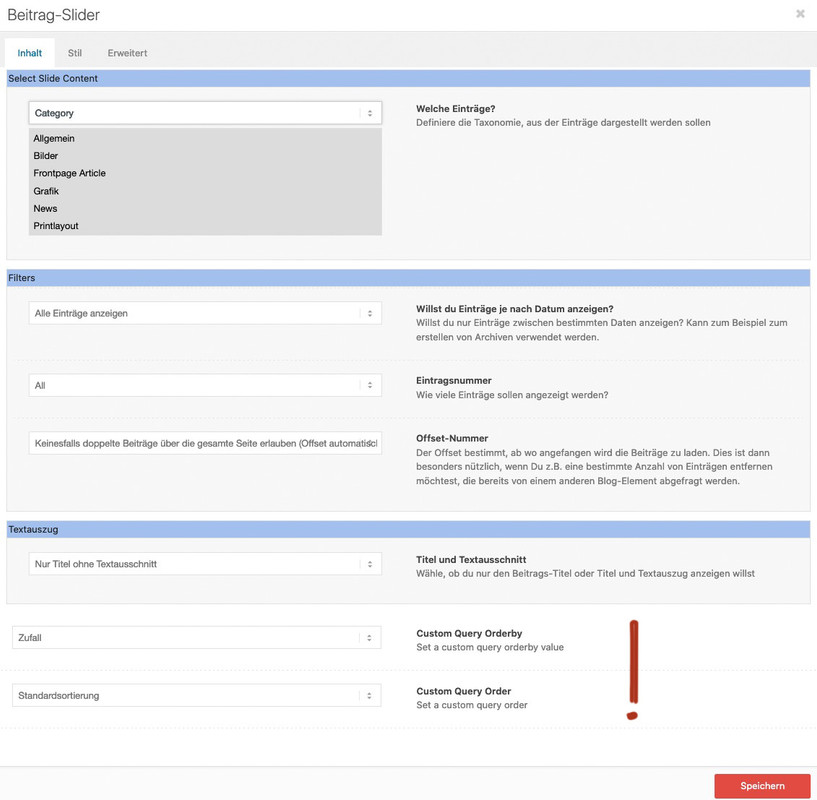
f.e. this is the needed code for 1/3 – 2/3<div class="flex_column av_one_third first"> content from contact form 7 </div> <div class="flex_column av_two_third"> content from contact form 7 </div>Denk noch an das Offset, damit im random slider nicht die gleichen Posts auftauchen wie bei den anderen.
and you are shure that you are not affected by this: https://kriesi.at/support/topic/problems-after-updating-to-wordpress-5-6-read-this-first/
did you try my solution?
that in copyright field
[polylang lang="en"]<a href="/en/privacy-policy/">Privacy Policy</a>[/polylang][polylang lang="nl"]<a href="/privacyverklaring/">Privacy Verklaring</a>[/polylang]with that snippet mentioned above in child-theme functions.php
function polylang_shortcode($atts, $content = null){ if (empty($content)) return ''; extract( shortcode_atts( array('lang' => ''), $atts ) ); if (empty($lang)) return "<h3>You must specify 'lang' using shortcode: polylang</h3>"; return ($lang == pll_current_language()) ? $content : ''; } add_shortcode('polylang', 'polylang_shortcode');to have the shortcode option on polylang first add this to your child-theme functions.php:
function polylang_shortcode($atts, $content = null){
	if (empty($content))
	return '';
	extract( shortcode_atts( array('lang' => ''), $atts ) );
	if (empty($lang))
	return "<h3>You must specify 'lang' using shortcode: polylang</h3>";
	return ($lang == pll_current_language()) ? $content : '';
}
add_shortcode('polylang', 'polylang_shortcode');
after that you can insert this :
[polylang lang="en"]english content[/polylang][polylang lang="de"]deutscher Inhalt[/polylang][polylang lang="nl"]Nederlandse inhoud[/polylang]December 21, 2020 at 12:33 pm in reply to: Adding button to mute/unmute audio on fullscreen background video #1269001Mh – that class isn’t added to mediaelementwrapper video : av-mediajs-loaded in Safari!
so the trigger for that function does not exist on safari.
On Firefox and Chrome this class is added when the video has fully loaded.on your link on top there is another interesting snippet – it will insert the oportunity to choose the orderby option on each alb.
https://kriesi.at/documentation/enfold/post-slider/#how-to-add-an-orderorderby-option-to-the-blogpost-sliderportfoliomasonry-grid-element
then take two blog posts for the newest posts of “Einsätze” and “Neuigkeiten” and for the last one only the randomized one a post slider?
the two show as grid with one column.
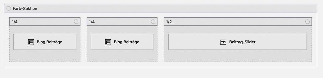
On the postslider you can choose the offset not to show duplicate post on the page.
Randomize only that sliderhttps://webers-testseite.de/jakob/
PS : mit dem Snippet oben, könnt ihr dann natürlich auch drei post-slider nehmen.
die zusätzlichen Optionen sind unten platziert:
-
This reply was modified 5 years, 3 months ago by
December 19, 2020 at 9:31 am in reply to: Can I delete all these random pages the theme comes with #1268587your start point was an imported Demo File? and you now like to delete not used Example Pages
Yes you can delete them – all at once – just mark them in the list view and choose “move to bin” and then “apply”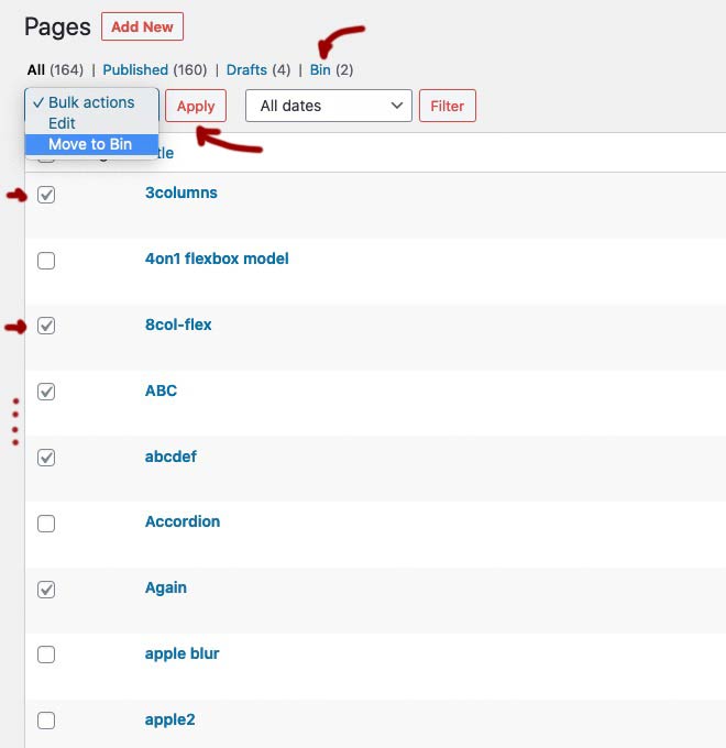
These pages are moved to the bin. However, if you’re sure, you might as well empty the bin now. Especially since it is only then possible to reassign the page name in the permalinks. Many people are surprised when they try to create a new contact page, for example, and it is then listed in the permalinks as /contact-2.
 December 18, 2020 at 7:19 pm in reply to: Adding button to mute/unmute audio on fullscreen background video #1268480
mediaelement-and-player.min.js is part of WordPress – so i guess on one of the last updates ( and as i said i did not update to WP5.6) there must be a sourcecode difference to older WP Versions.
December 18, 2020 at 7:04 pm in reply to: Adding button to mute/unmute audio on fullscreen background video #1268476Yes i know – but exactly this code does work on Safari too on former installations.
btw. : this part is only for child-theme shortcodes replacement and should stay in your child-theme functions.php
add_filter('avia_load_shortcodes', 'avia_include_shortcode_template', 15, 1);
function avia_include_shortcode_template($paths){
  $template_url = get_stylesheet_directory();
      array_unshift($paths, $template_url.'/shortcodes/');
  return $paths;
}
December 18, 2020 at 6:48 pm in reply to: Adding button to mute/unmute audio on fullscreen background video #1268472these are my two sites ( backgroud-video on slider and on color-section) :
https://webers-testseite.de/mute-unmute-video-slide/
https://webers-testseite.de/mute-unmute/And you are right – that on safari this did not work – with exactly your error log. i tested this on former times on safari too and it worked. So something must have changed in the source code either Enfolds, WordPress or Safari. These Sites above are from 2019-02-13 and color-section site from : 2018-05-01.
By the way: the domain above is still on WP 5.5.3if you look in dev tools – the id ( postid-123 or page-id-123) you can see at the body tag ( #top )
be careful of the hyphen posts do have only one no hyphen between post and id.December 17, 2020 at 2:09 pm in reply to: is it possible to load reCAPTCHA v3 only on needed Pages [UPDATE 2020] #1268125If not today when then one should do something good to a Ludwig.
* Ludwig v. Beethoven baptized on 17.12.1770best whishes from Bonn to the rest of the world ;)
December 17, 2020 at 12:42 pm in reply to: is it possible to load reCAPTCHA v3 only on needed Pages [UPDATE 2020] #1268099try this – i added contact form 7 support – so when the shortcode for contact-form 7 is used the recaptcha script is loaded – otherwise not.
function prohibit_google_recaptcha( $prohibited ){
  global $post;
  if( ! $post instanceof WP_Post ){
    return $prohibited;
  }


  /*** 1) Check to load recaptcha on given page ID's only*/
  $allowed = array( 1396, 1407 );
  $prohibited = in_array( $post->ID, $allowed ) ? false : true;

  /*** 2) Check to not load recaptcha on given page ID's - load on all others*/
  $not_allowed = array( 12, 25, 35 );
  $prohibited = in_array( $post->ID, $not_allowed ) ? true : false;

  /*** 3) Get content to check (ALB or normal content) ***/
  $content = Avia_Builder()->get_post_content( $post->ID );
  $prohibited = ( false !== strpos( $content, '[contact-form-7 ' ) || false !== strpos( $content, '[av_contact ' ) ) ? false : true;

  return $prohibited;
}

add_filter( 'avf_load_google_recaptcha_api_prohibited', 'prohibit_google_recaptcha', 10, 1 );
i only use 3) Option to check if contact shortcodes are used.
is this an actual Enfold Version?
this is not the actual Version fo TinyMCE !by the way : how did you insert images here on board – i only see on source-code your links to your posted images.
My images you can see above on the answers.I do not see your private content because i’m participant as you are.
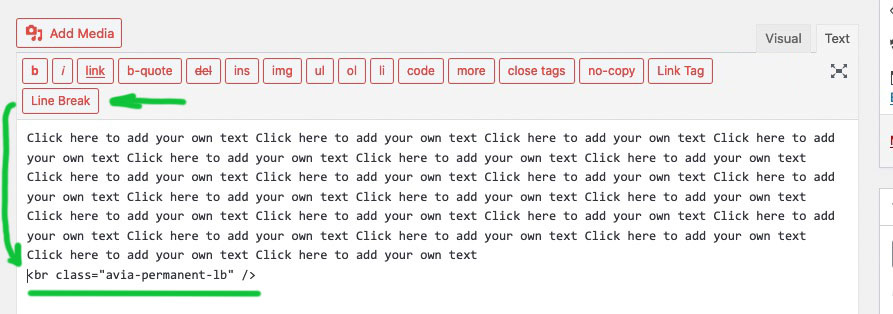
But : a line-break is a break ! if you do not want to have between your images a little space – do insert one image by the other ones without any break
and give a custom-class to the text-block itself like f.e.: images-blockthen:
.avia_textblock.images-block img {
display: block
}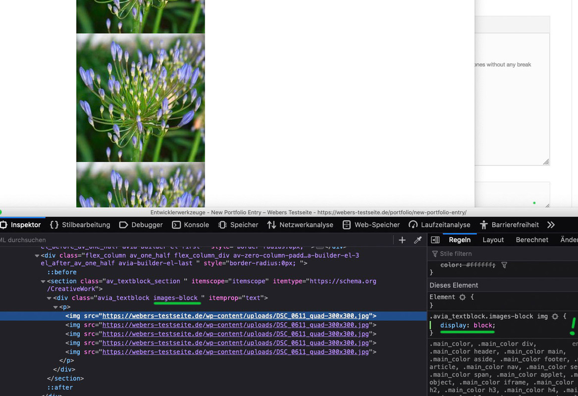
ok – you got a slideshow – selector is a bit in dependency what kind of Caption you use ( framed etc)
if you only like to have it not vertically centered then Rikards code is to use.
If you want to influence the distance between : avia-caption-title and avia-caption-content
you can use:.postid-3540 .slideshow_align_caption .avia-caption-title { margin-bottom: 20px !important; }but the code ( if your postid is correct ) had to work too:
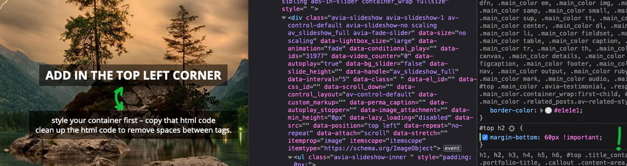
here a testpage with only #top h2
if you are in textmode of Editor in Textblock ALB you will see this:
maybe you have activated the option : force inline-svg that will transform all :
<img src="image-source.svg" />to svg itself
then svgs as inline svg needs absolute dimension settings – otherwise they will have 0x0px dimension :img[src*=".svg"], svg { width: 2500px; display: block; }the front-end width is then done by surrounding container.
the :
color: currentColor !important;is responsible for the font color. Erase only that line and see if your will be happy with that.
i guess you had to help her – she ( or he – could be both with that nick) – only 2 postings on her history. Maybe that is hard stuff for a beginner
did you copy&paste the line above?
I don’t see any “&” so it can hardly be from my snippet up there.Where did you paste the code?
And can you please post an example code you inserted to your menu?
-
This reply was modified 5 years, 2 months ago by
-
AuthorPosts