Forum Replies Created
-
AuthorPosts
-
wenn du das Logo lieber bündig mit der Navigatin haben möchtest:
#header_main .av-logo-container { padding: 0 5px; }zunächst sollten die ja keine Untermenupunkte haben diese beiden Individual Links. Daher sollten die Pfeile auch nicht da sein.
Hast du im Menu eventuell die als MegaMenu Punkte gesetzt?
Standardmäßig sind da bei Enfold keine “Arrows” – also wie hast du Sie eingebunden?
doch mit dem Pseudocontainer after – also nimm sie dort wieder raus:
besser hinter der ursprünglichen Anweisung im css platzieren..html_header_top .av_bottom_nav_header #header_main_alternate .main_menu ul:first-child > li.anfrage > a::after, .html_header_top .av_bottom_nav_header #header_main_alternate .main_menu ul:first-child > li.telefon > a::after{ content: ""; }der Unterstrich:
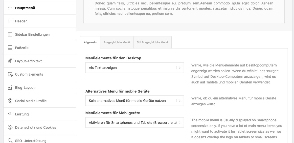
.anfrage.current-menu-item > a > .avia-menu-fx,
.telefon.current-menu-item > a > .avia-menu-fx {
    display: none
}
es ist bestimmt für deine Konstellation besser, wenn du zunächst mal den Umbruchpunkt wann der Hamburger auftaucht auf die “Mobile/Tablet” Option einstellst: ( Menuelemente für Mobilgeräte )
wenn das nicht reichen sollte, dann kann man das auch per css beeinflussen.
no private content for me – i’m participant as you are
ok – i thought it is your website – is there a test site with that?
your site http://peterloew.eu/ shows me not the equal height optionGerne auch via E-Mail wenn du die Seite nicht öffentlich machen möchtest.
ohne die Seite zu sehen ist es quasi unmöglich dir exakte Tips zu geben.
can you please set the columns now to equal height!
then it is easier to find the correct selectors for it –
maybe you give a custom-class to that column – then the selector is more specific.April 12, 2021 at 12:31 am in reply to: White Logo and Menu on front page, black logo and menu on other pages #1293810and your front-page realy get that high ID ( 3386 ) ?
and your front-page is a page? it might be a post?
and the link to your alternative Logo – try the absolute path with https://domain/wp-content/ …etcbest would be to have a live link for me to give better advice – if you like write me an email.
function replace_logo_on_some_pages($logo){
   if(is_home()){
      $logo = "/wp-content/uploads/2021/04/Element-1-4-1030×167.png";
    }
    return $logo;
}
add_filter('avf_logo','replace_logo_on_some_pages');
PS : i see now the dimensions of your “logo” – is it set as background ? and not in Enfold Options Dialog : “Logo” ?
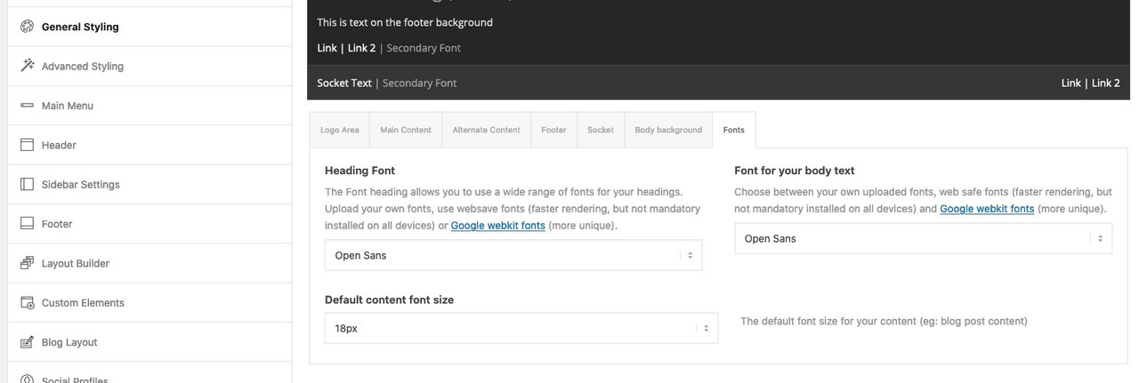
Maybe that will be a nice link ( on Google Webkit Fonts ) to have in Enfold Options:
It was meant as a suggestion for the developer fraction
PS: a few entries in the register-admin-options.php and there they are ;) April 11, 2021 at 11:14 am in reply to: Adding animated gif next to the social media icons header #1293755
your image link over bit.ly does not open here on my end.
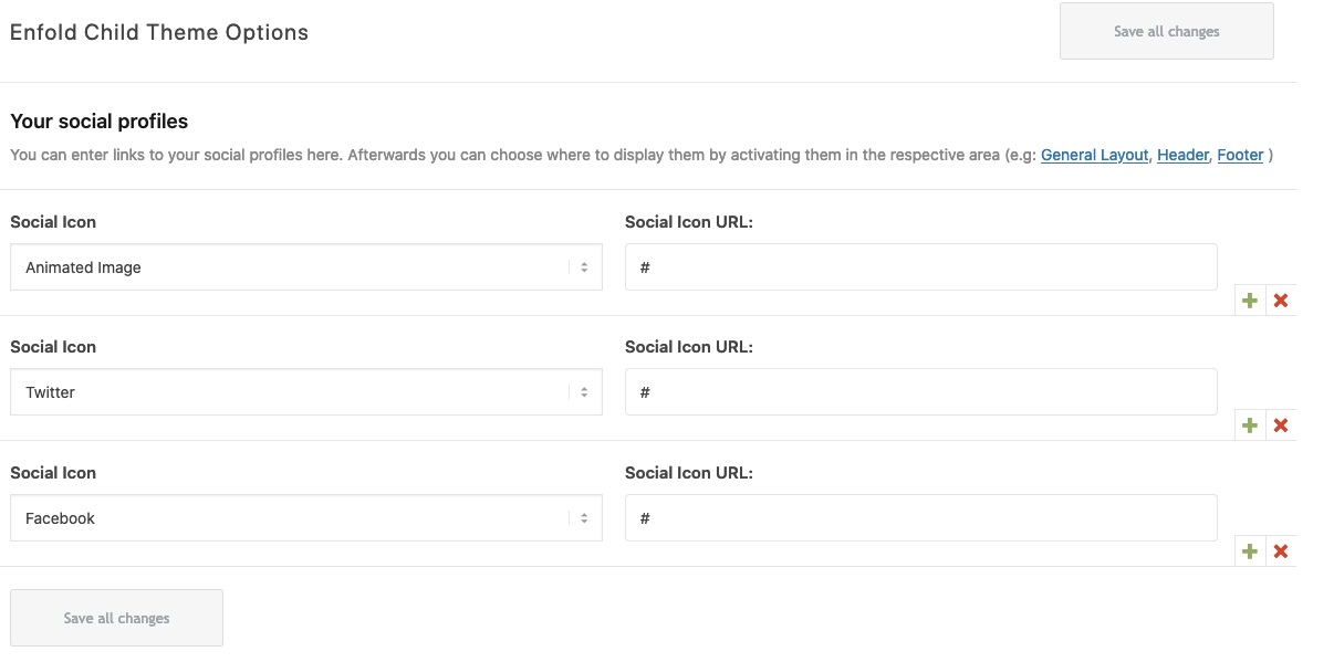
i would do this with registering an additional “social icon”
You can put this in your child-theme functions.php:/** Add new icon as an option for social icons **/ function avia_add_custom_social_icon($icons) { $icons['Animated Image'] = 'animated'; return $icons; } add_filter('avf_social_icons_options','avia_add_custom_social_icon', 10, 1);and this in your quick css:
/************* social animated gif *******************/
#top #wrap_all .av-social-link-animated a {
  pointer-events: none !important
}

#top #wrap_all .av-social-link-animated a:before{
  content: "";
  width: 35px;
  height: 35px;
  position: relative;
  top: -3px;
  left: -15px;
  display: inline-block;
  vertical-align: middle;
  background: url(/wp-content/uploads/2021/04/arrows.gif) no-repeat center center;
  background-size: contain;
}

#top .main_menu .social_bookmarks li.social_bookmarks_animated {
    width: 45px;
    position: relative;
    left: 10px;
}
Now you have on Enfold (Child) – Social Profile another link you can place at the beginning of that list:
adjust the link to your animated gif !
Result: https://webers-testseite.de/weber/
have a look how this shows if the social icons goes to main-menu when you are in between 768px and 990px !thanks for the pdf – helpfull.
Or use The Link to Google Fonts itself: Enfold Google Fonts
And type in any pangram you like f.e.: “The quick brown fox jumps over the lazy dog”
_________________________________
Maybe that will be a nice link ( on Google Webkit Fonts ) to have in Enfold Options:
-
This reply was modified 4 years, 11 months ago by
Guenni007.
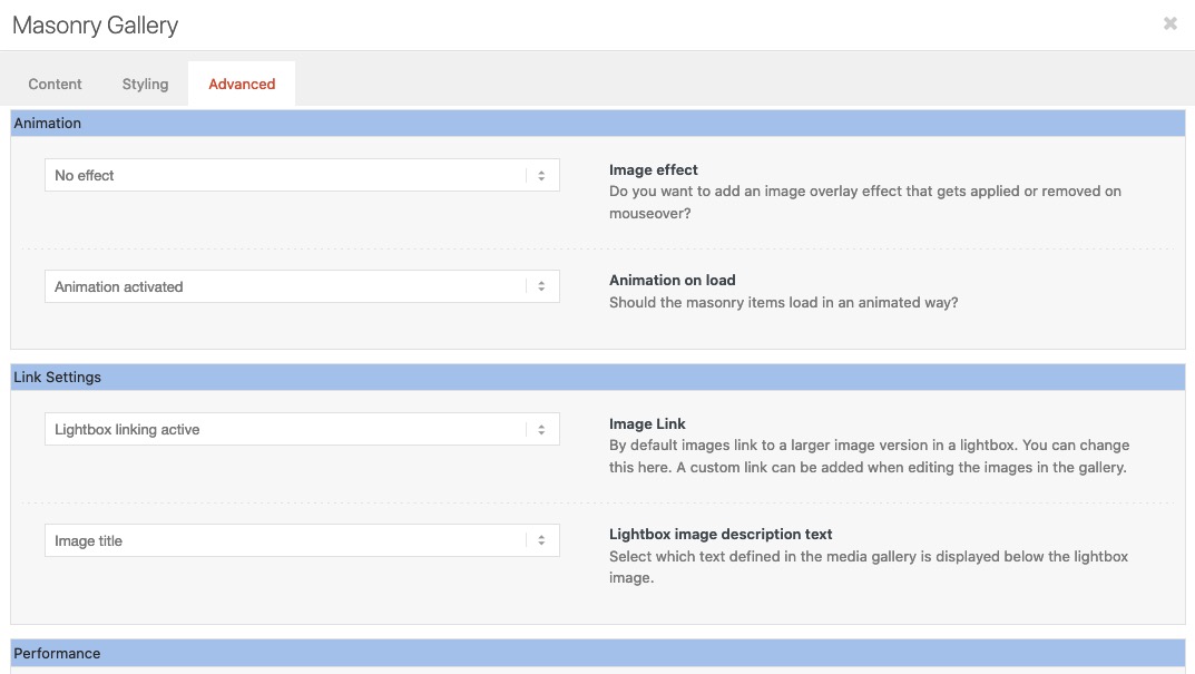
And you checked that option in : Enfold (Child) – Theme Options : “Lightbox Modal Window” ?
On the masonry Element did you activate the lightbox on the advanced tab:
 April 10, 2021 at 9:38 pm in reply to: White Logo and Menu on front page, black logo and menu on other pages #1293700
es ist sehr zu empfehlen, ein Child-theme zu nutzen. Das ist kein Zauberwerk und recht schnell eingerichtet. Es gibt auch ein vorgefertigtes Child-Theme in der Dokumentation zum download.: https://kriesi.at/documentation/enfold/child-theme/
Alle kleinen nützlichen Tips die über die functions.php laufen sind so recht simple anzuwenden, und gehen auch in der Regel nicht bei einem Update des Eltern-Themas verloren.
Gerade am Anfang einer Installation ist dies sehr simple zu machen. Sollte ein Thema schon recht fortgeschritten installiert sein bietet Enfold auch hier durch Übernahme der Einstellungen gute Möglichkeiten auch nachträglich noch umzustellen.April 10, 2021 at 7:29 pm in reply to: White Logo and Menu on front page, black logo and menu on other pages #1293693you can do it over the same filter in different ways ( one over url – the other over logo )
As Jordan said – set the one logo you like to have on all pages except few other pages to the enfold options dialog.
then put this in child-theme functions.php:
function replace_logo_on_some_pages($logo){
    if(is_page(array( 'home', 1396, 1234, ))){
      $logo = "/wp-content/uploads/alternativ-logo.png";
    }
    return $logo;
}
add_filter('avf_logo','replace_logo_on_some_pages');
or as mentioned above: via url:
function av_change_logo_url($url){
    if(is_page(array( 'home', 1396, 1234, ))){
        $url = "/wp-content/uploads/alternate-logo.jpg";
    }
    return $url;
}
add_filter('avf_logo','av_change_logo_url');
the numbers are the page-ids – page names comes into quotation marks.
if it is only the home or front_page or a single page replace that line with the array by
if(is_front_page()){ or if(is_home()){ or if(is_page( 1234 )) {and give to the header widgets a less z-index – otherwise the hamburger isn’t clickable:
look in your css and find that rule and change z-index.#header .widget_text { z-index: 2; /*** it is now 9999 ****/ }April 10, 2021 at 3:25 pm in reply to: Columns and "Custom top and bottom margin" on mobile view #1293636A solution would be to have analog to the equal-height ( min-height option in columns.php) an additional wrapper div even for individual height option that will have the style on that.
By the way – this seems to be a general problem on floating divs and negative margins.
f.e: https://www.smashingmagazine.com/2009/07/the-definitive-guide-to-using-negative-margins/#negative-margins-on-floated-elementsApril 10, 2021 at 2:56 pm in reply to: Columns and "Custom top and bottom margin" on mobile view #1293633btw: there is now a copy of the yellow color-section ( now with other bg-color) but without negativ margin shift
here again all is ok.
So the negative margin to shift the columns to top ( to overlap the section before ) in combination with individual height leads to that overlapping of the columns.April 10, 2021 at 2:44 pm in reply to: Columns and "Custom top and bottom margin" on mobile view #1293632Everything is said above. If you see this like me:
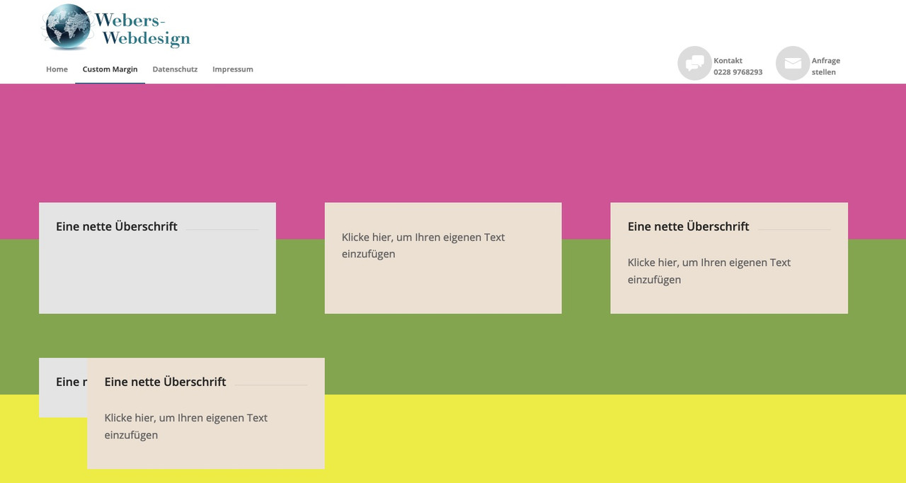
second color-section (green bg) with columns set to equal height and with negative shift of all columns to top – here everything is ok.
on bottom a color-section ( yellow one ) a copy of all columns – but set to individual height – same negative margin to shift to top – overlapping 3 columns – the fist looks out a bit – caused to margin-left : 0 – on mobile – totaly overlapping of all 3 columns.for you to copy:
[av_section min_height='25' min_height_pc='25' min_height_px='500px' padding='default' custom_margin='0px' custom_margin_sync='true' color='main_color' background='bg_color' custom_bg='#d65799' background_gradient_color1='' background_gradient_color2='' background_gradient_direction='vertical' src='' attachment='' attachment_size='' attach='scroll' position='top left' repeat='no-repeat' video='' video_ratio='16:9' overlay_opacity='0.5' overlay_color='' overlay_pattern='' overlay_custom_pattern='' shadow='no-border-styling' bottom_border='no-border-styling' bottom_border_diagonal_color='#333333' bottom_border_diagonal_direction='' bottom_border_style='' custom_arrow_bg='' id='' custom_class='' template_class='' aria_label='' av_element_hidden_in_editor='0' av_uid='av-kn75k2l9' sc_version='1.0'][/av_section] [av_section min_height='25' min_height_pc='25' min_height_px='500px' padding='default' custom_margin='0px' custom_margin_sync='true' color='main_color' background='bg_color' custom_bg='#83a846' background_gradient_color1='' background_gradient_color2='' background_gradient_direction='vertical' src='' attachment='' attachment_size='' attach='scroll' position='top left' repeat='no-repeat' video='' video_ratio='16:9' overlay_opacity='0.5' overlay_color='' overlay_pattern='' overlay_custom_pattern='' shadow='no-border-styling' bottom_border='no-border-styling' bottom_border_diagonal_color='#333333' bottom_border_diagonal_direction='' bottom_border_style='' custom_arrow_bg='' id='' custom_class='' template_class='' aria_label='' av_element_hidden_in_editor='0' av_uid='av-kn75k86o' sc_version='1.0'] [av_one_third first min_height='av-equal-height-column' vertical_alignment='av-align-top' space='' row_boxshadow_color='' row_boxshadow_width='10' custom_margin='aviaTBcustom_margin' margin='-200px,0px' mobile_breaking='' border='' border_color='' radius='0px' radius_sync='true' padding='30px' padding_sync='true' column_boxshadow_color='' column_boxshadow_width='10' background='bg_color' background_color='#e5e5e5' background_gradient_color1='' background_gradient_color2='' background_gradient_direction='vertical' src='' attachment='' attachment_size='' background_position='top left' background_repeat='no-repeat' highlight_size='1.1' animation='' link='' linktarget='' link_hover='' title_attr='' alt_attr='' mobile_display='' id='' custom_class='' template_class='' aria_label='' av_uid='av-kn75l7zt' sc_version='1.0'] [av_heading heading='Eine nette Überschrift' tag='h3' style='' subheading_active='' show_icon='' icon='' size='' av-medium-font-size-title='' av-small-font-size-title='' av-mini-font-size-title='' subheading_size='' av-medium-font-size='' av-small-font-size='' av-mini-font-size='' icon_size='' av-medium-font-size-1='' av-small-font-size-1='' av-mini-font-size-1='' color='' custom_font='' icon_color='' margin=',,,,' padding='10' icon_padding='10' link='' link_target='' av-desktop-hide='' av-medium-hide='' av-small-hide='' av-mini-hide='' id='' custom_class='' template_class='' av_uid='av-3khuw' sc_version='1.0'][/av_heading] [/av_one_third][av_one_third min_height='' vertical_alignment='av-align-top' space='' row_boxshadow_color='' row_boxshadow_width='10' margin='0px' margin_sync='true' mobile_breaking='' border='' border_color='' radius='0px' radius_sync='true' padding='30px' padding_sync='true' column_boxshadow_color='' column_boxshadow_width='10' background='bg_color' background_color='#ede2d3' background_gradient_color1='' background_gradient_color2='' background_gradient_direction='vertical' src='' attachment='' attachment_size='' background_position='top left' background_repeat='no-repeat' highlight_size='1.1' animation='' link='' linktarget='' link_hover='' title_attr='' alt_attr='' mobile_display='' id='' custom_class='' template_class='' aria_label='' av_uid='av-kn75m2i6' sc_version='1.0'] [av_textblock size='' av-medium-font-size='' av-small-font-size='' av-mini-font-size='' font_color='' color='' av-desktop-hide='' av-medium-hide='' av-small-hide='' av-mini-hide='' id='' custom_class='' template_class='' av_uid='av-9k2g' sc_version='1.0'] Klicke hier, um Ihren eigenen Text einzufügen [/av_textblock] [/av_one_third][av_one_third min_height='' vertical_alignment='av-align-top' space='' row_boxshadow_color='' row_boxshadow_width='10' margin='0px' margin_sync='true' mobile_breaking='' border='' border_color='' radius='0px' radius_sync='true' padding='30px' padding_sync='true' column_boxshadow_color='' column_boxshadow_width='10' background='bg_color' background_color='#ede2d3' background_gradient_color1='' background_gradient_color2='' background_gradient_direction='vertical' src='' attachment='' attachment_size='' background_position='top left' background_repeat='no-repeat' highlight_size='1.1' animation='' link='' linktarget='' link_hover='' title_attr='' alt_attr='' mobile_display='' id='' custom_class='' template_class='' aria_label='' av_uid='av-1vw80' sc_version='1.0'] [av_heading heading='Eine nette Überschrift' tag='h3' style='' subheading_active='' show_icon='' icon='' size='' av-medium-font-size-title='' av-small-font-size-title='' av-mini-font-size-title='' subheading_size='' av-medium-font-size='' av-small-font-size='' av-mini-font-size='' icon_size='' av-medium-font-size-1='' av-small-font-size-1='' av-mini-font-size-1='' color='' custom_font='' icon_color='' margin=',,,,' padding='10' icon_padding='10' link='' link_target='' av-desktop-hide='' av-medium-hide='' av-small-hide='' av-mini-hide='' id='' custom_class='' template_class='' av_uid='av-1ed7c' sc_version='1.0'][/av_heading] [av_textblock size='' av-medium-font-size='' av-small-font-size='' av-mini-font-size='' font_color='' color='' av-desktop-hide='' av-medium-hide='' av-small-hide='' av-mini-hide='' id='' custom_class='' template_class='' av_uid='av-rl7w' sc_version='1.0'] Klicke hier, um Ihren eigenen Text einzufügen [/av_textblock] [/av_one_third][/av_section][av_section min_height='25' min_height_pc='25' min_height_px='500px' padding='default' custom_margin='0px' custom_margin_sync='true' color='main_color' background='bg_color' custom_bg='#eeee22' background_gradient_color1='' background_gradient_color2='' background_gradient_direction='vertical' src='' attachment='' attachment_size='' attach='scroll' position='top left' repeat='no-repeat' video='' video_ratio='16:9' overlay_opacity='0.5' overlay_color='' overlay_pattern='' overlay_custom_pattern='' shadow='no-border-styling' bottom_border='no-border-styling' bottom_border_diagonal_color='#333333' bottom_border_diagonal_direction='' bottom_border_style='' custom_arrow_bg='' id='' custom_class='' template_class='' aria_label='' av_element_hidden_in_editor='0' av_uid='av-kn75tsfl' sc_version='1.0'] [av_one_third first min_height='' vertical_alignment='av-align-top' space='' row_boxshadow_color='' row_boxshadow_width='10' custom_margin='aviaTBcustom_margin' margin='-200px,0px' mobile_breaking='' border='' border_color='' radius='0px' radius_sync='true' padding='30px' padding_sync='true' column_boxshadow_color='' column_boxshadow_width='10' background='bg_color' background_color='#e5e5e5' background_gradient_color1='' background_gradient_color2='' background_gradient_direction='vertical' src='' attachment='' attachment_size='' background_position='top left' background_repeat='no-repeat' highlight_size='1.1' animation='' link='' linktarget='' link_hover='' title_attr='' alt_attr='' mobile_display='' id='' custom_class='' template_class='' aria_label='' av_uid='av-kn75tmau' sc_version='1.0'] [av_heading heading='Eine nette Überschrift' tag='h3' style='' subheading_active='' show_icon='' icon='' size='' av-medium-font-size-title='' av-small-font-size-title='' av-mini-font-size-title='' subheading_size='' av-medium-font-size='' av-small-font-size='' av-mini-font-size='' icon_size='' av-medium-font-size-1='' av-small-font-size-1='' av-mini-font-size-1='' color='' custom_font='' icon_color='' margin=',,,,' padding='10' icon_padding='10' link='' link_target='' av-desktop-hide='' av-medium-hide='' av-small-hide='' av-mini-hide='' id='' custom_class='' template_class='' av_uid='av-3zd4c' sc_version='1.0'][/av_heading] [/av_one_third][av_one_third min_height='' vertical_alignment='av-align-top' space='' row_boxshadow_color='' row_boxshadow_width='10' margin='0px' margin_sync='true' mobile_breaking='' border='' border_color='' radius='0px' radius_sync='true' padding='30px' padding_sync='true' column_boxshadow_color='' column_boxshadow_width='10' background='bg_color' background_color='#ede2d3' background_gradient_color1='' background_gradient_color2='' background_gradient_direction='vertical' src='' attachment='' attachment_size='' background_position='top left' background_repeat='no-repeat' highlight_size='1.1' animation='' link='' linktarget='' link_hover='' title_attr='' alt_attr='' mobile_display='' id='' custom_class='' template_class='' aria_label='' av_uid='av-37i6s' sc_version='1.0'] [av_textblock size='' av-medium-font-size='' av-small-font-size='' av-mini-font-size='' font_color='' color='' av-desktop-hide='' av-medium-hide='' av-small-hide='' av-mini-hide='' id='' custom_class='' template_class='' av_uid='av-2l0rw' sc_version='1.0'] Klicke hier, um Ihren eigenen Text einzufügen [/av_textblock] [/av_one_third][av_one_third min_height='' vertical_alignment='av-align-top' space='' row_boxshadow_color='' row_boxshadow_width='10' margin='0px' margin_sync='true' mobile_breaking='' border='' border_color='' radius='0px' radius_sync='true' padding='30px' padding_sync='true' column_boxshadow_color='' column_boxshadow_width='10' background='bg_color' background_color='#ede2d3' background_gradient_color1='' background_gradient_color2='' background_gradient_direction='vertical' src='' attachment='' attachment_size='' background_position='top left' background_repeat='no-repeat' highlight_size='1.1' animation='' link='' linktarget='' link_hover='' title_attr='' alt_attr='' mobile_display='' id='' custom_class='' template_class='' aria_label='' av_uid='av-1wz18' sc_version='1.0'] [av_heading heading='Eine nette Überschrift' tag='h3' style='' subheading_active='' show_icon='' icon='' size='' av-medium-font-size-title='' av-small-font-size-title='' av-mini-font-size-title='' subheading_size='' av-medium-font-size='' av-small-font-size='' av-mini-font-size='' icon_size='' av-medium-font-size-1='' av-small-font-size-1='' av-mini-font-size-1='' color='' custom_font='' icon_color='' margin=',,,,' padding='10' icon_padding='10' link='' link_target='' av-desktop-hide='' av-medium-hide='' av-small-hide='' av-mini-hide='' id='' custom_class='' template_class='' av_uid='av-1enuo' sc_version='1.0'][/av_heading] [av_textblock size='' av-medium-font-size='' av-small-font-size='' av-mini-font-size='' font_color='' color='' av-desktop-hide='' av-medium-hide='' av-small-hide='' av-mini-hide='' id='' custom_class='' template_class='' av_uid='av-uwqo' sc_version='1.0'] Klicke hier, um Ihren eigenen Text einzufügen [/av_textblock] [/av_one_third][/av_section]sorry – my imagehoster is temporarily down. – in the text there are a few images
btw: here is your logo as svg file: https://webers-testseite.de/weber/DigitalPrint.svg
if you need it.
To use it on WordPress you had to allow that mime type via functions.php child-theme.Nun : das hier in das Quick CSS einfügen.
.anfrage a:before {
  content: "\e805";
}
.telefon a:before {
  content: "\e83c";
}

@media only screen and (min-width: 990px) {
  #header_main_alternate {
    border-top: none;
  }

  span.menu-break {
    display: block;
    line-height: 60px;
    bottom: 35px;
    position: relative;
  }

  .anfrage, .telefon {
    text-align:left;
    float: right !important;
    top: -15px;
    margin-left: 60px
  }

  .anfrage a:hover:before ,
  .telefon a:hover:before {
    background-color : #aaa !important;
  }

  .anfrage a:hover .avia-menu-fx ,
  .telefon a:hover .avia-menu-fx {
    display : none !important;
  }

  .anfrage a:before, .telefon a:before {
    display: table;
    font-family: entypo-fontello;
    font-size: 30px;
    color: #fff;
    position: absolute;
    left: -50px;
    top: 0;
    padding: 5px 10px;
    background-color: #ddd;
    width: 40px;
    height: 40px;
    border-radius: 50%;
    text-align: center;
    vertical-align: middle;
  }
}

@media only screen and (max-width: 989px) {
  #av-burger-menu-ul .anfrage a:before,
  #av-burger-menu-ul .telefon a:before {
    font-family: entypo-fontello;
    font-size: 30px;
    color: #ddd;
    position: absolute;
    left: 0;
    top: 10px;
    padding: 5px 10px;
    width: 40px;
    height: 40px;
  }
}
du siehst hier tauchen die benutzerdefinierten Klassen auf: anfrage und telefon
diese Menüpunkte floaten jetzt rechts. Wenn du die Positionen tauschen willst, dann ziehe im Menu die Positionen an die richtige Stelleerstmal mache das mit dem Header Widget Area rückgängig!
Also auch aus der funkions.php den entsprechenden Eintrag entfernen, und bei Widgets das Widget-Area löschen.Dann ist es wohl für dein Menü günstiger den Responsiven Fall bei 990px eintreten zu lassen:
Enfold (Child) – Hauptmenü – “Menüelemente für Mobilgeräte” dort für mobil und tablets wählen.__________
zunächst musst Du wissen, wie man einzelnen Menupunkten eine benutzerdefinierte Klasse gibt:
im Dashboard – Design – Menüs
gibt es ganz oben im Fenster diesen Tab : “Ansicht anpassen” ( fly out button)
nachdem du das gedrückt hast, siehst du( alle bilder kannst du durch klicken vergrößern)
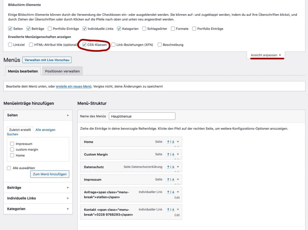
mach den Haken bei CSS-Klassen.Jetzt kannst du neben jedem Menupunkt den Edit Button Klicken und du hast dann die Möglichkeit diesem eine Klasse zuzuordnen.
also z.B: rechstbuendig besser ist für nachher aber hier auch schon zu unterscheiden also Klassen anfrage und telefon
Bei “Angezeigter Name” ( engl: Label ) gibst du in einem “Individuellem Link” ein
a)Anfrage<span class="menu-break">stellen</span>b)
Kontakt <span class="menu-break">0911-4771800</span>bei b) gibst du als Link an:
tel:+499114771800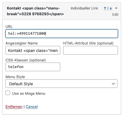
gleich geht es weiter: …
That’s o.k. ; but some mods here don’t work daily with customer requests in real wordpress life. I just know that all very well; in the time where I was intensively occupied with jQuery and further education I tried to realize everything via scripts.
Since one has already times a few standard answers, which are not always the optimal way.
You have to have understanding for that, because with the abundance of questions here they hardly have more time than 5-10min to find an answer.But if it is o.k. here now for the other participants I answer now in German. If someone needs the instructions in English please write here.
no – i’m kidding ;)
with the few pages I would also quickly rebuild with the content that I get via wayback machine (you can get the images via ftp).-
This reply was modified 4 years, 11 months ago by
i do not know how Backupbuddy does a backup. What files do you get after updating?
Another tip for the future.
I like most this duplicator plugin – and the freeware is as mighty as the pro version – pro has only some scheduling options and multi-site support.
it generates two files one installer and one zip file – with a complete backup of your page – and the database.When did that happen?
if you have no other backup – or you can not open that backup you have and have a look into them – then you can at least view the contents of some pages via the Wayback machine.
https://web.archive.org/the last catch was the 24.01.2021 : https://web.archive.org/web/20210124084742/http://www.propshopep.org/
for example: you can copy&paste the content from their site
About us:
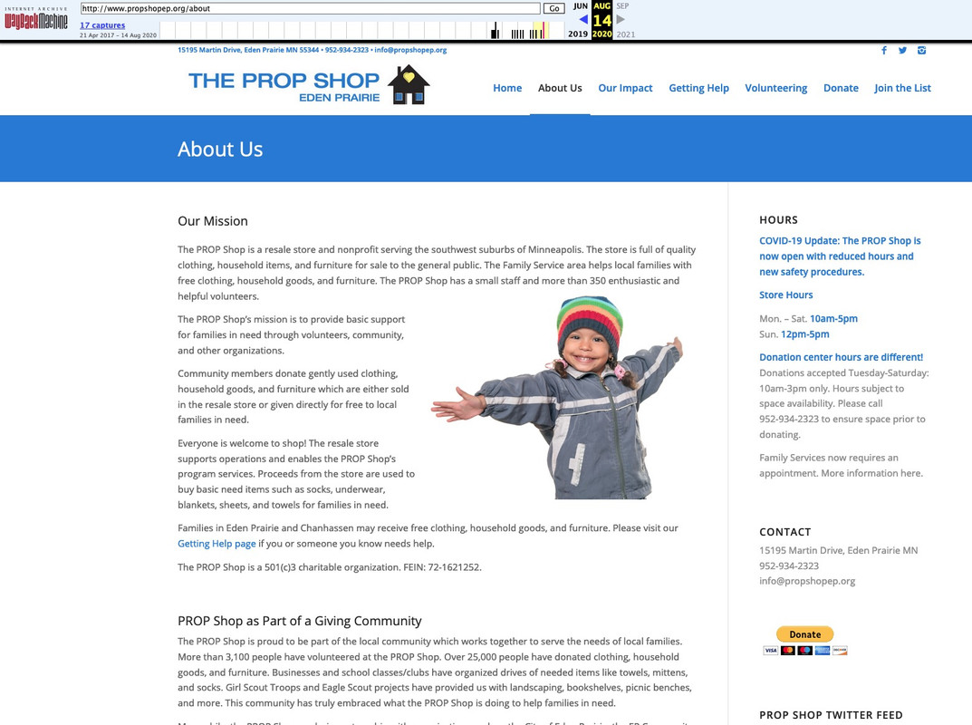
As far as i can see – a lot of pages are in that catch:
By the way the chocolate must now go to Bonn/Germany ;)i wouldn’t do that with header widget area. these are links that seems to be part of a navigation but only with icons in front and with two line labels.
So why not use the menu and to have those menu points with a custom-class. Your normal menu floats left – these two menu-points float right. Thats all.
the icons can be placed in pseudo-containers – and the two line label can be inserted by a label with a span inside – f.e.:
Anfrage<span class="menu-break">stellen</span>the rest is quick css – and what is very nice – the shrinking is included – and the links are in hamburger too from the beginning.
see: https://webers-testseite.de/weber/sollte dich das interessieren sag einfach Bescheid. Dann versuche ich es hier zu beschreiben.
April 9, 2021 at 1:24 pm in reply to: changes in buttons_fullwidth.php are lost after Enfold Update #1293503read carefully: https://kriesi.at/support/topic/changing-avia-iconbox-title-to-h2/#post-1261597
the child-theme usage of edited enfold alb elements – works if you insert to your child-theme functions.php :
function avia_include_shortcode_template($paths){
  $template_url = get_stylesheet_directory();
      array_unshift($paths, $template_url.'/shortcodes/');
  return $paths;
}
add_filter('avia_load_shortcodes', 'avia_include_shortcode_template', 15, 1);
The trick is to have a copy of the alb element ( in your case: buttons_fullwidth.php ) in a subfolder of your child-theme folder: shortcodes and to edit this copy.
Because this child-theme folder is untouched on an update of the parent theme – entries and edited alb elements are not influenced.
But if there are major changes on the parent file – you had to synchronize these edited elements again by new edited files.
But that is something which did not change the layout – it can cause that this alb element didn’t have the new features of the parent element.on a shrinking header they overlap after scrolling.
But now you set the header to non-shrinking. ( ok that problem is solved by this )shrink the browser window ( make it narrower ) or look to your page on a mobile device:
the left hamburger overlapping slider is the active one – the right one is without function ( twice hamburgers )

Ipad view: ( all tablets ):
overlapping navigation etc ( both navigation list points are not clickable anymore by the overlapping header widget area )

btw. if you always have the background-image in the first container – you can give them a min-height if you are in responsive case:
@media only screen and (max-width:989px) {
  .av-layout-grid-container .avia-builder-el-first {
    min-height: 290px;
  }
}
otherwise you will only see a 100px height when the cells go under each other.
– if you like to have the background-image on different cells – put in that cell with the background-image a separator whitespace with f.e: 250px
Please update to Enfold 4.8.1 – these are br tags : https://kriesi.at/support/topic/enfold-4-8-1-and-removing-additional-br-tags-added-in-4-8/
-
This reply was modified 4 years, 11 months ago by
-
AuthorPosts