Forum Replies Created
-
AuthorPosts
-
March 30, 2022 at 3:25 pm in reply to: Can the Portfolio grid auto not show the portfolio item of the current page? #1346602
can you try this instead:
function ava_exclude_current_post($query) { // you can use here aswell : if(is_single()){ if (is_singular('post') || is_singular('portfolio') ) { $exclude = avia_get_the_ID(); $query->set( 'post__not_in', array($exclude) ); } } add_action('pre_get_posts', 'ava_exclude_current_post');Offtopic:
PS : if i like to insert something on that position – i would have placed it inside wrap_all container and maybe used the hook: ava_after_footer_output
because that will work with all footer settings – even with curtain effect – because it will be part of that.f.e.: something like this will be more elegant:
function subsocket_color_set($color_sets){
  $color_sets['subsocket_color'] = 'Subsocket';
  return $color_sets;
}
add_filter( 'avf_color_sets', 'subsocket_color_set', 999, 1 );

add_action('ava_after_footer_output', function() {
  echo '<div id="subsocket" class="container_wrap subsocket_color"><div class="container">YOUR HTML CONTENT HERE</div></div>';
});
Result: you will have that extra container : #subsocket and you can style it in enfold general styling by an extra styling set : Subsocket ;)
But you can have a look if there is a child-theme footer.php via ftp – and post the content from it here.
Or you can post here the whole content of your child-theme functions.php ( please use on that the code tag here on the forum – that we can better inspect )If it is in footer.php there must be something like this under the wrap_all closing div arround line 304
echo "<!-- end wrap_all --></div>"; // maybe that is the insertion: echo '<section id="footer"><div class="container"><div class="row">LilaHaarup.dk / <a href="https://www.facebook.com/lila.haarup" target="_blank">Facebook </a> / <a href="https://www.instagram.com/lilahaarup/?hl=da" target="_blank">Instagram</a></div></div></section>';first: you know best how you put in that additional container under wrap_all.
Your additonal Container is not part of that #wrap_all (as the enfold #footer is) – and besides that i would not give it the same ID as the Enfold Footer !!! ID’s have to be unique.
it is a top-border of 5px set on that section#footer:section#footer { border-top: none !important; }or do you like to get rid of the whole new container – guess you did that insertion via functions.php – or do you have a child-theme footer.php ?
First read this please : did you fill in the enfold options on transparency header? or how did you set up your white font on transparency header?
Dashboard – Enfold Child – Header : “Transparency Options” – there is that setting for : “Transparency Menu Color”The default way would be to set the font color options on General Styling : Logo Area Background Colors – and for transparency see above.
________
Have you set a shrinking header? then you can do it page dependent – by using that additional Class on #header : header-scrolled#top.page-id-123 .header_color.header-scrolled .main_menu ul:first-child > li > a { color: red }March 29, 2022 at 9:52 pm in reply to: Unschärfe im Logo, trotz hoher Auflösung und korrekter Einstellung #1346480ok – ich sehe Du hattest es schon als svg vorliegen , wobei meines netter innen benannt ist – du musst dann halt über #Ebene_1 etc adressieren.
Und bei mir liegt es auch direkt responsiv vor. Ausserdem wird es beim Shrinken nach links oben gehenhttps://webers-testseite.de/wp-content/uploads/Patrik-Beneke.svg
Ah PS: wenn du dein Enfold aktualisierst, dann wird das Logo als inline svg geführt – erst dann ist das mit dem css Zugriff möglich.
March 29, 2022 at 9:01 pm in reply to: Unschärfe im Logo, trotz hoher Auflösung und korrekter Einstellung #1346474Hallo Patrik – zunächst : geht es um deine Homepage?
Dein Logo dort verlangt geradezu nach der Umsetzung als svg File. Vorteil: svgs sind vektorbasiert; somit beliebig vergrößerbar / und auch eben verkleinerbar ohne Qualitätsverluste.
Deine Schrift ist wohl eine Avenir und die zwei Striche sollten auch schnell in Illustrator gesetzt sein.
Weiterer Vorteil : als nunmehr inline svg könntest du diese Striche bei sehr kleinen Screenweiten sogar verschieben.
https://webers-testseite.de/pb-logo/
Schieb mal das Browserfenster kleiner als 767px dann siehst du was ich meine. Es ist eben dort im svg addressierbar über cssMarch 29, 2022 at 8:45 pm in reply to: Button styling also impacts styling of the prev/next buttons for easy slider #1346471yes you are right – that setting influences not only the button but also:
#top #wrap_all .avia-slideshow-button, #top .avia-button, .html_elegant-blog .more-link, .avia-slideshow-arrows a::before {
  border-radius: 50px;
}
so you can set for those an extra rule in your quick css:
#top .avia-slideshow-arrows a::before {
  border-radius: 5px;
}
the #top selector will ensure that the rule will be overwritten but these rules from slideshow_fullsize.css will be untouched
#top .av_slideshow_full.av-control-default .next-slide:before{ border-top-right-radius: 0; border-bottom-right-radius: 0; } #top .av_slideshow_full.av-control-default .prev-slide:before{ border-top-left-radius: 0; border-bottom-left-radius: 0; }guess the main reason on that is that you are using the parallax effect on that background.
For a parallax effect the image is set to cover a much bigger parallax container – that is ( similar to background-attachment: fixed ) a fundamental thing. ( The parallax container had to fill the whole screen height – and only a part of it is visible)
on that background – there is no cropped image used – as you can see in the dom – but compare both dimensions:
(click to enlarge)

______
@nikko : is it a new filter : pre_option_image_default_size – i can not find it in enfold 4.9.2.1
is it a wordpress filter?I have tried putting the code in a few places, on the Fullwidth Easy Slider element, on the Content of the first slider and in the General Styling Quick CSS but the caption is still heavier than the rest.
And you realy think of the custom-class to place?
Now: on topic you are only talking about sliders – now you like to influence all headings?
if you realy want to style all H3 that way try :#top #wrap_all .all_colors h3 { font-weight: 300 !important }but on heading alb element the font-weight is 400 on modern style so maybe you try 400
First – is it too hard to
copy&pastean url from the browser? And post it above?
http://43.134.194.96/wp-content/uploads/2022/03/20220327181440.pngnow: what effect do you mean?
well if there is a link to your site in private content area – i do not see as a participant.
If you look to the demo: https://kriesi.at/themes/enfold-2017/#footer
the height is in dependency to the content.
You only have the chance to minimise some paddings or margins – f.e.:
the footer container itself got padding:#footer { padding: 15px 0 30px 0; /*** top and bottom paddings ***/ }each widget got a top/bottom margin of 30px
#footer .widget {
  margin: 30px 0 30px 0;    /*** top and bottom margins ***/
}
the widget titles got a top margin of 0.85em
.flex_column .widget .widgettitle,
.content .widget .widgettitle {
  margin-top: 0.85em;   /*** top margin ***/
}
you can override all these rules with lower values in your quick css
First of all – please look on top of this forum – this logo is with text. After scrolling the text disapears. And now your customer likes to have besides the text a second logo.
What kind of header did you choose? Logo left – menu right … shrinking or not ?
What should happen on scroll – on small screens?
Do you whish to have on each a different link – or is it for all the same backlink?you realy mean the #footer ? or do you like to have a higher socket: #socket ?
March 25, 2022 at 3:10 pm in reply to: Prev–Next Post navigation not working by using full width easyslider #1346013if you got no child-theme –
where did you place that snippet?try it just after that comment – but before the :
require_once( 'functions-enfold.php' );

for both then try:
function my_avf_post_nav_settings( array $settings ){
     // yes you can add here other post types like product or other cpt
  if( ! in_array( $settings['type'], array( 'post', 'portfolio' ) ) ){
    $settings['same_category'] = true;
    $settings['is_fullwidth'] = false;
    return $settings;
  }
}
add_filter( 'avf_post_nav_settings', 'my_avf_post_nav_settings', 10, 1 );
but without child-theme you had to do that each time enfold parent is updating.
thats it – the names ?
btw. the original path is includes/admini guess the most important difference is the font-weight: 300
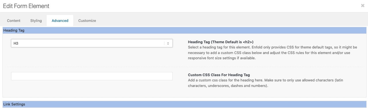
to address the captions specifically it is maybe a good idea to place a custom-class either to the whole slider or to the slide
f.e.: modern
If you have the custom-class on the alb itself – all caption titles will be then in font-weight: 300
if you have the custom-class only on the slide – only this will be selected ( see above image : Custom CSS Class For Heading Tag ).modern .avia-caption-title , .avia-caption-title.modern { font-weight: 300 !important; }The heading tag itself ( h3 or whatever ) is on the slide options page on advanced tab.
the positioning of the caption is on styling tab.
the rest will be css onlyMarch 25, 2022 at 5:22 am in reply to: Prev–Next Post navigation not working by using full width easyslider #1345956you can deactivate the fullwidth/fullscreen slider check by filter: avf_post_nav_settings former: avia_post_nav_settings
if you only like to have that on posts/portfolio put this to your child-theme functions.phpfunction my_avf_post_nav_settings( array $settings ){ if( ! in_array( $settings['type'], array( 'post', 'portfolio' ) ) ){ $settings['is_fullwidth'] = false; return $settings; } } add_filter( 'avf_post_nav_settings', 'my_avf_post_nav_settings', 10, 1 );maybe it will be necessary to shift those post-nav arrows ( especially on full-screen sliders )
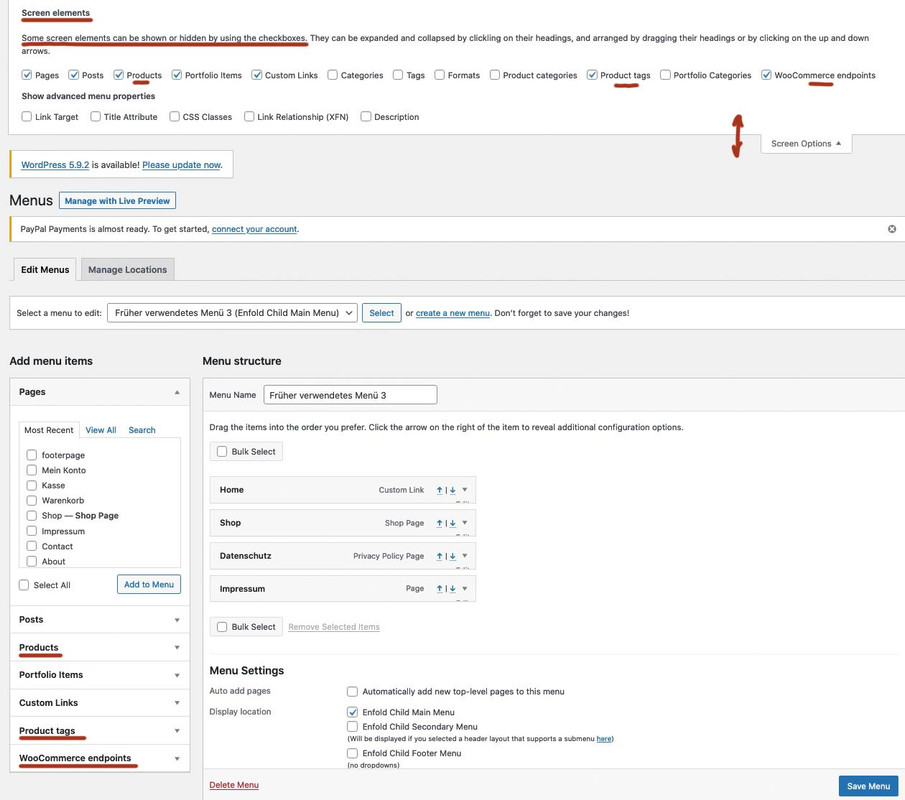
then it maybe better to have them in absolute positionon Dashboard – Appearance – Menus : there is on top right a slideout Button: “Screen Options” – when slided out – did you mark the checkboxes of concerning product fields? If checked then there is in left side “Add menu items” product options.
(click to enlarge the image)
zunächst wenn du anker setzt – werden dies hoffentlich ID’s sein, denn auch ein navigierbarer Anker sollte einzigartig sein.
Bei Klassen kannst du in das Feld beliebig viele eingeben. Du musst nur darauf achten, dass diese durch eine Leerstelle getrennt sind.
Alle eingetragenen Klassen werden am gleichen Element angefügt.Das Problem mit deiner css Setzung ist, dass dies die Browsersilbentrennung ist, und mit deutscher Rechtschreibung nicht vieles gemeinsam hat.
______
Du siehst an meiner Beispielseite auch die Trennung innerhalb von englischen Texten.
Die Einstellungen in Hyphenator sind ja auch dafür gedacht die Zahl der Filtersprachen zu begrenzen. Die Standardsprache ist nur dafür gesetzt, wenn ein lang-Attribut bei html fehlt. Das sollten aber Sprachplugins beherschen diese zu setzen.Wenn Du das natürlich in die Hände einer html ungeübten Person übergeben mußt ist es ( hyphens setzung ) wohl die einzige praktikable Lösung.
for those who are interested – https://www.typografie.info/3/wiki.html/v/grosses-eszett/
I’m not a friend of that too – but there are arguments for that to useÜbrigens: du könntest mal in den Einstellungen von Hyphenator das Häckchen bei An/Aus Switch setzen und folgendes in dein Quick CSS einfügen:
#HyphenatorToggleBox {
	position: fixed !important;
	top: 200px !important;
	right: 20px !important;
	background-color: rgb(235, 13, 13) !important;
	font: 12px Arial !important;
	padding: 5px !important;
	border-radius: 0 !important;
}
Dann siehst du einen Switch Button mit dem man den Einfluss ein und ausschalten kann. Nur zu Testzwecken.
https://webers-testseite.de/hyphenator/PS: sollte es dann bei Dir funktionieren; Die Setzung der Klasse kann an jedem Elternelement erfolgen um für alle Texte unterhalb Wirkung zu zeigen.
Also wenn du einer Color-Section die Klasse : hyphenate gibts sind auch alle Texte innerhalb dem unterworfen.you haven’t this on dashboard – appearance – widgets:
You are talking about the headings ALB elements – right?
you had to know that this custom class ( ID’s have to be unique – so if you want to use it on a page twice – a class will be better ) goes to the parent container so selector will be before the h2 container itself.
and if you do not like to have the whole width with a background-color – you had to set the container to display : inline-block
( my test custom class was: heading-bg-special).heading-bg-special .av-special-heading-tag { background-color: red; display: inline-block; padding: 2px 8px !important; }March 22, 2022 at 9:03 pm in reply to: Hiding tooltip also hides lightbox text (under image) #1345583if you only want it for img and anchors – use instead:
function temporary_removal_title_tags(){ ?> <script> window.onload = function() { var links = document.querySelectorAll('a , img'); for (var i = 0; i < links.length; i++) { var link = links[i]; link.onmouseover = function() { this.setAttribute("org_title", this.title); this.title = ""; }; link.onmouseout = function() { this.title = this.getAttribute("org_title"); }; link.onclick = function() { this.title = this.getAttribute("org_title"); }; } }; </script> <?php } add_action('wp_footer', 'temporary_removal_title_tags');es ist halt bei der DSGVO so, dass sobald du auch nur eine Kontaktmöglichkeit anbietest ( Telefon; E-Mail etc. ) – muss das eben vorhanden sein.
Das machen sehr viele falsch, die glauben eine sogenannte Visitenkarten-Seite im Netz platzieren zu können._______
und bei den Sprachen, die hyphenate bedient, hast du das manuell eingestellt? Ist aus performance gründen schon besser.
Ausserdem siehst du ja anhand meiner Beispielseite, dass bei breiten Screens ja auch kein Unterschied zu sehen ist. Hast du mal deine Seitenbreite ( durch verkleinern des Browserfensters ) verkleinert?Hast du nachdem du Hyphenate installiert hast – alle Cache geleert ( Browser Cache ) in Enfold – falls du das aktiviert hast das Merging aktualisiert ( unter Performance ) – hast du Performance Plugins laufen? dort auch die Cache erneuern.
Vielleicht schickst du mir mal das Seitenpasswort (also nicht die WP Zugänge) via E-Mail ( alles unter meinem Nick – bzw siehst ja die Testseite )
________
wei man ein plugin installiert weißt du! Mein Vorschlag für Günters Plugin war halt nur, dass man da nicht drei Rauten vor und nach den Einsetzungen macht sondern nur eine. Und eben die Liste erweitert – da es so viele schöne html entities gibt die man nutzen könnte.
zB ist das nonbreaking hyphen (geschützter Bindestrich) auch in der deutschen Sprache wichtig um zu verhindern, dass diese Worte bei Zeilenumbruch getrennt werden. ( z.B. bei 100 % – gehört einfach ein Leerzeichen hin – oder besser vielleicht ein dreiviertel Geviert Leerzeichen; soll aber wohl nicht im Zeilenumbruch getrennt werden – daher meine #nbhyp# Ergänzung in dem Plugin.
Hier kannst du meine Veränderungen sehen – pastebin: Link
und hier das installierbare zip file downloaden: https://webers-testseite.de/avia-special-characters.zipAb da kannst Du dann überall für diese Zeichen das Pendent einsetzen. In allen ALB Elementen wo der Kontent gesetzt wird – aber auch in der Textblock eingabe. #shy# setzt dann ein softhyphen.
-
This reply was modified 3 years, 12 months ago by
Guenni007.
it is a wordpress – no it is a browser related question – if there are titles – browsers will show tooltip after some time.
to simply remove all titles from images :function custom_remove_title_script() { ?> <script> (function($){ $("img").hover(function(){ $(this).removeAttr("title"); }); })(jQuery); </script> <?php } add_action('wp_footer', 'custom_remove_title_script');but even this you had to know how to insert it.
if content is missing after activating a child-theme – then there is something wrong with the installation from you.
i tried to explain it even for noobs how to. And linked the description to the docu with even a film to explain.
Maybe you let a mod do this for you.Otherwise you can insert it to parent-theme functions.php ( it is in enfold folder ) and on that file there is a comment at the bottom of that file:
/*
 *  register custom functions that are not related to the framework but necessary for the theme to run
 */
after that – and before the last command (
require_once( 'functions-enfold.php' );) i would place that code.March 22, 2022 at 7:13 pm in reply to: Audioplayer -time display in the timeline not visible #1345568on the demos and on my own test there are infos about the time:
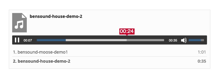
see here and look to the css code for influence on that current time: https://webers-testseite.de/code-for-audioplayer/
and for the bars too.can you try this in your child-theme functions.php:
ok i had to show you the image of that snippet, because boardsoft will allways transform the included entities to the signs:
you had to type it your own:
( click to enlarge )
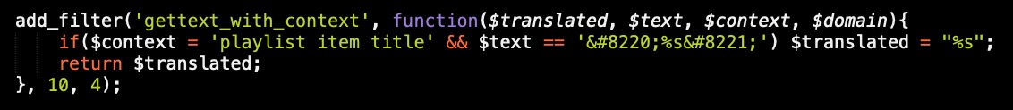
or copy&paste from pastebin: https://pastebin.com/k0f385TJ
by the way – that does not come from enfold – it is a wordpress based style. from media.php and function is : wp_underscore_playlist_templates
-
This reply was modified 3 years, 12 months ago by
-
AuthorPosts