Forum Replies Created
-
AuthorPosts
-
Hey hylandgraphics,
Sorry for the late reply, to remove the youtube branding @Guenni007 has offered this post with a code snippet, and Here is YouTube Embedded Players and Player Parameters
As for uploading your mp4 please check your PHP Post Max Size & PHP Max Upload Size, typically these are set low by your webhost. An easy way to check is to go to WordPress > Dashboard > LayerSlider > Options and click “System Status” and look under “Server Settings”
Have you tried using the layerslider for adding the video to your page? I ask because for mobile devices autoplay is blocked but typically the layerslider is getting around that limitation.
I downloaded your video and found it was 8.26mb as an mp4 so I converted it to .webm and got it down to 2.61mb if you self host it on your site this will load faster.
Please see link in Private Content area.Best regards,
MikeSeptember 1, 2019 at 11:42 pm in reply to: "Read more" button on cookie bar after 4.6 update #1132756Hi,
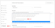
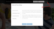
Thank you for the link, I tested your site by accepting the cookie and then checking many more pages but I didn’t get another cookie notice. The browsers I tested in were Chrome, Firefox, Edge & IE11Your cookie notice looks different than the new install version, I believe that your old settings are interfering with the new settings, you see Enfold doesn’t remove data, but when a major change like this cookie update takes place the data is merged into the best or closest option. Please carefully go through the new options and check each one.

Best regards,
MikeHi,
Please try adding this css:.html_header_sidebar .logo { margin-right: -1px !important; }please adjust the negative number to suit. Please clear your browser cache after each change.
Best regards,
MikeHi,
Ok, I corrected this by adding this css:@media only screen and (max-width: 767px) { #top.home .post-entry.bloglist-excerpt .entry-content-wrapper.standard-content > p { display: none !important; } }Please clear your browser cache and check.
Best regards,
MikeHi,
I tried to research how the voiceover screen reader works and general screen accessibility, and I believe what your menu needed was Title Attributes so I added them to the menu items. There was also the option for a description for each menu item so I also added that too. Please clear your browser cache and check.Best regards,
MikeHi,
That does make sense because the additional “div” divides the page into two sections.
So if you want this to work on every page I recommend making the first rule very genetic, and then add your “azimuts-first” & “azimuts-last” to the columns that you wish.@media only screen and (max-width: 767px) { .template-page.content > div > .entry-content-wrapper { display: flex !important; flex-wrap: wrap !important; } .flex_column.azimuts-last { order: 2 !important; } .flex_column.azimuts-first { order: 1 !important; } }Best regards,
MikeHi,
Thanks for the feedback, I believe that you are getting this from your screen reader, and what it was reading is the “article” sections so I replaced them with the standard “div”
Please clear your browser cache and check.Best regards,
MikeHi,
Please try this code in the General Styling > Quick CSS field or in the WordPress > Customize > Additional CSS fieldspan.logo { float: right; }Best regards,
MikeHi,
Sorry I forgot the “entry-content-wrapper”
Please use this css instead:@media only screen and (max-width: 767px) { .azimuts-swap .entry-content-wrapper { display: flex !important; flex-wrap: wrap !important; } .azimuts-swap .flex_column.azimuts-last { order: 2 !important; } .azimuts-swap .flex_column.azimuts-first { order: 1 !important; } }Best regards,
MikeHi,
We are able to remove the excerpts and read more buttons by going to Enfold Theme Options > Blog Layout > List Layout – Simple (Title and meta information only)
But this setting still added another read more link, so I removed it with this css:#top.home .bloglist-simple .post-meta-infos .read-more-link { display: none !important; }It is now all set, please clear your browser cache and check.
Best regards,
MikeSeptember 1, 2019 at 8:21 pm in reply to: Hamburger menu icon – png for open and another for closed #1132717Hi,
Glad to hear, I assume we can close this now, but I like to ask first. Shall we close this then?Best regards,
MikeHi,
I took a look at your page but I didn’t find “azimuts-swap” I did find the other two, once you add “azimuts-swap” it should work, if not please disable the other css so I can check what is wrong.Best regards,
MikeHi,
I have added the child theme with the modifications, so you won’t lose this customization. I also found that your “Home” menu item was pointing to our demo site so I corrected it and it now points to your site.
Please check and let us know if this helped.Best regards,
MikeHi,
We will close this now. Thank you for using Enfold.For your information, you can take a look at Enfold documentation here
For any other questions or issues, feel free to start new threads in the Enfold forum and we will gladly try to help you :)Best regards,
MikeHi,
Thank you, in your screenshot the umlaut seems to be there for Safari, although it looks bolder, I see in your elementor text widget you are using the “geo-sans-light” font:<p style="font-family: font-family:geo-sans-light; font-size: 30px;">ÜBER MICH</p>I couldn’t find this on Google Fonts, but on dafont.com it doesn’t work well:

Perhaps try a different font.Best regards,
MikeSeptember 1, 2019 at 6:53 pm in reply to: "Read more" button on cookie bar after 4.6 update #1132695Hi,
Please provide a link and admin access in the Private Content area to your site so we can see your “read more” button and investigate.
I’m not able to reproduce this as I understand it:
Best regards,
MikeHi,
@newmediologo Glad to hear, shall we close this then?
@Guenni007 perhaps Theme Forest is trying to track “shaired” files? Just a guess.Best regards,
MikeHi,
Sorry I found the first link you posted to confusing because some of the posts have no date and others have the date above the title, so I’m glad that you posted the second link for the posts pages because it is more in line with your earlier requests, so I made the adjustments based on this.I adjusted the /enfold/includes/loop-index.php so the output would be:
Post heading
Author
date and time
this retains the settings at Enfold Theme Options > Blog Layout > Blog meta elements
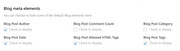
This is the output:
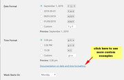
Now if you don’t want the author to show on the homepage but you do on the posts, please add this css in your Quick CSS:#top.home span.blog-author.minor-meta { display: none !important; } #top.home span.post-meta-infos { margin-top: -30px; }Now to change the date and time format, please make the adjustments at WordPress > Settings > General > Date Format :
Now the only issue I see is that you have not updated to v4.6 and when you update you will lose this customization, I recommend installing a child theme so you can add your customizations and not lose them on every update. Read about using a Child Theme and get our free pre-built one.
When you update to v4.6 you will need to use this loop-index.php as the file changed.
To add this file to your child theme create the /includes/ folder and place there, like this:
/enfold-child/includes/loop-index.phpHope this helps,
MikeHi,
Please add a custom class to the two columns you wish to flip, in this case the “form” and “girl”
the form is “avia-builder-el-20” in the css above,
the girl is “avia-builder-el-22” in the css above
so if you added the custom classes “form-last” and “girl-first” your final css would look like:@media only screen and (max-width: 767px) { #top.postid-1212 #after_submenu_1 .entry-content-wrapper { display: flex !important; flex-wrap: wrap !important; } #top.postid-1212 #after_submenu_1 .flex_column.form-last { order: 2 !important; } #top.postid-1212 #after_submenu_1 .flex_column.girl-first { order: 1 !important; } }Best regards,
MikeHey guttogjente,
Thanks for the screenshot and login, I added this css to your Quick CSS to solve:.avia-content-slider .slide-image img { object-fit: cover; width: 100%; }Please clear your browser cache and check.
Please see the screenshot in Private Content area.Best regards,
MikeHi,
I added the css above into the Quick CSS and it is working good now, please clear your browser cache and check.
Please see the screenshot in Private Content area.Best regards,
MikeHey leahmessina,
Thanks for the link to the page, but the above css is working for me, please clear your browser cache and check.
Please see the screenshot in Private Content area.Best regards,
MikeHey 0_o,
Glad you were able to sort it out, we will close this now. Thank you for using Enfold.For your information, you can take a look at Enfold documentation here
For any other questions or issues, feel free to start new threads in the Enfold forum and we will gladly try to help you :)Best regards,
MikeSeptember 1, 2019 at 4:28 am in reply to: Update Failed: Download failed. Problem downloading theme #1132612Hey CBrandDesigner,
I took a look at your site and it seems that you have now updated to v4.6 but the login you posted is not working for me, please check so we can assist with your othr issue.Best regards,
MikeHey guttogjente,
In this case I believe you will find it easier to copy the whole function and change the key parts so the two can work at the same time. This will also assist you in the future when you wish to remove it, or change it, instead of trying to recall how the function works.Best regards,
MikeHey Arbis11,
Please try this solution once you have created the widget area you can add the widgets that will be your “columns”Best regards,
MikeHey zetharia,
Thanks for the login, I have looked for your yelp function in the functions.php but I didn’t find it, so I thought you had removed it and I tried to add it but I got this error:

so it seems that you have added the function into the wrong file at: /wp-includes/functions.php if you did this please remove the code.I corrected the function that was posted at your link above and adjusted it so I could add it to your /enfold/functions.php:
// Register new icon as a theme icon
function avia_add_yelp_icon($icons) {
$icons['yelp']	= array( 'font' =>'fontello', 'icon' => 'uf1e9');
return $icons;
}
add_filter('avf_default_icons','avia_add_yelp_icon', 10, 1);

// Add new icon as an option for social icons
function avia_add_yelp_social_icon($icons) {
$icons['Yelp'] = 'yelp';
return $icons;
}
add_filter('avf_social_icons_options','avia_add_yelp_social_icon', 10, 1);
but I’m still not finding the Yelp option in your social icons list, I believe this is due to the other code that needs to be removed. I tested this on my localhost and it works correctly. I also removed the duplicate yelp css that would cause issues, this is the css I left in your Quick CSS:
#top #wrap_all .av-social-link-yelp:hover a{
    color:#fff;
    background-color:#9fae37;
}
So once you remove the other code you should be able to choose the Yelp icon.
Now I note that you are not using a child theme, so I wanted to let you know that when editing functions.php you should use the child theme, so your changes will not be lost with future theme updates Read about it & Get it here
Best regards,
Mike -
AuthorPosts