
-
AuthorPosts
-
August 31, 2019 at 7:30 pm #1132552
I want the order of two 1/2 sections be swapped on small screens (phones). I found the following on StackOverflow that does what I need:
https://stackoverflow.com/questions/7425665/switching-the-order-of-block-elements-with-css
But for this to work I need to put a DIV ID on each 1/2 sections. How can I do that? The only place the Layout Builder let me insert DIV ID is on color sections…
August 31, 2019 at 10:34 pm #1132573Hey photographie-tous-azimuts,
Please try this code in the General Styling > Quick CSS field or in the WordPress > Customize > Additional CSS field, it will only work on this one page:@media only screen and (max-width: 767px) { #top.postid-1212 #after_submenu_1 .entry-content-wrapper { display: flex !important; flex-wrap: wrap !important; } #top.postid-1212 #after_submenu_1 .flex_column.avia-builder-el-20 { order: 2 !important; } #top.postid-1212 #after_submenu_1 .flex_column.avia-builder-el-22 { order: 1 !important; } }Best regards,
MikeAugust 31, 2019 at 11:27 pm #1132578Hi Mike,
Wow! Support on weekend! Nice!
Your CSS does the job. One question: I notice the code refers to Layout Builder internal tags. Will this code break if I modify the page? Or will it works as long as I don’t delete those specific 1/2 sections?
It would be nice to be able to add DIV ID to any column section, though. This would allow to target a specific section with #id on URL on mobile devices no matter where it ends up.
Best regards,
SergeSeptember 1, 2019 at 12:24 am #1132586Hi,
Yes this code could break if you move the page elements around, I recommend adding custom classes to the 3 elements and adjust the css. You can add column IDs by enabling the theme option at: Enfold Theme Options > Layout Builder > Builder Options For Developers I’m pretty sure this was an option in v4.5.7, but I know it is in v4.6 I recommend updating as there is a large list of fixes in this one.

here’s the option in the column element:
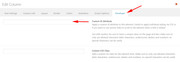
Best regards,
MikeSeptember 1, 2019 at 12:46 am #1132589Hi,
I figured out the update process to 4.6. I will give it a try.
Best regards,
Serge-
This reply was modified 5 years, 10 months ago by
photographie-tous-azimuts.
September 1, 2019 at 1:05 am #1132592Now that I have update the theme, how do I adjust the CSS? According to the StackOverflow post or a variant of your CSS?
-
This reply was modified 5 years, 10 months ago by
September 1, 2019 at 6:01 am #1132626Hi,
Please add a custom class to the two columns you wish to flip, in this case the “form” and “girl”
the form is “avia-builder-el-20” in the css above,
the girl is “avia-builder-el-22” in the css above
so if you added the custom classes “form-last” and “girl-first” your final css would look like:@media only screen and (max-width: 767px) { #top.postid-1212 #after_submenu_1 .entry-content-wrapper { display: flex !important; flex-wrap: wrap !important; } #top.postid-1212 #after_submenu_1 .flex_column.form-last { order: 2 !important; } #top.postid-1212 #after_submenu_1 .flex_column.girl-first { order: 1 !important; } }Best regards,
MikeSeptember 1, 2019 at 7:31 pm #1132705Hi Mike,
It does work. Thanks. I really love Enfold and Kreisi customer support.
I tried to generalize it so I can use it on other pages if needed, but I must be missing something since my generalization does not works. (I did this test on my dev server to avoid breaking the site until I can make it work.)
I added a color section with a class ID azimuts-swap to wrap the form and the girl. I changed the class names for the form and girl to azimuts-last (form) and azimuts-first (girl). Then I updated the CSS to:
@media only screen and (max-width: 767px) {
  .azimuts-swap {
    display: flex !important;
    flex-wrap: wrap !important;
  }
  .azimuts-swap .flex_column.azimuts-last {
    order: 2 !important;
  }
  .azimuts-swap .flex_column.azimuts-first {
    order: 1 !important;
  }
}
What’s wrong?
Best regards,
Serge-
This reply was modified 5 years, 10 months ago by
September 1, 2019 at 8:15 pm #1132713Hi,
I took a look at your page but I didn’t find “azimuts-swap” I did find the other two, once you add “azimuts-swap” it should work, if not please disable the other css so I can check what is wrong.Best regards,
MikeSeptember 1, 2019 at 8:26 pm #1132718Hi,
I was testing this on my dev server in order to not break the site. Since you tell me it should work, I just did it on the prod server. You can look at it now. It does not works.
Best regards,
SergeSeptember 1, 2019 at 9:04 pm #1132729Hi,
Sorry I forgot the “entry-content-wrapper”
Please use this css instead:@media only screen and (max-width: 767px) { .azimuts-swap .entry-content-wrapper { display: flex !important; flex-wrap: wrap !important; } .azimuts-swap .flex_column.azimuts-last { order: 2 !important; } .azimuts-swap .flex_column.azimuts-first { order: 1 !important; } }Best regards,
MikeSeptember 1, 2019 at 9:15 pm #1132733Hi,
It works for the swap, but it introduced a large white space at the beginning of the page. Compare those two pages:
https://www.photographie-tous-azimuts.com/cours-photo/portrait-en-lumiere-ambiante/
https://www.photographie-tous-azimuts.com/cours-photo/maitrise-de-la-lumiere-1/
Best regards,
Serge-
This reply was modified 5 years, 10 months ago by
September 1, 2019 at 10:09 pm #1132741Hi,
Problem solved. There was an extra space element added at the beginning of the page. Once removed, everything is OK. Looks like a manip error of mine.
Thank you very much for your support.
Best regards,
SergeSeptember 1, 2019 at 10:24 pm #1132743Hi,
That does make sense because the additional “div” divides the page into two sections.
So if you want this to work on every page I recommend making the first rule very genetic, and then add your “azimuts-first” & “azimuts-last” to the columns that you wish.@media only screen and (max-width: 767px) { .template-page.content > div > .entry-content-wrapper { display: flex !important; flex-wrap: wrap !important; } .flex_column.azimuts-last { order: 2 !important; } .flex_column.azimuts-first { order: 1 !important; } }Best regards,
MikeSeptember 2, 2019 at 10:29 pm #1133132Hi Mike,
I like that! It works great! The code is now so simple and easy to use. Having to add a Color Section did have some minor side effects on spacing too. I suggest you add this to the documentation of columns so anyone can benefit.
Best regards,
SergeSeptember 4, 2019 at 5:25 am #1133602Hi,
Glad we were able to help, and it’s working well for you, we will close this now. Thank you for using Enfold.For your information, you can take a look at Enfold documentation here
For any other questions or issues, feel free to start new threads in the Enfold forum and we will gladly try to help you :)Best regards,
Mike -
This reply was modified 5 years, 10 months ago by
-
AuthorPosts
- The topic ‘Changing display order on mobile’ is closed to new replies.