Forum Replies Created
-
AuthorPosts
-
Hey Erwin,
Thank you for the link, this is sort of new, it is coming from the browsers for “A11y” or “ARIA”, for people with visual impairment. So the classic css “reset” used to set “outline” to “none” or zero but now as “we” (as in all developers) are preparing for new “A11y” standards, this practice is discouraged so now the browsers are showing the styles that they have been including in the “agent stylesheet” Anyways, please try this css to remove:#top .main_color .tab:focus { outline: 0 !important; outline: 0 -webkit-focus-ring-color !important; }but perhaps a better solution would be to style it with your sites colors, such as this 1px slightly darker outline, please adjust it to the most you are willing to go keeping in mind of our visually impaired visitors and friends :)
#top .main_color .tab:focus {
  outline: #DBDBDB solid 1px !important;
  outline: #DBDBDB solid 1px -webkit-focus-ring-color !important;
}
Best regards,
MikeNovember 10, 2019 at 2:48 am in reply to: 1 Pixel Line When Using Background Repeat Stretch to fit. #1155271Hey MinsterSC,
Thanks for the link, the “border” was actually the background showing though because the image was set to “bottom center”, seems it put it off a hair, this css should fix:#top.home #av_section_2 { background-position: top !important; }for the other borders in the header, please try this:
#top #header_main, #top #header_meta,#top #header_meta.container_wrap {
    border-bottom-width: 0 !important;
    border-top-width: 0 !important;
}
.avia-menu.av_menu_icon_beside {
    border-right-width: 0 !important;
    border-bottom-style: none !important;

}
After applying the css, Please clear your browser cache and check.
Best regards,
MikeNovember 10, 2019 at 2:17 am in reply to: woocommerce single project page layout official solution #1155267Hi,
Thank you for the feedback, for mobile you will have to allow for full-width, I tried to check but couldn’t find the exact item as in your screenshot, but the ones I saw were correct, sidebar in desktop and full width in mobile.
Please see the screenshots in Private Content area.Best regards,
MikeHi,
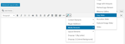
Sorry for the late reply, the Classic Editor featured image post option “don’t display post picture” in the new block editor is under the “layout” options.
Please see the video in the Private Content area.Best regards,
MikeHi,
Thanks, Try adding this code to the end of your functions.php file in Appearance > Editor:function custom_script(){ ?> <script> jQuery(window).load(function(){ jQuery( ".widget_icl_lang_sel_widget" ).appendTo( ".main_menu" ); }); </script> <?php } add_action('wp_footer', 'custom_script');Best regards,
MikeHi,
Entschuldigung für die verspätete Antwort, leider habe ich vorher keine Pods verwendet, daher kann ich nicht raten, aber wenn es Ihnen helfen würde, können Sie den Shortcode für den Schieberegler abrufen, indem Sie zum Classic Editor gehen und auf den Shortcode-Zauberstab klicken. Nachdem Sie die Schritte ausgeführt und den Assistenten gespeichert haben, wird der Shortcode in der Nachricht angezeigt, damit Sie ihn kopieren können.
— Translated with Google —
Sorry for the late reply, unfortunately I have not used pods before so I can’t advise, but if it would help you can get the shortcode for the slider by going to the Classic Editor and clicking on the shortcode wand. After you follow the steps and save the wizard, the shortcode will show in the post for you to copy.
Best regards,
MikeHi,
Sorry for the late reply, and thanks for the login. I took a look at the page you posted as an example of double images, but I don’t see double images?
I looked and your theme and it’s up to date.
To clone your site to your localhost, I will assume that you already have a localhost set up, so then I would recommend using the Duplicator plugin from “Snap Creek” (there is a knock-off in the archive) it’s very good, watch the video.Best regards,
MikeHey FA123,
Sorry for the late reply, for question 1, Please try this code in the General Styling > Quick CSS field or in the WordPress > Customize > Additional CSS field:@media only screen and (max-width: 767px){ .responsive #top .av-logo-container .avia-menu { top: -10px !important; } }for question 2, please see our documentation for adding a header widget area
for question 3, I adjusted your css, which only had the transparent mobile header up to 900px and it needed to be 989pxBest regards,
MikeHey bobfurgo,
Sorry for the late reply, I was able to get past your htaccess login, but couldn’t login to WordPress, but it’s ok I was able to examine your site and adjust your css so it will work. Please try this code in the General Styling > Quick CSS field or in the WordPress > Customize > Additional CSS field:#top #wplc_hovercard #wplc_hovercard_bottom #speeching_button, #wp-live-chat-inner #wplc_message_div #wplc_na_msg_btn { border-radius: 0px !important; font-family: lato !important; }After applying the css, Please clear your browser cache and check.
Best regards,
MikeHey Kurt,
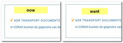
Sorry for the late reply and thanks for the login, I adjusted your css from this:p.update-time { width: 340px; margin: auto; font-size: 90%; }to this:
@media only screen and (min-width: 767px) {
p.update-time {
    width: 300px;
    font-size: 90%;
    float: right;
}
}
@media only screen and (max-width: 766px) {
p.update-time {
    width: 340px;
    margin: auto;
    font-size: 90%;
}
}
Please clear your browser cache and check.
Best regards,
MikeHi,
Sorry for the late reply, please include a link to your page so we can examine your elements and assist.Best regards,
MikeHi,
Sorry for the late reply, I’m not sure I understand correctly, is this what you are looking for?
Best regards,
MikeHi,
Sorry for the late reply and thanks for sharing your solution.
Shall we close this then?Best regards,
MikeNovember 9, 2019 at 8:48 pm in reply to: Error with sticky header mobile in new Enfold version #1155240Hey mofix,
Sorry for the late reply, and thanks for the link. It looks like your issue is with this css:@media only screen and (max-width: 767px){ .responsive #top #main { padding-top: 0 !important; margin: 0; } }It needs to be:
@media only screen and (max-width: 767px){
.responsive #top #wrap_all #main {
    padding-top: 80px !important;
    margin: 0;
}
}
If you can’t find the first code just try adding the second code in the General Styling > Quick CSS field or in the WordPress > Customize > Additional CSS field.
After applying the css, Please clear your browser cache and check.Best regards,
MikeNovember 9, 2019 at 8:29 pm in reply to: woocommerce single project page layout official solution #1155239Hey HeeHA,
Sorry for the late reply, please try this solution:
Try adding this code to the end of your functions.php file in Appearance > Editor:add_action('init','ava534345953_init', 50); function ava534345953_init() { add_action( 'woocommerce_after_single_product_summary', 'avia_add_sidebar', 25); } function avia_close_image_div() { global $avia_config; echo "</div> "; } function avia_add_sidebar() { if(is_product()) { $avia_config['currently_viewing'] = "shop_single"; get_sidebar(); } }Then add this code in the General Styling > Quick CSS field or in the WordPress > Customize > Additional CSS field:
//add right sidebar to woo product page
.single-product-main-image {
    width: 25%;
}

.single-product-summary {
    overflow: hidden;
    width: 45%;
    float: left;
    margin-right: 5%;
}

.single-product .sidebar {
    width: 25%;
}
Before:
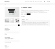
After:
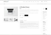
Best regards,
MikeHi,
Sorry for the late reply, I tried to take a look at your page but can not without a login, which is not working. Please check.Best regards,
MikeNovember 9, 2019 at 7:56 pm in reply to: Create a dropdown menu on regular button in the page (not menu) #1155235Hi,
Sorry for the late reply, the css on the CodePen page had to be adjusted because it didn’t account for other css included on the page with a higher specificity. I have combined the html and the css to be used within a code block element, just copy all of this code and add to a code block element and it should work fine.<style> .dropdown { position: relative; display: inline-block; text-align: left; width: 132px; } .dropdown-text { cursor: pointer; position: absolute; text-indent: 10px; line-height: 32px; background-color: #eee; border: 1px solid #ccc; border-radius: 3px; box-shadow: 0 1px 0 rgba(255,255,255, .9) inset, 0 1px 3px rgba(0,0,0, .1); width: 100%; color: #333; } .dropdown-text:after { position: absolute; right: 6px; top: 15px; content: ''; width: 0px; height: 0px; border-style: solid; border-width: 5px 4px 0 4px; border-color: #555 transparent transparent transparent; color: #333; } .dropdown-text, #top #main ul.dropdown-content a { color: #333; text-shadow: 0 1px #fff; } #top #main input.dropdown-toggle[type='text'] { font-size: 0; z-index: 1; cursor: pointer; position: absolute; top: 0; border: none; padding: 0; margin: 0 0 0 1px; background: transparent; text-indent: -10px; height: 34px; width: 100%; color: #333; } #top #main input.dropdown-toggle[type='text']:focus { outline: 0; } #top #main ul.dropdown-content { -webkit-transition: all .25s ease; -moz-transition: all .25s ease; -ms-transition: all .25s ease; -o-transition: all .25s ease; transition: all .25s ease; list-style-type: none; position: absolute; top: 32px; padding: 0; margin: 0; opacity: 0; visibility:hidden; border-radius: 3px; text-indent: 10px; line-height: 32px; background-color: #eee; border: 1px solid #ccc; width: 140px; } #top #main ul.dropdown-content a { display: block; text-decoration: none; } #top #main ul.dropdown-content a:hover { background: #e8e8e8; } #top #main input.dropdown-toggle[type='text']:hover ~ .dropdown-text, #top #main input.dropdown-toggle[type='text']:focus ~ .dropdown-text { background-color: #e8e8e8; } #top #main input.dropdown-toggle[type='text']:focus ~ .dropdown-text { box-shadow: 0 1px 3px rgba(0,0,0, .2) inset, 0 1px 0 rgba(255,255,255, 0.8); z-index: 2; } #top #main input.dropdown-toggle[type='text']:focus ~ .dropdown-text:after { border-width: 0 4px 5px 4px; border-color: transparent transparent #555 transparent; } #top #main ul.dropdown-content:hover, #top #main input.dropdown-toggle[type='text']:focus ~ .dropdown-content { opacity: 1; visibility:visible; top: 42px; } </style> <p><i>To show/hide menu, I'm using :focus instead of checkbox so when you click somewhere else then menu will be hidden :).</i></p> <div class="dropdown"> <input class="dropdown-toggle" type="text"> <div class="dropdown-text">Account</div> <ul class="dropdown-content"> <li><a href="#">Settings</a></li> <li><a href="#">Projects</a></li> <li><a href="#">Log out</a></li> </ul> </div>expected results:

Best regards,
MikeNovember 9, 2019 at 7:02 pm in reply to: Issue with responsive optimization at mobile devices / urgent customer project #1155234Hi,
Sorry for the late reply, I tested your page on my Android phone checking both landscape and portrait, but I was unable to recreate your error. Please see the video in the Private Content area.Best regards,
MikeNovember 9, 2019 at 6:42 pm in reply to: Grid row mobile responsiveness not working properly #1155233Hi,
Sorry for the late reply, but I was not able to reproduce your screenshots unless I changed the width of a browser without refreshing, which doesn’t give an accurate view of the page on mobile. Is this how you are testing?
Please see the screenshots in Private Content area of 3 different mobile sizes, 320px, 425px, and 768px
I do see that we can improve the tablet view, 768px, as seen in the last screenshot, by removing most of the padding from the cells with css, which will allow the text to show better.@media only screen and (min-width: 767px) and (max-width: 967px) { .av-layout-grid-container .flex_cell.no_margin.av_one_third { padding: 90px 20px 90px 20px !important; } }After applying the css, Please clear your browser cache and check.
Best regards,
MikeHi,
Sorry for the late reply, I have taken a look at your “desktop page” and at the response from the plugin developer. So on your page I see that no css is loading, and the plugin developer said they “removed the css for the dashboard page” to solve an issue with plugin buttons not working? I was not able to login as admin to take a look, please include in the Private Content area.
Also please disable all cache plugins including Autoptimize, and the Enfold Theme Options > Performance > JS & CSS file merging and compression settings and clear your browser cache.Best regards,
MikeHi,
Sorry for the late reply, about your footer icons animation not occurring until the cookie is accepted, it looks to me that the script is stopping due to “essb_subscribe_logging” which looks like it is from “/plugins/easy-social-share-buttons3/”
I don’t see in your previous posts that you tried disabling your plugins, have you tried this on your staging site?Best regards,
MikeHi,
Glad we were able to help, we will close this now. Thank you for using Enfold.For your information, you can take a look at Enfold documentation here
For any other questions or issues, feel free to start new threads in the Enfold forum and we will gladly try to help you :)Best regards,
MikeHey aebli,
Sorry for the late reply, Please try this code in the General Styling > Quick CSS field or in the WordPress > Customize > Additional CSS field:#top.page-id-218 .all_colors .image-overlay-inside{display: block !important;} #top.page-id-218 a.avia_image:hover .image-overlay.overlay-type-extern { left: -5px!important; top: 0px!important; overflow: hidden!important; display: block!important; height: 100%!important; width: 100%!important; }After applying the css, Please clear your browser cache and check.
This css is set for your one page in the Private Content area so to not conflict with other pages, also I notice that some of the logos have a smaller height than the overlay icon, I recommend resizing your images so they are square.
Best regards,
MikeNovember 9, 2019 at 11:46 am in reply to: Enfold: Latest version of Event Calendar not working with Counter #1155200Hey CampCarysbrook,
Sorry for the late reply, I tried to login to your dev site, but the access is not admin so I can’t see any settings or backend of the page. Please adjust to admin.Best regards,
MikeHi,
This has been adjusted so it will also work on your homepage:#top.page-parent #main > div.sidebar_left > div,#top.page-child #main > div.sidebar_left > div { background-color: #717377 !important; } #top.page-parent #main > div.sidebar_left > div > main,#top.page-child #main > div.sidebar_left > div > main { background: #ffffff url(/wp-content/uploads/2019/11/main-content-bg.png) top right no-repeat scroll !important; } #main #after_section_1 > div { padding-left: 0 !important; } #after_section_1 > div > div { padding-left: 15px !important; }After applying the css, Please clear your browser cache and check.
Best regards,
MikeNovember 8, 2019 at 11:26 am in reply to: Change the color for each menue incl. the mouse over color #1154921Hi,
Sorry for the late reply to change the button font size and color please adjust your custom css, please look for:.avia-menu-text { font-size: 14px !important; color: #777777 !important; font-weight: normal !important; letter-spacing: 0.07em !important; text-transform: uppercase !important; }to remove the border, try adding this css:
#top #wrap_all .header_color .av-menu-button-colored > a .avia-menu-text {
    border-color: transparent !important;
}
to remove the red background for your sub-menu items please adjust your custom css, please look for:
#menu-item-11106 .avia-menu-text {
background-color: #6A1A35 !important;
}
#menu-item-11105 .avia-menu-text {
background-color: #8D5560 !important;
}
and change to:
#menu-item-11106 > .avia-menu-text {
background-color: #6A1A35 !important;
}
#menu-item-11105 > .avia-menu-text {
background-color: #8D5560 !important;
}
Best regards,
MikeHi,
Ok, I added this css:#main > div > div { background-color: #717377 !important; } #main > div > div > main { background: #ffffff url(/wp-content/uploads/2019/11/main-content-bg.png) top right no-repeat scroll !important; }Please clear your browser cache and check.
Best regards,
MikeHi,
Oh, try adding this css and clear your browser cache:#main > div > div { padding-left: 0 !important; } #main > div > div > main { padding-left: 15px !important; }Since you are adding your css to your child theme styles.css, after you add the go to your Quick CSS and add a blank space and save, this will force your css to be rebuilt, then clear your browser cache.
Best regards,
MikeHi,
I tested again and added an item (Ownes Cross) and saved and again I got no error messages and it was successful
what browser and connection are you using?Best regards,
MikeHi,
Sorry, but I don’t have an iPhone, but I did try to research a “web-kit” solution which is for IOS, and perhaps this will work, see near the bottom for #Faking it here is a another example.Best regards,
Mike -
AuthorPosts