Forum Replies Created
-
AuthorPosts
-
Hi,
Thank you for the feedback, I viewed the post in the Private Content area, but the little images in the sidebar are visible under “POST RECENTI” is this the element you are talking about?
But using css to hide the featured image on posts is quite small and would not make your site heavier.
Here is an example:#top.single-post .big-preview.single-big { display: none !important; }Best regards,
MikeHi,
I tried adjusting again, with this solution I added a little fade animation to hide the transformation,
this is the new functions.php code:function custom_logo_script(){ ?> <script> (function ($) { $(window).scroll(function() { var scroll = $(window).scrollTop(); if (scroll >= 1) { $("#header").addClass('scrolled'); } else { $("#header").removeClass('scrolled'); } }); })(jQuery); </script> <?php } add_action('wp_footer', 'custom_logo_script');this is the new css:
#header.av_header_transparency #header_main .av-logo-container .inner-container {
height: 175% !important;
overflow: visible;
  animation-name: fadeInOpacity!important;
  animation-timing-function: ease-in !important;
  animation-duration: 1.5s!important;
}
#top #header.scrolled img.alternate{
        -webkit-animation-name: slideDown;
        -webkit-animation-timing-function: ease-out;
        -webkit-animation-duration: 0.5s;
        -webkit-animation-iteration-count: 1;
        -webkit-animation-fill-mode: forwards;

}
@keyframes fadeInOpacity {
  0% {
    opacity: 0;
  }
  100% {
    opacity: 1;
  }
}
@keyframes slideDown{
  from {
    transform: translateY(-100%);
    opacity: 0;
  }
  to {
    transform: translateY(0);
    opacity: 0;
  }
}
please clear your browser cache and check.
Best regards,
MikeHi,
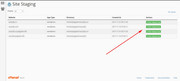
Sorry for the late reply, I tested some more and found that if I block the/enfold-child/style.cssfile from loading your page loads correctly. Please see the link and screenshot in the Private Content area.
Please try blocking the file in your browser dev tools and check your stylesheet.Best regards,
MikeHi,
Please try this code in the General Styling > Quick CSS field or in the WordPress > Customize > Additional CSS field:@media only screen and (max-width: 430px){ #top.page-id-17448 #wrap_all #main .avia-slide-wrap { height: auto !important; margin-top: 60px !important; } #top.page-id-17448 #wrap_all #main .av-special-heading-h3.avia-builder-el-2 { margin-top: 10px !important; } }There is a known WordPress issue that it doesn’t always show our builder correctly in the preview, sometimes disabling the block editor and using the Classic Editor solves. I recommend saving your page with the Visibility set to private if you don’t want it visible to the public and checking that way.
For your LearnDash shortcode
[course_content course_id="1"]I believe that this shortcode belongs with the Uncanny LP addon, please see here for the list of shortcodes, yet it seems that the LearnDash shortcode is[ld_course_list num="1"]please see here for the list of shortcodes
I don’t have any experience with LearnDash, but this is what my research returned.Best regards,
MikeHi,
Sorry for the late reply, so for “sta-op stoel Arnhem” & “Thuisdemonstratie” on small mobile (320px) I was able to adjust them, on large mobile (425px) they showed correctly.@media only screen and (max-width: 424px) { #top.home .cme { width: 260px !important; margin-left: -20px !important; } #top.home .avia-builder-el-19 h2.kop-gradient { margin-left: -28px !important; } }But the “Wisselend assortiment” is too large to adjust this way. Is it possible that this one can have a shorter heading? If so we can duplicate the element and only show it on the small mobile screens. It may be better to do the same for the other elements instead of using the css above.
Another option may be to make the font-size smaller only for the small mobile screens.Best regards,
MikeHi,
Thank you, I’m trying to research this more, thank you for your patience.Best regards,
MikeHi,
Thank you, Please try this code in the General Styling > Quick CSS field or in the WordPress > Customize > Additional CSS field:nav.main_menu { width: 70% !important; }Best regards,
MikeHi,
Please change the css to this:#top.page #wrap_all #main .breadcrumb.breadcrumbs.avia-breadcrumbs span,#top.page #wrap_all #main .breadcrumb.breadcrumbs.avia-breadcrumbs a,#top.archive #wrap_all #main .breadcrumb.breadcrumbs.avia-breadcrumbs span,#top.archive #wrap_all #main .breadcrumb.breadcrumbs.avia-breadcrumbs a { color: #fff !important; }Best regards,
MikeHi,
I see that you have no portfolio categories, please try adding one.Best regards,
MikeHi,
Sorry, the two links you posted redirect to the same page for me, so they look the same.
Perhaps screenshots would help. Please try https://postimg.cc/ to add screenshots.Best regards,
MikeHi,
Thanks for the login, I created a copy of one of your sliders and tried to edit it “BC17.homeslider-1 copy copy”
and received this error:
as you said.
I also exported it to my localhost but didn’t get this error.
I see that you have many plugins, have you tried deactivating them?Best regards,
MikeHi,
From what I see it is in our PHP files, but “do_shortcode” is not applied.Best regards,
MikeNovember 21, 2019 at 12:28 pm in reply to: When using Event Tickets, tickets and form are not visible. #1158797Hi,
Thank you, I believe the issue is that Enfold uses a custom “view” for The Events Calendar, and when you use a default theme these files are not used. I will ask the dev team to review, thank you for your patience.Best regards,
MikeHi,
Thank you for the login, I see that your post is a custom post type, I tried removing all of your css to test if that was causing the error, but it seems that it is not. I then Enabled the Avia Layout Builder Debugger and copied your posts shortcode to a new WordPress post as a test and it shows correctly, please see the links in the Private Content area. I set the post as private.
So I believe that the error is coming from the “custom-post-type.php” or your child theme “functions.php”
I tried reviewing your “functions.php” but it’s quite large and I didn’t see anything that stood out to me that may be an error.
Please try removing all of your custom code in the child theme functions.php, and if that solves, then add it back one function at a time until you find the error.
If it doesn’t solve then there is an error in your “custom-post-type.php” perhaps with your “enqueue_style” stylesheet code as the error looks like a css error overall.
Please let us know what you find.Best regards,
MikeHi,
Thank you for the login and feedback, please note that if you install a new demo it will overwrite your current changes, I wanted to point this out because I see that you have already created a nice homepage.
We have many portfolio layouts and I’m not sure which one you are trying to create, please go to our demo and find the one you like and send us the link so we can help with the correct one.

If you want to include a screenshot, https://postimages.org/ works well.Best regards,
MikeHi,
Thanks for the login, I found that the functions code to add the TripAdvisor icon as a social icon was not in the functions.php, probably because you are not using a child theme and when you updated it was overwritten. So I added it for you, but TripAdvisor is not showing as an option. Although the icon is available in your icon sets.
I see you have Cache Enabler & CDN Enabler plugins, but I don’t see how to clear them, please try to clear them or disable them temporarily to see if that helps, actually please try disabling all of your plugins and check the social profiles again, to rule this kind of error out.
I tested the same TripAdvisor code and icon on my test site with the same Enfold version, and it was working, so it should also work for you.Best regards,
MikeHi,
I don’t believe this is a “limitation” your filter adds “do_shortcode” for titles not schema.
Please post your shortcode code and where you are adding it so we can test.Best regards,
MikeHi,
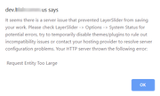
Thank you for the feedback, I couldn’t find a page that is using the layerslider, the slider on the homepage is a “full-width easy slider”.
But I also see that I can not create a new slider.
As this is a live site, I believe it would be a good idea to create a stagging site to investigate this issue with.
Please check your webhost to see if you have the one click staging site option, this is a option in most cPanels to create a staging clone of your site so we can test on it and you site will stay up and running. You can always ask your webhost to help you with setting this up if you want.Here are some screenshots of what it would look like:

Best regards,
MikeNovember 20, 2019 at 11:18 am in reply to: When using Event Tickets, tickets and form are not visible. #1158430Hi,
Are these buttons from the “Event Tickets Plus” add-on plugin?
Are you using the “Events Calendar PRO” version?Best regards,
MikeHi,
Please try this code in the General Styling > Quick CSS field or in the WordPress > Customize > Additional CSS field:#top.page #wrap_all #main .breadcrumb.breadcrumbs.avia-breadcrumbs span,#top.page #wrap_all #main .breadcrumb.breadcrumbs.avia-breadcrumbs a { color: #fff !important; }this sets it to white, but please adjust to suit.
Best regards,
MikeHi,
Please include an admin login in the Private Content area so we can be of more assistance.Best regards,
MikeNovember 19, 2019 at 1:28 pm in reply to: Link parent page above nested subpages in sidebar navigation #1158156Hi,
Thanks for sharing your modification, I’m sure this will help others 🙂
We will close this now. Thank you for using Enfold.For your information, you can take a look at Enfold documentation here
For any other questions or issues, feel free to start new threads in the Enfold forum and we will gladly try to help you :)Best regards,
MikeHi,
Glad to hear, you do not need to add to the parent theme as long as your child theme is active, a child theme is much better as you will not lose this code after your next update.
Shall we close this then?Best regards,
MikeHi,
I see, sorry perhaps I didn’t check by logging out?
Anyways, I checked WordPress > Settings > Reading > Your homepage displays and found this error:
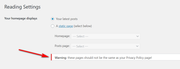
and your WordPress > Settings > Privacy > Select a Privacy Policy page is not set:
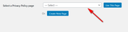
Please try setting your privacy page and then set your homepage in the Your homepage displays, perhaps this is a new override in WordPress 5.3?Best regards,
MikeHi,
Thank you for the login, this is odd, I’m not sure why this is not working on your site I had tested it on mine?
So in the interest of getting this done, I choose a social icon that you are not using “VK”, and then changed your css to this:#top #wrap_all .av-social-link-vk a:before{ content: ""; width: 30px; height: 30px; display: inline-block; vertical-align: middle; background: url([your-site]/wp-content/uploads/2019/11/iu.png) no-repeat center center; background-size: contain; }and then changed the “VK” title to “Discord” with this script in your functions.php:
function custom_discord_title(){
  ?>
  <script>
(function($){
$(window).load(function(){
$('.av-social-link-vk a').attr('title','Discord');
});
})(jQuery);
</script>
<?php
}
add_action('wp_footer', 'custom_discord_title');
Please change the link in your social profiles as I didn’t know what it was.
Please clear your browser cache and check.Also please note that I see you have some other changes in your functions.php & functions-enfold.php and you are not using a child theme, so your changes will be lost with future theme updates Read about child themes & Get it here
Please let us know if you want a hand with installing a child theme.Best regards,
MikeHi,
It will take a while for Google to not show your site, here is a good article on the steps you can do.Best regards,
MikeHi,
Glad we were able to help, we will close this now. Thank you for using Enfold.For your information, you can take a look at Enfold documentation here
For any other questions or issues, feel free to start new threads in the Enfold forum and we will gladly try to help you :)Best regards,
Mike -
AuthorPosts