
-
AuthorPosts
-
November 13, 2019 at 7:22 pm #1156479
Hi Mike,
Thanks! That’s working in Chrome, only in Safari the text is transparant. When I select the text, the text is not visible but I see it is centered.
You can have a look! Thanks!
November 13, 2019 at 9:21 pm #1156524Hi,
OK, I also notice that the gradient is not very good with display:flex, so it seems display:inline is the best way.
So lets try adding a div around the h2 and center that:<div class="cme"><h2 class="kop-gradient center">Sta-op stoel Arnhem</h2></div>this will be the css for the new class “cme”
.cme {
    display: flex;
    justify-content: center;
}
So we are leaving the h2 in the way we know works in Safari, and wrapping it in a new div which we will then center with flex.
If your not sure how to add a div, Please include an admin login in the Private Content area so I can demonstrate.Best regards,
MikeNovember 13, 2019 at 9:26 pm #1156528I think it’s working!! Thanks a lot Mike!
Your support is amazing!
November 14, 2019 at 12:31 pm #1156737Hi,
Glad to help, please check one more time and then we will close this thread.Best regards,
MikeNovember 20, 2019 at 11:20 pm #1158630Hi Mike,
Thanks for not closing this thread yet. I now see that on mobile some headings are not correctly visible. When you go to the homepage you see the heading “sta-op stoel Arnhem”. That should be centered. On desktop it is, on mobile not. Than when you scroll down you see the white squares with gradient title, text and gradient button. The second heading is not showing great. That one is longer so it has two lines of text and the second word is not visible and too much to the left if you understand what I mean. “Wisselend assortiment” is the title name.
On the page /merken you see the title “Welke merken” but the whole title is “Welke merken verkopen wij?”. So, not the whole title is visible.
Hope you understand what I mean! I’ve added al the pages where the title is not good on mobile in private content!
Thanks a lot!
November 23, 2019 at 11:46 am #1159400Hi,
Sorry for the late reply, so for “sta-op stoel Arnhem” & “Thuisdemonstratie” on small mobile (320px) I was able to adjust them, on large mobile (425px) they showed correctly.@media only screen and (max-width: 424px) { #top.home .cme { width: 260px !important; margin-left: -20px !important; } #top.home .avia-builder-el-19 h2.kop-gradient { margin-left: -28px !important; } }But the “Wisselend assortiment” is too large to adjust this way. Is it possible that this one can have a shorter heading? If so we can duplicate the element and only show it on the small mobile screens. It may be better to do the same for the other elements instead of using the css above.
Another option may be to make the font-size smaller only for the small mobile screens.Best regards,
MikeJanuary 11, 2020 at 6:32 pm #1172423HI Mike,
How do I implement the code for the gradient text you send as an example in your reply from the beginning? (#1082076)
I like the gradient from example 3, but i have no idea on how to apply that on my h1 texts?
Hope you can help me with that.
Best regards,
SebastianJanuary 11, 2020 at 7:33 pm #1172437Hi,
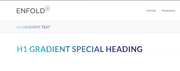
To add the gradient to your page title H1 heading you would use this css in your Enfold Theme Options > General Styling > Quick CSS field:#main h1.main-title a { text-transform: uppercase !important; background: linear-gradient(to right, #30CFD0 0%, #330867 100%); -webkit-background-clip: text; -webkit-text-fill-color: transparent; }To add the gradient to another element that is using the H1 heading such as a Special Heading element you would first add a custom class to the element such as “h1-gradient” and then use this css:
#main .h1-gradient h1 {
	text-transform: uppercase !important;
	background: linear-gradient(to right, #30CFD0 0%, #330867 100%);
	-webkit-background-clip: text;
	-webkit-text-fill-color: transparent;

}
Expected results:
If you have trouble targeting your H1 element please link to it and we will help identify the correct sector.Best regards,
MikeJanuary 11, 2020 at 10:18 pm #1172456I tried to do the first option to the general styling field, but it didn’t work. :/
January 12, 2020 at 2:21 pm #1172525Hi,
Sorry, I get this error when I try to login:Unbekannter Benutzername. Überprüfe ihn noch einmal oder versuche es mit deiner E-Mail-Adresse.
please check.
Please try this code in the General Styling > Quick CSS field or in the WordPress > Customize > Additional CSS field:
#top.home .avia_textblock h1 {
	text-transform: uppercase !important;
	background: linear-gradient(to right, #30CFD0 0%, #330867 100%);
	-webkit-background-clip: text;
	-webkit-text-fill-color: transparent;
}
Then clear your browser cache and check.
Best regards,
MikeJanuary 12, 2020 at 2:45 pm #1172529Perfect, with the new code, it worked perfectly! Thanks a lot!
January 12, 2020 at 5:35 pm #1172547Hi,
Glad we were able to help, we will close this now. Thank you for using Enfold.For your information, you can take a look at Enfold documentation here
For any other questions or issues, feel free to start new threads in the Enfold forum and we will gladly try to help you :)Best regards,
Mike -
AuthorPosts
- The topic ‘Gradients (buttons and text)’ is closed to new replies.