
-
AuthorPosts
-
March 22, 2019 at 11:04 pm #1082030
Is it possible to apply a color gradient to all H1 texts? and to a especific button?
Thanks!
March 23, 2019 at 5:56 am #1082076March 23, 2019 at 11:23 am #1082104Thanks Mike!
That was very useful, I already applied on my site.
March 23, 2019 at 2:37 pm #1082121Hi,
Glad to hear, I assume we can close this now, but I like to ask first. Shall we close this then?Best regards,
MikeMarch 23, 2019 at 10:30 pm #1082180Hi Mike,
I am not too familiar with this setup …
If I want to apply this button to my website …
What should I do …
Step by step guide would be very helpful. (Where would I enter the HTML and what labels should I use)
Kind regards,
March 24, 2019 at 1:11 am #1082200Hi,
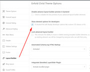
First you will want to ensure that your custom classes enabled in the theme options at: Enfold Theme Options > Layout Builder > Show element options for developers:
Then we will add this style to a X-large enfold button, so add your button to the page in the Advanced Layout Builder:
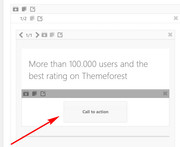
Then add the custom class to the button:btn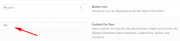
Then we will add the button css to the Enfold Theme Options > General Styling > Quick CSS field#top .main_color .btn a.avia-button.avia-color-theme-color { color: rgba(255,255,255,0.9) !important; border-radius: 50px !important; background: linear-gradient(-45deg, #FFA63D, #FF3D77, #338AFF, #3CF0C5) !important; border-color: transparent !important; background-size: 600% !important; animation: anime 16s linear infinite; } @keyframes anime { 0% { background-position: 0% 50%;} 50% { background-position: 100% 50%;} 100% { background-position: 0% 50%;} }Results:

Best regards,
MikeMarch 24, 2019 at 10:29 pm #1082384Perfect … That work like a charm …
Thank you for your help.
Just for future reference … How should I copy other CSS stylings from the websites you provided?
e.g. other button styles, background styles etc. etc.
Your help will be appreciated.
March 24, 2019 at 11:29 pm #1082403Thank you for your explanation.
How can I apply the same animation to background colour e.g. to a colour section. Is it possible?
If yes how would I implement that?
Kind regards,
http://www.projectt.co.uk-
This reply was modified 6 years, 3 months ago by
projectt_co_uk.
March 24, 2019 at 11:36 pm #1082405Hi,
Glad to help, as for copying other styles and using them, I wouldn’t say that you can copy css you find and add it to your elements very easily, you would need a little knowledge of css. I would say that if you see this done a few times you will get a sense of how to do it. If you find something else you want to do please let us know and we will assist again.Best regards,
MikeAugust 12, 2019 at 4:26 pm #1126826Hi Mike, I tried to accomplish to get that same button style and followed the layed out steps. However, the buttons with the .btn class now totally disappear or appear white or transparent. Is there anything I can do to get this working?
See link. They should appear in the lower section above the Opt in on the left and right.
-
This reply was modified 5 years, 11 months ago by
AwiIlanKali.
August 13, 2019 at 6:44 am #1127084Hi,
@AwiIlanKali thank you for the link, I took a look at your buttons and adjusted the css for your buttons that were using some different classes and it seems to work now. Please try this code in the General Styling > Quick CSS field or in the WordPress > Customize > Additional CSS field:#top .main_color .btn a.avia-button.avia-color-custom { color: rgba(255,255,255,0.9) !important; border-radius: 50px !important; background: linear-gradient(-45deg, #FFA63D, #FF3D77, #338AFF, #3CF0C5) !important; border-color: transparent !important; background-size: 600% !important; animation: anime 16s linear infinite; } @keyframes anime { 0% { background-position: 0% 50%;} 50% { background-position: 100% 50%;} 100% { background-position: 0% 50%;} }Here is the result:
via GIPHYBest regards,
MikeAugust 13, 2019 at 11:29 am #1127142phantastic Mike. Thank you so much. Works great now in Chrome and Safari!!!
Anything I can add to make it work in FIrefox as well? Not sure about otherPC browsers.August 14, 2019 at 4:45 am #1127462Hi,
Glad to hear, I’m on a PC and it works with Chrome & Edge, for Firefox please try using this css instead:#top .main_color .btn a.avia-button.avia-color-custom { color: rgba(255,255,255,0.9) !important; border-radius: 50px !important; background: linear-gradient(-45deg, #FFA63D, #FF3D77, #338AFF, #3CF0C5) !important; border-color: transparent !important; background-size: 600% !important; animation: anime 16s linear infinite; -moz-animation: anime 16s linear infinite; } @keyframes anime { 0% { background-position: 0% 50%;} 50% { background-position: 100% 50%;} 100% { background-position: 0% 50%;} } @-moz-keyframes anime { 0% { background-position: 0% 50%;} 50% { background-position: 100% 50%;} 100% { background-position: 0% 50%;} }Best regards,
MikeAugust 15, 2019 at 2:26 pm #1127942thank you for checking Mike and the new code. I adjusted it to my gradient here. But Firefox still doesn’t display the gradient animation.
Any ideas?#top .main_color .btn2 a.avia-button.avia-color-custom {
color: rgba(255,255,255,0.9) !important;
border-radius: 30px !important;
background: linear-gradient(-45deg, #0077f2, #202b8e, #ff481e, #ff5e1e) !important;
border-color: transparent !important;
background-size: 600% !important;
animation: anime 8s linear infinite;
-moz-animation: anime 8s linear infinite;}
@keyframes anime {
0% {
background-position: 0% 50%;}
50% {
background-position: 100% 50%;}
100% {
background-position: 0% 50%;}
}
@-moz-keyframes anime {
0% {
background-position: 0% 50%;}
50% {
background-position: 100% 50%;}
100% {
background-position: 0% 50%;}
}August 17, 2019 at 5:12 am #1128420Hi,
Sorry for the late reply, I did not figure out why this is not working, I’m sure the css is correct with the proper “-moz-” prefixes, so I tried changing it to jQuery and now it works in Chrome and Firefox.
To test this, please add a code block element to your page and place this code inside:<script> (function($){ $(document).ready(function () { $('.btn2 a.avia-button').css({ 'color': 'rgba(255,255,255,0.9)', 'border-radius': '50px', 'background': 'linear-gradient(-45deg, #FFA63D, #FF3D77, #338AFF, #3CF0C5)', 'border-color': 'transparent', 'background-size': '600%', 'animation': 'anime 16s linear infinite' }) }); })(jQuery); </script> <style> @keyframes anime { 0% { background-position: 0% 50%;} 50% { background-position: 100% 50%;} 100% { background-position: 0% 50%;} } </style>We could make this code global, but first, test it on one page to see if it’s also working for you.
If you would like to test this on a new page, please Enable Avia Layout Builder Debugger which will add a new text field below the Advanced Layout Builder, and then add the page shortcode in the link below, then save the page.
https://www.dropbox.com/s/641pwwo7eukd5ts/gradient_button_shortcode.txt?dl=0Best regards,
MikeAugust 17, 2019 at 1:29 pm #1128475HI Mike,
thank you so much for your work.
I added your code to the Quick CSS Panel.
However in Firefox the buttons with btn2 are now transparent and not visible.
Everything still works in Chrome. But now not in Safari.I am going to switch it back to the other code, as I need to present my client the page. And without the skript it at least shows the button in the theme color. I you feel like figuring it out I am grateful. However I can live with it not working in firefox for now. Since every other browser seems to display it right.
Thank you.
AwiAugust 17, 2019 at 4:09 pm #1128482Hi,
The jQuery code I posted last will not work in the Quick CSS field, that area is only for css.
If you include an admin login I can demonstrate on a test page, or even on the one page you are working on.
Or you can download the test page shortcode that I wrote about.
But if you are fine with it as it is that ok too :)Best regards,
MikeOctober 24, 2019 at 12:36 pm #1150867Hi there!
I’m using a css code to create text color gradient, but the problem is that the second color (100%) is not visible. When the text is longer, the color is visible. Looks like it’s using the whole column as 100% in stead of only the text. When I make the screen smaller, the second color (pink) is visible because the column is getting smaller. Hope you understand me.
This is my css code:
h2.kop-gradient {
background: -webkit-linear-gradient(left, #8e0075, #fa006b);
background: -o-linear-gradient(right, #8e0075, #fa006b);
background: -moz-linear-gradient(right, #8e0075, #fa006b);
background: linear-gradient(to right, #8e0075, #fa006b);
-webkit-background-clip: text !important;
-webkit-text-fill-color: transparent !important;
}See link in private data. The pink color should be more visible, just like the logo.
Thanks a lot!
October 24, 2019 at 11:12 pm #1151016Hi,
Please try this code in the General Styling > Quick CSS field or in the WordPress > Customize > Additional CSS field:h2.kop-gradient { display: table !important; }Best regards,
MikeNovember 11, 2019 at 11:30 am #1155540Hi Mike,
Thanks but now the title is totally gone. Any other ideas?
November 11, 2019 at 11:32 am #1155542Oh, that’s weird. When I select the text, the color is appearing. The color is great now. Any idea why the text is first transparant? And the centered title is not centered anymore. See link! Thanks!
Is it because of this code:
-webkit-background-clip: text !important;
-webkit-text-fill-color: transparent !important;-
This reply was modified 5 years, 8 months ago by
jannnnnneke.
November 11, 2019 at 12:36 pm #1155559Hi,
Sorry I’m not experiencing transparent text, but I’m on Windows and I assume you are on IOS, if so then try removing those two lines of code they are for IOS and was recommended as necessary, but perhaps I misunderstood.
I see that your H2 is not centering because we had to set the display to “table” for the gradient to work, to center we need to add:h2.kop-gradient { margin: auto !important; }Best regards,
MikeNovember 11, 2019 at 12:51 pm #1155564Hi! In Google Chrome the text was visible, in Safari not.
I’ve added the margin auto, but now all the titles are centered.
And when I remove the two lines of background clip and text fill color, the background is gradient, not the text. See site!
Thanks!
November 11, 2019 at 2:04 pm #1155606Hi,
I see so you will need those two lines of code. I thought you wanted allh2.kop-gradientcentered?
If not then add another class, such ascenterto theh2.kop-gradientelements, be sure you leave a space between the classes likekop-gradient centerthen use this css instead:h2.kop-gradient.center { margin: auto !important; }As for the Safari issue I will have to investigate more.
Best regards,
MikeNovember 11, 2019 at 2:12 pm #1155610Yes, perfect! That’s working. Thanks!
About the safari issue: when I load the page, the text is not visible/transparent.. when I select the text, it is visible and stays visible. So when I select all the text on the page and than deselect, than all the titles are visible.
November 12, 2019 at 1:20 pm #1155999Hi,
Glad that is working, as for Safari I found thedisplay: table;may be causing the issue with the-webkit-background-clip: text;(more about background-clip) This may be a solution, please note that on that page it is pointed out that this is a Safari bug, Please try changingdisplay: table;todisplay: inline;and see if that helps, after clearing your browser cache.Best regards,
MikeNovember 12, 2019 at 2:55 pm #1156023Yes display inline is working! Only the centered text is not centered anymore. This is the css code im using:
h2.kop-gradient {
background: -webkit-linear-gradient(left, #8e0075, #fa006b);
background: -o-linear-gradient(right, #8e0075, #fa006b);
background: -moz-linear-gradient(right, #8e0075, #fa006b);
background: linear-gradient(to right, #8e0075, #fa006b);
-webkit-background-clip: text !important;
-webkit-text-fill-color: transparent !important;
display: inline !important;
}

h2.kop-gradient.center {
margin: auto !important;
}
Thanks!!
November 12, 2019 at 9:28 pm #1156175Hi jannnnnneke,
Well, to center the text the container have to have more width and with the inline element, it will not work. You can try the left margin, but it might not be ideal:
h2.kop-gradient {
    margin-left: 30%;
}
Best regards,
VictoriaNovember 13, 2019 at 6:23 pm #1156467Hi,
Margin left 30% is ideal… and not perfect working on mobile. Maybe there is another element in stead of the inline element? Any ideas? Or a total other way of creating gradient text color? Or another way of removing the transparent text in Safari? Maybe set display inline only for Safari? But I dont know if that will solve the problem..
Thanks a lot!
November 13, 2019 at 7:17 pm #1156476 -
This reply was modified 6 years, 3 months ago by
-
AuthorPosts
- The topic ‘Gradients (buttons and text)’ is closed to new replies.