Forum Replies Created
-
AuthorPosts
-
Hi,
Thank you for your patience and the link to your page, when I look at your #av_section_9, the section that begins with the title: ACCESS the only issue that I see is that the section is not centered, this is because of some custom css that you have added:#av_section_9 .container { max-width: 100% !important; margin: 0 !important; padding: 0 !important; }If you remove this the section will show correctly.
If this is not the issue that you are talking about, please explain further and include a screenshot and admin login in the Private Content area so we can be of more assistance.Best regards,
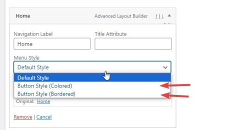
MikeHey dreamreader,
To edit the menu item subline, first ensure that you have the Screen Options ▸ Description check box enable at the Screen Options at the top of the menu page:

Then you will see the menu item subline:

Best regards,
MikeHi,
The option would look like this:
If you continue to have trouble with this issue please open a new thread and post your admin login in the Private Content area so we can assist, as this is not your thread posting your login here will not be private and you will not see our comments in the Private Content area.
Thank you for your patience and understanding and using Enfold.Best regards,
MikeOctober 26, 2023 at 5:38 pm in reply to: ENFOLD GDRP / General Data Protection Regulation Cookie Settings Multilang #1423816Hi,
Thanks for reporting back the solution you found for Polylang, I’m sure other users may find this helpful. If you have any further questions please create a new thread and we will gladly try to help you. Thank you for using Enfold.Best regards,
MikeOctober 25, 2023 at 6:52 pm in reply to: Linking external images within – product grid, product slider or product list #1423727Hi,
Thank you for your patience and for the link to your site, I see that your product imports do not include a “featured image”.
When I check your “custom fields” I see your images for main_image & thumbnail_image, but from what I can see on my demo, the featured image is not stored as a “custom field” but as the thumbnail_id and are refured to by the attachment ID, and since these images are not in your media library they won’t have a attachment ID.
Unfortunately I don’t have a way to test this situation because the standard WordPress import/export file (xml) imports the images into the media library, but your import method doesn’t.
Does your import tool offer any other fields like the thumbnail_id?Best regards,
MikeOctober 25, 2023 at 6:22 pm in reply to: Blog page in portrait orientation iPhone 14 max pro sticks #1423726Hi,
Sorry, but I don’t use any CDNs, so I can’t make any recommends, I think that Guenni007 is pointing out that the domain cloudflareinsights.com is on a AD tracking list, perhaps from some of their users, I’m not sure. As for fixing the CORS issue with them you will need to ask them and your webhost, as I pointed out above. Or you could try not using the CDN at all and see if this helps. Once you stop using them and clear your server cache, it might take a day or so for the files to stop being serve by them.Best regards,
MikeHi,
Glad we were able to help, if you have any further questions please create a new thread and we will gladly try to help you. Thank you for using Enfold.Best regards,
MikeHi,
If you are not using the LayerSlider pro plugin, please re-enable the theme settings for the built-in layerslider to be used and then try updating the theme to v5.6.8, which came out today (10-24) as it has Layerslider 7.9.1, perhap it will solve the LayerSlider error you are seeing.Best regards,
MikeHi,
Glad that this helped, your new issue seems to be pointing at core WordPress js files in /wp-includes/js/ and may be related to jquery-migrate,
Try checking that Enfold Theme Options ▸ Performance ▸ Disable jQuery Migrate is not enabled, if you don’t see the option then your server has disabled it and you should try enabling it. If you don’t see the option then typically you will not see the Enfold Theme Options ▸ Performance ▸ Load jQuery in your footer either, when a server trys to force jQuery to the footer then both of these options are missing from the theme settings.
If you have a caching plugin that trys to Disable jQuery Migrate & Load jQuery in your footer, then disable these options or disable the plugin completely for testing.
It is possible that another plugin is causing a confident, so again try to disable all of your plugins to rule this out.Best regards,
MikeOctober 24, 2023 at 6:24 pm in reply to: Accordion in grid row mobil doesn’t close properly #1423613Hi,
Thank you for your patience, on your /dachdecker/ page I changed the element to Accordion mode and added this css:.togglecontainer .single_toggle { float: none; }and tested on desktop and mobile Android and the issue seems to be solved now.
Please note that if you are testing with an iPhone it can be hard to clear the cache, often you need to also clear the history to fully purge the cache, following these steps for Safari and note Step 4 where you will Clear the History.
Please check.Best regards,
MikeHi,
Glad to hear that you have this sorted out, with Nikko’s help, if you have any further questions please create a new thread and we will gladly try to help you. Thank you for using Enfold.Best regards,
MikeOctober 23, 2023 at 7:51 pm in reply to: Installing Enfold theme fails due to mising metadata theme name. #1423466Hey abix,
I believe that you have uploaded the Enfold Theme and documentation zip file, please either check your Theme Forest account for the Installable WordPress file only zip file, or extract your current zip file and file the “enfold.zip” inside and installthat file.
Also ensure that your cPanel have the PHP ZipArchive Extension enabled so the zip file can be extracted, it seems some cPanels with PHP v8, don’t have this enabled by default.Best regards,
MikeHey Timothy,
Your error points to this line:$enqueued->registered[ $remove ]->src = '';in /config-templatebuilder/avia-template-builder/php/class-asset-manager.php
This was also reported by a user that was using the plugin: Asset CleanUp: Page Speed Booster are you using this plugin?
I recommend disabling all of your plugins, besides your Memberpress and see if this helps, if so enable your plugins one at a time to isolate the conflict.
Or you can try the solution in this thread, it seemed to help in 2021, perhaps it will also help you.Best regards,
MikeHey jaimemerz,
Thanks for the link to your page, the browser console shows this error:Google Maps JavaScript API error: ExpiredKeyMapError https://developers.google.com/maps/documentation/javascript/error-messages#expired-key-map-errorExpiredKeyMapError
Please follow the link above, it looks like your API key has exprired, please check and ensure that you have a active payment card on file with Google Maps, perhaps your payment method has expired.Best regards,
MikeOctober 23, 2023 at 7:19 pm in reply to: Is it possible to hide the “All” sorting tag on the accordion? #1423461Hi,
Please try the setting in Guenni007‘s screenshot, thank you Guenni007 :)Best regards,
MikeOctober 23, 2023 at 7:16 pm in reply to: Anchor link from header link to a Slider Revolution slider #1423460Hi,
Glad we were able to help, if you have any further questions please create a new thread and we will gladly try to help you. Thank you for using Enfold.Best regards,
MikeHi,
Glad we were able to help, and thank you for the kind words, if you have any further questions please create a new thread and we will gladly try to help you. Thank you for using Enfold.Best regards,
MikeHi,
The second code goes in your child theme functions.php file, I added it for you:

please clear your browser cache and check.Best regards,
MikeHi,
Glad we were able to help, if you have any further questions please create a new thread and we will gladly try to help you. Thank you for using Enfold.Best regards,
MikeHey steveorrmedia,
Thank you for your patience and the link to your site, for your first issue I found that between 1340px & 1799px you were seeing the four images appear in one horizontal row and two in a row underneath with a big grey space next to it, try this CSS in your Enfold Theme Options ▸ General Styling ▸ Quick CSS field t correct:@media only screen and (min-width: 989px) and (max-width: 1799px) { .responsive .av-masonry-col-flexible .av-masonry-entry { width: 33.3%; } }For your second issue, having good titles for your images is good for SEO, but I notice that your titles are not very good, for example see the first screenshot below: “Steve5 In Action – Copy” try going to your media library and check each image and make the titles something that you would want to see on google like: “Award winning broadcaster Steve teaches”
Ok, then I know you don’t want to see the titles when you mouse-over the images, so to correct try adding this code to the end of your child theme functions.php file in Appearance ▸ Editor:function custom_remove_title_on_mouse_over_script() { ?> <script> (function($){ $('img').hover(function(e){ $(this).attr('data-title', $(this).attr('title')); $(this).removeAttr('title'); }, function(e){ $(this).attr('title', $(this).attr('data-title')); }); $('.av-masonry-image-container').hover(function(e){ $(this).attr('data-title', $(this).attr('title')); $(this).removeAttr('title'); }, function(e){ $(this).attr('title', $(this).attr('data-title')); }); $('a').hover(function(e){ $(this).attr('data-title', $(this).attr('title')); $(this).removeAttr('title'); }, function(e){ $(this).attr('title', $(this).attr('data-title')); }); })(jQuery); </script> <?php } add_action('wp_footer', 'custom_remove_title_on_mouse_over_script', 99);Then clear your browser cache and check.
Best regards,
MikeHey padclip,
Thank you for your patience, I recommend trying to add the language selector to your css, I checked your site and these are the language code that you are using:html[lang="de-DE"] html[lang="en-US"] html[lang="fr-FR"]So for example if the css above is for the DE language try adding the language like this:
html[lang="de-DE"] #top .av-main-nav li:nth-child(3) {
    margin-right:300px;
}

@media only screen and (min-width: 990px) {
html[lang="de-DE"].html_header_top.html_header_sticky #header {
    position: fixed;
    top: 0px;
}
}

html[lang="de-DE"].html_top_nav_header .av-logo-container {
	top: -30px;
    z-index: 999;
}

@media only screen and (max-width: 989px) {
html[lang="de-DE"].html_top_nav_header .av-logo-container {
	top: 0px;
	left:0;
}
}

/*Up the menu on the logo and remove the container of the menu*/

html[lang="de-DE"] #top .main_menu {
top: -85px;
}

html[lang="de-DE"] #top #header #header_main_alternate .container {
height: 0px!important;
}

html[lang="de-DE"] #top ul#avia-menu {
margin-right: -35px;
}
Then I would add all three languages to the WordPress ▸ Customize ▸ Additional CSS as it has top preference.
Best regards,
MikeOctober 22, 2023 at 8:26 pm in reply to: Is it possible to hide the “All” sorting tag on the accordion? #1423338Hi,
Thank you for the link to your site, try this CSS in your Enfold Theme Options ▸ General Styling ▸ Quick CSS field:.togglecontainer .taglist a:first-child { display: none; }After applying the css, please clear your browser cache and check.
Best regards,
MikeHi,
Odd, so you disabled all of your plugins, except for “Temporary Login Without Password” and then tried to add a image to a post, and you couldn’t use the space bar?
After much testing, I found that disabling the Feedzy RSS Feeds Lite plugin solved the issue in Windows in Chrome, Firefox, & Edge.
I have left it disabled so you can check. Please note that if you are using a Mac or IOS, it can be hard to clear the cache, often you need to also clear the history to fully purge the cache, following these steps for Safari and note Step 4 where you will Clear the History.Best regards,
MikeHi,
Ok, hopefully it also works well on the live site, this has been a big customization, more than normal.Best regards,
MikeHi,
I have checked your two sites, the homepage and the /galerien/ for each and I don’t see any errors, so I would say that your css is working correctly.Best regards,
MikeHi,
The commas are not in the author links:

but please note that the entire product grid item is wrapped in a link to the product page:

What is your goal, do you want to change the color of the commas?
Try this CSS in your Enfold Theme Options ▸ General Styling ▸ Quick CSS field:.inner_product.main_color a.woocommerce-LoopProduct-link { color: #7d7d7d; }Best regards,
MikeHey Michael,
Thank you for the link to your sites, as I understand your request you would like the two cookie consent buttons to always be side-by-side (inline) and the cookie consent text to be inline next to the buttons, but at smaller screens the text should become multiple lines and still inline with the buttons.
Try this CSS in your Enfold Theme Options ▸ General Styling ▸ Quick CSS field for each site:.avia-cookie-consent .container { display: flex; flex-wrap: wrap; align-items: center; justify-content: space-between; } .avia-cookie-consent .avia_cookie_text { flex: 1; white-space: normal; margin: 0; } .avia-cookie-consent .avia-button { display: inline-block; }This is the expected result that I see when I test:

Best regards,
MikeHi,
Thank you for your patience, but unfortunately I’m not able to login, please check.Best regards,
Mike -
AuthorPosts

