Forum Replies Created
-
AuthorPosts
-
Hi,
I am referring to this authentication.
Please ask your hosting provider for that info. Or check the wp root directory where the htaccess or the .htpasswds files are located.
Best regards,
IsmaelHi,
You’re welcome! Please open a new thread if you need anything else. :)
Best regards,
IsmaelOctober 23, 2018 at 2:42 pm in reply to: Option "use as mega menu" and "Column or Rows" no more available #1025433Hi,
The plugin is probably using the same hook as the mega menu, which is the same exact issue as Popup Maker plugin conflict. The PUP Maker provided a workaround but I’m not sure if it’s going work with the “menu visiblity” plugin.
// https://wordpress.org/support/topic/overrides-other-menu-functions/#post-8945399
// https://kriesi.at/documentation/enfold/mega-menu/#mega-menu-appears-as-a-normal-menuPlease ask the plugin author if it’s possible to call the render function using the “wp_nav_menu_item_custom_fields” hook as described above.
Best regards,
IsmaelHi,
Yes, that should be possible. Start with the Header > Header Layout settings. You should be able to change the logo and menu position there along with the rest of the header options. For the cart icon, go to the Shop Options > Header Shopping Cart Icon. Again, you can set it so that it is attach to the main menu.
Best regards,
IsmaelHi,
You can try this css code.
@media only screen and (max-width: 989) {
  /* Add your Mobile Styles here */
  .responsive #top .logo {
    position: absolute;
    left: 50%;
    -webkit-transform: translate(-50%, 0);
    -ms-transform: translate(-50%, 0);
    transform: translate(-50%, 0);
    top: 0;
  }

  .responsive #top #header_main {
    z-index: 3;
    min-height: 80px;
    position: relative;
  }

  .responsive #top .logo img {
    margin: 0;
    margin: 0 auto;
    max-height: 80px !important;
 }
}
Best regards,
IsmaelOctober 23, 2018 at 2:23 pm in reply to: Main menu active/hover state with background image #1025419Hi,
Cool. We’ll close the thread now. Please open a new thread if you need anything else.
Best regards,
IsmaelHi,
You can hide the other search bar with css. Would you like that?
Best regards,
IsmaelOctober 23, 2018 at 2:20 pm in reply to: How can i remove the gaps between these container content view in responsive #1025417Hi,
Thank for the info.
How did you set the font? It is currently set to “Antic”.
h1, h2, h3, h4, h5, h6, #top .title_container .main-title, tr.pricing-row td, #top .portfolio-title, .callout .content-area, .avia-big-box .avia-innerbox, .av-special-font, .av-current-sort-title, .html_elegant-blog #top .minor-meta, #av-burger-menu-ul li.antic {
    font-family: 'Antic', 'HelveticaNeue', 'Helvetica Neue', Helvetica, Arial, sans-serif;
}
Best regards,
IsmaelOctober 23, 2018 at 2:17 pm in reply to: The Language Switcher is Not Displaying on the Search Page #1025414Hi,
It seems to be an issue with the W P M L function “icl_get_languages”. It returns nothing when the search query is present. Please provide the FTP details in the private field. We would like to do a few tests.
Best regards,
IsmaelHi,
You have to disable the performance settings first. Add the css modification on the Quick CSS field or the child theme’s style.css file. Let us know if it changes anything.
Best regards,
IsmaelHi,
Thanks for the update. We need the htaccess authentication in order to see the site. Please post in the private field.
Best regards,
IsmaelHi,
Did you update the theme? The modification was removed. I added it back on line 751.
if( value === undefined ) return;Best regards,
IsmaelHi,
Sorry for the late response. You can use the following css code to make the left sidebar switch to the top header when the screen width is equal or less than 1024px.
@media only screen and (max-width: 1024px) {
    .responsive #top #wrap_all #header {
      position: relative;
      width: 100%;
      float: none;
      height: auto;
      margin: 0 !important;
      opacity: 1;
    }

    .responsive #top #wrap_all .container {
      width: 85%;
      max-width: 85%;
      margin: 0 auto;
      padding-left: 0;
      padding-right: 0;
      float: none;
    }

    .responsive #top .logo {
      position: static;
      display: table;
      height: 80px !important;
      float: none;
      padding: 0;
      border: none;
      width: 80%;
    }

    .responsive .logo a {
      display: table-cell;
      vertical-align: middle;
    }

    .responsive .logo img {
      height: auto !important;
      width: auto;
      max-width: 100%;
      margin: 0;
      display: block;
      max-height: 80px;
    }

    .responsive #header_main .inner-container,
    .responsive .main_menu {
      position: static;
    }

    .main_menu .avia-menu, #header_main_alternate,
    .fallback_menu {
      display: block;
    }

    .responsive #top #main {
      padding-top: 0 !important;
      margin: 0;
    }

    .container #advanced_menu_toggle,
    #advanced_menu_hide {
      display: block;
    }

    .responsive.html_header_sidebar #top #header .social_bookmarks, .avia-custom-sidebar-widget-area, .html_header_sidebar #header .av-main-nav > li  {
        display: none;
    }

    .responsive #top .av-main-nav .menu-item-avia-special {
        display: block;
    }

    .responsive #top #wrap_all .main_menu {
        top: 0;
        height: 80px;
        left: auto;
        right: 0;
        display: block;
        position: absolute;
    }
}
Best regards,
IsmaelHey Chris,
Thank you for using Enfold.
Do you have a live site? Please post the site url, so that we can check it.
// https://kriesi.at/documentation/enfold/google-map/#google-maps-setup
Best regards,
IsmaelOctober 23, 2018 at 11:41 am in reply to: Contact form spam with privacy policy message = false #1025353Hi,
Have you tried the plugins mentioned above? What is the current theme version? Please upgrade to v4.5.
Best regards,
IsmaelHi,
@Underkult: Do you have a staging site? Please put your modifications in the avia.js file and then we’ll check the site again. What did you add in the includes > helper-main-menu.php file?
Best regards,
IsmaelHi,
The “shop_thumbnail” size is still set to 100x100px when I check the Settings > Media panel. You have to adjust it before the regenerating the images.
Best regards,
IsmaelHi,
Cool! Glad we could help!
Please take a moment to review our theme and show your support https://themeforest.net/downloads
Don’t forget to bookmark Enfold Documentation for future reference.Thank you for using Enfold :)
Best regards,
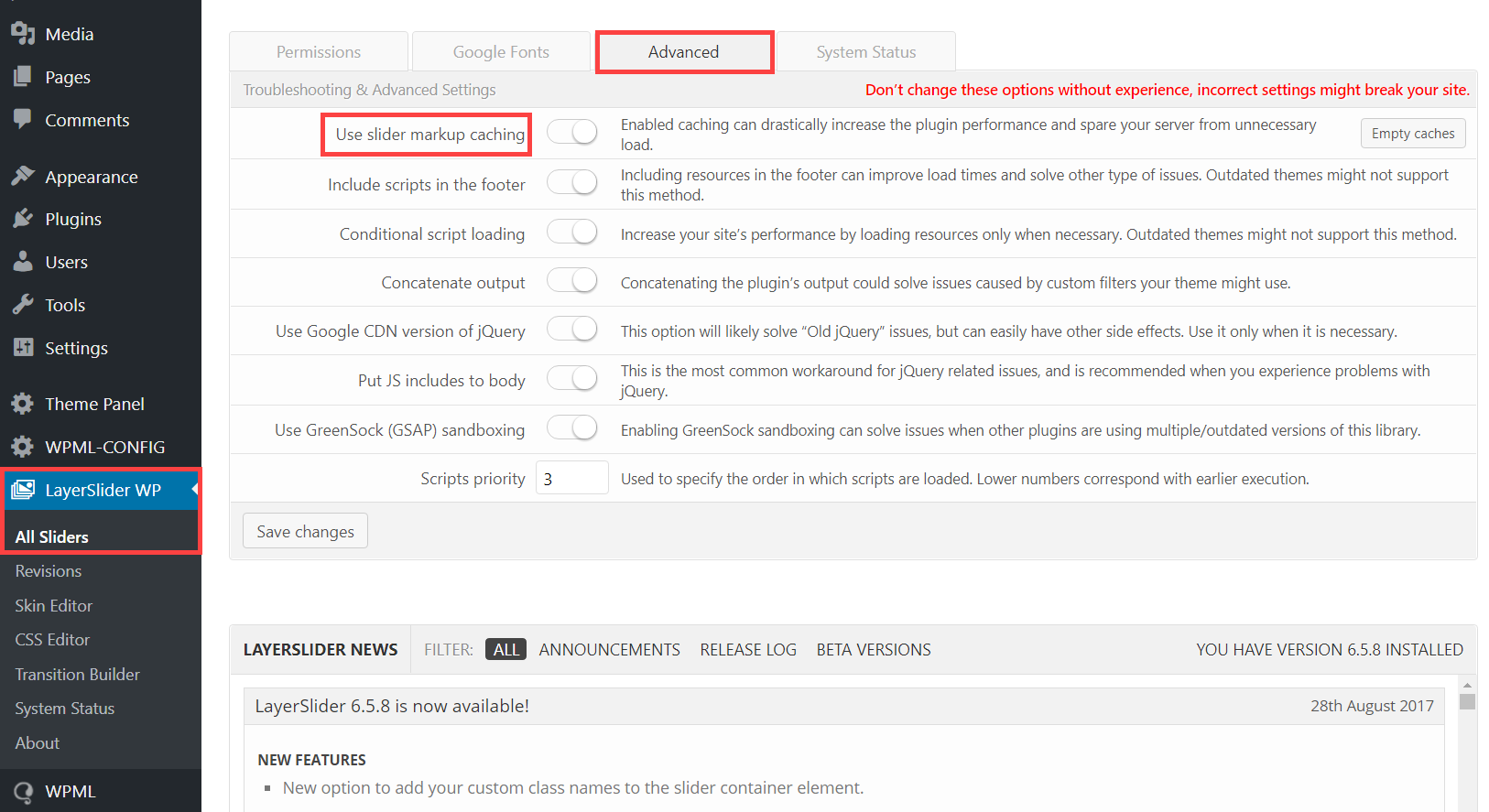
IsmaelHi,
Sorry for the confusion. I was referring to the “Slider markup caching”. Is that enabled?
Best regards,
IsmaelOctober 23, 2018 at 11:19 am in reply to: Option "use as mega menu" and "Column or Rows" no more available #1025340Hi,
I think it’s not working because of the “If Menu – Visibility control for menu items” plugin. Please try to disable it temporarily.
Best regards,
IsmaelHey CloudZen,
Thank you for using Enfold.
Yes, that is the default behavior of the element. Use this css code to redisplay a finished countdown.
.av-countdown-timer {
    opacity: 1;
}
Best regards,
IsmaelOctober 22, 2018 at 3:49 pm in reply to: Main menu active/hover state with background image #1024921Hey Gitte,
Thank you for using Enfold.
Try to append the “current_page_item” or “current_menu_item” class attributes to the id selector. That should work for the active state.
#menu-item-29.current_menu_item {
   // css here
}
Best regards,
IsmaelHi,
I can’t access the hotspots even on desktop view. It just blinks. Did you modify the element? Please upgrade the theme to version 4.5.
Best regards,
IsmaelOctober 22, 2018 at 3:29 pm in reply to: Single portfolio entry lightbox gallery won't show all the images #1024910Hey!
I see. The last two images are not included. Try to move them inside the same section as the first four.
Best regards,
IsmaelOctober 22, 2018 at 3:03 pm in reply to: Single portfolio entry lightbox gallery won't show all the images #1024893Hi,
All of the images in the section are included inside the lightbox when I checked — all six of them. Is this fixed?
Best regards,
IsmaelHi,
Do you have a staging site? I don’t think there’s any modification related to the media files in the latest version for it to not work properly. The error thrown by the browser is quite unclear, so I’m not really sure where to check.
Best regards,
IsmaelOctober 22, 2018 at 5:17 am in reply to: WooCommerce Grid / List toggle v1.1.0 not working on enfold :( #1024665Hi,
@gtekit: Sad to hear that you’ve switched theme. Good luck. And thank you for the input.
@EdgeWP: Use this script in the functions.php file:add_action('wp_footer', 'ava_move_prod_list_title', 9999); function ava_move_prod_list_title() { ?> <script> (function() { const p = document.querySelectorAll('.list .product'); if(p) { p.forEach( pr => { const t = pr.querySelector('.inner_product_header'); const d = pr.querySelector('.woocommerce-LoopProduct-link'); const f = t.cloneNode(true); t.querySelector('.woocommerce-loop-product__title').remove(); d.parentNode.insertBefore(f, d.nextSibling); f.querySelector('.price').remove(); f.querySelector('.onsale').remove(); }); } })(); </script> <?php }And then add this css code:
#top div .products.list .woocommerce-loop-product__link + .inner_product_header {
    float: left;
    clear: none;
    height: auto;
    min-height: 0;
}
Best regards,
IsmaelHi,
Cool! Glad we could help!
Please take a moment to review our theme and show your support https://themeforest.net/downloads
Don’t forget to bookmark Enfold Documentation for future reference.Thank you for using Enfold :)
Best regards,
IsmaelOctober 22, 2018 at 4:25 am in reply to: How can i remove the gaps between these container content view in responsive #1024662Hi,
Thanks for the update.
I don’t really see any issue with that section aside from the h1 text bleeding outside the container on smaller screens. You can fix that with this css code.
@media only screen and (max-width: 767px) {
.avia_textblock h1 {
    font-size: 20px !important;
}
}
You can adjust the font size value as you wish.
Best regards,
IsmaelOctober 22, 2018 at 4:16 am in reply to: Fatal Error with nextgen plus using lightbox pro effect on mobile devices #1024660Hi,
Thanks for the info.
Try to wrap the gallery inside a div container. Example.
<div class="ngg-gallery-wrap">
 // gallery here</div>
Use this script in the functions.php file.
add_action('wp_footer', 'ava_remove_ngg_wrapper', 9999);
function ava_remove_ngg_wrapper() {
    ?>
    <script>
        (function() {
            const ngw = document.querySelector('.ngg-gallery-wrap');
            const ngg = ngw.childNodes;
            const h = ngg[0].offsetHeight;
            const w = ngg[0].offsetWidth;

            ngw.style.width = w + 'px';
            ngw.style.height = h + 'px';
        })();
    </script>
    <?php
}
And then add this code in the Quick CSS field:
.ngg-gallery-wrap {
    display: block;
    width: 100%;
    height: auto;
    margin: 0 auto;
}
Don’t forget to remove the browser cache before you check the page.
Best regards,
Ismael -
AuthorPosts