
Tagged: iPad, iPad Pro, mobile view
-
AuthorPosts
-
October 20, 2018 at 3:22 am #1024272
Hello,
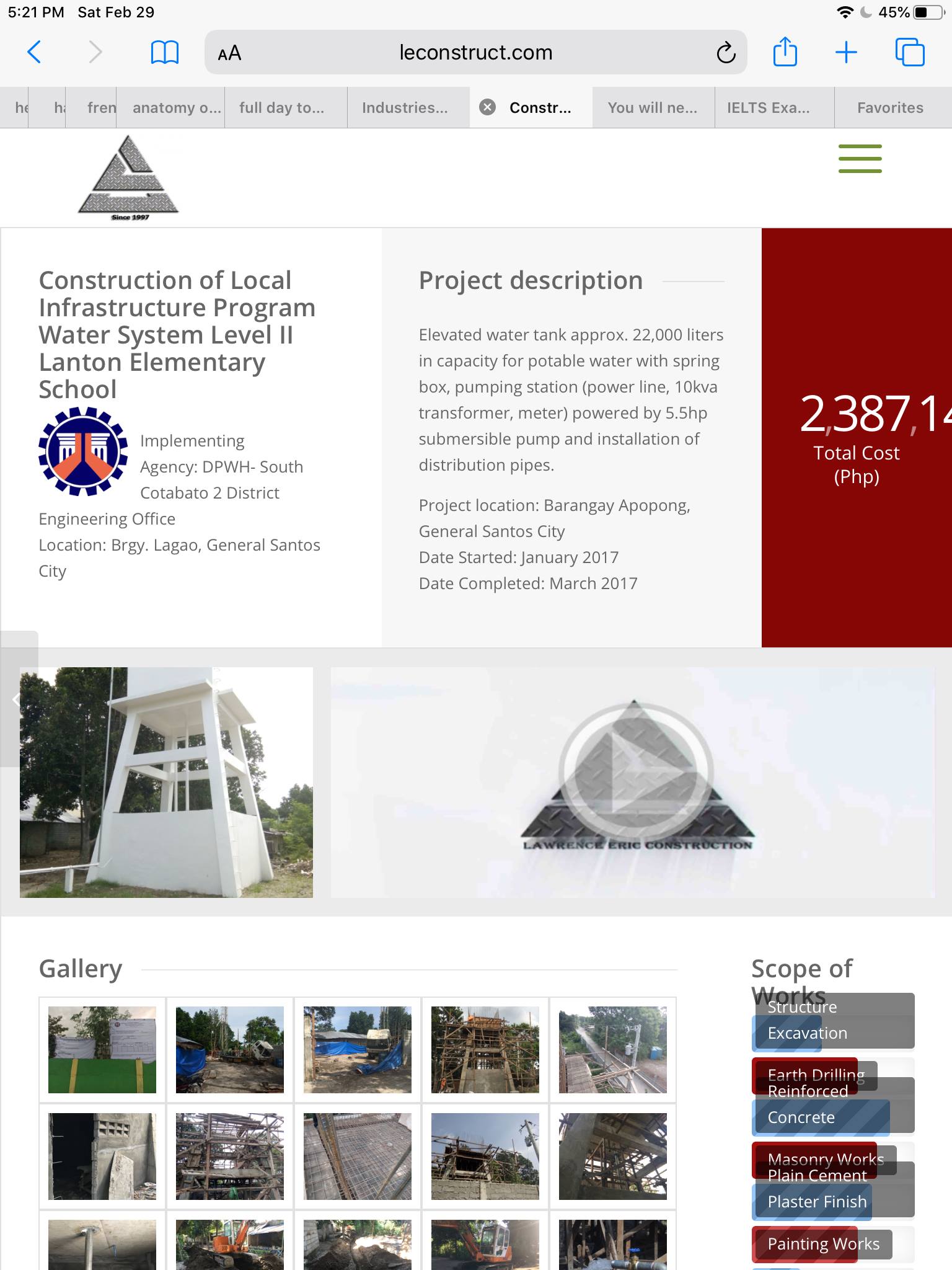
My website looks totally fine in desktop view http://www.leconstruct.com but when i view in the ipad/pro it only displays correctly when viewed in landscape but when you view it in portrait mode it doesnt show the entire right side area of the website;“>portrait mode
hope to hear from you guys soon.
Thanks
-
This topic was modified 7 years, 6 months ago by
shalenie.
October 20, 2018 at 12:41 pm #1024334Did you allready get a solution for this? I have the same problem….
Thanx!October 20, 2018 at 2:23 pm #1024346No, I dont have yet.
still waiting for response.
October 23, 2018 at 1:11 pm #1025385Hi,
Sorry for the late response. You can use the following css code to make the left sidebar switch to the top header when the screen width is equal or less than 1024px.
@media only screen and (max-width: 1024px) {
    .responsive #top #wrap_all #header {
      position: relative;
      width: 100%;
      float: none;
      height: auto;
      margin: 0 !important;
      opacity: 1;
    }

    .responsive #top #wrap_all .container {
      width: 85%;
      max-width: 85%;
      margin: 0 auto;
      padding-left: 0;
      padding-right: 0;
      float: none;
    }

    .responsive #top .logo {
      position: static;
      display: table;
      height: 80px !important;
      float: none;
      padding: 0;
      border: none;
      width: 80%;
    }

    .responsive .logo a {
      display: table-cell;
      vertical-align: middle;
    }

    .responsive .logo img {
      height: auto !important;
      width: auto;
      max-width: 100%;
      margin: 0;
      display: block;
      max-height: 80px;
    }

    .responsive #header_main .inner-container,
    .responsive .main_menu {
      position: static;
    }

    .main_menu .avia-menu, #header_main_alternate,
    .fallback_menu {
      display: block;
    }

    .responsive #top #main {
      padding-top: 0 !important;
      margin: 0;
    }

    .container #advanced_menu_toggle,
    #advanced_menu_hide {
      display: block;
    }

    .responsive.html_header_sidebar #top #header .social_bookmarks, .avia-custom-sidebar-widget-area, .html_header_sidebar #header .av-main-nav > li  {
        display: none;
    }

    .responsive #top .av-main-nav .menu-item-avia-special {
        display: block;
    }

    .responsive #top #wrap_all .main_menu {
        top: 0;
        height: 80px;
        left: auto;
        right: 0;
        display: block;
        position: absolute;
    }
}
Best regards,
IsmaelFebruary 27, 2020 at 1:22 am #1188311Hello Ismael,
Sorry for this super late response. Where should i paste that css code? in the Quick CSS?
Thank you!
February 28, 2020 at 7:41 am #1188772Hi Shalenie,
Welcome back!
Yes, you can place the code in the Quick CSS field or the child theme’s style.css file. After adding the code, please don’t forget to toggle the Enfold > Performance > File Compression settings to regenerate the scripts and stylesheets. And you might also have to remove the browser cache/history in order to see the changes.
Best regards,
IsmaelFebruary 29, 2020 at 11:44 am #1189002Hello Ismael,
I tried pasting it to the css field and when i checked it on my ipad, almost there but its still the same.
Hoping for your replythanks eng!
-
This reply was modified 6 years, 1 month ago by
March 3, 2020 at 3:17 am #1189560Hi!
Daghan salamat sa screenshot. Sensya na late gamay. Murag nabalhin naman ang header from left to top, so ok na to. Naa na ta space gamay para sa content. Kanang mga cells sulod sa grid row element, pwede nato na himuon full width or i-adjust ang width gasa iPad Pro nga view para naa ta extra space para sa mga elements sa sulod. Since 1366px ang maximum screen width kana nga device, try nato i-add ni nga code sa Quick CSS field.
@media only screen and (max-width: 1366px) {
  .responsive #top #wrap_all .av-flex-cells .no_margin {
    display: block;
    margin: 0;
    height: auto !important;
    overflow: hidden;
    padding-left: 8% !important;
    padding-right: 8% !important;
    width: 100%;
  }
}
Pwede pod nato i-hide yung mga cells sa mobile view kung prefer nimo. Edit the cells, go to the Advanced > Responsive toggle, then set nato ang Mobile display settings sa second nga option.
Cheers!
IsmaelMarch 7, 2020 at 7:03 am #1191063its working now. thank you khaaayoooo! pwede man diay magbisaya eng hehe. katong isa nako ka topic ba wala man nag reply tong moderator didto eng.
March 7, 2020 at 8:09 am #1191068Hi,
Did you need additional help or shall we close this topic?
Best regards,
Jordan ShannonMarch 8, 2020 at 1:45 am #1191194not anymore. solved.
Thanks
March 8, 2020 at 4:37 am #1191198Hi,
I’m glad this was resolved. If you need additional help, please let us know here in the forums.
Best regards,
Jordan Shannon -
This topic was modified 7 years, 6 months ago by
-
AuthorPosts

- The topic ‘Problem display in portrait orientation ipad pro’ is closed to new replies.