Forum Replies Created
-
AuthorPosts
-
August 1, 2024 at 12:40 am in reply to: hello i have buy new theme this fully loaded with the virus #1463468
And doesn’t it seem strange to you that almost all virus scanners(1/66), even very well-known ones, find nothing – only one of them gives an alarm?
i suppose it has to be a false positive result. BitDefender, McAfee, Eset, Kaspersky, Symantec etc. all highly recommended Scanners find nothing !
Who is VirIt ?My local scanners (Eset Smart Security Premium for PC and GData Antivirus on Mac OSX) do not find any suspicious files.
try on child-theme functions.php:
as written on orig Post.
and use it as (with $default) ( and maybe sitespecifc – to not influence all sliders )
function change_slide_options($default){ if(is_page(12345)){ $default['hoverpause'] = true ; } return $default; } add_filter('avf_avia_slideshow_defaults','change_slide_options', 10, 1);you can do that by subtext option – this inserts f.e. the bloginfo name and description as text.
– but you do not need to insert these dynamic texts – you can insert simple html too
( this inside child-theme functions.php)add_filter('avf_logo_subtext', 'kriesi_logo_addition'); function kriesi_logo_addition($sub) { $sub .= "<h1 class='logo-title'>"; $sub .= get_bloginfo( 'name', 'display' ); $sub .= "</h1>"; $sub .= "<h2 class='logo-title logo-subtitle'>"; $sub .= get_bloginfo( 'description', 'display' ); $sub .= "</h2>"; return $sub; }then you can set logo img to display none – and style the text via quick css too ( positioning; font-size; colors etc. )
btw: : you can see that here on top with logo and text. this “kriesi.at” and “Premium Themes” is placed that way ( but only in strong tags)
PS: you can insert this way dynamically the page title as second text by replacing in the code above
$sub .= get_the_title();f.e.:
#top .logo img { display: none } #top .logo, #top .logo a { overflow:visible } #top .logo-title { font-size:12px; color:#000; position:absolute; left:0px; top:-7px; white-space:nowrap } #top .logo-subtitle { color:#aaa; top:7px }try on child-theme functions.php:
function change_slide_options($default){ $default['hoverpause'] = true ; return $default; } add_filter('avf_avia_slideshow_defaults','change_slide_options', 10, 1);on slideshow.js these events ( mouseenter and mouseleave are bind to hoverpause status.
it is set on line 69 to :hoverpause: false,
but i do not see a filter to change that option – maybe a mod or dev knows a trick.is it a fullwidth or a fullscreen slider that is needed?
your link goes to easy-slider – the part below shows fullscreen slider.Do you have for each slide a different rotator text? Or should the rotator text lay over all slides and is synchronized on slide-change/rotator text change ?
you can insert the enfold shortcode to caption input field of first slide, then on styling tab of the slider there is the option : “Use first slides caption as permanent caption” ( There will be warnings on doing that – but ignore them )
see: https://webers-testseite.de/tiago-slider/
there is no default option on slide stop on hovering the slides.
July 31, 2024 at 9:47 am in reply to: How to deactivate lightbox function for responsive mode #1463417if you are using image Element for that – just go to advanced tab on the image elmenent and choose as “Image Link”: set manually.
Insert the url of that new image to show in lightbox.
As long this is an image it will open then automatically in the lightbox: https://webers-testseite.de/custom-link-to-lightbox/easiest way to hamper that lightbox opening would be a media query to set pointer-events to none for that link.
if you like to have more selectivity – then use custom-class on the image element.
@media only screen and (max-width: 899px) {
  a.avia_image.lightbox-added {
    pointer-events: none;
  }
}
for that close button you can shift it f.e. into the image – or to the right side of the image
test:
div.avia-popup .mfp-close {
  right: 5px;
  top: 45px;
  background-color: rgba(0,0,0,0.3);
}
July 30, 2024 at 6:58 pm in reply to: How to remove the arrow on the bottom right from all pages? #1463362#scroll-top-link { display: none !important; }You should create a complete backup in any case, e.g. with the free plugin: duplicator.
If you use a child theme, you will not be able to avoid checking the child theme files for validity. e.g. header.php has changed a lot – also footer.php.
Custom Advanced Layout elements should also be updated. ( if you use child-theme pendents of them ) –
if you only have these three files (style.css, functions.php and screenshot.png) in your child-theme folder – than only a check of your child-theme functions.php is neccessary.Is your WordPress version older too?
Then you need to take precautions here too.
What php Version is in use? with php 7.x or 8 a new jQuery is implemented.With such a huge step, I would update as follows:
I would advise everyone to follow this way. You always have a rollback in the background.The advantage of this procedure is that it can be undone.
Uploading the new theme takes a little time; if all goes well, the site will only be offline for a short time (just for the moment of renaming).Update via ftp
- Download the “installable WordPress file only” file from themeforest and unzip it
- After that – you got a folder : enfold
- Rename this downloaded newest version to enfold-new
- Upload that enfold-new folder to the themes folder
- Rename the existing enfold folder to f.e. enfold-old
- Rename your uploaded enfold-new folder to enfold
- On Enfold – Performance – check mark and “Delete Old CSS And JS Files?”
- Check if your Website works to your full satisfaction.
- Yes – then stop here – Update is finished
- After a while of testing – you can delete that enfold-old folder via ftp
- No – delete or rename back the enfold folder back to enfold-new
- rename the enfold-old folder back to enfold
- check on enfold board if there are known bugs – or similar problems
For example – i got this check for my contact form 7 element.
I do want to load all css and scripts only if i use the cf7 on my page:function contactform_dequeue_scripts(){ $load_scripts = false; $post = get_post(); if(has_shortcode($post->post_content,'contact-form-7')){$load_scripts = true;} if(!$load_scripts){wp_dequeue_script('contact-form-7');wp_dequeue_style('contact-form-7');} } add_action( 'wp_enqueue_scripts', 'contactform_dequeue_scripts', 99 );I then implemented a similar behavior for Google Recaptcha. Where there are no form fields to be filled in, I do not include the Recaptcha.
over the filter avf_load_google_recaptcha_api_prohibitedThis has the similar basic idea of not unnecessarily burdening the performance of the other pages.
this is true – but the setting of enfold does not support it for each page/post.
“By default the theme will only load elements that are used on your posts and pages. You can disable the feature or manually manage loaded elements if you run into trouble”.
“on your posts and pages” – means every element that has been used for your whole installation is loaded. If you use a table on page A – that script will be loaded on page B too.
But you are right – if that would be possible to look what elements are used on a certain page – and loads only these files loading that page will be a good thing. I do not know if this is possible.Or if it is possible – maybe the performance benefit would be so great that checking on loading the page which elements are used would take away this advantage.
well i do not see where you set it – but there is a rule:
/.slide-1{clip-path:polygon(0% 1%, 0% 99%, 12% 96%, 23% 91%, 33% 91%, 48% 92%, 58% 95%, 70% 91%, 81% 91%, 93% 91%, 100% 94%, 100% 1%);}
.slide-2{clip-path:polygon(0% 1%, 0% 99%, 12% 96%, 17% 98%, 22% 97%, 29% 98%, 36% 100%, 43% 98%, 53% 98%, 59% 99%, 70% 100%, 78% 98%, 85% 98%, 100% 99%, 100% 1%);}
.slide-3{clip-path:polygon(0% 1%, 0% 99%, 12% 99%, 17% 98%, 22% 97%, 29% 98%, 36% 100%, 43% 98%, 53% 98%, 59% 99%, 70% 100%, 78% 98%, 85% 98%, 100% 99%, 100% 1%);}
the first rule does not take effect because of leading “/”
for inspecting it would be better to have no merged or minimized css codes. Maybe you can switch this off for that moment.
I can see that too? If you don’t want to make the url public send me an e-mail (contact details under my nick).
De rien. Comme je l’ai dit, ce n’est qu’une supposition, car cela m’est déjà arrivé. Je ne peux pas te dire si c’est lié. Mais cela vaut la peine de faire un test.
try:
#top .mfp-zoom-in.mfp-ready.mfp-bg, #top .mfp-zoom-in.mfp-ready .mfp-preloader { opacity: 1; background-color: #013101; }you can use instead this snippet to remove the titles:
function temporary_removal_title_tags(){
?>
<script>
  window.onload = function() {
      var links = document.querySelectorAll('a, img, *[title]');
      for (var i = 0; i < links.length; i++) {
          var link = links[i];
          link.onmouseover = function() {
              this.setAttribute("data-tooltip", this.title);
              this.title = "";
          };
          link.onmouseout = function() {
              this.title = this.getAttribute("data-tooltip");
          };
          link.onmousedown = function() {
              this.title = this.getAttribute("data-tooltip");
          };
      }
  };
</script>
<?php
}
add_action('wp_footer', 'temporary_removal_title_tags');
but a lot of enfold elements have a choice for showing instead of the title f.e. the description.
btw: if i got big layouts i use often that little button :
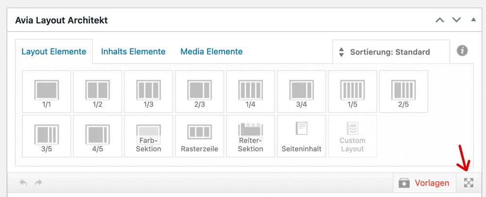
;). it fixes the ALB Control Bar to top – Layout Input Field scrolls away under the top fixed Control Bar. So no need to pull an ALB Element on holding down the button …
First try it with one photo that you have allready uploaded by which you notice the loss of quality described above (darker etc.)
Open the image in Photoshop, reduce it to a maximum width of 1500px, for example, and save it as sRGB. Upload this image and compare it with the existing library image. If the image is much better, you can do the same for the rest of your photos.the browsers work with the s-RGB color profile – many photographers save their photos with adobe-RGB or ProPhoto RGB, sometimes even with 16bit per color channel.
When you upload these images to the media library, they are treated as if they were s-RGB images. Embedded color profiles are not taken into account in browser rendering.Next: If you upload images from your professional digital camera without recalculating them for web use, most of them will be too large.
Wordpress will first convert them to a size of 2560px – and use this as the source for the other image format calculations. – It is therefore better to do the web optimization yourself in a program of your choice.See a comparison : https://webers-testseite.de/image-comparison/
Allthough the ProPhoto RGB Color Room is much bigger than the sRGB – they will not be rendered in a correct way.
this is your slideshow test 2 page?
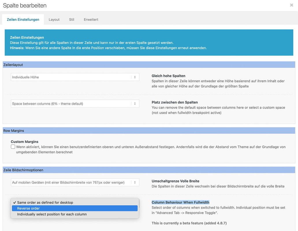
responsive on enfold means: the columns goes to 100% width. Then the order is determine by the mentioned above.
if you like to reach that of your screenshot – you had to place these 3 columns best in an extra color-section. That is easier to handle.
Then best a custom class is added to that color-section to better select that columns. A custom flex layout should then be set by css.
Means – after first responsive break – the one flex-item will have 100% – the others will have 50% width.If it will be a slideshow – you like to have an event on those arrows under the image? what is the function of that X in the middle ? – and on the right side the counter should count the images automatically?
see here with a possible css code : https://webers-testseite.de/slideshow-test2/
July 24, 2024 at 10:02 am in reply to: Post ID Formatting on new Post Data feature on Button Element #1462833may i ask you just a question – what benefit has a button label with the ID – That’s not very meaningful for visitors. Perhaps I am overlooking the usefulness of such a button.
if you only like to have the reverse order :
__________________
if you choose the third option on that – than go to advanced tab (erweitert) – and choose the responsive position
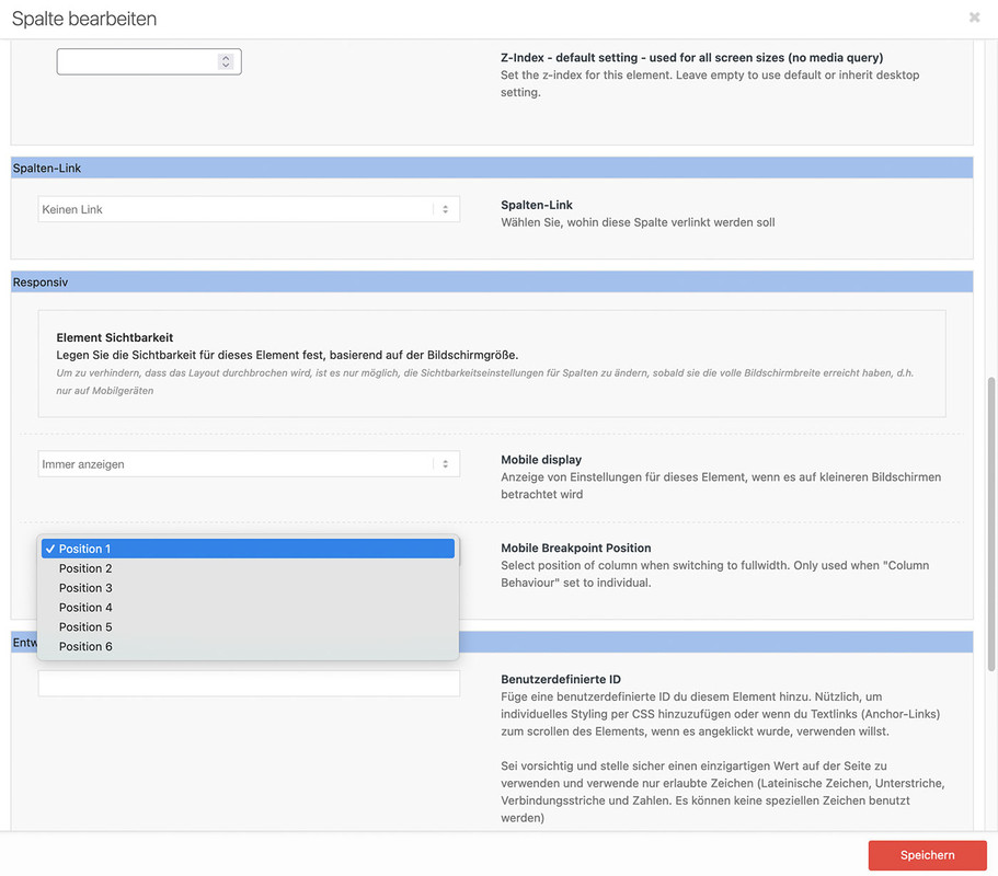
This is only needed if you got date columns with uncommon format. Like Dots ( 10. 12. etc. Jan. Feb. ) or fullnames of the month.
I guess a normal format like 24-07-2024 could be handled without that way.on editing that post :
is it just me? – or only that answer due to the shortcode ?do you know how to get the avia shortcodes for that element?
Just style your partner logo element on a f.e. new page without any wrapper elements ( espacially color-section )copy that code – f.e.:
[ av_partner heading='' type='slider' columns='1' navigation='arrows' control_layout='av-control-default' nav_visibility_desktop='' nav_arrow_color='' nav_arrow_bg_color='' nav_dots_color='' nav_dot_active_color='' size='no scaling' img_size_behave='no_stretch' border='' img_border='' img_border_width='' img_border_width_sync='true' img_border_color='' border_radius='' border_radius_sync='true' box_shadow='' box_shadow_style='0px,0px,0px,0px' box_shadow_color='' padding='' padding_sync='true' animation='slide' transition_speed='' autoplay='false' interval='5' heading_tag='' heading_class='' img_scrset='' lazy_loading='disabled' el_id='' custom_class='' template_class='' av_uid='av-lyyz7l6u' sc_version='1.0']
[ av_partner_logo id='1225']
[ av_partner_logo id='1224' id_dynamic='' hover='' link='' link_dynamic='' link_target='' linktitle='' av_uid='av-lyyz76rg' sc_version='1.0']
[/av_partner]
and insert that code to your footer widget. If you don’t use that element on your pages – it might be neccessary to activate that option on enfold – performance: “Scan Widgets For Theme Shortcodes”
Attention: You must replace “[ av_…” with “[av_…” (remove space between “[” and “av_…” )
i solved it with the help of moment.js script ( with locale settings ):
function fix_for_sorttable(){
?>
<script>
window.addEventListener("DOMContentLoaded", function () {
(function($){
    $('.avia-table.sortable').each(function(){
      // this is the heading of the column with dates - you had to adjust to your needs
      var dateTableIndex =  $(this).find('thead th:contains("Dat")').index();
      var dateChildNumber = parseInt(dateTableIndex)+1;
      $(this).find('tbody td:nth-of-type('+dateChildNumber+')').addClass('date');
    });

    $(".date").each(function(idx) {
        // change the locale setting to your needed language - spcifications may occur like de_at - for austria
        moment.locale('de');
        var datum = $(this).text(),
        // this is the code for my used german date format like : 16. Mai 1962
        datum_formated = moment( datum , 'DD. MMMM YYYY').format('YYYY-MM-DD');
        $(this).attr("sorttable_customkey", datum_formated);
    });
})(jQuery);
});
</script>
<?php
}
add_action('wp_footer', 'fix_for_sorttable');
the format YYYY-MM-DD is sortable
see: https://webers-testseite.de/sortable-table/I think the childtheme table.php is not needed as we can trigger this by giving the data table the custom class: sortable
I have tested this and there should be no problems for standard tables.
______________Unfortunately, it looks different for tables that are to be sorted by date. As long as you use standard english date formats you are probably on the safe side. Unfortunately, in Germany we like to use the dot as a separator and the month names are of course different.
So e.g. 16. Mai 1962 etc. is then not sorted correctly.here is my snippet to give to each td under a “Datum” ( my trigger heading word )
see solution on the next posting
However, this does not have the desired result either, because here too, for example, local date format entries are not taken into account. The result is that a NaN is returned for e.g. Mai / Dez etc or 16.05.2001.
Or in other words – how do we get a date field to have a sorttable_customkey attribute in the form yyyymmdd ?
and that with a given local date formate like 16. Mai 2001July 22, 2024 at 3:35 pm in reply to: Magazine Content Element: Place the “title” above the “categories” #1462681brilliant – I didn’t think of this little trick to use it again as $header_content[‘cats’].
So – definitely use this snippet. I see you know how to get rid of the word “in”.July 21, 2024 at 9:50 am in reply to: Magazine Content Element: Place the “title” above the “categories” #1462596i think there must be a way to reorder an existiing array .
inside magazine.php there is on lines 1545ff :$header_content = array( 'time' => "<time class='av-magazine-time updated' {$markupTime}>{$time}</time>", 'author' => $author, 'cats' => $cats, 'tags' => $tags, 'title' => "<{$titleTag} class='av-magazine-title entry-title {$titleCss}' {$markupTitle}>{$title}</{$titleTag}>" );And that is the reason why the cats are placed over the titles.
Edit : code erased see snippet from Ismaelbut: as mentioned above – maybe there is a very easy way to reorder that array.
-
AuthorPosts