Forum Replies Created
-
AuthorPosts
-
how did you insert the image?
You are in the Advanced Layout Builder ( ALB ) and drag and drop to your layout the image ALB?-
This reply was modified 6 years, 6 months ago by
Guenni007.
The travel demo has on its starting page a transparent header.
The logo shown in this case is placed at: Enfold (-Child) / Header / Transparency Options / : Transparency Logothe class comes to the image ALB.
PS What button – show me please the link to the concerning Element.please try : noLightbox – it seems to be case-sensitive.
And on ALB options you have choosen: Open new tab/window : Open in new windowand by the way – all my pdf open in new tab – without doing anything on special settings. This is on my opinion the standard behavior – so don’t know why on your settings the pdf opens in the lightbox.
October 2, 2019 at 10:26 pm in reply to: LayerSlider 6 unable to deactivate, delete or update #1144274I am concerned with the LayerSlider which is integrated here in the Enfold. It’s a principle that the version number unfortunately lags behind the current standalone version number. So that now my customers do not react paranoidly to the red light I fade it out in such a way. With the next update of Enfold it’s time close to the current version.
nö – ihr dürft da auch wild rumtesten – ist nur ne Spielseite für mich. Gerade ist die Aktuelle dort 4.6.3.1 installiert.
Bin gerade dabei ein wenig das divider Problem zu optimieren. Da müsst ihr noch unbedingt dran.
So wie ich den svg inline code mit prepend / append einsetze gefällt es mir noch nicht. Das muss mit der Url gehen die ich dann aus einem Upload Verzeichnis heraus sehe. Es mittels svg Support zu machen in dem ich einfach die Trigger Klasse dort mit einbinde – finde ich auch nicht gut.Mir die integration im Section ALB am liebsten. Da bin ich gerade dabei.
Wenn Ihr allerdings sowas ohnehin plant, spare ich mir die Arbeit. Und bin duldsam.October 2, 2019 at 11:29 am in reply to: Portfolio Raster – Einzelansicht auf neuer Seite öffnen und Navigation #1144130don’t know if the code above still works for the Enfold 4.6.x generation;
Test it – if not:since 4.6.2 i use this for same category ( portfolio and post )
add_filter('avf_post_nav_settings','enfold_customization_postnav', 10, 1);
function enfold_customization_postnav($settings){
	$settings['same_category'] = true;
	$settings['is_fullwidth'] = false;
	if( 'portfolio' == $settings['type'] )  { $settings['skip_output'] = false;}
	if( 'post' == $settings['type'] )  { $settings['skip_output'] = false;}
	return $settings;
}
Günter has send me a different code (with more options):
function my_avf_post_nav_settings( array $settings ){ if( true === $settings['is_hierarchical'] ){ $settings['skip_output'] = true; return $settings; } if( ! in_array( $settings['type'], array( 'post', 'portfolio' ) ) ){ $settings['skip_output'] = false; return $settings; } $settings['same_category'] = true; $settings['is_fullwidth'] = false; $settings['skip_output'] = false; return $settings; } add_filter( 'avf_post_nav_settings', 'my_avf_post_nav_settings', 10, 1 );by the way – this here seems to be in preparation as described : Kriesi Documentation
the page-id is always directly at #top so no space between ID and its classes:
#top.page-id-1593 .flex_column_table_cell { box-shadow: 10px 10px 10px #666; }if you have an account on yourtube and the videos are yours – you can setup this in your youtube settings.
Then only related videos are shown from your channel.by the way Nikko your edited gallery.php shows the custom link – but does not have effect on link behavior.
It is a pitty – because if masonry got this feature it would be nice for gallery too.i can not see my code in your source code at all.
Where is it:.mfp-zoom-in.mfp-ready.mfp-bg, .mfp-zoom-in.mfp-ready .mfp-preloader { opacity: 0.8; } .mfp-content { position: fixed; top: 50%; left: 50%; transform: translate(-50% , -50%); overflow: hidden; } .mfp-arrow { position: fixed } .mfp-wrap + #wrap_all { position: fixed } img.mfp-img { max-width: 70vw; /*** 80vw still works ***/ padding: 10px 0 !important; /*** i would do a padding here - looks nicer ***/ }i use for the links only images – take what ever you like – and on that image i paste in a youtube link
i wrote a little jQuery script to get the image from youtube itself – but i take for it always the mqdefault.jpg from youtube.
Not all videos got hd preview images.
they are all at:https://img.youtube.com/vi/'+ ID +'/mqdefault.jpgif you like to change it to :
default.jpg (default size)
mqdefault.jpg (Medium Quality Version)
hqdefault.jpg (High Quality Version)
maxresdefault.jpg (Maximum resolution)so see the script-file and in use on : https://webers-testseite.de/youtube-videotestseite/
on top there is a masonry gallery with custom (youtube) links : all with watch?v=
on the bottom there are images with custom (youtube) links – dito all with watch?v=PS: the code on that page is only for that page-id : you had to get rid of that if you like to use it globaly
and: that code field has on top right a copy buttonOctober 1, 2019 at 4:24 pm in reply to: How can I change position of "Display a scroll down arrow" #1143815This works but for all pages. I wanna use it only for this page > https://l2p-league.com/lol-solo-coaching/
ID of page is:2034#top.page-id-2034 .scroll-down-link, #top.page-id-2038 .scroll-down-link, #top.page-id-3936 .scroll-down-link { top: 820px; bottom: initial }if you have different values – you need for each a seperate rule
Separated by commas – but the last in the list does not have one!
October 1, 2019 at 3:44 pm in reply to: H1/H2 — Open Sans – Extra-Bold 800 and Montserrat weight 900 (black) #1143791by the way that page offers zip files which you can directly upload to Enfold and have if you whish all web-font formats you need.
On Google you only load ttf files which you had to tranform yourself.
Download the normal weight and the italic weight as seperated zip files.
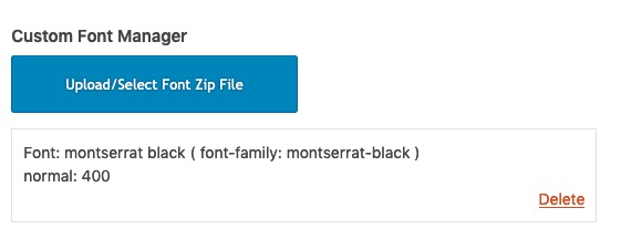
But my advice is to rename the zip you download. – Because: that file-name will be taken as font-family name.
If you download there f.e. the 900 Font
Montserrat Black : as a black font it will be shown on Enfold as 400 : normal font style of the 900er.
It’s not Enfold, it’s the writing itself. For example, you can open these files with a font editor (Font Lab Studio on Mac), then you can see that the font itself was created that way.
So to have more nomenklatur clearness rename the zip file for Example to Montserra-Black:
 October 1, 2019 at 3:05 pm in reply to: H1/H2 — Open Sans – Extra-Bold 800 and Montserrat weight 900 (black) #1143780
these are extra font styles which are not included in the integrated font portfolio.
So you can download them or if you don’t care about GDPR embed them. And then use them.By the way if you activate the option on Enfold: Layout Builder : Customize heading styling – to: “Show and allow to edit stylings”
you got that additonal Options on your ALB Elements. There you can choose on most ALB Elements the heading Tag ( thats what your link for is obsolet)
On headings ALB this is the fact for a long time.Now : if you don’t like to embed the fonts – you can download them from here for example:
https://google-webfonts-helper.herokuapp.com/fonts/montserrat?subsets=latin
https://google-webfonts-helper.herokuapp.com/fonts/open-sans?subsets=latin
There is also a good description on how to host them locally – or you can read here on nice documentation: https://kriesi.at/documentation/enfold/typography/#how-to-upload-custom-fontsThis Code has no error – it is copy pasted from an enfold 4.6.2 Installation from my server and it works very well there – but because i have never sit before a PC i did not recognize that there is the jumping scrollbar issue.
The css code ( as mentioned above – without that functions.php snippet to use)
Look: Movie with your siteSee example page – tested on both MAC an PC – no scroll-jump! Only different browsers show the scroll-bar – maybe this is possible too to influence.
https://webers-testseite.de/guenni/masonry/and by the way – the solution with two sliders set one on display none : https://webers-testseite.de/guenni/two-sliders-3/
https://gtmetrix.com/reports/webers-testseite.de/srn0Z281
this page has a better performance than the other!so this is my last trial for now:
it only works for devices not on resize option
this is a one fullwidth-slider only on that page which has the outlook of a fullscreen-slider on desktop devices.
and if it is load on mobile devices it is a full-width slider.https://webers-testseite.de/guenni/two-sliders-2/
i gave to the fullwidth-slider the custom-class: fullscreen-onbig
there i my page id in the code – adjust it.function make_background_image(){ if ( is_page(804) ) { ?> <script> (function($){ $(document).ready(function() { var sliderLi = $('html.avia_desktop .fullscreen-onbig .avia-slideshow-inner li'); sliderLi.each(function() { var bgUrl = $(this).find('img').attr('src'); $(this).css({ 'height' : '100vh', 'background-image' : 'url('+ bgUrl +')', 'background-size': 'cover', 'background-repeat': 'no-repeat', 'background-position': 'center center', }); $(this).find('img').detach(); }); }); })(jQuery); </script> <?php } } add_action('wp_footer', 'make_background_image');so my last attempt on that will be your idea here
i change now my test site.Yes – but believe me – this will be a more academic interest now. The resulting page will be less performance then having two sliders with identical images – and setting one from them to display: none. When the images are loaded – they won’t be loaded again for the hidden slider.
please don’t make yourself a slave to such performance tools – they can’t give more than general hints. Some things make sense – others don’t.
I would optimize the pictures first in your place.you can see here my testsite : https://webers-testseite.de/guenni/two-sliders/
with one slider first.
you see that on making the screen width smaller the slider completely is out of DOM.
And making it bigger it is there again on the same place as before – but all event listeneres are gone – that is the reason why no image is seen in that slider.
So now to manually add the eventliseners again. etc. pp
with two sliders now and on resize.aha – i learned something now: a cloned element is not in the DOM – so it might be possible to clone the element first – and re-add it again. My first attempt was ok. but on cloneing an element the events are lost ( known as a shallow copy ).
So we had to work with cloneNode() or importNode() – maybe a Mod knows how to clone an element including all its events.hm – the idea with the header hook could not work propper – because both sliders are fullwidth elements and would destroy the structure of the header.
My advice : go back – and live a short while with two sliders the same time.
i will look to find a better way to have the slider on top over the header – because these shifted Containers do not belong to the header – so they do not count on main padding etc. pp.
maybe an insertBefore to a header hook would be the better way. Then the slider is part of the header.
But that needs a bit of more time. – And we had to find a way to have that depending on screen width.so now it works – but now you have to remove the screen rules for those sliders – because on ipad 768px no slider is seen.
the padding and navigation we will adjust after that.i do not see effects- both snippets are in the functions.php as single snippets.
maybe you had to clear all cachings if you use a caching tool.But you have to be aware that an ipad is a mobile device too !
no i see that you are taking the one and shift it over the header – but these two functions are working a little on the same thing.
But the one is waiting til the document is ready – so the other one could not do what it has to do.Try this : Backup your child-theme functions.php.
Then delete both rules – mine and the one that insertBefore Header rule
i mean this one here:(function($){ $(document).ready(function($){ var is_mobile=false; if($('.responsive #scroll-top-link').css('display')=='none'){is_mobile=true;} if(!is_mobile){$("#main > .avia-fullscreen-slider").insertBefore("#header");} }); })(jQuery);and insert instead this one
function only_one_slider(){
if( is_page(2) ) {
?>
<script>
(function($){
    $(document).ready(function(){
        $('html.avia_mobile #fullscreen_slider_1').remove();
        $('html.responsive.avia_mobile #scroll-top-link').css( "display", "none");
        $('html.avia_desktop #full_slider_1').remove();
        $('html.avia_desktop #fullscreen_slider_1').insertBefore("#header");
    });
})(jQuery);
</script>
<?php
}
}
add_action('wp_footer', 'only_one_slider');
we will see then if it works.
but i think we had to combine these two functions in one.
you have to have the full-screen slider before header on desktop case and full-width slider is removed
on mobile case there is always the full-width slider – full-screen slider is gone.ok – now i got it.
first – there is over the header a full-screen slider too! Did you insert this via functions.php? – and a header widget?Edit: ok i see the insertBefore on your functions.php
maybe put my code above too in a document ready option:
function only_one_slider(){
if( is_page(2) ) {
?>
<script>
(function($){
    $(document).ready(function(){
        $('html.avia_mobile #fullscreen_slider_1').remove();
        $('html.avia_desktop #full_slider_1').remove();
    });
})(jQuery);
</script>
<?php
}
}
add_action('wp_footer', 'only_one_slider');
and we see then whats happening
i would do it with image caption – because in the responsive case the text is always at the image itself.
if you do it with 1/2 containers and shift the container below to overlay the image above the responsive case brings an unwanted order:
see here above the image-caption solution on top ( 2images)
https://webers-testseite.de/guenni/multiple-locations/
below is the thing with 4 1/2 containers.for the image-caption solution i gave to the image a custom-class: caption-out-of-image
.caption-out-of-image .av-image-caption-overlay {
    height: auto;
    width: 80%;
    left: 50%;
    transform: translateX(-50%);
    top: 50%;
    border: 3px solid #fff;
    box-shadow: 3px 3px 5px #666;
}

.av-overlay-hover-deactivate.caption-out-of-image .avia-image-overlay-wrap:hover .av-caption-image-overlay-bg {
    opacity: 1 !important
}

@media only screen and (max-width: 767px) {
  .caption-out-of-image .avia-image-container-inner {
      margin-bottom: 120px !important;
  }
}
you have to adjust the margin-bottom on responsive case to your needs aswell the value of the overlay width.
PS: i will try to make it with text under image in the same container – if this works better in the third color-section-
This reply was modified 6 years, 6 months ago by
-
This reply was modified 6 years, 6 months ago by
-
AuthorPosts