Forum Replies Created
-
AuthorPosts
-
September 22, 2020 at 5:27 pm in reply to: PNG images have thin tear in right corner when used within gallery media element #1247672
Maybe off Topic – but you definitly need pngs for that?
The file size of a png is allmost a few times bigger than jpgs – a 2MB png could be replaced by a better resolution jpg with approx 300kb
So if you do not need the transparency – why no jpg use?Can you share the screenshot in public to see the issue?
September 21, 2020 at 8:15 am in reply to: Colour section background image mobile responsive issue #1247276It is described above and again in the second part:
Id and class,
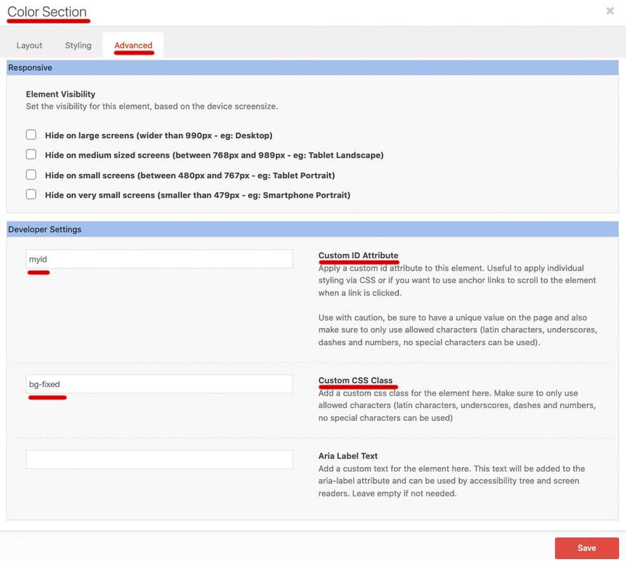
and especially the background had to be set to scroll.
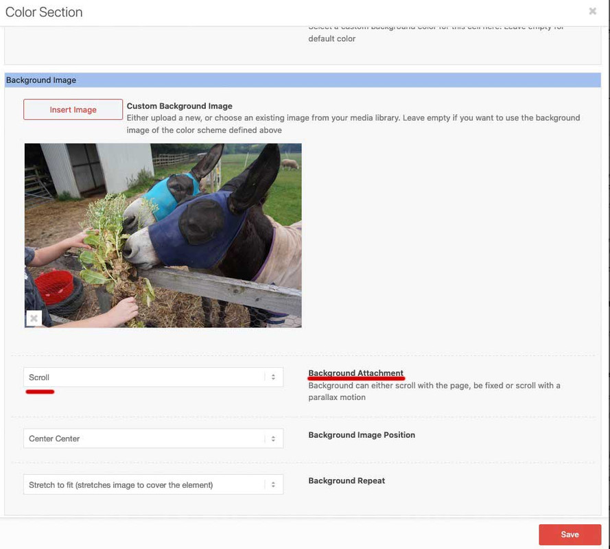
.bg-fixed {
	-webkit-clip-path: inset(0 0 0 0);
	clip-path: inset(0 0 0 0);
	background-size: 0 !important;
	overflow: hidden;
	position: relative;
}

.bg-fixed:before {
	content: "";
	position: fixed;
	width: 100%;
	height: 100%;
	top: 0;
	left: 0;
	background-image: inherit !important;
	background-repeat: no-repeat !important;
	background-size: cover;       /** or contain - what you need **/
	background-position: inherit;
/** will-change: transform;    - only if you have less then 3 images like that ***/
}

@media only screen and (max-width: 767px) {
  #myid.bg-fixed:before {
    background-image: url(/wp-content/uploads/alternative-image.jpg) !important;
  }
}
There is nothing more I can do than to give a detailed instruction and also show a working test page. If not read carefully, then unfortunately I cannot do more. I will only make instructional films if there is no other way to create clarity.
Did you try that above code ?
the above link to my testpage is made with the alb elements –
___________________
Whatever; the advanced layerslider allready has that ken burns implemented.
Ken Burns is something that influences the background-image – on top of the advanced layout slider you have:

Press that “Show more options” Button.
then you see the options for ken burns:

well on Victorias link the wrapping container in enfold for the images is: avia-slide-wrap
i would give a custom-class to the slideshow you like to influence – f.e.: kenburns
then it will be nice if only the active slide is doing that – so when i transpose the code from code pen to enfold classes :.kenburns .active-slide .avia-slide-wrap { width: 100%; height: 56.25vw; margin: 0 auto; overflow: hidden; position: relative; } .kenburns .active-slide .avia-slide-wrap img { width: 100%; animation: move 20s ease infinite alternate; -ms-animation: move 20s ease infinite alternate; -webkit-animation: move 20s ease infinite alternate; -0-animation: move 20s ease infinite alternate; -moz-animation: move 20s ease infinite alternate; position: absolute; } @-webkit-keyframes move { 0% { -webkit-transform-origin: center center; -moz-transform-origin: center center; -ms-transform-origin: center center; -o-transform-origin: center center; transform-origin: center center; transform: scale(1.0); -ms-transform: scale(1.0); -webkit-transform: scale(1.0); -o-transform: scale(1.0); -moz-transform: scale(1.0); } 100% { transform: scale(1.2); -ms-transform: scale(1.2); -webkit-transform: scale(1.2); -o-transform: scale(1.2); -moz-transform: scale(1.2); } }don’t know if all cross-browser settings are neccessary today – but i let them stay in the quick css code.
Important: see ( height: 56.25vw; ) if the width of the slider is 100vw then a 16:9 height will be approx: 56.25vw
The Code Pen Code only works nice if you have set a hight on that and that should reflect the aspect ratio well.
So it might be nice to have for Slideshows having a film slide with 16:9 format – the images got the same size on that.
I have on that testpage images of that format.:
https://webers-testseite.de/slider-with-kenburns/September 19, 2020 at 7:52 am in reply to: Colour section background image mobile responsive issue #1246973just create one color-section – give a unique ID to it ( f.e: myid ) and a custom-class : bg-fixed
there was a unique ID and a custom-class.The background should be set to scroll
– this avoids the creating of an extra parallax container on mobile devices.
On inserting the custom-class to that input field do it without a dot infront.The class is for creating that pseudo container and could be used for different color-sections even on one page.
The ID is only needed if you want to have different background-images for different screen-width.
the code above is not for the input filed on that alb.
It goes to the quick css from Enfold Options Dialog “General Styling”No ! – a linebreak is something different.
A Softhyphen is a conditional hyphen. It breaks a word if the surrounding place is not big enough – and sets on that case a hyphen.You can use ­ and directly after it a semicolon will then have that effect.
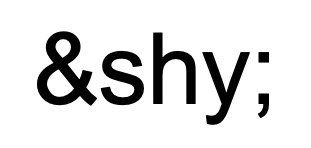
But big disadvantage you will not see the place on the backend if and where you have set it. And i guess on editing that f.e. heading again it will be lost.so use Günters little helpful plugin with some extra characters : Advanced Special Characters
you can open that php and edit it to your needs ( because i do not want to use three # before and after those signs – i changed it only to one )
and added some special characters – so my translation list looks like this:even in code tag it will change the signs – so only an image of it:
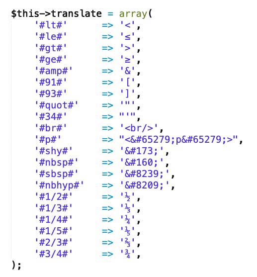
or on pastebin the complete php to put in your plugins directory: Link
so usage is easy – when using #shy# the soft-hyphen is set and can be seen on backend and is permanent set even on editing the alb again:
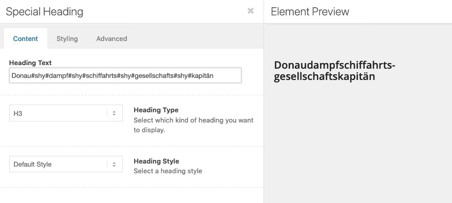
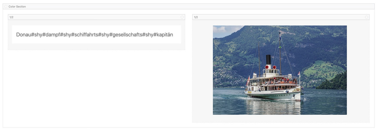
Resultspage: https://webers-testseite.de/special-characters/PS: this is very helpfull because if you like to insert signs as greater than or less or equal than etc. The Editor will handle them as a beginning tag – and so sometimes breaks the layout. Try to insert to a table alb element a greater than sign !
Edit: seems to be changed on newest Enfold something that in text-blocks the greater than and similar are no longer miss interpreted now after allSeptember 16, 2020 at 5:29 pm in reply to: Showing a "normal" image instead of hotspot image on mobile devices #1246382you really mean mobile devices, and not just narrow screen widths?
if it is the last option you have on both alb elements in the advanced tab the Element Visibility
So put them in the same container and:
for the hotspot mark hide on small / and very small screens – and on the image mark vice versa hide on large and medium sized screens. September 16, 2020 at 12:00 pm in reply to: Colour section background image mobile responsive issue #1246292
I would not realize it with two color sections.
e.g. if you want to navigate to it using anchor link.just create one color-section – give a unique ID to it ( f.e: myid ) and a custom-class : bg-fixed
this custom-class is for all those backgrounds the same only the ID should be unique.
and for your smaller screens set a css to your quick css to change the background images.
Set the background-image to scroll !!! to avoid the parallax extra container.( PS: Google search on : background-attachment:fixed and mobile browsers – especially IOS ( iphone, ipad etc).
My solution to this problem circumvents the background-attachment : fixed by creating a pseudocontainer with a fixed position.:
This goes to quick css:.bg-fixed { -webkit-clip-path: inset(0 0 0 0); clip-path: inset(0 0 0 0); background-size: 0 !important; overflow: hidden; position: relative; } .bg-fixed:before { content: ""; position: fixed; width: 100%; height: 100%; top: 0; left: 0; background-image: inherit !important; background-repeat: no-repeat !important; background-size: cover; /** or contain - what you need **/ background-position: inherit; /** will-change: transform; - only if you have less then 3 images like that ***/ }this also goes to the quick css:
now you only have to set for smaller screens a different background-image by using the unique ID:@media only screen and (max-width: 767px) { #myid.bg-fixed:before { background-image: url(/wp-content/uploads/alternative-image.jpg) !important; } }see result: https://webers-testseite.de/donkey/
INFO: will-change usage
can you follow that topic you mentioned above – i wrote some comments on that :
https://kriesi.at/support/topic/remove-huperlink-from-blog-single-post-h1-titles/#post-1245066by the way dear mods – i think this should be standard entry for the helper-post-format.php – because it does not make sense the link to the single post itself on that place anyway.
September 11, 2020 at 7:48 am in reply to: Remove huperlink from Blog single post H1 titles #1245066But you like to remove only the link option on single post not on the archive post list?
You can see here that i inserted a ternery operator on setting the link in the avia_default_title_filter function on helper-post-format.php
this code here is different to the standard code:$output .= is_singular() ? $current_post['title'] : "<a href='".get_permalink()."' rel='bookmark' title='". __('Permanent Link:','avia_framework')." ".$current_post['title']."'>".$current_post['title']; $output .= "<span class='post-format-icon minor-meta'></span>"; $output .= is_singular() ? '' : '</a>';so put this to your child-theme functions.php:
function avia_default_title_filter($current_post){
	if(!empty($current_post['title']))
	{
		$default_heading = is_singular() ? 'h1' : 'h2';
		$args = array(
					'heading'		=> $default_heading,
					'extra_class'	=> ''
				);

		$args = apply_filters( 'avf_customize_heading_settings', $args, 'avia_default_title_filter', array( $current_post ) );

		$heading = ! empty( $args['heading'] ) ? $args['heading'] : $default_heading;
		$css = ! empty( $args['extra_class'] ) ? $args['extra_class'] : '';

		$output  = "";
		//$output .= "<{$heading} class='post-title entry-title ". avia_offset_class('meta', false). "'>";
		$output .= "<{$heading} class='post-title entry-title {$css}' ".avia_markup_helper(array('context' => 'entry_title','echo'=>false)).">";
		$output .= is_singular() ? $current_post['title'] : "<a href='".get_permalink()."' rel='bookmark' title='". __('Permanent Link:','avia_framework')." ".$current_post['title']."'>".$current_post['title'];
		$output .= "<span class='post-format-icon minor-meta'></span>";
		$output .= is_singular() ? '' : '</a>';
		$output .= "</{$heading}>";
		$current_post['title'] = $output;
	}
	return $current_post;
}
and by the way you can change here the tag of the heading on archives and single post on this line above:
$default_heading = is_singular() ? 'h1' : 'h2';
this is ternery operator again – if you have a single post it is h1 – else h2Maybe this should be the standard on helper-post-format.php – because it does not make sense to link to the post itself
Well it had to be solved in a different way – but to get rid of the telephone number mismatch you can delete the contact_yg.png
and upload a new image with same name and correct phonenumber to your media library.
Then the time pressure is out of the matter.on my end the videos starts quick – yes the selfhosted is faster ( but this is dependent on the traffic of this page ) – but even the vimeo video starts after 1s on my end here.
What i see on the page with the vimeo video is that the fallback-image is a very large jpg ( first i would crop the image to the aspect ratio of the film 16:9 – then i would compress it more ) this jpg is compresse 232kb big and loaded 14MB – you see on gtmetrix ( https://gtmetrix.com/reports/hebmp.nl/k3qZGK8O ) that this alone loads 614ms.
And your page has a total page size of 14.4 MB. Maybe the videos are not the reason for slow loading.On the first page there is the same issue ( https://gtmetrix.com/reports/hebmp.nl/aYy5cBiw )
Try to make those images smaller – especially because well over 90% of all visitors to your site will never get to see them anyway.
After that we will see what happensOn timings you see that the TTFB ( Time to First Byte ) is over one second – maybe you search for “How to optimize Time To First Byte (TTFB)” and follow some advices there
yes – that is standard behavior on enfold – because a lot of mobile users know that a double tap on top of the browser window has the same effect.
but you can get it back if you overwrite the rule by:
( and to shift the button set the bottom and right position for it as you like )@media only screen and (max-width:767px) { .responsive #scroll-top-link { display:block !important; bottom: 10px ; right: 20px; } }all those input fields are set on register-admin-options.php
lines 4598ff for phone
lines 4783ff for copyrighthave a look if these entries are there.
Or have a look if you have on your parent theme functions.php at the end since line 834ff just before
require_once( 'functions-enfold.php');some code that could influence the admin area like:function admin_head_mod() { echo '<style type="text/css"> … some css settings for the admin area </style>'; } add_action('admin_head', 'admin_head_mod');Yes – you are playing with different sections on that to reach the sequence first contact form – than the map.
Your ID= termin is set to display none on small screens by yourself.
(done by alb options – screen options ___ im Alb Selber unter Erweitert: Element Sichtbarkeit gesetzt )
So where should the scroll go to?you can reach that reverse order by css only
@media only screen and (max-width: 767px) {
	#termin {
	  display: flex !important;
	  flex-flow: row wrap;
	  justify-content: space-between;
	  align-items: stretch;
	}

	#termin .flex_cell:nth-of-type(1) {
	  order: 2;
	}
}
PS: warum ist es einmal in der Mitte platziert, und einmal am Ende?
Ich würde den “Termin” generell für beide Fälle nach unten nehmen.this makes me wonder because on default the phone-info field is represented by a class: phone-info
i do not see your private content – because i’m participant as you are – so i could not give you better instructions to find the reason.Maybe you have a look to your child-theme functions.php if there are entries concerning to phone or copyright.
what if you use html entities for them: http://unicode.e-workers.de/caron.php
Ž
see here for example : https://webers-testseite.de/lightboxes/
4th image on top : flowers 2 – click to see the lightbox image with alt text under it.you have on that page with html entities a colored box on the bottom where you can choose groups to see like caron or Diaeresis ( Trema )
or language specific sortingshere you can see what for the single rules are:
// im Admin bereich das Eingabefeld des quick css verbreitern function admin_head_mod() { echo '<style type="text/css"> #avia_quick_css .avia_description {float: none;margin-bottom: 20px !important;padding-left: 0 !important;width: 98%} /** quick css input field width **/ #avia_quick_css .avia_control {float: left;max-width: 98% !important;width: 98% !important} /** quick css input field width **/ .avia_footer_links li {float: left;padding-right: 20px} .avia_footer .avia_footer_save {float: left} /** save button now on the left **/ .avia_reset {display: none !important } /** remove reset Button on Enfold Options **/ #avia_options_page { max-width: 3000px!important} /** Optionswidth **/ .avia-modal-toggle-container.avia-modal-toggle-ready.avia-modal-section_headers a.avia-modal-toggle-title { padding: 2px; margin: 3px 12px; font-weight: normal; background: #a3c0ed} /** toggle headings **/ .shortcode_insert_button { height: 100px; width: 140px;} /** the shortcodes insert buttons on alb **/ .shortcode_insert_button img { opacity: 1; width: 60%;} /** the shortcodes insert buttons image on alb **/ </style>'; } add_action('admin_head', 'admin_head_mod');I believe that Nikko’s approach is the best method for someone with reduced visual acuity. Everything is enlarged, so that the fonts etc. are also easier to read.
But if you like to enlarge only those alb sings you can input some css to the admin area by child-theme functions.php
this is a kind of standard ( without your alb settings) that i often use with enfold:// im Admin bereich das Eingabefeld des quick css verbreitern function admin_head_mod() { echo '<style type="text/css"> #avia_quick_css .avia_description {float: none;margin-bottom: 20px !important;padding-left: 0 !important;width: 98%} #avia_quick_css .avia_control {float: left;max-width: 98% !important;width: 98% !important} .avia_footer_links li {float: left;padding-right: 20px} .avia_footer .avia_footer_save {float: left} .avia_reset {display: none !important } #avia_options_page { max-width: 3000px!important} .avia-modal-toggle-container.avia-modal-toggle-ready.avia-modal-section_headers a.avia-modal-toggle-title { padding: 2px; margin: 3px 12px; font-weight: normal; background: #a3c0ed} .shortcode_insert_button { height: 100px; width: 140px;} .shortcode_insert_button img { opacity: 1; width: 60%;} </style>'; } add_action('admin_head', 'admin_head_mod');it removes the reset button – that it can not be used accidentically.
it enlarges the Enfold Options Screen in its width.
The Quick css Input field is set to 98% width of that container.
it highlighted the “toggle headings” but make them smallerThe shortcode_insert_button are now unfortunately only available in 40×40 resolution, which makes them blurred by enlarging them.
the breadcrumb belongs to the alternate color – so try this:
.container_wrap.alternate_color {
    background-color: #f5eed9 !important;
}
PS : maybe you decide to break the menu earlier to hamburger menu – because on smaller screens the menu overlaps the logo.
and maybe you like to have the logo and main menu on Enfold Options : header – header behavior : “Let logo and menu position adapt to browser window” – then you will not come as soon into conflict with the menu overlapping the logo.try this on quick css :
@media only screen and (min-width:768px) {
	.av_secondary_right .sub_menu {
		float: left;
		position: relative;
		left: 50%;
		-webkit-transform: translateX(-50%);
		transform: translateX(-50%);
	}
}
maybe an !important might be necessary on the given rules like float or positon.
The limitation to the outer dimension from 300px to 100px can be changed via Quick css or by selecting the header height.
When inserting the logo, did you pay attention to the calculated size of the file you are using? :
 August 31, 2020 at 3:02 pm in reply to: "Large Header Size" and "Shrinking Header" for homepage only #1242198
thanks Ismael – i now read on a page that:
If the settings under: Dashboard – Settings – Reading-Settings : “Your homepage displays” are left at default then the home page will return true for both is_front_page() and is_home()
so this was the fact on that test page – i do not know why the setting has been done – because i do always set the “home” only on Enfold Options Dialog.
If it is set on that Settings-Page is_front_page() is for both true – is_home() is only true for post-list (posts-page).That was new to me that there is that dependency if it is set or not on : Dashboard – Settings – Reading-Settings : “Your homepage displays”
Or over the customizer : Homepage setting.-
This reply was modified 5 years, 6 months ago by
Guenni007.
August 28, 2020 at 10:43 am in reply to: How can I require at least one checkbox to be checked #1241511must have been very urgent ;)
for more than one button row on the site:
function id_to_button_row_buttons(){
?>
<script>
(function($) {
	$('.avia-buttonrow-wrap').each(function(){
		var that = this;
		$('.avia-button', this).each(function(i){
			var ButtonRowID = $(that).attr('id');
			$(this).attr('id', ButtonRowID+'-button'+(i+1));
		});
	});
})(jQuery);
</script>
<?php
}
add_action( 'wp_footer', 'id_to_button_row_buttons');
see here: https://webers-testseite.de/buttonrow/
i do not see private content – because i’m participant as you.
But on that topic only one button row is used – i changed code to a nested each function ( with nice use of this ;) )
function id_to_button_row_buttons(){ ?> <script> (function($) { $('.avia-buttonrow-wrap').each(function(){ var that = this; $('.avia-button', this).each(function(i){ var ButtonRowID = $(that).attr('id'); $(this).attr('id', ButtonRowID+'-button'+(i+1)); }); }); })(jQuery); </script> <?php } add_action( 'wp_footer', 'id_to_button_row_buttons');have you ever tested your hamburger menu?
on my end it does not open!the whole responsive case is in a mess – sorry to say that.
first i do not see the input when i click the magnifier symbol for wide screens – because you have in your css a rule:
#top  #searchform {
    display: none !important;
}
and that hampers to show the input form !
I know that you want to replace the search there for smaller screens but duplicate ID’s are not good html.to avoid duplicate IDs add to the code above:
$('#menu-menu3').find('form').attr('ID', 'searchform-2');so that there is then:
function shift_search_icon(){
?>
<script type="text/javascript">
(function($){
	$('#avia-menu').find('#menu-item-search').clone().appendTo('#menu-menu3');
	$('#menu-menu3').find('form').attr('ID', 'searchform-2');
    $('#avia-menu').find('#menu-item-search').remove();
})(jQuery);
</script>
<?php
}
add_action('wp_footer', 'shift_search_icon');
you only had to set the css then for it to:
#top #searchform-2 { margin: 0; padding: 0; }i would take on that logo a vector based image like svg:
The font ? maybe Troy or Mastro Sans – i think and the sign is a fibonacci spiral
If you tell me what font it is – it is easy to get the svg for it.e.g.: like this – I have narrowed the Fibonacci spiral inwards, that looks better. : Link
PS: due to the poorer resolution of a png I can’t quite see where you went through the Fibonacci sequence – I think I drew a few more arcs.
to replace the login logo ( and replace the back link of that logo ) – and to have a background setting on that too:
you can do this on child-theme functions.php:and before the style is set use ismaels snippet to get the url of the logo:
function my_login_logo(){
$logo = avia_get_option('logo');
?>
<style type="text/css">
        #login h1 a, .login h1 a {
            background-image: url(<?php echo $logo; ?>);
            height: 100px;
            width: 300px;
            background-size: contain !important;
            background-repeat: no-repeat;
        }
        body.login {
            background-image: url(/wp-content/uploads/LOGIN-BG.jpg) !important;
            background-repeat: repeat;
        }
</style>
<?php
}
add_action( 'login_enqueue_scripts', 'my_login_logo' );

function custom_loginlogo_url($url) {
  $url = get_site_url();
  return $url;
}
add_filter( 'login_headerurl', 'custom_loginlogo_url' );
you had to find your best dimensions on width and height above
see here: Link
-
This reply was modified 5 years, 6 months ago by
-
AuthorPosts