
-
AuthorPosts
-
May 19, 2020 at 3:17 pm #1214350
>>>>>> Update, I need some additional help after all.
This is the page without the slider : https://aptilostaging.wpengine.com/cloud/zero-touch-wifi-iot-no-slider/
I have managed to get it to look as I want with one exemption. I want the heading with white transparent background to be in the bottom LEFT corner of the color-section (background image) in order to look as much as possible as the page using the advanced layerslider. I have made some tweaks, with my limited knowledge in CSS, trying to achieve this. Works well for tablets but NOT for mobile phones for some reason.
FOR YOUR REFERENCE :This is the page with the advanced layer slider i.e. the look I want: https://aptilostaging.wpengine.com/cloud/zero-touch-wifi-iot/This is the updated CSS (from Guenni’s original design), any suggestions are much appreciated:
.responsive-colorsection {
width: 100vw !important;
height: 29.6vw;
}.responsive-colorsection .container {
position: relative;
height: 100% !important;
top: 0 !important;
}.responsive-colorsection .container .content {
position: absolute !important;
bottom: 0px !important;
left: 0px !important;
width: auto !important;
}.responsive-colorsection .container .av-special-heading {
background-color: rgba(255,255,255,0.9);
padding: 10px 15px;
}.responsive-colorsection .template-page .entry-content-wrapper h1 {
text-transform: none !important;
}>>>>>>
Hi,
I am looking for a way to replace the Advanced Layerslider with a fixed picture. This is because I want to speed up our site and also Layerslider is the only remaining problem when it comes to use webp pictures through the imagify plugin.First I thought of using the color section and simply put the picture I want to use as background picture. Then use custom CSS to produce the H1 heading I want in terms of size etc to go on top of the picture. Problem is that I cannot find a way to get the picture all the way out to the edge, even if I set the padding to zero there will still be a few pixels white space to the left and right (if the picture is centered), this is not the case if I use colored background instead of picture. The next issue is that there is no way to say that the color section should fit to the background picture size. I need it to scale with different devices just like Layerslider does.
Is there a way to overcome this? I really want to get rid of the Advanced Layerslider as it only ads unneccesary code to my pages and ridiculously enough the majority of them only have one picture anyways. But I need the heading to be on in front of the picture at the bottom just like in the layerslider.
-
This topic was modified 5 years, 11 months ago by
Terve.
May 19, 2020 at 6:35 pm #1214397this is a full-width slider of Enfold. – With Caption Text ( in this case with frame ) etc. pp. there are a lot of options to choose ( even the h1 for the heading could be reached.)
on Styling Tab of the slide options – you can set for different screen-width the font-sizes.May 19, 2020 at 6:54 pm #1214401Thanks Guenni, but will this not also mean unnecessary java code etc that will affect performance? What I am after is to just display a full-width 1500 wide picture that have a styled text H1 like you show in your exampel and that scales down for smaller screens. Fast and simple is what I am after.
May 19, 2020 at 7:37 pm #1214409you take your color-section with background-image.
Set the background-image to cover.
The color-section with custom-class f.e: responsive-colorsection
and : no minimum height – thats ruled by quick cssnow you have to know the aspect ratio of your image ! mine on the testpage is nearly a 16:9 image
so if the image-width is 100% the height must be 56.25%so:
.responsive-colorsection {
  width: 100vw !important;
  height: 56.25vw;
}

.responsive-colorsection .container {
  position: relative;
  top: calc(100% - 150px) !important;
}
for a more banner like image take a different aspect ratio image !
See example page from above.btw.: I hope you have performance optimized the pictures with the same vigor ;)
May 20, 2020 at 3:42 pm #1214697Thanks Guenni, I will try that. Yes, images are optimised through Imagify. Performance is getting more and more important for SEO and I am very focused on that.
May 21, 2020 at 6:00 am #1214891Hi Terve,
Thanks for the update, please let us know how you get on with it. Thanks @guenni007 for helping out :-)
Best regards,
RikardMay 22, 2020 at 11:22 am #1215204Guenni,
Can I ask what you mean by “Set the background-image to cover.” ? I can’t see any such settings for the color section element.May 22, 2020 at 11:47 am #1215206On Styling Tab :
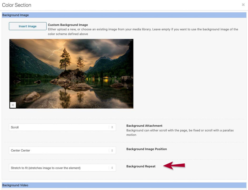
but you can implement the attribute on css too:
.responsive-colorsection {
    width: 100vw !important;
    height: 56.25vw;
    background-size: cover !important;
}
May 22, 2020 at 1:56 pm #1215236Thanks Guenni, that worket perfectly. If I want to have a h1 text anchored at the bottom with a white transparent background and have it scaling with the image, is that possible to achieve through CCS too? I am very novise when it comes to CCS. Look here https://aptilostaging.wpengine.com/cloud/zero-touch-wifi-iot/ at the layerslider on the top and the colorsection right under. It is the look of the layerslider h1 heading I am looking for (no rotation of text though).
May 22, 2020 at 6:11 pm #1215293first – how did you get the 28,67 vw height?
you are using the image with 1500 x 630 ?
so height has to be : 42vwso remove please the other code – and replace with
try :
.responsive-colorsection {
    width: 100vw !important;
    height: 42vw;
}

.responsive-colorsection .container {
  position: relative;
  height: 100% !important;
  top: 0 !important;
}

.responsive-colorsection .container .content {
  position: absolute;
  bottom: 10px !important;
  width: auto !important;
}

.responsive-colorsection .container .av-special-heading {
  background-color: rgba(255,255,255,0.9);
  padding: 10px 30px;
  border-radius: 0.5em;
}

.responsive-colorsection .template-page .entry-content-wrapper h1 {
  text-transform: none !important;
}
May 22, 2020 at 6:50 pm #1215301Hi Guenni, Yes, the 28.67 was an error from my side, sorry for the confusion. I realized this myself but have not purched our casches as we are working on a cashing issue at the same time with our provider. Thanks alot, I am very greatful!
May 22, 2020 at 6:57 pm #1215303Worked perfectly, I will make some detail changes now to get it 100% as I want it. Thanks again for all your help Guenni. You thought me some on CSS as well!
We can close this now I think.May 22, 2020 at 7:42 pm #1215309Fine – you are welcome
May 23, 2020 at 4:18 pm #1215514Hi Terve,
Glad you got it working for you with Guenni007’s help! :)
If you need further assistance please let us know.
Best regards,
Victoria -
This topic was modified 5 years, 11 months ago by
-
AuthorPosts
- The topic ‘How to replace the Advanced Layerslider’ is closed to new replies.