Forum Replies Created
-
AuthorPosts
-
Sorry then you have to wait for Nikko or any other Mod – i’m participant as you are. So i do not see private content area.
the other hint is to put the code to your quick css:
i can see all the svg (Firefox, Chrome and Safari ) on your site mentioned above ( but https://www.flo-haaf.de )
( but your logo on top comes from .https://ftp.flo-haaf.de)
so maybe all your browser cache had to be cleaned ? You will surely have checked your site frequently with said browsers, so they may still have the old links in there.on your first post on this topic you are talking about a plugin – but the fix is for something different ?
did you try that button mentioned above?
na dann lass es doch auf !important
da du es ja inline verwendest, und es mit keinem Selektor von Enfold kollidiert – ist es ok.
die original css Anweisung für Überschriften kommt aus:
.main_color h3versuch also mal ob
h5.gelb etc nicht zum Ziel führtoder eben
.gelb {
color: gelb !important
}
hast du irgendwelche Caching Tools laufen ; das Merging von Enfold ( Enfold oder Enfold-Child – Leistung ) an – dann refreshe auch diese Files.
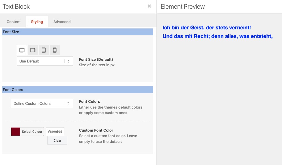
denn selbt im Textblock ALB Element gesetzte Farbe für die Schrift überschreibt die inline gesetzte nicht:
Läuft bei dir schon WP 5.6 – siehe: https://kriesi.at/support/topic/problems-after-updating-to-wordpress-5-6-read-this-first/
https://kriesi.at/support/topic/maybe-its-about-time-for-a-sticky-post-regarding-wordpress-5-6/
maybe that is a fix for your mobile menu problem – til they have the next update.
This: https://kriesi.at/support/topic/theme-bug/#post-1267488
is a solution for your ampersand problem i think. ( our “&” symbols )
Put it in quick css field and refresh all caches and if you have css and js merging on ( Enfold – Performance ) – regenerate those files too.December 16, 2020 at 9:13 am in reply to: Dragging Elements While Scrolling screen Issue in Editor #1267712on my installation this drag&drop works well – but
However, I often use this small button on the right side for layouts with a lot of content.
For this it is also useful to collapse the dashboard.
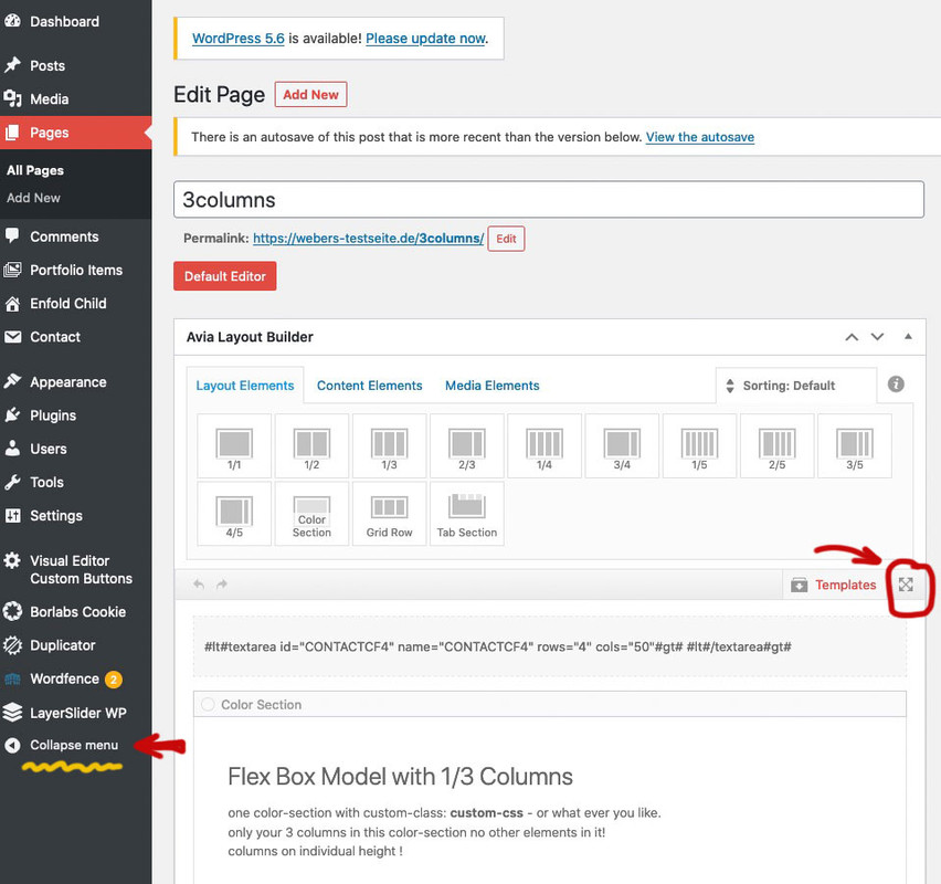
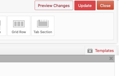
the ALB Elements Bar is then sticky on top – you can scroll the content underneath.After Work is done you have nearby the ALB Elements Bar the buttons for updating the post:
hm where did you ask for menu / mobile menu ?
Hi,
There is a rule that is being created from your CSS that messed up 100 pages of our website and we’ve tried everything and cannot fix it. Bunch of our “&” symbols along with “Subtitles” have suddenly turned Blue color and we can’t do anything to fix this. Need your HELP ASAP website looks like a Zebra, very unprofessional…
how did you insert that code – in textblock element?
if you use this button to enter a break it will insert that code :<br class="avia-permanent-lb" />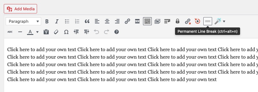
the br tags with classes remain in the DOMDecember 16, 2020 at 8:42 am in reply to: Is it possible to have the left menu scrolling along the Homepage? #1267706https://kriesi.at/themes/enfold-consulting/
this is done only with enfold options already – the place ( enfold – general layout) where you have set up the left menu bar – just under it there is the option to fix it.
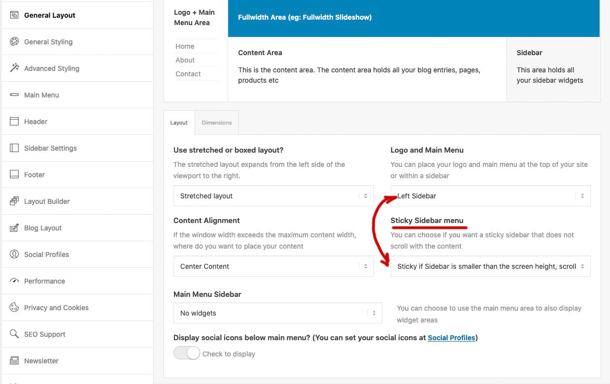
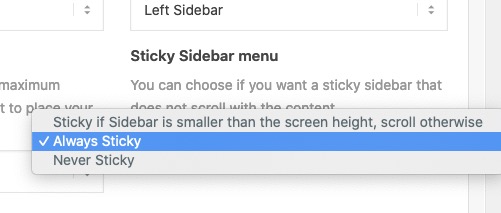
i would prefer the first option – but if you have a shorter menu Always might also be a good wayTry:
#top.postid-3540 h2 {
   margin-bottom: 800px!important;
}
heading-tags and p-tag and body and div do not have a dot in front – i hope it is only 80px ;)
Gemeint von mir war – ob du nicht hier Einstellungen gesetzt hast – bzw. bei Übernahme einer Demo dort Einstellungen bestehen.
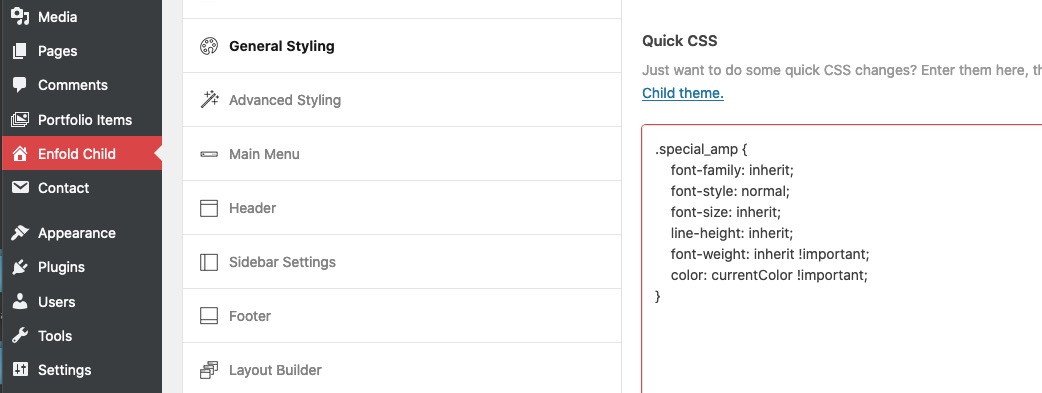
the class: special_amp gets all the color from .main-color a, .main-color strong etc pp
you can overwrite the rules on :
.special_amp {
    font-family: inherit;
    font-style: normal;
    font-size: inherit;
    line-height: inherit;
    font-weight: inherit !important;
    color: currentColor !important;
}
December 15, 2020 at 2:56 pm in reply to: Need to remove link from the post title, on a single post #1267485And dear Mods ( and Devs ) this might be the standard behavior. It makes no sense to have a link from a post to the post itself!
December 15, 2020 at 2:51 pm in reply to: Need to remove link from the post title, on a single post #1267484btw: the hover style is correlated with the title itself (not the anchor), so it remains valid.
if you do not like to have an opacity of 0.7 on hovering the heading:
this to quick css ( maybe an important is necessary ).html_elegant-blog #top .post-entry .post-title:hover, .html_elegant-blog .avia-content-slider .slide-entry-title:hover { opacity: 1; }December 15, 2020 at 2:41 pm in reply to: Need to remove link from the post title, on a single post #1267481see here:
https://kriesi.at/support/topic/remove-permanent-link-from-the-post-h1-title/#post-1220155
this to your child-theme functions.php:function avia_default_title_filter($current_post) { if(!empty($current_post['title'])) { $default_heading = is_singular() ? 'h1' : 'h2'; $args = array( 'heading' => $default_heading, 'extra_class' => '' ); /** * @since 4.5.5 * @return array */ $args = apply_filters( 'avf_customize_heading_settings', $args, 'avia_default_title_filter', array( $current_post ) ); $heading = ! empty( $args['heading'] ) ? $args['heading'] : $default_heading; $css = ! empty( $args['extra_class'] ) ? $args['extra_class'] : ''; $output = ""; $output .= "<{$heading} class='post-title entry-title {$css}' ".avia_markup_helper(array('context' => 'entry_title','echo'=>false)).">"; $output .= is_singular() ? $current_post['title'] : "<a href='".get_permalink()."' rel='bookmark' title='". __('Permanent Link:','avia_framework')." ".$current_post['title']."'>".$current_post['title']; $output .= "<span class='post-format-icon minor-meta'></span>"; $output .= is_singular() ? '' : '</a>'; $output .= "</{$heading}>"; $current_post['title'] = $output; } return $current_post; }the links on the blog are still active – only the links on single-post are influenced.
btw: you can change on that line ( ternary operator ) :$default_heading = is_singular() ? 'h1' : 'h2';if you like to have on single post (first tag) a h1 or whatever you like
h2 is only for blog-view (second tag in ternary operator)zunächst ist es in der Tat so, dass ich jetzt schon mal beobachtet habe, dass inline-style – wie der deine nicht die bestehenden css überschreibt.
Das ist eigentlich sonderbar, denn gemäß den Spezifitätsregeln ( Link ) sollte das eigentlich immer funktionieren.Sei es drum:
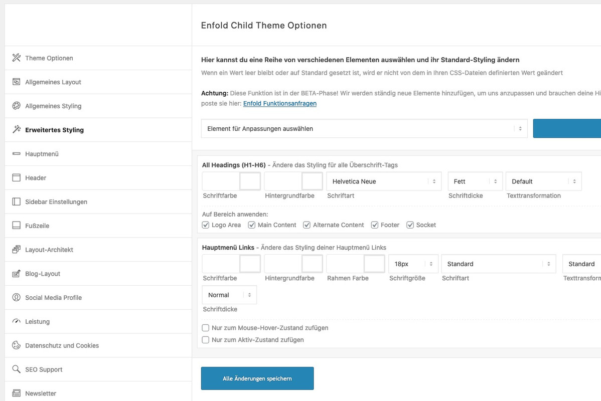
schau mal ob du nicht z.B. in Enfold – Erweitertes Styling nicht für die Überschriften Regeln bestehen hast.
Diese Regeln dort stehen noch hinter denen der Quick Css Regeln – also in der Kaskade weiter unten.du könntest die Regeln oben mal alle auf !important stellen. Da du die ja inline verwenden möchtest wäre das o.k.
can you try this in your child-theme functions.php:
add_filter('wp_nav_menu_items', 'do_shortcode');on my installation its working without that snippet – but maybe it helps.
by the way dear Mods – it would be nice to have an info on newly added filters how to use them with a little example.
maybe on github – but better on the board itself or in documentation. Or as a link to a page from the changelog text where the added filters are listed.
f.e.: avf_lightbox_show_alt_text etc.But I think you are on a good way, if you already found the places in the source code where it has to be changed.
f.e on index.php – some lines under your columns (count) you see that filter (line55) avf_post_slider_argsNow this is not general knowledge like css or jQuery which serves as a basis for something like this.
It is pure Enfold knowledge. Enfold has a lot of hooks and filters already built in.
So I look at the list of hooks and filters and try to find out what they are for.
btw.: the list is not complete – if you search the whole enfold folder for “do_action” you will find a lot of possibilities.By the way, it is very helpful to create a small file in which you write down such snippets with the purpose they have and possibly with a link to the post that refers to the application.
2nd : the documentation is well done and is usually ignored as an aid.
3rd : Read, read, learn.
By not only following my questions here, but also reading through questions from other participants, I get a good coverage of problems that can arise using the Enfold theme. Every question that is asked here – could also be a question from my customers to me.
If you look at my postings from the beginning here, you’ll see that I wasn’t exactly the expert either. The trick is to question the answers as to why the solutions offered work.There is probably also a jQuery solution without the need to deposit a child theme version of toggles.php file .
However, some of the contributors here are of the opinion that bots such as the Google Bot would probably read over these jQuery replacements and still SEO wise lead the as p-tag.you can test this first in your child-theme functions.php:
function replace_tags_with_tags(){ ?> <script> (function($) { function replaceElementTag(targetSelector, newTagString) { $(targetSelector).each(function(){ var newElem = $(newTagString, {html: $(this).html()}); $.each(this.attributes, function() { newElem.attr(this.name, this.value); }); $(this).replaceWith(newElem); }); } replaceElementTag('.togglecontainer p.toggler', '<h3></h3>'); }(jQuery)); </script> <?php } add_action('wp_footer', 'replace_tags_with_tags');i realy think that the best and propper way would be to have a child-theme toggles.php file
you find the original file in your enfold folder: /config-templatebuilder/avia-shortcodes/toggles/on line 917 ( Enfold newest Version) there is :
$output .= ' <p data-fake-id="#' . $toggle_atts['custom_id'] …and the closing tag is on line 918
$output .= ' <span class="vert_icon"></span><span class="hor_icon"></span></span></p>';instead of those two p insert your h3
see here the edited file: https://pastebin.com/fREzmbUb
or download it from my pastebin : Linkput that edited ALB Element to your child-theme/shortcodes folder
this folder is not per se in your child-themes folder – create it thenand put this ( if it is not allready done) to your child-theme functions.php :
you find this snippet on documentation : https://kriesi.at/documentation/enfold/intro-to-layout-builder/#customizationfunction avia_include_shortcode_template($paths){ $template_url = get_stylesheet_directory(); array_unshift($paths, $template_url.'/shortcodes/'); return $paths; } add_filter('avia_load_shortcodes', 'avia_include_shortcode_template', 15, 1);-
This reply was modified 5 years, 3 months ago by
Guenni007.
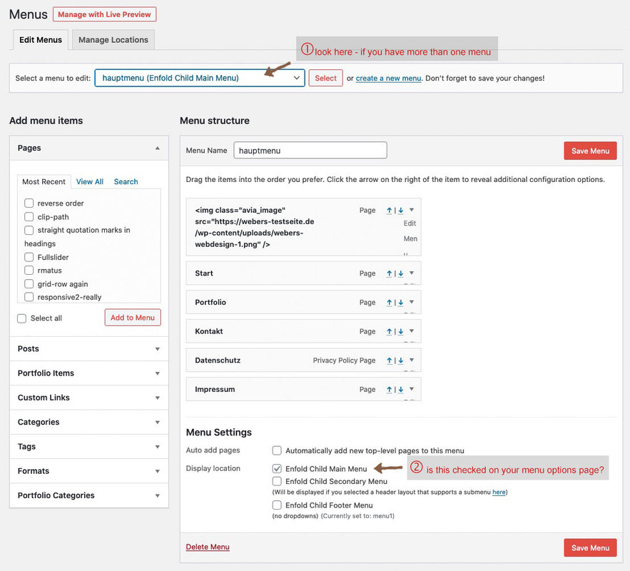
what about your menu options page on dashboard
did you create a menu and mark for it that it is the enfold main menu?
 December 13, 2020 at 7:15 pm in reply to: left to right and right to left animation modification #1266920
this is nearly the same rule from shortcodes.css – and you only want to overwrite the timing to 0.7s
one difference is that original shortcodes.css has 0.8s – and allthough i could not imagine that the 0. is mandatory try it with 0.7s instead of .7s
and you do not see the code on developer tools to be active? because i couldn’t see a difference of 0.1s
if you do not have child-theme you can manage it by functions.php of parent – but then again an update will overwrite all settings there.
the right place to insert those snippets it at the bottom of funcitons.php
just before :require_once( 'functions-enfold.php');there is a comment on that place :
/* * register custom functions that are not related to the framework but necessary for the theme to run */you can try it with filter on that.
Put this to your child-theme functions.php
context blog goes with the context : indexadd_filter('avf_post_slider_args', function($atts, $context){ global $posts; if($context == 'index') { $atts['type'] = grid; $atts['columns'] = 2; } if($context == 'archive') { $atts['type'] = grid; $atts['columns'] = 4; } if($context == 'tag') { $atts['type'] = grid; $atts['columns'] = 5; } return $atts; }, 10, 2);shortversion if the column-count is the same:
add_filter('avf_post_slider_args', function($atts, $context){
	global $posts;
	if($context == 'index' || $context == 'archive' || $context == 'tag') { $atts['columns']  = 2;}
	return $atts;
}, 10, 2);
December 10, 2020 at 4:48 pm in reply to: Help putting icons in one row on small bar in header #1266325or with the animated icons:
<p class="ontop"><a href="mailto: (Email address hidden if logged out) ">[av_font_icon icon='ue805' font='entypo-fontello' size='24px' position='left'][/av_font_icon] (Email address hidden if logged out) </a></p><p class="ontop"><a href="tel:8056580109">[av_font_icon icon='ue854' font='entypo-fontello' size='24px' position='left'][/av_font_icon](805) 658-0109</a></p>and:
.phone-info  p.ontop {
    display: inline-block;
    margin-right: 10px;
}
but then you had to style the postition of the icons.
maybe a mod could help you to do thatDecember 10, 2020 at 4:25 pm in reply to: Help putting icons in one row on small bar in header #1266322maybe you try only html and a bit of quick css:
put this to your phone-info field:
<a href="tel:8056580109"><span class="tel">(805) 658-0109</span></a> | <a href="mailto: (Email address hidden if logged out) "><span class="mail"> (Email address hidden if logged out) </span></a>The telephone number in the href should be with maybe countrycode we in Germany got +49 – you will know your whole number ( no spaces in it)
in the span itself you can write what you like to have – maybe only Mail and Phonethen to quick css:
.phone-info span::before {
    font-family: entypo-fontello;
    font-size: 24px;
    padding-right: 5px;
    position: relative;
    top: 2px;
}

.phone-info .mail::before { content: "\e805"; color: #090}
.phone-info .tel::before { content: "\e854"; color: #009}
if you do not need extra color for the icons – put a uniform color to the span:before rule and erase it in mail and tel
-
This reply was modified 5 years, 3 months ago by
-
AuthorPosts