Forum Replies Created
-
AuthorPosts
-
Calculation
You are welcome
dieser Effekt Ist sicherlich häufiger anzutreffen – bei anderen Themen – daher glaube ich schon es wäre eine Bereicherung.
Ich sehe momentan keine Probleme, da all_colors bei footer meist durch footer_color überschrieben wird.
Ok – on looking into avia_performance.php i see the if clause on showing these checkboxes :)
if( avia_count_active_plugins() > 0 )i said it above a clean install – no plugins on that moment.
so it can be closed.August 18, 2021 at 9:49 am in reply to: Issue with debug info still showing with font error #1317309how did you update to 4.8.3
don’t know when the change of the correlated names start – but now this file is called: class-font-manager.php
so if you do update f.e. by overwriting existing files via ftp etc. pp . the old file will persist in that folderAugust 18, 2021 at 9:25 am in reply to: Disappearing WebP Image as ColorSection Background Image? #1317305Hi Günter – thanks
Looks better – if you like to have an alternative –
try:#top .av-rotator-container-inner { text-shadow: 1px 1px 0 #c7c8ca, 2px 2px 0 #b1b3b6, 3px 3px 0 #9d9fa2, 4px 4px 0 #8a8c8e, 5px 5px 0 #77787b, 6px 6px 0 #636466, 7px 7px 7px #000; }but then with more letter-spacing
Yes, that is definitely the better phrase.
you see the word by word translation on German is misleading:
It is the oposite way as described.
 August 17, 2021 at 4:53 pm in reply to: Disappearing WebP Image as ColorSection Background Image? #1317184
i hope that they will soon add these additonal image formats:
https://kriesi.at/support/topic/svg-support-3/#post-1317155This way with page array
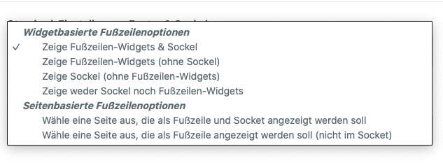
if( is_page ( array ( 21, 8675, 13792, 14614 ))){by the way – on enfold options footer – there is :
“Select a page as footer and socket” and
“Select a page as footer (no socket)”but isn’t it a bit confusing ( you can see the translation faults on that f.e. in German )
wouldn’t it be better to make it more clear if you say:
“Select a page replacing footer only”
“Select a page replacing footer and socket”first : i do not like the big white rectangle when the letters change – then maybe a text-shadow will do the job:
#top .av-rotator-container-inner {
	text-shadow: 3px 3px 10px #000 !important;
}

.av-marked-text .av-rotator-text-single {
	background-color: transparent !important
}
or in additon a little outline with a modern method to add outline ( only IE11 does not support this) – replace the first rule with:
#top .av-rotator-container-inner{
	text-shadow: 2px 3px 4px #000 !important;
	-webkit-text-stroke: 1px black
}
if you like it with more browser support – that little trick will do – replace the first rule with:
#top .av-rotator-container-inner { text-shadow: 3px 3px 5px #000, -2px -2px 0 #000, 2px -2px 0 #000, -2px 2px 0 #000, 2px 2px 0 #000; }it is your whole layerslider installation that does not work.
i would try to install a complete new enfold in this way:
https://kriesi.at/support/topic/some-hints-and-advice-to-update-enfold/#post-1056107Even if they have the same version – this will work.
Just to look if something went wrong on last updates.
If this does not solve the issue – you can go back in the described way.First of all – do you still need the jQuery Migrate on your installation?
It is still active. You can avoid loading it on Performance : “Disable jQuery Migrate”This has nothing to do with your problem at first, but if your plugins are up to date, there should be no reason not to disable it.
If you experience problems afterwards, you can undo it.__________
Do you use Gutenberg on your Enfold Installation? – or the Classic Editor?
Some Addons on Gutenberg Editor can cause such a problem ( f.e.: Ultimate Addons for Gutenberg )It doesn’t seem to be that important anymore!
you don’t have to insert the css code above – because it is part of that css belongs to layerslider – but on some reasons this is not loaded.
If you put in the css code above – you will see that the gray rectangle is gone.
But i do not see any of this .ls-hidden rules in your css.August 15, 2021 at 7:40 pm in reply to: Is there a way to one column in a color section break lower tha #1316817Why don’t you define on the 3/5 column that they have same height.
Only to give advice from a screenshot it is hard to more precise.maybe this is an alternative:
https://wordpress.org/plugins/menu-items-visibility-control/
there are additonal fields on each Menu-Item – you can insert conditional tags there ( f.e. is_home() or ! is_home() etc pp )
https://codex.wordpress.org/Conditional_Tags
so it will be possible to even have is_user_logged_in() etc.and everything is clear on that description? Or are there questions?
the css rule for ls-hidden is missing in your stylesheet !
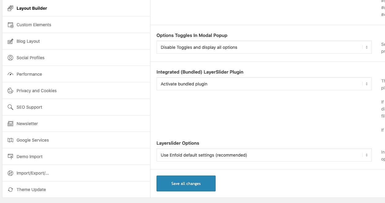
if you add to quck css this – you will see that it will work:.ls-hidden { width: 0px !important; height: 0px !important; position: absolute; left: -5000px; top: -5000px; z-index: -1; overflow: hidden !important; visibility: hidden !important; display: block !important; }what is your setting on Enfold (Child) : Layout Builder :
- Integrated (Bundled) LayerSlider Plugin and
- Layerslider Options
 August 12, 2021 at 11:27 am in reply to: I need twice the amount of letters from the text excerpt #1316411
the snippet is correct but:
if you insert it to parent functions.php there are only a few places where this should be done.
i prefer as advice: just before the require_once at the very bottom.- where the comment is pointing the place:/* * register custom functions that are not related to the framework but necessary for the theme to run */ require_once( 'functions-enfold.php' );i have no problems with layerslider this way.
Do you have installed a stand-alone Version? and do not use the implemented function?in dem Fall würde ich dann doch diesen buttons eine custom-class zuordnen.
Das geht über das Element selbst, wähle den Tab: Advanced an , und dann trage eine für dich sinnvolle Klasse mit Wiedererkennungswert ein ;)
Diese benutzerdefinierte Klasse erscheint am wrapper des Buttons, sodaß der selector dann folgender wäre:.avia-button-wrap.custom-class .avia_iconbox_title { font-size: 20px; }das : custom-class ersetzt du bitte mit deiner benutzerdefinierten klasse.
PS: in das Eingabefeld wird die Klasse ohne Punkt davor eingegeben.Can you check your advanced Layerslider insertion on that page.
F.e. remove it and place again your layerslider – and save the page..postid-1307 #av_section_10 .avia_iconbox_title { font-size: 20px; }yes – but think of new jQuery 3.5.1
jQuery(window).load(function(){: it is deprecated – you had to use now:
jQuery(window).on( 'load' , function(){PS – if you do not like to have it sticky: change it to disabled
– but do not forget to set the class too: av_header_sticky_disabledmy observation is that it would be very hard to determine for one page a shrinking if you do not have shrinking header on enfold options page.
Guess it has something to do with embedding the scripts needed and to get rid of html class – set from beginning. Maybe Guenter knows a way to get this way around.
But as i see – there is a shrinking header – that is possible to get rid of for one pagei would use the filter a bit different. – Replace that code above ( save a copy of that snippet ) :
function avf_header_setting_filter_mod($header) {
  if ( is_page(21) ) {
    $header['header_layout']      = 'logo_left main_nav_header menu_right';
    $header['header_sticky']      = 'header_sticky';
    $header['header_shrinking']   = 'disabled';
    $header['header_stretch']     = 'disabled';
    $header['header_size']        = 'custom'; // slim, large or custom
    $header['header_custom_size'] = '45' ; // if custom size : integer value in px
    // on default we do add here classes by .= but in this case
    $header['header_class'] = " av_header_top av_logo_left av_main_nav_header av_menu_right av_custom av_header_sticky av_header_shrinking_disabled av_header_stretch_disabled ";
  }
  return $header;
}
add_filter('avf_header_setting_filter', 'avf_header_setting_filter_mod', 10, 1);
PS : on dropdown custom pixel value option less than 45px are not possible – on that snippet above you can even choose less than 45px
PS : i assumed that all images have a link associated with them. If this is not the case, one would have to tinker with it again.
PPS: I removed title attribute on hover – and bring back title on click or mouseleave. So there are no Tooltips – i do not like them ;)
ok – thanks:
see here: https://webers-testseite.de/hover-images/the trouble with it is – as mentioned above – that in image.css there is a rule set to !important.
We must avoid that – here is the possibility to have a child-theme image.css. But i hope that developer will prove that standard enfold behavior will work without !important setting – and remove it on next update.Basic: Put in the custom css field of your image : hoverstyle2
First:
Snippet to have child-theme alb element replacement:
(for child-theme functions.php ):function avia_include_shortcode_template($paths){ $template_url = get_stylesheet_directory(); array_unshift($paths, $template_url.'/shortcodes/'); return $paths; } add_filter('avia_load_shortcodes', 'avia_include_shortcode_template', 15, 1);Second:
download from pastebin these two files ( the child-theme image alb files ):
https://pastebin.com/ndewwkx7 or download
https://pastebin.com/WJTbAxJJ or downloadThird:
Upload these two files to a child-theme folder named: “shortcodes”Fourth
To preserve the alb setting for overlay color and opacity we store this overlay opacity in a variable and transfer that to a container of our choice:function style_a_hover_state(){ ?> <script type="text/javascript"> (function($) { $(document).ready(function(){ $('.avia-image-container.hoverstyle2').each( function() { var initialOpacity = $(this).find('.av-caption-image-overlay-bg').css('opacity'); $(this).find('.avia_image').hover(function() { $(this).find('.av-caption-image-overlay-bg').css('opacity', initialOpacity ); }); }); }); })(jQuery); </script> <?php } add_action('wp_footer', 'style_a_hover_state');Last:
put this to your child-theme quick css:.hoverstyle2 .image-overlay { display: none !important; } .hoverstyle2 .avia-image-overlay-wrap .av-image-caption-overlay { pointer-events: none; } .hoverstyle2 .avia-image-overlay-wrap .av-image-caption-overlay { opacity: 0; transform: translateY(100%); transition: 0.5s transform cubic-bezier(.77,0,.18,1); } .avia-image-container:not(.av-hover-grow).hoverstyle2 .avia-image-overlay-wrap .av-image-caption-overlay { opacity: 1; transition: 0.5s all cubic-bezier(.77,0,.18,1); } .hoverstyle2 .avia-image-overlay-wrap a:hover.avia_image .av-image-caption-overlay { opacity: 1; transform: translateY(0); transition: 0.5s transform cubic-bezier(.77,0,.18,1) 0.3s , 0.5s opacity ease 0.5s; overflow: visible; } .hoverstyle2 .av-caption-image-overlay-bg { width: calc(100% - 50px); height: calc(100% - 50px); top: 50%; left: 50%; transform: translate(-50%, -50%); } .av-hover-grow.hoverstyle2 .av-caption-image-overlay-bg { width: calc(90% - 50px); height: calc(90% - 50px); } .av-hover-grow:not(.av-hide-overflow).hoverstyle2 .av-caption-image-overlay-bg { width: calc(110% - 50px); height: calc(110% - 50px); } .av-image-caption-overlay-center p { padding: 5px; } .av-hover-grow.hoverstyle2 .avia-image-overlay-wrap:hover a.avia_image::before, .av-hover-grow.hoverstyle2 .avia-image-overlay-wrap:hover a.avia_image::after { transform: scale(0.9); } .av-hover-grow:not(.av-hide-overflow).hoverstyle2 .avia-image-overlay-wrap:hover a.avia_image::before, .av-hover-grow:not(.av-hide-overflow).hoverstyle2 .avia-image-overlay-wrap:hover a.avia_image::after { transform: scale(1.1); }PPS: these little frames growing on hover are hoverstyle1:
.hoverstyle1 .image-overlay {
  display: none !important;
}

.hoverstyle1 a.avia_image:before,
.hoverstyle1 a.avia_image:after {
  content: '';
  position: absolute;
  top: 10px;
  right: 10px;
  bottom: 10px;
  left: 10px;
  -webkit-transition: all 0.5s ease;
  -ms-transition: all 0.5s ease;
  transition: all 0.5s ease;
  pointer-events: none;
  background: transparent;
  width: auto;
  height: auto;
  z-index: 10;
}

.hoverstyle1 a.avia_image:before {
  border-top: 2px solid #fff;
  border-bottom: 2px solid #fff;
  -webkit-transform: scaleX(0);
  -ms-transform: scaleX(0);
  transform: scaleX(0);
}

.hoverstyle1 a.avia_image:after {
  border-left: 2px solid #fff;
  border-right: 2px solid #fff;
  -webkit-transform: scaleY(0);
  -ms-transform: scaleY(0);
  transform: scaleY(0);
}

.hoverstyle1 .avia-image-overlay-wrap:hover a.avia_image:before,
.hoverstyle1 .avia-image-overlay-wrap:hover a.avia_image:after {
  -webkit-transform: scale(1);
  -ms-transform: scale(1);
  transform: scale(1);
}
Result page: https://webers-testseite.de/hover-images/
so – if you like both hoverstyles on the image – put in the custom css field: hoverstyle1 hoverstyle2 -
AuthorPosts