Hi,
Glad to help, so on the /podcasting-test/ page you are not seeing Steve’s Podcasting Articles under the Podcast “Aircheck” like this?

I see this in chrome dev tools emulating a mobile device and in my Android mobile.
Please note that testing with iPads & iPhones can be hard to clear the cache, often you need to also clear the history to fully purge the cache, following these steps for Safari and note Step 4 where you will Clear the History.
What device are you using? Perhaps try disabling your maintenance mode and check again.
I added the css to your WordPress ▸ Customize ▸ Additional CSS perhaps this will help your device.
Best regards,
Mike
Hi,
Glad we were able to help, if you have any further questions please create a new thread and we will gladly try to help you. Thank you for using Enfold.
Best regards,
Mike
Hi,
Thank you for the link to your site, I found that you are not using a child theme and I didn’t see any other code snippet plugins, so I added the WPcode plugin this plugin supports PHP code snippets, JavaScript code snippets, & CSS code snippets.
I then added the function temporary_removal_title_tags and cleared my browser cache and now the titles are not shown on mouse-over:

please clear your browser cache and check. Please note Safari can be hard to clear the cache, often you need to also clear the history to fully purge the cache, following these steps for Safari and note Step 4 where you will Clear the History.
Best regards,
Mike
Hey daves1997,
Thanks for the login, I checked your page and when you edit the text block element with the “visual tab” you will see it like this:

when the “text tab” is used you will see the HTML code like this:
This is the normal and correct behavior, I found no errors.
Best regards,
Mike
Hi,
Glad Rikard could help, if you have any further questions please create a new thread and we will gladly try to help you. Thank you for using Enfold.
Best regards,
Mike
Hi,
Sure, so first I copyied your page and created a test page to demonstrate /podcasting-test/ Then I enabled the right sidebar on the test page:

The screenshots will be from the Classic Editor, as I prefer it over the Block Editor. Then I created the three sidebar widgets to replace your “fake sidebar”

WordPress ▸ Appearance ▸ Widgets ▸ Sidebar Pages

Then in the backend I removed the sections not needed, and added a little css to remove the sidebar border:
#top #main .sidebar.sidebar_right {
	border: none;
}
#top .container_wrap.sidebar_right .template-page.content {
	border-right: none;
}
and added a little css so the sidebar will show on mobile centered:
@media only screen and (max-width: 767px) {
	.responsive #top #main .sidebar {
		display: block;
		width: 100%;
		padding-top: 0;
	}
	.responsive #top #main .sidebar .inner_sidebar {
		margin: 0;
	}
	.responsive #top #main .sidebar .inner_sidebar .avia_textblock * {
		text-align: center !important;

	}
	#top .container_wrap.sidebar_right .template-page.content {
		padding-bottom: 0;
	}
}
Now if you compare the original /podcasting/ with the new /podcasting-test/ I don’t think you can tell the difference, except on mobile the sidebar is under the Podcast “Aircheck” and if you want to add this sidebar to other pages it will be easy.
Please clear your browser cache and check.
Best regards,
Mike
Hi,
You can remove the asterisc, that was only an example.
As for the URLs and SEO, I’m not a SEO expert so please research this, but I thought of two options, when you use the Classic Editor you can change the URL to something different than the page title, so I’m thinking that you can for example, change all of the “About” pages to use the URL slug of /about so the language switcher will work, and leave the titles in the appropriate language, like this:

you would need to do this for each language.
Or you can use a redirect plugin and manually add your pages and the corresponding page for each language, here is an example from the plugin page:
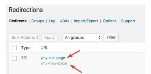
you would need to do this for each language, but all of these redirects will be “301” and I’m not sure if this is bad for SEO, it may be.
All in all, either of these will be a lot of work, if it was my site I think that I would just use the original menu and assume that if someone landed on the EN site and they really wanted the FR site, that they would be fine with going to the FR homepage. But I probably have not thought about it as much as you have.
I hope this helps.
Best regards,
Mike
Hey CharlieTh,
1. I’m not sure I understand what you are looking to remove, could you post a screenshot highlighting it please?
2. Please try the following in Quick CSS under Enfold->General Styling:
.page-id-699 #after_submenu_1 .content {
    padding-top: 0;
    padding-bottom: 0;
    min-height: 0;
}
Best regards,
Rikard
Yes I did. Via css-trickery.
Here is how: Every Single Page gets its own class in the body-tag, so you can adress img-replacement of the img tag.
<body class”page-id-456″>
<div class=”logo”>

</div>
<//body>
CSS img-replacment:
.page-id-456 .logo img {content: /uploads/other_pic.jpg;}
But, then you have to use hard coded URL and if somerthings changing you have ti fix this. And if you have more then one site in others languages you have to figure out alle the different classes. So the solution above only makes sense when you have single-pages!!!
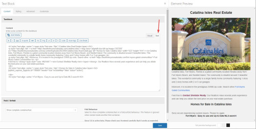
So, is there a solution in Enfold itself?
Hi,
Yes this is possible and I have made this modification to your site, but in doing so I found that your URLs are not the same across all three sites so you will need to change all pages on all sites to match, and you may not wish to do this, but I added the code so you can decide.
So to test this I added three test pages on these three sites:
your french site is your core site with no “FR” in the URL, I know you know this but in the future people will want to know how this works 🙂
Anyways, I disabled your topbar menu and enabled the topbar Enfold Theme Options ▸ Header ▸ Extra Elements ▸ Phone Number or small info text to hold the language switcher shortcode, you can easily switch back to using the topbar menu there if you wish.
This is the shortcode I added: [dynamic_lang_switcher lang="EN"] * [dynamic_lang_switcher lang="IT"] * [dynamic_lang_switcher lang="FR"] on the frontend it shows the whole language word:

Then I added this code to the end of your child theme functions.php file in Appearance ▸ Editor on all three sites:
function dynamic_language_switcher($lang) {
    // Get the current full URL
    $protocol = (isset($_SERVER['HTTPS']) && $_SERVER['HTTPS'] === 'on' ? "https" : "http") . "://";
    $current_url = $protocol . $_SERVER["HTTP_HOST"] . $_SERVER["REQUEST_URI"];

    // Base URL without language
    $base_url = $protocol . 'guidedtour.ch/';

    // If the language is French, return the current URL without language segment
    if (strtoupper($lang) == 'FR') {
        $path = str_replace($base_url, '', $current_url);
        $segments = explode('/', trim($path, '/'));

        if (in_array($segments[0], array('EN', 'IT'))) {
            array_shift($segments); // Remove the language segment
        }
        return $base_url . implode('/', $segments) . '/';
    }

    // Remove the base URL to get just the path
    $path = str_replace($base_url, '', $current_url);

    // Split the path into segments
    $segments = explode('/', trim($path, '/'));

    // Check if the first segment is a known language code
    if (in_array($segments[0], array('EN', 'IT'))) {
        // Replace the existing language code with the desired one
        $segments[0] = $lang;
    } else {
        // If the first segment is not a language code, prepend the desired language code
        array_unshift($segments, $lang);
    }

    // Construct the new URL
    $new_url = $base_url . implode('/', $segments) . '/';

    return $new_url;
}


function dynamic_language_switcher_shortcode($atts) {
    // Mapping short language codes to their full word representations
    $language_names = array(
        'EN' => 'English',
        'IT' => 'Italian',
        'FR' => 'French'
    );

    $atts = shortcode_atts(
        array(
            'lang' => 'EN'
        ),
        $atts,
        'dynamic_lang_switcher'
    );

    $url = dynamic_language_switcher($atts['lang']);

    // Display the full word representation, but link to the appropriate URL
    return '<a href="' . $url . '">' . $language_names[strtoupper($atts['lang'])] . '</a>';
}
add_shortcode('dynamic_lang_switcher', 'dynamic_language_switcher_shortcode');
and now you can go to any of those three pages and click the new language switcher and go to the corresponding page in any language.
But unfortunately it looks like all of your other menu items don’t match across your sites.
Best regards,
Mike
Hi,
To add custom images before menu items for both regular submenus and mega menus like this:
Main menu items:

Regular submenu items:

and mega menu items:

Try adding this code to the end of your child theme functions.php file in Appearance ▸ Editor:
function add_image_before_menu_item_based_on_class($items) {
    // Define the images for specific CSS classes.
    $class_image_mapping = array(
        'custom-class-1' => 'https://swisspecial.com/wp-content/uploads/2023/09/png-e1695487023144.png',
        'custom-class-2' => 'https://swisspecial.com/wp-content/uploads/2023/09/siberian-husky-e1695493493574.png',
        // ... add more class-to-image mappings as needed
    );

    // Loop through each menu item
    foreach ($items as &$item) {
        // Check if any of the item's classes matches our custom classes
        foreach ($item->classes as $class) {
            if (isset($class_image_mapping[$class])) {
                // If a match is found, prepend the image to the title
                $item->title = '<img src="' . esc_url($class_image_mapping[$class]) . '" alt="" style="margin-right: 5px;width: 30px;vertical-align: middle;margin-left: -15px;" />' . $item->title;
                break;  // exit the loop once the first match is found
            }
        }
    }
    return $items;
}
add_filter('wp_nav_menu_objects', 'add_image_before_menu_item_based_on_class');
Note the custom classes have the image path assigned, and also not the inline css to set the width of the images and the margin and the vertical-align, while these work well in my example, you may wish to adjust to your specific menu style.
Then click on the Screen Options tab at the top-right corner of the screen in the menu panel and check the box next to “CSS Classes”, then click on any menu item to expand it. You will see an option named “CSS Classes” where you can add a custom class.

Best regards,
Mike
Hi,
Sorry we were not more help, if you have any further questions please create a new thread and we will gladly try to help you. Thank you for using Enfold.
Best regards,
Mike
Hi,
For the image that overlaps the text at the bottom of your page, I added a little padding between the text and image:

fell free to adjust if you want more space.
Your other page was much harder because of the column structure, I added this css:
@media only screen and (min-width: 768px) and (max-width: 1280px) {
	.podcast-image,
	.avia-image-container.avia-align-center.podcast-image {
		margin-top: 20px;
	}
}
@media only screen and (min-width: 768px) and (max-width: 1160px) {
	.podcast-image,
	.avia-image-container.avia-align-center.podcast-image {
		margin-top: 50px;
	}
}
@media only screen and (min-width: 768px) and (max-width: 989px) {
	.responsive #top.page-id-1313 .av_one_half.first + .av_one_fourth + .av_one_fourth.flex_column_div{
		width: 20%;
		position: absolute;
        right: 0;
        top: -50px;
	}
	.podcast-image, .avia-image-container.avia-align-center.podcast-image {
    margin-top: -50px;
}
}
@media only screen and (min-width: 768px) and (max-width: 989px){
.responsive .av_one_half.avia-builder-el-14.first.el_before_av_one_fourth.flex_column_div {
	width: 72%;
}
}
@media only screen and (max-width: 767px) {
	#top.page-id-1313 #av_section_3 .template-page.content {
		padding-bottom: 0 !important;
	}
	#top.page-id-1313 #av_section_4 .template-page.content {
		padding-top: 0 !important;
	}
}
and I made some extra elements on the page to show at the mobile size, in my test it seems to be working, please clear your browser cache and check.
for tablet before the mobile break you will see that the right side “sidebar” items look like that are in a sidebar, Please see the screenshot in the Private Content area.
and then at mobile they become full width and are under each other, Please see the screenshot in the Private Content area.
If you don’t see it this way try clearing your cache a few times.
Best regards,
Mike
Hi again,
Did you try updating to 5.6.6, and did that fix the problem? https://kriesi.at/documentation/enfold/how-to-install-enfold-theme/#theme-update.
Best regards,
Rikard
 Logan James Koester
Guest
Hello,
I know this isn’t the right spot to request a refund. But if I could be pointed in the right direction, I would appreciate it. I don’t know how to use enfold. Which is what I bought, and I will no longer use wordpress.
Thanks,
Logan
 Thorsten Kaltenborn
Guest
Hallo zusammen,
ich verwende enfold V. 5.6.5 (Support ist ausgelaufen).
Ich habe hier ein Problem, wenn ich eine 3-spaltige Galerie (avia_sc_gallery) ausgeben möchte. Dabei wird für die Thumb-Breite lokales CSS erzeugt. In gallery.php Zeile 658 wird dazu einfach der Prozentwert errechnet. In WordPress 6.3.1 unter PHP 7.4 erhält man bei 3 Spalten “33,3333”. Das wird aber auch mit Komma ausgegeben, müsste für CSS aber mit Punkt 33.3333 ausgeben werden.
Hoffe, diese Fehlermeldung reicht Euch für einen Bugfix. Ansonsten meldet Euch gern noch einmal bei mir. Ich habe für meine Zwecke einen lokalen Bugfix eingebaut. Vielleicht wird der Kunde ja mal updaten :-)
Viele Grüße
Thorsten Kaltenborn
This reply has been marked as private.
Hey steveorrmedia,
Thank you for your patience and the links, so based on your description for the first three issues, that are all for heading text being cut off at screen sizes below 480px, while it is possible to break the words with a hyphen, I don’t think this will look good so a better option is to reduce the font size for small screens.
The Special Heading element that you are using on these three pages has an option to do this, please go to the styling tab and look for Heading Font Sizes then click the icon for the small device screen and adjust the font size to about 37px.

You could also adjust the Subheading Font Sizes if you wish. I did this for your /message-development/ page special heading, and now the text fits at the smallest screen sizes, please clear your browser cache and check, and then try this for your other pages.
Fot your last issue with the logos being too close together on small mobile when they are in a single column, try this CSS in your Enfold Theme Options ▸ General Styling ▸ Quick CSS field:
@media only screen and (max-width: 479px) {
	#top .avia-logo-element-container .slide-entry {
    padding: 10px;
	}
}
and feel free to adjust the 10px to suit if it is not enough
Please ensure to copy the code from the forum and not an email notification so the symbols are not converted.
After applying the css, please clear your browser cache and check.
Best regards,
Mike
Hi,
I believe that you are refuring to this margin and padding of the pags, the red is the margin, and the green is the padding:

so if you change the dimensions to 100% it would remove the margin, and currently you have the padding set to 20px and you could adjust that until the designer is happy.
Or you could remove the padding and set the dimensions to a width that the designer is happy with and it would be a set amount for all screen sizes, so either way would give the same result.
Best regards,
Mike
Hi,
If I am understanding correctly you want to line up the logo with the left margin and padding starting at 768px

but doing this makes the logo over lap your menu items because the white space of the logo is so large, try trimming down the logo so it has no white space:

then I think this css will work:
@media only screen and (min-width: 768px) {
.html_header_top #top .av_header_stretch .container {
	width: 90%;
	padding: 0px 50px;
}
}
Best regards,
Mike
Hi,
Thanks for the link to your site, I checked the backend of your page <strong style=’color:#000′>/international/ and found that the Advanced Layout Builder was hidden, this was due the screen options box <strong style=’color:#000′>Avia Layout Builder was unchecked, I checked it and now it is showing:

I checked a couple of random pages and the <strong style=’color:#000′>Avia Layout Builder is also showing on those so it seems this is fixed all of them for this account, but you may need to check this for other accounts.
Best regards,
Mike
Hi,
Glad to hear that you have this sorted out, if you have any further questions please create a new thread and we will gladly try to help you. Thank you for using Enfold.
Best regards,
Mike
Hi,
Try this CSS in your Enfold Theme Options ▸ General Styling ▸ Quick CSS field:
#top #header.av_header_transparency #header_meta {
    border-bottom: none;
}
After applying the css, please clear your browser cache and check.
Best regards,
Mike
Hi,
Glad we were able to help, if you have any further questions please create a new thread and we will gladly try to help you. Thank you for using Enfold.
Best regards,
Mike
Hey Henning,
Please try the following in Quick CSS under Enfold->General Styling:
.html_elegant-blog #top .post-entry .post-meta-infos {
    width: 40em;
    float: none;
    max-width: 40em;
}
Best regards,
Rikard
I updated to 5.6.6
I didn’t find Enfold > Performance > File Compression settings > as such. I tried >Performance > Manually manage loaded elements > Separator/Whitespace > Disable
I then restored settings as before.
The problem still exists.
Dear Team,
This issue can be closed since I solved the problem by modifying the margins of the titles.
But there is an anomaly I would like to share for your information that I noticed since I was working on the website using Enfold one year ago. When one achieves an effect in one page, the same exact setting should work for the same effet in another page. At this purpose, please note that I had to make three different setting for the same effect in three different homepages:
EN site: color box of special heading under the video: 50 and 10 for smartphones.
IT site: I had to put 100 and 0 to reach the same effect, plus, I had to set the margin in the design of the heading on 50.
FR site: on top of that, I had to set the line margins of the first color box (with text “A destination…) on 3 and 50.
So Enfold might have instability issues with the titlle. There also might have some other general setting on these pages of which I’m not aware and that might influence the behaviour of the titles, but this is what I noticed.
Besst regards,
Natacha
Dear team,
We had our website too many years without due maintenance. With the help of the hosting provider, we upgraded from WP 4.7.26 and Enfold 3.0.8 to WP 6.3.1 and Enfold 5.6.6.
Now we have a little difference in visualization of the Home Page and the Layer Slider between the production site and the staging site.
I don’t know how to fix it.
Can you tell me how?
Thanks
This reply has been marked as private.