
Tagged: Hamburger-Menu, iOS
-
AuthorPosts
-
October 1, 2023 at 7:49 pm #1421036
I’ve been going crazy trying to figure out why the hamburger menu either doesn’t show up at all in my iphone when I have menu set to logo center, menu below, or shows up but doesn’t work when I set it to logo left, menu right. I’ve tried changing all kinds of settings re: menu, header, etc. Still doesn’t work. No cache problems. Every time I made a change to the settings they take effect right away.
I just had my daughter go on her much newer iphone to one of the two sites I’m making with Enfold and tell me if she could use the menu. Menu works fine for her.
I have the most current iOS that iphone 6 can use, which is 12.5.7. I can’t be the only person in the smartphone world who has an old iphone. I understand that developers have to draw a line beyond which their code won’t work. Is I phone 6 beyond your line?
I believe it’s the iOS because site looks exactly the same in Firefox (latest version) and Safari.
Everything else about enfold is so great. Is there any way around this issue?
Here is a link to one of the sites:
test.shastasymphony.orgI now think it is not just my iOS. Here is a link to a local organization that also uses enfold. In fact, I looked at the code in their site to see what theme it uses and that’s why I looked at enfold. This is a very simple site, as are the ones I’ve made with enfold. But the hamburger menu on their site works on my phone and on the two sites I’ve made it does not work on my phone.
roguevalleychorale.org
What am I doing differently?Barb
-
This topic was modified 2 years, 6 months ago by
bbarasa. Reason: More info to help diagnose
October 2, 2023 at 5:02 am #1421058Hey bbarasa,
Thank you for the inquiry.
The site above contains a very outdated version of the theme, 4.5.2. It’s important to update the theme to the latest version, 5.6.6, as soon as possible. This upgrade should help resolve the issue you’re having with the mobile menu.
Best regards,
IsmaelOctober 2, 2023 at 7:45 am #1421068In the Enfold Child Theme Options, under Update Theme, it says this:
No Updates available. You are running the latest version! (5.6.6)
October 2, 2023 at 7:54 am #1421070Hi,
Thank you for the update.
We checked the roguevalleychorale.org site. Would you mind providing a link to your site again? Please post the site URL in the private field and upload a screenshot using platforms like Savvyify, Imgur or Dropbox.
Best regards,
IsmaelOctober 2, 2023 at 9:38 pm #1421205The Rogue Valley Chorale site is NOT a site I made. But it uses Enfold theme, is also a very simple setup, and the menu opens on my iphone. I was just using it as an example that works.
I’ve put two screenshots from my iphone into a dropbox folder. Link to that is below.
I indicated on the screenshots what the header setting is for each.I have tried changing Main Menu theme settings for menu, burger mobile menu, burger mobile menu styling but none of those changes allowed the menu to appear and work.
October 3, 2023 at 7:33 am #1421240on newest Enfold there is that new option on “Show Advanced Options” see what is there on “Old Browser Support”
Try the option “Support old Browsers”
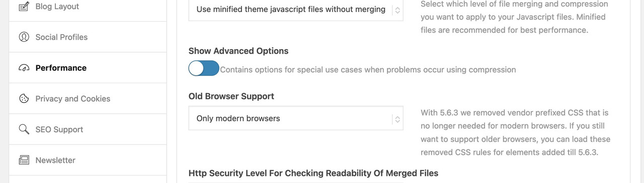
in the option “only modern Browsers” all f.e. -webkit- prefixes will not be there
– and that might be necessary css for the older iOS 12.5.7 on your iPhoneTest that – but do not forget to refresh all cache and or merged files by enfold
October 3, 2023 at 7:40 am #1421242Hi,
Thank you for the screenshot.
We couldn’t reproduce the same issue when we checked the site using mobile emulation. It’s possible that the device or phone contains an older version of the browser, which for some reason, may no longer render the site properly.
. I understand that developers have to draw a line beyond which their code won’t work. Is I phone 6 beyond your line?
We don’t have a list of supported devices but we do recommend using the latest versions of browsers, plugins and other related softwares.
// https://themeforest.net/item/enfold-responsive-multipurpose-theme/4519990
Best regards,
IsmaelOctober 3, 2023 at 8:09 am #1421244you can see here that my old ipad 3 mini (iOS 12.5.7 – that last one i could install on that device) caused some troubles on newer alb element like the before/after image.
https://kriesi.at/support/topic/enfold-options-page/see my comment here on apples philosophy to handle older devices:
https://kriesi.at/support/topic/enfold-options-page/#post-1406649October 4, 2023 at 9:17 pm #1421426I enabled the “Support Older Browsers.” No change.
The reason I included a link to a site that I did NOT make is that it is a simple site, made using Enfold, and in my old iphone the burger menu appears and works correctly in my iphone 6. That site is the one using version 4.5.2.The sites I’ve made in the past few weeks are using the current version, 5.6.6, and the burger menu does not work on my iphone 6.
Isn’t the most logical explanation that something changed in the Enfold code between those two versions? Probably something having to do with either burger menu or with logo/menu settings or with mobile settings.
The only other explanation is that either some combination of settings in my sites or some custom code in my sites is messing up the display and functioning of the menu only when displayed in my iphone 6. That seems highly unlikely to me, since there is almost no custom code. (Burger menu works fine when I’m on my computer and narrow the browser window as far as I can.) I know it’s POSSIBLE it’s something I did. I just don’t think that’s the most likely explanation.
See private content for website links and Enfold versions they use
-
This reply was modified 2 years, 6 months ago by
October 5, 2023 at 3:40 pm #1421506ok – the page with version 4.5.2. does not have this option (so it has all these -webkit- prefixes included).
The default on 5.6.6 is: modern browsers only. – So the missing vendor prefixes could have been a reason.Isn’t the most logical explanation that something changed in the Enfold code between those two versions? Probably something having to do with either burger menu or with logo/menu settings or with mobile settings.
see here an excerpt of legacy-enfold.css :
/*
	Contains vendor prefixed CSS rules that have been removed from core files because no longer needed
	Cannot be minified because old rules are removed !!!!
	@source			enfold/css
	@since 5.6.3
*/

…
.av-burger-menu-main{
	-webkit-transition: padding 0.3s ease-out;
}

.av-hamburger--spin-r .av-hamburger-inner::after {
	transition: bottom 0.1s 0.34s ease-in, -webkit-transform 0.3s cubic-bezier(0.55, 0.055, 0.675, 0.19);
}

.av-hamburger--spin-r.is-active .av-hamburger-inner {
	-webkit-transform: rotate(-225deg);
}

.av-hamburger--spin-r.is-active .av-hamburger-inner::after {
	-webkit-transform: rotate(-90deg);
	-webkit-transition: bottom 0.1s ease-out, -webkit-transform 0.3s 0.14s cubic-bezier(0.215, 0.61, 0.355, 1);
}

#av-burger-menu-ul li a{
	-webkit-transition: none;
}

#top #wrap_all #av-burger-menu-ul > li{
	-webkit-transition: opacity 0.3s ease-out, top 0.3s ease-out, left 0.3s ease-out;
	-webkit-transform: translate3d(0,0,0); /*fixes disapearing in ios*/
}

.avia_desktop.avia-safari #top #wrap_all #av-burger-menu-ul > li {
	-webkit-transform: none;
}

.html_av-overlay-side .av-burger-overlay-scroll{
	-webkit-transform: translateX(350px); transform: translateX(350px);
	-webkit-transition: all 0.5s cubic-bezier(0.75, 0, 0.25, 1);
}
etc. etc. …
these are all concerning to hamburger – and a lot more
___________
What happend if you use not the smaller hamburger icon?-
This reply was modified 2 years, 6 months ago by
Guenni007.
October 7, 2023 at 9:18 pm #1421785Hi,
Glad Guenni007 could help, thank you Guenni007, bbarasa did this help you?Best regards,
MikeOctober 8, 2023 at 12:06 am #1421792i guess that this is not the solution – that was a suggestion – but he said that this does not solve the problem.
i can not test it because the only device with iOS 12.5.7 is my ipad mini 3 – and the testpage is even in portrait mode with normal menu.PS: on iphone you had to erase the device cache via Settings – Safari – Clear History and Website Data
October 8, 2023 at 12:43 pm #1421801 -
This topic was modified 2 years, 6 months ago by
-
AuthorPosts
- You must be logged in to reply to this topic.