Forum Replies Created
-
AuthorPosts
-
Hi,
Please add following code to Quick CSS in Enfold theme options to remove main navigation and side navigation
#header_main_alternate { display: none; }#top .widget_nav_menu .nested_nav { display: none; }
Regards,
Yigit
Hi,
To open images in lightbox, in portfolio page you should click on Add Media and add image on the top of the content. Then you should set a Featured Image on the lower right side of the page.
You can add following code to Quick CSS in Enfold theme options under Styling to remove featured image in single portfolio pages.
.page-thumb img { display: none; }In your WordPress theme directory, please go to Enfold folder and open Footer.php file and find following code in line 96
<span class='copyright'><?php echo $copyright . $kriesi_at_backlink; ?></span>and change it to
<span class='copyright'><?php echo $copyright; ?></span>Regards,
Yigit
September 10, 2013 at 2:18 pm in reply to: WooCommerce "Store Page" not recognizing layout options #139759Hi,
You can add following code to Quick CSS to remove that black bar
.alternate_color { display: none; }Regards,
Yigit
Hi,
Please add following code to Quick CSS in Enfold theme options under Styling
#top .header_color .sub_menu ul li a:hover { color: red; }Regards,
Yigit
Hi,
Please add following code to Quick CSS in Enfold theme options under Styling
.iconbox_top .iconbox_icon { left: 6%; font-size: 20px; padding: 15px;}.iconbox_top .iconbox_content { text-align: left; }
To increase the size of icons you should adjust the value of font-size and padding
Regards,
Yigit
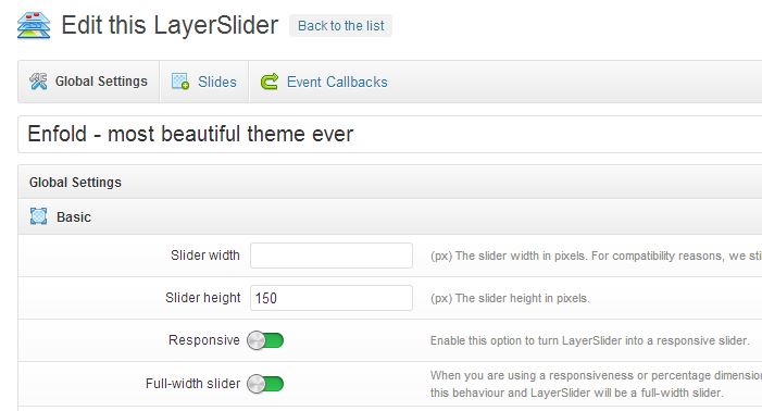
September 10, 2013 at 1:27 pm in reply to: LayerSlider in my Enfold Theme site not displaying on iPad or iPhone. #140338Hi,
Can you please once again make sure that ‘Responsive’ is checked in your slider settings?
Regards,
Yigit
Hi Miguel,
You are currently using version 1.7. Please update Enfold to version 2.1 and WordPress to 3.6
For a quick guide on updating your theme take a look at this video on updating the Enfold theme via FTP:
http://vimeo.com/channels/aviathemes/67209750
After updating Easy slider should work
Regards,
Yigit
Hi Vedran,
Can you please once again make sure that Post Number in Portfolio Grid setting is not set to 9

Regards,
Yigit
Hi,
Can you post a screenshot of the issue you are having? I have tested your site on IE 10 and there seems to be no problem with your logo
Regards,
Yigit
Hi,
Please add following code to Quick CSS in Enfold theme options under Styling
img.avia_image.avia_image_team { float: left; }Regards,
Yigit
September 10, 2013 at 11:49 am in reply to: Need to Move and Maybe Change Social Media Icons in my Header #140374Hi,
Please try adding following code to Quick CSS in Enfold theme options under Styling
#top .sub_menu>ul { top: -36%!important; margin-left: 1px; }Regards,
Yigit
Hi Xavier,
To display big preview picture you should go to Enfold theme options and change blog style to “Single Author, big preview pic” under General Settings

Posts that have the same tags will be displayed in “You might also like” section. You can add tags in post page

Regards,
Yigit
Hi,
Please add following code to Quick CSS that is in Enfold theme options under Styling
@media only screen and (max-width: 1016px) { div.main_menu { display: none!important; } }This will hide menu on screens smaller than 1016px.
Regards,
Yigit
Hi,
As i see Kriesi was tagged in this post but your website gives “Error connecting to database” error. Please contact your hosting company
Regards,
Yigit
Hi,

by adding target=”_blank” as above, you can make it open in a new window
Regards,
Yigit
Hi Matt,
You can add this code to Quick CSS that is in Enfold theme options under Styling
@media only screen and (min-width: 1140px) { .main_menu ul:first-child > li > a { padding: 0 5px!important; } }It will decrease padding to 5px on menu anchor tags on screens smaller than 1140px. Then you can change the switch width of mobile menu. To do so, in your WordPress themes folder, please go to Enfold > Js and open Avia.js file and find following code in line 87
switchWidth = 767;and change it to
switchWidth = 989;Then some CSS codes may be needed, but it would be better if you apply those now then we inspect live on your website
Regards,
Yigit
Hi Rob,
You can solve this issue by switching to mobile menu, let’s say, at 975px.
To do so, in your WordPress directory please go to Enfold > Js and open Avia.js file and find following code in line 87
switchWidth = 767;and change it to 975 or any other desired value
switchWidth = 975;Regards,
Yigit
September 9, 2013 at 3:06 pm in reply to: Remove section background image in mobile / responsive layout #140110Hi Chris,
You are welcome, glad we could help :) Let us know if you have any other questions
Regards,
Yigit
Hi,
You can find Enfold.pot file in Enfold > Lang folder. As i remember you are using Enfold in Chinese without an issue, you only had to increase font size in some sections and that’s all
Regards,
Yigit
Hi,
This is how i see your test page and Polish characters looks fine?

Regards,
Yigit
Hi Revas,
Glad you figured it out :) Let us know if you have any other questions
Regards,
Yigit
September 8, 2013 at 11:20 pm in reply to: Remove section background image in mobile / responsive layout #140107Hi Chris,
Yes actually that’d be great if you could so we can see what exactly it will look like.
Regards,
Yigit
Hi,
In your WordPress directory please go to Enfold > Config-templatebuilder > Avia-shortcodes and open Postslider.php file and find following code in line 321
$output .= "<div class='slide-content'>";and add your code right under it
$output .= " your code here ";But please not that you should use ‘ instead of ” inside your iframe tag so your code should be like height=’20’ and not like height=”20″
On Localhost it did not work for me but Facebook like button for pages worked fine, so i guess you will not have a problem as long as your code is fine :) Feel free to let us know if does not work
Regards,
Yigit
Hi,
Please add following code to Quick CSS that is in Enfold theme options under Styling
@media only screen (max-width: 480px) { .social_header .phone-info span { font-size: 14px!important; } }Until 480px it looks fine so this will switch text and phone numbers font size to 14 when displayed on screens smaller than 480px.
Regards,
Yigit
Hi,
Please add following code to Quick CSS that is in Enfold theme options under Styling
.header_color .main_menu ul:first-child > li > a { color: white!important; }.header_color .main_menu ul:first-child > li.current-menu-item > a, .header_color .main_menu ul:first-child > li.current_page_item > a, .header_color .main_menu ul:first-child > li.active-parent-item > a, #top .header_color .main_menu .menu ul .current-menu-item > a { color: blue!important; }
ul.sub-menu { color: red!important; }
#top .header_color .main_menu .menu ul li>a:hover { color: green; }
#top .main_menu .menu li>a { color: black; }
Active state will be Blue and submenu hover state will be Green.
Regards,
Yigit
September 8, 2013 at 2:59 pm in reply to: Remove section background image in mobile / responsive layout #140102September 8, 2013 at 2:52 pm in reply to: menu font change, size, color, active color, font weight #139968Hi Chris,
Please replace previous CSS code with following one
.header_color .main_menu ul:first-child > li > a { font-family: "freight-sans-pro", sans-serif; font-size: 18px!important; font-weight: 300!important; color: red!important; font-style: normal!important; }.header_color .main_menu ul:first-child > li.current-menu-item > a, .header_color .main_menu ul:first-child > li.current_page_item > a, .header_color .main_menu ul:first-child > li.active-parent-item > a, #top .header_color .main_menu .menu ul .current-menu-item > a { color: pink!important; }
ul.sub-menu { font-family: "freight-sans-pro", sans-serif; font-weight: 300!important; color: red!important; font-style: normal!important; }
#top .main_menu .menu li>a { color: red; font-family: "freight-sans-pro", sans-serif; font-weight: 300!important; font-style: normal!important; }
#top .header_color .main_menu .menu ul li>a:hover { color: green; }
#top #menu-item-search.menu-item-search-dropdown>a { font-family: 'entypo-fontello' !important; }
You just need to change color hex values.
This code will increase padding under social only on screens smaller than 767px
@media only screen and (max-width: 767px) { .responsive #header .social_bookmarks { padding-bottom: 20px!important; } }Regards,
Yigit
-
AuthorPosts