Forum Replies Created
-
AuthorPosts
-
Hi,
Sorry for the late reply, and thanks for the login, so I tested this solution on my localhost, and found that editing the/enfold/config-templatebuilder/avia-shortcodes/section.phponly works when the option “Show in lightbox” is selected.
Otherwise, it seems the command is coming from mediaelementplaye which is a core WordPress script and I couldn’t find where to edit it.Best regards,
MikeHi,
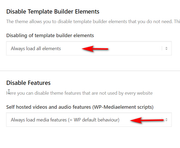
Sorry for the late reply, it looks like you are using JetPack on this site, which as I recall, has a lazy load option, have you tried disabling JetPack and other plugins?
Also try with these options on:
Best regards,
MikeHi,
Sorry for the late reply, when I checked your page I find this error:Failed to load plugin url: /wp-content/plugins/popup-maker/assets/js/mce-buttons.min.js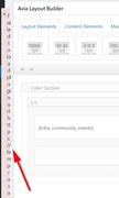
Please try disabling the popup-maker plugin to see if this corrects the error.Best regards,
MikeHi,
Sorry for the late reply, I was able to sftp in but I couldn’t get past your htaccess password, please check.Best regards,
MikeHi,
Glad we were able to help, we will close this now. Thank you for using Enfold.For your information, you can take a look at Enfold documentation here
For any other questions or issues, feel free to start new threads in the Enfold forum and we will gladly try to help you :)Best regards,
MikeDecember 8, 2019 at 6:32 pm in reply to: Google Ads Anzeigen Abgelehnt wegen unerwünschter Software oder MaleWare #1163844Hey jpsmetalldesign,
Thanks for the link, but I’m not sure why you were told this, I scanned your site with VirusTotal and Google’s Safe Browsing, both of which found zero.
Is your homepage the page you submitted, or do you have a different landing page?Best regards,
MikeDecember 8, 2019 at 5:04 pm in reply to: Problem with slider menu overlaying video and preview image under slide on mobil #1163829Hi,
Sorry for the late reply, for your menu on mobile, Please try this code in the General Styling > Quick CSS field or in the WordPress > Customize > Additional CSS field:@media only screen and (max-width: 767px) { .responsive #top .av-main-nav .menu-item-avia-special { top: -40% !important; } }For you video controls , I do see them for about one second on load, but not after that. If this is what you mean, please include an admin login in the Private Content area so we can take a closer look.
Best regards,
MikeHi,
Sorry for the late reply, Please try this code in the General Styling > Quick CSS field or in the WordPress > Customize > Additional CSS field:#top #header_main .main_menu { width: 80% !important; }After applying the css, Please clear your browser cache and check.
Best regards,
MikeHi,
Sorry for the late reply, I issue that I see with your css is there is not enough specificity for the elements on your page to overwrite the theme css, and since this is meant for one page only you need to add the page ID for each of the rules.
Please note thath3.widget-titleshould beh3.widgettitle, also I found no.mega_menu_titleon this page.
This css has the specificity needed, note that I created a new line for each rule so it would be easier for you to read and compare to your original css:#top.page-id-718 #wrap_all #avia-menu.menu, #top.page-id-718 #wrap_all #footer h3.widgettitle, #top.page-id-718 #wrap_all span.avia-menu-text, #top.page-id-718 #wrap_all .main_menu ul:first-child > li > a { font-family:'arial', sans-serif!important; text-transform: uppercase!important; letter-spacing:1px!important; font-weight:normal!important; font-size:15px!important; text-align: center!important; color: red!important; }After applying the css, Please clear your browser cache and check.
Best regards,
MikeDecember 8, 2019 at 3:43 pm in reply to: Video not fully covering color section element until the page is refreshed #1163816Hey originalsource,
Sorry for the late reply and thanks for your screenshots and login, I see your pages look different now than in your screenshots, you don’t that the sidebar menu now, but your color section doesn’t have the gray area now?
What I believe was happening is when “No minimum height, use content within section to define Section height” is used the image is used to define the color section height, the background video is not. If you are still experiencing this please try choosing a Minimum Height for the color section.Best regards,
MikeDecember 8, 2019 at 3:19 pm in reply to: About font upload cannot be deleted and the load button does not work #1163807Hi,
Glad to hear that this solved your original issue, now we are on to new issues.
So for your first one I see that you have 4 categories selected and 5 items will be shown:
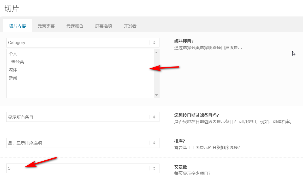
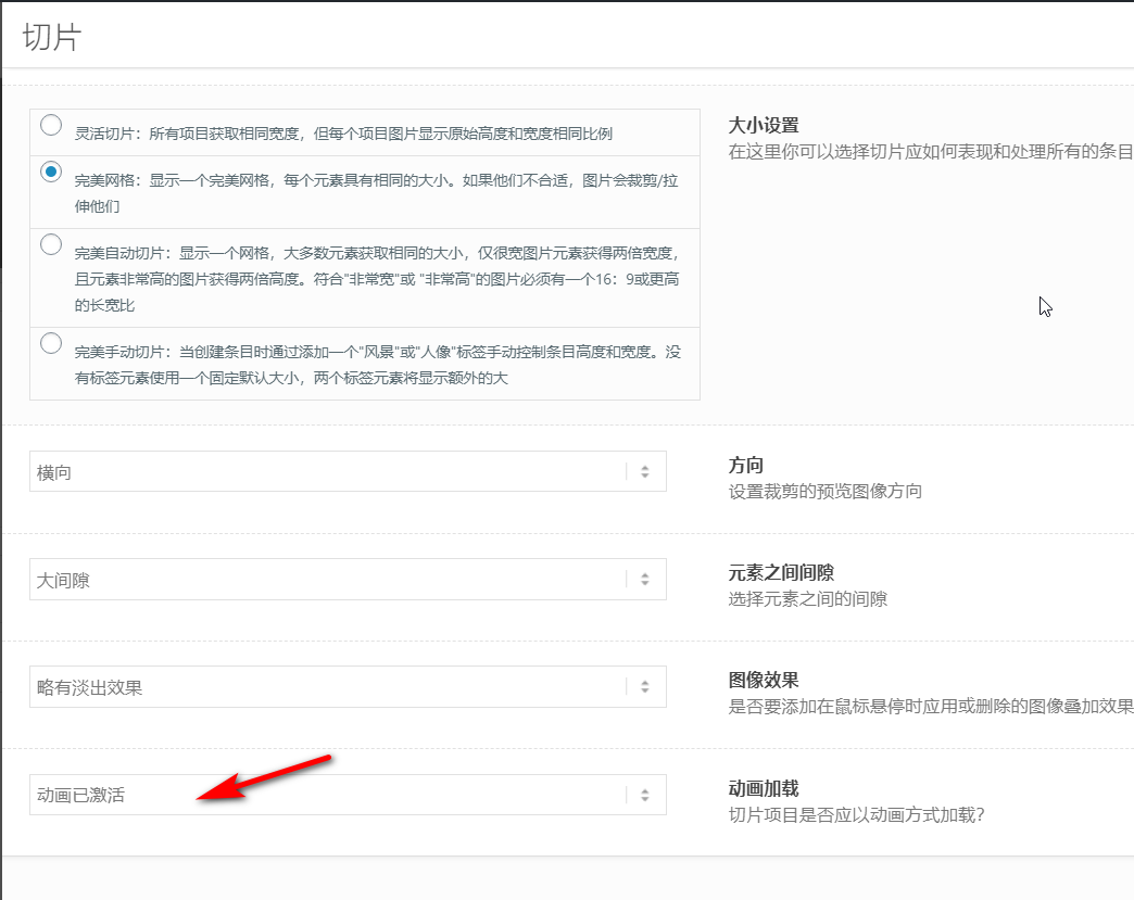
every time I load your page 5 items are shown, so this is working correctly, I don’t know what you mean by “flickering problems”, perhaps you are talking about the animation where the items “fly” into place? But you can choose to disable this:
For the next issue your mobile menu looks correct:
Please try including a screenshot of the issue so we can better understand.
You can upload the image to https://pictr.com/ and post the link in your reply.Best regards,
MikeHi,
To remove the code, you would select it and delete it and then save again. But I believe your question has more to do with that you feel someday in the future you won’t remember what your custom css does, to solve this you can add comments to your css, this is done by adding a backslash and star before and after a comment in your css, like this:
/* this is my comment */you can add this to the start and end of a block of code to help you remember, like this:/* this is the start of my comment */ @media only screen and (max-width: 767px) { #revolutionslider_1 { display:none !important; } } /* this is the end of my comment */Is this what you ment?
Best regards,
MikeHi,
Thanks for the feedback, when I check your site I don’t find the css that is posted above, but I do see that your are using a cache minify, but can’t tell which plugin it is, please clear or disable this plugin, and ensure the css above is in your Quick CSS.
I was not able to login and check because your token login is not working, it probably needs to be reset, please check if you continue to have problems.Best regards,
MikeHi,
Sorry for the late reply and thank you for explaining and the links. So to correct for pages that don’t have the transparent header Please try this code in the General Styling > Quick CSS field or in the WordPress > Customize > Additional CSS field:#top #header:not(.av_header_transparency) #menu-item-search a { color: #000!important; }Best regards,
MikeHi,
Sorry for the late reply, I took a look at your video and found that your video code has errors, for example, it has misplaced quotes:
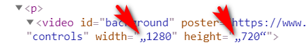
and of the 3 file types for your videos the “webm” link is broken
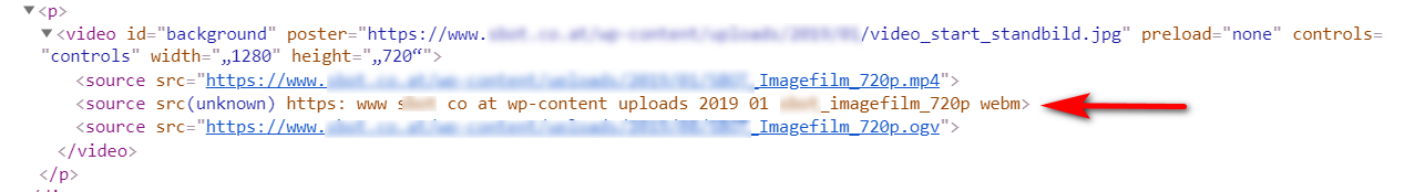
and your mp4 is not playing as a video file, it is playing as an audio file, please see the link in the Private Content area.
So this only leaves one video file that works “ogv” but not all browsers will play this type of file.
I recommend fixing your “webm” link and fixing your “mp4” file.Best regards,
MikeDecember 8, 2019 at 12:55 pm in reply to: Fullscreen Slider Video Playing at Low Resolution #1163755Hey npmcgrew,
Sorry for the late reply and thanks for the login, so after some researching and testing on my localhost and on yours, I found that the 4k playback is partly based on user options and on the user’s internet speed.
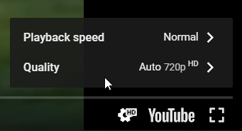
For example, on YouTube when I watched your video it was shown to me at HD

until I selected to view it at 4k
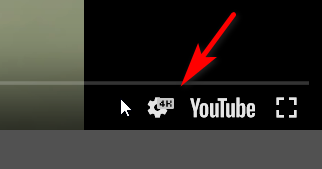
then after I enabled the “Video Controls” in the slider on your page, it showed as 4k, but when I viewed your page in incognito mode the video showed as HD again
So I tried to find an API to force the video to play at 4k, but found that this option has been removed by YouTube:The option has been removed and no longer available on YouTube. YouTube now automatically select the best resolution for YouTube video based on Internet connection speed that it detected, with option to change the video quality during playback.
So, unfortunately, I don’t believe you can force 4k to be shown. Perhaps a different service such as Vimeo will, but I didn’t research this. I also saw a mention that Safari won’t play YouTube’s 4k videos due to some bug, but I couldn’t verify if this is true.
Best regards,
MikeDecember 7, 2019 at 2:41 pm in reply to: About font upload cannot be deleted and the load button does not work #1163573Hi,
Thank you for the login, I believe this is due to your MemcacheD cache on your server, this type of cache has to be cleared from your cPanel or via a command line, disabling the plugin will not clear it.
I recommend clearing it from your cPanel and then disable it on your server and also disable the plugin until your site is completely done. I also recommend disabling your Enfold Theme Options > Performance > JS & CSS file merging and compression until your site is done.Best regards,
MikeHi,
Thank you for the login, I took a look and your background-image and found that your site was using a 200×300 thumbnail instead of the full image so I corrected this and added this css into your Quick CSS:html.html_boxed { background-size: cover !important; }I also tried correcting your logo background-image, please clear your browser cache and check.
Best regards,
MikeDecember 7, 2019 at 12:00 pm in reply to: Latest update broken the Styling and will not save any changes #1163562Hi,
Your customjs.js is returningFailed to load resource: the server responded with a status of 403 (Forbidden)which seems to lead toFailed to load resource: the server responded with a status of 500 (Internal Server Error)
Please check your file permissions, also please ask your web host to review your server log for the cause of your 500 error.Best regards,
MikeHi,
Thank you for replacing the file, it is now working for me Mac Mojave Safari, please try clearing your browser cache again.
The javascript files can be stubborn, but I now see the consent bar & the layerslider.Best regards,
MikeDecember 6, 2019 at 2:37 pm in reply to: Latest update broken the Styling and will not save any changes #1163387Hi,
Thanks for the feedback, so is all of the css correct now? This seems to now be a different topic. Please explain how you updated, via ftp, did you overwrite the theme folder?The easiest and safest way to update is to download the newest version from Theme Forest and rename your current theme folder to “enfold-old” via ftp then upload the new “enfold” folder and check that your site is working correctly.
Once you are happy you can delete the “enfold-old” folder via ftp, (not the WP theme page)
Should for some reason you wish to roll-back to the old version, it’s easy to do, simply rename the new “enfold” folder to “enfold-new” via ftp and then rename “enfold-old” to “enfold” then refresh your page.
Please don’t try to overwrite the theme folder, as this will leave old files behind and cause errors.Best regards,
MikeHey Michael,
Sorry for the late reply, I assume we are talking about the site in the Private Content area?
So I see that after I accept the cookie from the cookie bar the “DESTINATIONSFILM” & the “FILM FÖR SOCIALA MEDIER” both autoplay in the lightbox. But the others no not. It seems that all of the videos are from Vimeo, do all of the embed links have the same settings on Vimeo? Please include an admin login in the Private Content area so we can check further. It is odd that only two work.Best regards,
MikeHi,
Glad to hear this is now working.
For the next issue I added this css:#top.home #av_section_7 > div > main > div > div > section > div { position: relative; z-index: 100 !important; } #top.home #av_section_8 { position: relative; z-index: 0 !important; }Please clear your browser cache and check.
Best regards,
MikeHey Kathy,
Sorry for the late reply, and thanks for the screenshot.
I do see your second screenshot, of how your site is now, but the link to the screenshot of how you would like it is not working, please check and post again so we can understand better.
Also, the login doesn’t seem to be correct, please check.Best regards,
MikeHi,
Thank you for the feedback, I logged in to your site but didn’t find the css in the Quick CSS, so I added it and cleared my browser cache, and now on mobile I see this:

Please clear your browser cache and check.Best regards,
MikeHey FayeMcC,
Sorry for the late reply and thanks for the example link.
I believe you are looking at this one:
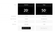
Please try Enabling the Avia Layout Builder Debugger and then pasting in this shortcode in a new page:[av_table purpose='pricing' caption='' av_uid='av-46vmngy'] [av_row row_style='avia-heading-row' av_uid='av-45s5m2a'][av_cell col_style='avia-desc-col' av_uid='av-43cwysi']Plan[/av_cell][av_cell col_style='' av_uid='av-42aq0c2']Business[/av_cell][av_cell col_style='' av_uid='av-41352uq']Mega[/av_cell][/av_row] [av_row row_style='avia-pricing-row' av_uid='av-3yqto5u'][av_cell col_style='avia-desc-col' av_uid='av-3xek25e'][/av_cell][av_cell col_style='' av_uid='av-3vnbtpe']20$ <small>per month</small>[/av_cell][av_cell col_style='' av_uid='av-3uktq0i']50$ <small>per month</small>[/av_cell][/av_row] [av_row row_style='' av_uid='av-3s6wnpe'][av_cell col_style='avia-desc-col' av_uid='av-3qrslf6']Bandwidth[/av_cell][av_cell col_style='' av_uid='av-3pe4ef6']10 GB[/av_cell][av_cell col_style='' av_uid='av-3n7ojgy']Unlimited[/av_cell][/av_row] [av_row row_style='' av_uid='av-3lmbn1u'][av_cell col_style='avia-desc-col' av_uid='av-3jw4p76']Max File Size[/av_cell][av_cell col_style='' av_uid='av-3iz8pqq']50 MB[/av_cell][av_cell col_style='' av_uid='av-3hg3bz6']No Maximum[/av_cell][/av_row] [av_row row_style='' av_uid='av-3fo0nuq'][av_cell col_style='avia-desc-col' av_uid='av-3divj02']CPU[/av_cell][av_cell col_style='' av_uid='av-3cmw4du']3 GHZ[/av_cell][av_cell col_style='' av_uid='av-3am13de']5 GHZ[/av_cell][/av_row] [av_row row_style='' av_uid='av-386d89e'][av_cell col_style='avia-desc-col' av_uid='av-36r53de']Memory[/av_cell][av_cell col_style='' av_uid='av-35ggx9e']1024 MB[/av_cell][av_cell col_style='' av_uid='av-33k159u']4 GB[/av_cell][/av_row] [av_row row_style='avia-button-row' av_uid='av-32b228i'][av_cell col_style='avia-desc-col' av_uid='av-305sus2'][/av_cell][av_cell col_style='' av_uid='av-2yfxx0y'][av_button label='Get Business Plan' link='manually,http://' link_target='' color='theme-color' custom_bg='#444444' custom_font='#ffffff' size='medium' position='center' icon_select='yes' icon='29' av_uid='av-2x7x4k2'] [/av_cell][av_cell col_style='' av_uid='av-2vwhy82'][av_button label='Get Mega Plan' link='manually,http://' link_target='' color='theme-color-subtle' custom_bg='#444444' custom_font='#ffffff' size='medium' position='center' icon_select='yes' icon='44' av_uid='av-2t9lvtu'] [/av_cell][/av_row] [/av_table]
This should give you the example table which you can examine the settings or adjust to suit your needs, and then paste into your page.Best regards,
MikeHey mynick,
Sorry for the late reply and thanks for the screenshot.
Please try this code in the General Styling > Quick CSS field or in the WordPress > Customize > Additional CSS field:@media only screen and (max-width: 423px) { #top.home #av_section_7 > div > main > div > div > div > div { padding: 10px !important; } }After applying the css, Please clear your browser cache and check.
Best regards,
MikeHi,
Thank you for sharing your solution. Shall we close this thread then?Best regards,
MikeHi,
Good news, apparently we have a fix for this already, I guess I had searched our GitHub with different keywords.
So this will be in the next update, but for now please try replacing:/enfold/js/avia-snippet-cookieconsent.js
with this file.
Please keep a backup copy of the old file, just in case.Best regards,
Mike -
AuthorPosts