Forum Replies Created
-
AuthorPosts
-
Hi,
Sorry for the late reply and thanks for the video, I believe what you are asking is to have the header disappear on scroll down and then show on scrolling up like Rolex.com – correct?
We don’t have a built-in way to do this but this script has worked for others:
Try adding this code to the end of your functions.php file in Appearance > Editor:function show_header_scroll_down(){ ?> <script> ( function( $ ) { 'use strict'; var $window = $( window ); var lastScrollTop = 0; var $header = $( '#header_main' ); var headerBottom = $header.position().top + $header.outerHeight( true ); $window.scroll( function() { var windowTop = $window.scrollTop(); // Add custom sticky class if ( windowTop >= headerBottom ) { $header.addClass( 'myprefix-maybe-sticky' ); } else { $header.removeClass( 'myprefix-maybe-sticky' ); $header.removeClass( 'myprefix-show' ); } // Show/hide if ( $header.hasClass( 'myprefix-maybe-sticky' ) ) { if ( windowTop <= headerBottom || windowTop < lastScrollTop ) { $header.addClass( 'myprefix-show' ); } else { $header.removeClass( 'myprefix-show' ); } } lastScrollTop = windowTop; } ); } ( jQuery ) ); </script> <?php } add_action('wp_footer', 'show_header_scroll_down');then add this code in the General Styling > Quick CSS field or in the WordPress > Customize > Additional CSS field:
.myprefix-maybe-sticky {
		    position: fixed !important;
		    top: -100px;
		    width: 100%;
		    z-index: 999;
		    opacity: 0;
		    background: #fff;
		    transition: 0.3s all;
		    box-shadow: 0 2px 3px rgba(0,0,0,0.15);
		}

		.myprefix-show {
		    top: 0;
		    opacity: 1;
		}
Please see the video in the Private Content area.
If this doesn’t work for you it’s probably because you have a gtag script errorUncaught SyntaxError: Invalid or unexpected tokenplease include an admin login so we can adjust.Best regards,
MikeHi,
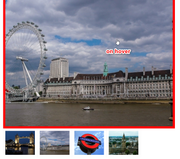
Sorry for the late reply, looking at your gallery in the middle of your homepage with the “london eye” I believe what you would like to do is have the gallery image’s white border turn the red on hover. So please remove this css:#top div .avia-gallery { background-color: red; }and try this instead:
#top.home div .avia-gallery .avia-gallery-big:hover {
    background-color: red;
}
#top.home .avia-gallery .avia-gallery-thumb a img:hover{
	background-color: red;
}
Expected results, large image on hover:
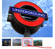
small image on hover:
Is this what you had in mind?Best regards,
MikeHi,
Thanks for the link, but your site seems to be down right now, please check.Best regards,
MikeHi,
To remove your empty menu area on your homepage we can hide the ID and adjust the height with this css:#top.home #header_main_alternate { display: none !important; } .html_header_top.html_header_topbar_active.html_header_sticky.html_large.html_bottom_nav_header #top.home #main { padding-top: 158px !important; }To change the image of “nordic” on hover, please try this css:
#top.home .flex_column.av_one_half.nordic:hover {
  background: url(https://[see-below]/wp-content/uploads/2014/12/f-G-Nepal-blue-diamond.jpg) !important;
  background-repeat: no-repeat !important;
  background-size: cover !important;
  background-position: 50% 50% !important;
}
please change the domain “[see-below]” in the css above with the domain in the Private Content area, or use your own image url.
Best regards,
MikeHi,
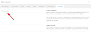
Thank you for the screenshots, I first looked at one of your pages that was meant to have two columns but only showed one full-width, link in the Private Content area. Your columns are created by a grid row, but your grid row only has one cell which should never be.

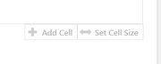
when I tried to adjust the size of the cells I got this error:

so I added another row using the option at the bottom of the grid row:
and then I was able to adjust the size of the cells to ensure there are two cells:
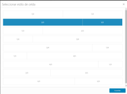
Now your page has two columns, and you can add something to the right side cell.
I assume that you are using “templates” to create your pages and one of them with the grid rows are corrupt
I also see that you have the WPBakery Page Builder plugin activate, this can cause errors and I recommend disabling the plugin.Best regards,
MikeHi,
Thank you for the feedback, I’m not able to login to investigate at the normal login url: /wp-admin/ I just get a blank screen.
Is your login different or are you blocking some countries?Best regards,
MikeHi,
Thank you for the feedback, so it looks like those two lines of code were for the desktop menu, on mobile they are making the menu items very large. So I have added#avia-menuto the code so it will show for desktop and not for mobile.#top #header_main > .container .main_menu ul#avia-menu:first-child > li > a { line-height: 155px !important; } #top .header-scrolled #header_main > .container .main_menu ul#avia-menu:first-child > li > a { line-height: 60px !important; }It is activate now, please clear your browser cache and check.
Best regards,
MikeHi,
Thanks for the test page, Please try this code in the General Styling > Quick CSS field or in the WordPress > Customize > Additional CSS field:#top.page-id-1038 #layer_slider_1 { z-index: 0; } #top.page-id-1038 #after_layer_slider_1 > div > div > div > div > div { z-index: 99; position: relative; }After applying the css, Please clear your browser cache and check.
Best regards,
MikeHi,
Is this going to be for a language plugin, often they have language flags, which one are you using?
If not where will they be linking to?Best regards,
MikeHi,
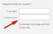
Thank you for your feedback, so for the 4 images on your home page that are also links you can add this css to make them white on hover, I usedrgba(255, 255, 255, .8)so it’s 80% white, but you can change the last number to make it more or less white.
Please try this code in the General Styling > Quick CSS field or in the WordPress > Customize > Additional CSS field:#top.home .flex_column.av_one_half.avia-link-column-hover:hover:before { content:""; display: block; height: 100%; position: absolute; visibility: visible !important; top: 0; left: 0; width: 100%; background-color: rgba(255, 255, 255, .8)!important; }After applying the css, Please clear your browser cache and check.
The reason your floating button’s z-index is not on top of all of your elements is because of the stacking order of the page, that is since your button is at the top of the page elements later are still stacked on top. To correct please move your button down to above the footer, your css will still place it in it’s fixed position and it will be on top of the elements.
I tested this with jQuery and it works, if you want to try the jQuery I tested with then add this code to the end of your functions.php file in Appearance > Editor:function custom_script(){ ?> <script> (function($) { $(document).ready(function(){ $('.avia-button-wrap.avia-button-right.floating').detach().insertBefore('#footer'); }); })(jQuery); </script> <?php } add_action('wp_footer', 'custom_script');you will need to keep your button css in place.
Best regards,
MikeHi,
Sorry for the late reply, you can limit the effect to only one or some of your columns, to do this you will need to add a custom class to the one you want it to work on. I tried searching your pages but didn’t find the custom class “three_columns”
If you can include admin login in the Private Content area and tell us which one you want the effect for we can assist and explain what we did should you want to do it again in the future.Best regards,
MikeHi,
Glad that Nikko could help you out, we will close this now. Thank you for using Enfold.For your information, you can take a look at Enfold documentation here
For any other questions or issues, feel free to start new threads in the Enfold forum and we will gladly try to help you :)Best regards,
MikeHi,
Glad to hear Guenni could help, we will close this now. Thank you for using Enfold.For your information, you can take a look at Enfold documentation here
For any other questions or issues, feel free to start new threads in the Enfold forum and we will gladly try to help you :)Best regards,
MikeHi,
Sorry for the late reply, Please try this code in the General Styling > Quick CSS field or in the WordPress > Customize > Additional CSS field:#top.page-id-2412 span.mejs-time-total.mejs-time-slider { display: none !important; }After applying the css, Please clear your browser cache and check.
Best regards,
MikeHi,
Glad we were able to help, we will close this now. Thank you for using Enfold.For your information, you can take a look at Enfold documentation here
For any other questions or issues, feel free to start new threads in the Enfold forum and we will gladly try to help you :)Best regards,
MikeHey chefstevendellima,
Thank you for the login, are you trying to install the
Enfold Classic Restaurant Demo
or
Enfold One Page Restaurant Demo?
Are you going to be using woocommerce? if so this should be installed first.
Which Webhost are you using and is it a “managed wordpress” host?
I ask because these typically have more restrictions.
please ask your webhost to check the PHP settings to see if the secure options are activated.
If “allow_url_fopen, “allow_url_include” and “register_globals” are “off” ask to have these “on” and temporarily disable modsec so the demo files can be imported from our .at domain.
Before we import the demo again we will have to reset your site, so any content you now have will be lost.
Please also include FTP access so if the server continues block the import we can manually upload the images.Best regards,
MikeHi,
We can assist with css to remove the “UID” of each cell for mobile, but we are going to need to see the table. Please link to the page.Best regards,
MikeHey Dundee,
Thanks for the links, so on your ski page I see you have a full width slider, then 3 smaller images, then a full width gray text block.
So I make the 3 image section have a max-width 80% with margin auto to center them. In between the images and the slider was a white area so I hide it to look better, but feel free to adjust to suit.
Please try this code in the General Styling > Quick CSS field or in the WordPress > Customize > Additional CSS field:#homepage-section-overlay { max-width: 80%; margin: auto; } #after_full_slider_1 { display: none; }After applying the css, Please clear your browser cache and check.
Please see the screenshot in Private Content area of the Expected results.Best regards,
MikeHey Charlotte,
Please try this code in the General Styling > Quick CSS field or in the WordPress > Customize > Additional CSS field:.avia-menu.av-main-nav-wrap.av_menu_icon_beside { padding-right: 0 !important; margin-right: 0 !important; } .social_bookmarks.icon_count_2:after { content: url(https://img.icons8.com/officexs/16/000000/great-britain.png) url(https://img.icons8.com/officexs/16/000000/switzerland.png); }Best regards,
MikeHi,
Thank you for the link and screenshots, I see that you are using the grid row and the images are backgrounds of the cells, so what you need to do is add a “white space” element to the cells with enough padding to force the height you wish for mobile. Right now the cells think they are empty so they are collapsing down.Best regards,
MikeHey John,
You can move elements up and over the layerslider with “top” & “z-index”.

Thanks for the test page, I see that it is a easy slider, do you have an example with the layerslider?Best regards,
MikeHey marcoabis81,
Sorry for the late reply, which kind of gallery are you going to be using?
The default WordPress gallery
Gallery with Preview
Small Thumb Gallery
Bigger Gallery were additional images are available via lightbox
or the horizontal gallery
you can see most of them here.
1: With the default WordPress gallery adding a background-color will show as thin lines between the images, but the other galleries have a white border around each image so this doesn’t work, but it does change the hover overlay color because opacity is used.
This is an example css:#top div .avia-gallery { background-color: red;2: adding radius to the gallery would be different for each one, but here is an example:
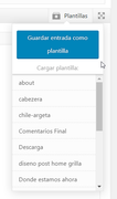
#top div .avia-gallery {
    border-radius: 20px;
3: when you add images to your gallery you will see this option:
4: Typically the related posts at the bottom of a post are added automatically so to add anything under it could be done with jQuery, we would have to see the page to be able to assist with this.I know this answers are a little vague, but there are many different possibles here depending on which gallery you use, once you start putting together your page we can assist further when we can see it.
Best regards,
MikeHey Carsten,
Sorry for the late reply, I have looked at your site on mobile but I don’t see that your header is disappearing on scroll up, I only see it return to the transparent state. Which browser are you seeing this on?
I also looked at your css above, but don’t see anything that might cause this.
Do you have the ability to make a screencast of the error and post the link to it in the Private Content area?Best regards,
MikeMarch 1, 2020 at 6:43 pm in reply to: Blog Posts – pagination (stay in the same element when go to next page) #1189240Hey cukrmi,
Sorry for the late reply, the only way I could find to change this is to append your section ID to the pagination links with jQuery.
Try adding this code to the end of your functions.php file in Appearance > Editor:function custom_pagination_script(){ ?> <script> (function($){ $(document).ready(function(){ $(".pagination-wrap.pagination-slider nav.pagination a").each(function() { var $this = $(this); var _href = $this.attr("href"); $this.attr("href", _href + '#novinky'); }); }); })(jQuery); </script> <?php } add_action('wp_footer', 'custom_pagination_script');also please ensure that this theme setting is disabled: Enfold Theme Options > Performance > Load jQuery in your footer
Best regards,
MikeHi,
Sorry we were not more helpful, we will close this as requested. Thank you for using Enfold.For your information, you can take a look at Enfold documentation here
For any other questions or issues, feel free to start new threads in the Enfold forum and we will gladly try to help you :)Best regards,
MikeHi,
To add a screenshot please try using https://postimages.org/ and pasting the image URL in your post.
Or you can upload screenshots and videos to DropBox and post the urls in the Private Content area.Best regards,
MikeHi,
Glad we were able to help, we will close this now. Thank you for using Enfold.For your information, you can take a look at Enfold documentation here
For any other questions or issues, feel free to start new threads in the Enfold forum and we will gladly try to help you :)Best regards,
MikeHi,
Thank you for the login, in order to make the left column sticky and retain it’s width and position and a fluid feel I recommend using jQuery. So the first step is to add a custom ID to your left column so we are only targeting this one, in the future if to create another page like this with the sticky column on the left and the distance from the top of 330px, you can use the same ID to also target it.
then we will add this code to the end of your functions.php file in Appearance > Editor:function sticky_column(){ ?> <script> (function ($) { $(window).scroll(function (e) { var $sticky = $('#sticky-column'); var width = $(window).width() var position = ($sticky.css('position') == 'fixed'); if ($(this).scrollTop() > 100 && width >= 767 && !position) { $sticky.css({ 'position': 'fixed', 'top': '330px', 'width': $sticky.innerWidth() }); $sticky.next().css('float', 'right'); $sticky.addClass('fixed_element_style'); } if ($(this).scrollTop() < 100 && position) { $sticky.css({ 'position': 'static', 'top': '0px', 'width': '' }); $sticky.next().css('float', 'left'); $sticky.removeClass('fixed_element_style'); } }); })(jQuery); </script> <?php } add_action('wp_footer', 'sticky_column');Then in your theme settings this option needs to be unchecked: Enfold Theme Options > Performance > Load jQuery in your footer
Now you will see the column is sticky, you may need to clear your browser cache.
The only issue is that you are not using a Child Theme so on your next update this customization will be lost. Please consider reading about child themes and using one.Best regards,
MikeHi,
Sorry for the late reply, I have taken a look at your pages and it looks like /monova2/ is correct now, but your screenshot to the other site is not but we don’t have a link to it, only a screenshot.
Please include a link to the other site.Best regards,
MikeHey polilili,
Please try this code in the General Styling > Quick CSS field or in the WordPress > Customize > Additional CSS field:#main .entry-content .wp-block-button__link { background-color: #b90239; color: #fff; }this will make your button background color magenta and the text white, feel free to adjust to suit.
After applying the css, Please clear your browser cache and check.Best regards,
Mike -
AuthorPosts