Forum Replies Created
-
AuthorPosts
-
negative margin works – padding I do not believe.
Unfortunately, I can not see your private content as a participant, otherwise my comment would certainly be more constructive.you see it is in that one line starting with:
$('.av-burger-overlay')that part:
<video autoplay="" loop="" class="video_bg" style="width: 1920px; height: 1080px;"><source src="/wp-content/uploads/Blurred-Crowd-of-People-Walking_SD_DOWNLOAD.mp4"><img src="/wp-content/uploads/video-preview.jpg" alt="background"></video>my insertion on that test-page is only with mp4
but if you enter that like this :
<video autoplay="" loop="" class="video_style" style="width: 2226px; height: 1252px; top: 0px; left: -248px;">
<source src="https://milano.beantown.website/wp-content/uploads/menu.m4v" type="video/mp4">
<source src="https://milano.beantown.website/wp-content/uploads/menu.webm" type="video/webm">
<source src="https://milano.beantown.website/wp-content/uploads/menu.ogv" type="video/ogv">
<img src="https://milano.beantown.website/wp-content/uploads/menu.jpg" alt="background">
</video>
it will not work – the line breaks do hamper the insertion – so i mentioned that it has to be a one-liner
<video autoplay="" loop="" class="video_style" style="width: 2226px; height: 1252px; top: 0px; left: -248px;"><source src="https://milano.beantown.website/wp-content/uploads/menu.m4v" type="video/mp4"><source src="https://milano.beantown.website/wp-content/uploads/menu.webm" type="video/webm"><source src="https://milano.beantown.website/wp-content/uploads/menu.ogv" type="video/ogv"><img src="https://milano.beantown.website/wp-content/uploads/menu.jpg" alt="background"></video>:
function add_video_to_hamburger_background() { ?> <script type="text/javascript"> (function($){ $('#header').one('click', '.av-main-nav-wrap' , function() { setTimeout( function() { $('.av-burger-overlay').append('<div class="video_burger_bg"><video autoplay="" loop="" class="video_style" style="width: 2226px; height: 1252px; top: 0px; left: -248px;"><source src="https://milano.beantown.website/wp-content/uploads/menu.m4v" type="video/mp4"><source src="https://milano.beantown.website/wp-content/uploads/menu.webm" type="video/webm"><source src="https://milano.beantown.website/wp-content/uploads/menu.ogv" type="video/ogv"><img src="https://milano.beantown.website/wp-content/uploads/menu.jpg" alt="background"></video></div>'); },300); }); })(jQuery); </script> <?php } add_action('wp_footer', 'add_video_to_hamburger_background');Perhaps we should rule out the other sources of error before blaming everything on the theme first.
Which WordPress (6.2.2) version is running and which php version is selected at your provider for the corresponding domain?
The WordPress 6.2 definitly needs newer php versions to run properly.@jonroot : this is possible if you have disabled this option for security reasons. This can be done via ftp and an entry in the wp-config.php.
Caution : please backup that file first, so that accidental changes don’t wreck the whole thing for you.
have a look to that file and set this to false or delete that entry.define('DISALLOW_FILE_EDIT', true);Some security Plugins can switch off that Option too. Maybe that is the reason you can’t find it
on default settings it will look this way:
you see on your example page they are working with self hosted html5 videos. You could insert them on enfold burger overlay via script.
you had to be sure that the html insertion is on one line :
( a line-break inside that append – will break the script )
<video autoplay="" loop="" class="video_style" style="width: 1636px; height: 920px; top: 0px; left: -72.5px;"><source src="https://milano.beantown.website/wp-content/uploads/menu.m4v" type="video/mp4"><source src="https://milano.beantown.website/wp-content/uploads/menu.webm" type="video/webm"><source src="https://milano.beantown.website/wp-content/uploads/menu.ogv" type="video/ogv"><img src="https://milano.beantown.website/wp-content/uploads/menu.jpg" alt="background"></video>i just did it here: https://enfold.webers-webdesign.de/
only with mp4 video :
function add_video_to_hamburger_background() {
?>
<script type="text/javascript">
(function($){
	$('#header').one('click', '.av-main-nav-wrap' , function() {
		setTimeout( function() {
			$('.av-burger-overlay').append('<div class="video_burger_bg"><video autoplay="" loop="" class="video_bg" style="width: 1920px; height: 1080px;"><source src="/wp-content/uploads/Blurred-Crowd-of-People-Walking_SD_DOWNLOAD.mp4"><img src="/wp-content/uploads/video-preview.jpg" alt="background"></video></div>');
		},300);
	});
})(jQuery);
</script>
<?php
}
add_action('wp_footer', 'add_video_to_hamburger_background');
But one thing to mention Does it all the time loop. so maybe it is best to enter a play/pause routine f.e. on clicking to a link inside the hamburger or the av-main-nav-wrap burger icon.
#top .video_bg { position: fixed; left: 0; top: 0; right: 0; bottom: 0; min-width: 100%; min-height: 100%; background-color: #000; } #top .av-burger-overlay-bg { opacity: 0.8; }Yes – it is only on older IOS devices
You have found it already! Havn’t you?
I can see no hover bg color for those list itemsAnd you do not understand how plugins work:
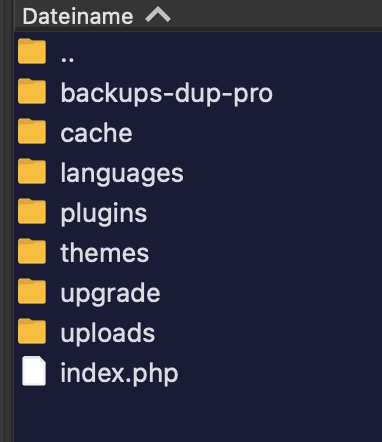
The plugins folder is outside the themes folder – there is no parent plugin nor a child plugin folder – just a pure plugin folder:
Maybe a Mod knows better to help you out of this.
April 14, 2023 at 11:15 pm in reply to: White Screen of Death – when activating Enfold theme #1404495i’m too at allInkl and have on all of my projects PHP Version 8.1.16 without any problem.
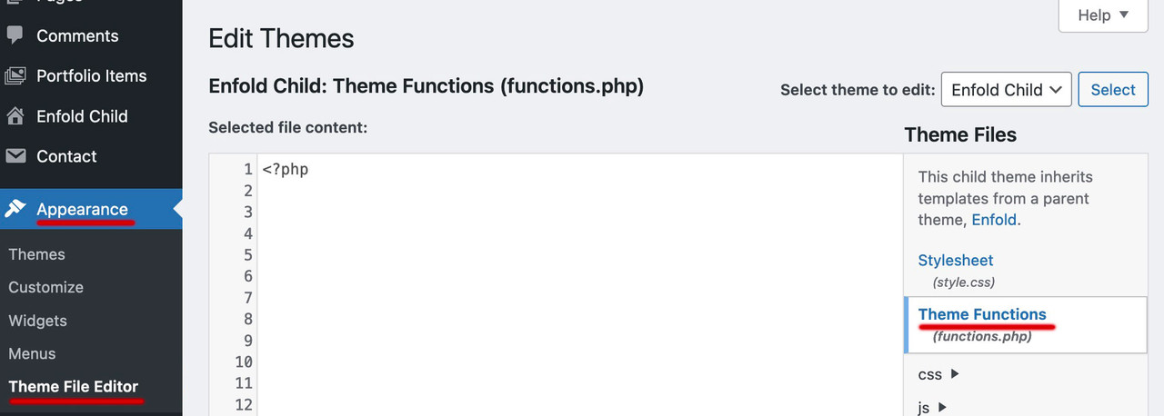
Sometimes on important installations i do have these entries in my wp-config.php ( it is a different way to set up these values ):define( 'WP_MAX_MEMORY_LIMIT', '256M' ); define( 'WP_MEMORY_LIMIT', '128M' );Dashboard – Appearance – Theme File editor : on the right side you had to click the file you like to edit.
But: be careful – do not erase the first line of that file (<?php)there are no child-theme plugins – there are only plugins.
f.e. – if i have contact form 7 plugin installed – it will be there on enfold parent theme – and it will be there on the child. No extra loading needed.
Plugins are loaded by wordpress – not by there themes. You can easily check this – because changing the theme to 2020, for example, does not change the activations of the plugins – all those that were active before remain so.
There may be plugins that are written specifically for Enfold (I can’t think of any right now) – but even there the above applies.
What plugin do you like to work with? What changings do you have made?_______
Maybe you just don’t see the change because you have caching tools running or Enfold’s file merging is active. In this case you should refresh the files: Enfold – Performance – “Delete Old CSS And JS Files?
and this edited file was created outside of wordpress? Then look where the original is located – and upload it via ftp.
I think you have a little misunderstanding about how a child theme works. A child theme uses all the parent theme elements as long as no files of its own are explicitly added. Plugins are no exception, they are added to WordPress and made available to the themes. The child is then allowed to be the one who benefits from the whole thing.
no difference to editing if you only have your parent theme activated.
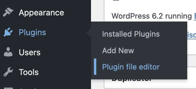
just choose on top right your desired plugin you had to edit. “Select plugin to edit:”have a look to the docu:
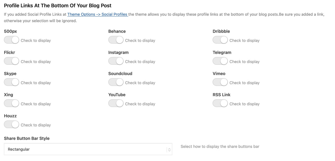
https://kriesi.at/documentation/enfold/social-share-buttons/#how-to-add-custom-social-icons-to-enfold-optionsi do often prefer the option a little bit under the snippet: “Using images or non-Fontello icons” – so you can have multicolored icons
this to child-theme functions.php:
function avia_add_houzz_social_icon($icons) {
$icons['Houzz'] = 'houzz';
return $icons;
}
add_filter('avf_social_icons_options','avia_add_houzz_social_icon', 10, 1);
and f.e. something like this to your quick css:
#top #wrap_all .av-social-link-houzz a:before{
    content: "";
    width: 20px;
    height: 20px;
    display: inline-block;
    vertical-align: middle;
    background: url(url-to-your-houzz.png) no-repeat center center;
    background-size: contain;
}
you find the new entry on the end of the drop-down list.
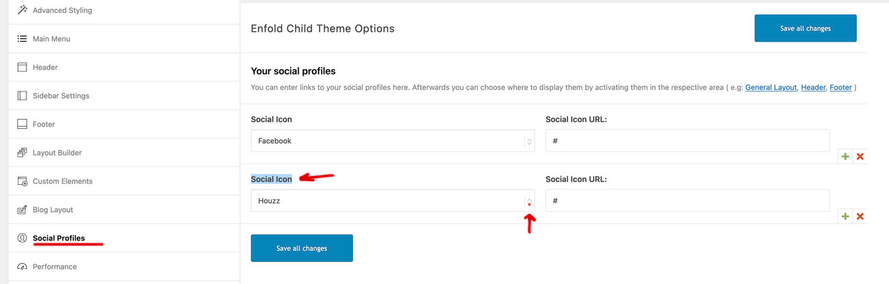
and on blog-layout options you will see too that new social option
by the way : now after an enfold option offers a solution you can kill that post here – or close it
I do have this on an older Ipad 3 with IOS 12.5.7
i try to simulate this on desktop Safari by using Developer Tools and an own user-agent-string.
guess that is the only way to inspect what might cause the issue.maybe you style it this way: one color-section to 100% height. Page Template as : Template Blank – no header no footer
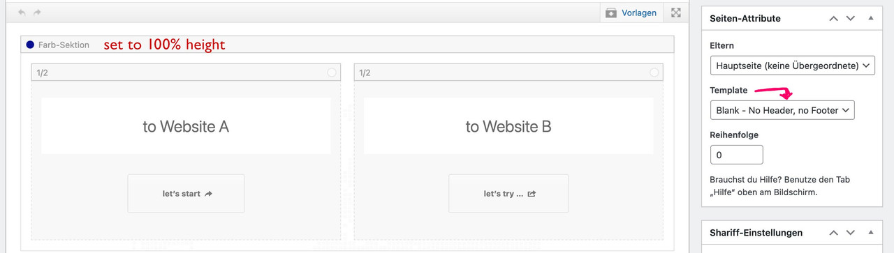
see: https://enfold.webers-webdesign.de/website-switch/
you can have that page as landing page – but for your menu set the home button as you like and change logo link to Website A link
add_filter('avf_logo_link','av_change_logo_link'); function av_change_logo_link($link){ $link = "https://website-A-Domain-link"; return $link; }Just look at the slider images :
totatl Page-size: 3,5Mb
the four images on top list – got 2mb …
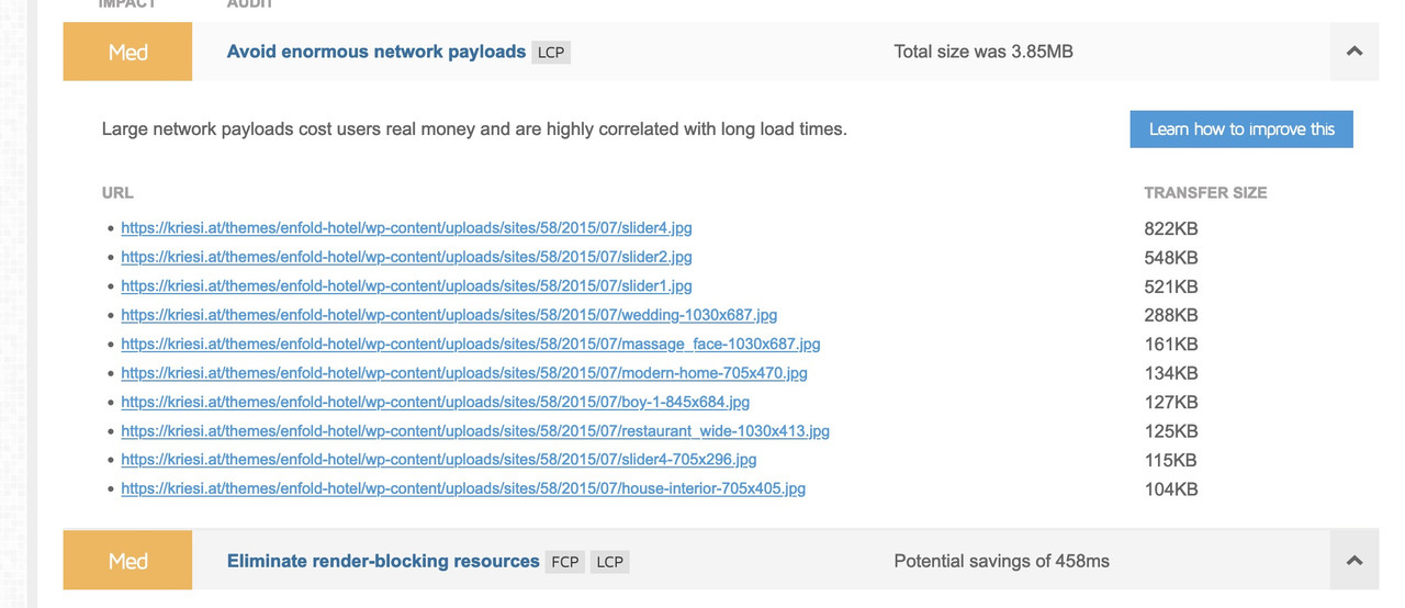
They do not take care of this for the demo – even a nice sharpness – and 1500px width should not have more than 250kb
But keep in mind that by default Enfold recalculates the images in different sizes when uploading; these images are then saved without compression, which can lead to these images having more file size than the original uploaded image.
Therefore I mostly use this snippet in the child-theme functions.php:add_filter("avf_jpeg_quality", "avf_set_quality_mod", 9999, 1); add_filter("avf_wp_editor_set_quality", "avf_set_quality_mod", 9999, 1); function avf_set_quality_mod($quality) { $quality = 55; return $quality;}set to 55% compression level – that amount depends on your average image needs.
a comparison between the original images ( just one from enfold – the other one is with higher compression level in photoshop
https://enfold.webers-webdesign.de/image-comparison/do not use these filters for that – just load your svg logo by enfold options dialog.
All newer Enfold will suport the inline svg logo now. And on transparency the sameSee comment on bottom right “Since 4.8.6.4 … )
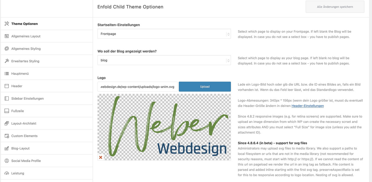
These filters can be used to show on specific pages a different logo. But for svg there might be better ways then.
f.e.: to replace a standard jpg/png logo with inline svg on specific pages:
function replace_logo_with_svg() {
if(is_page(array( 39718, 39906))){
?>
  <script type="text/javascript">
  (function($) {
    function a() {
      $( ".logo a img" ).remove();
      $.get('/wp-content/uploads/logo-rood-2023.svg', function(svg){
        $( ".logo a" ).html( svg );
      }, 'text');
    }
    a();
  })(jQuery);
  </script>
<?php
}
}
add_action('wp_footer', 'replace_logo_with_svg');
see here a different logo – than on the other pages: https://webers-testseite.de/portfolio/
In almost all cases it is sufficient to have these custom scripts in the footer – sometimes it is necessary to set a priority for these inserts. But for all jQuery scripts, they must be loaded after jQuery is already loaded.
( maybe your timing is a bit to fast – i did not test your script – but if 100 does not work try 300)
( PS – this comes to child-theme functions.php )function your_custom_script_insertion() { ?> <script type="text/javascript"> (function($){ $(window).on('load',function(){ setTimeout(function(){ var _hash=window.location.hash; if(_hash){ var targetElem=$(_hash); if(targetElem.length){ targetElem.addClass('highlighted-term'); } } },100); }); })(jQuery); </script> <?php } add_action('wp_footer', 'your_custom_script_insertion');However, I do not understand the meaning of the script.
because only if you click a link with hash, the hash is also indicated above in the Url. If you click several hash links, then all get this class one by one.are you trying to have a menu floating into two lines? – Or do you only want to have a break in menu label ( see here: https://consulting.webers-testseite.de/ )
the first is possible too – with flex box layout. But that will be difficult to style if you have a shrinking header – and if the first level menu-items got a lot of drop-down sublevel menu-items ( or mega-menu option ) see: https://pureinstall.webers-testseite.de/impressum/
You will run into conflict with area to click – The click areas are too close together
see docu: https://kriesi.at/documentation/enfold/menu/#multiline-menu
( but that will work with menu left and logo right too – just change some flex settings to have it )This is no standard behavior – are you sure that there is no extra snippet in your child-theme.
For example – it is possible to only show search for logged-in users.
Easiest way to test – log out on your PC and look if it is still working for PCunder Performance Setting you find it on the top : “File Compression” – you can set css and js merging.
This setting ensures that a single file ( each ) is created from the many individual css or js files; this is then loaded by Enfold instead of the individual files. But this is a kind of cached information. Therefore, changes to the settings are only visible when you reinitiate the creation of these merged files below.
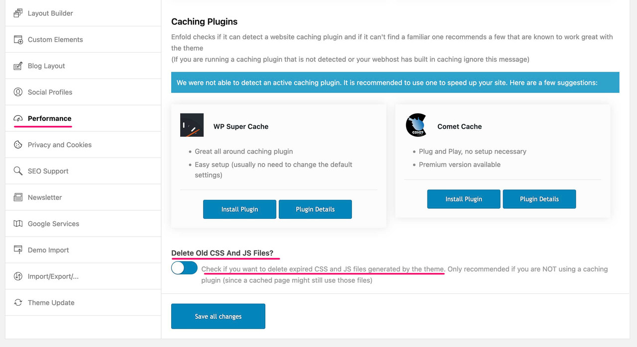
Hence my request to switch off this setting to find out where the changes were made.
In principle, I would also recommend to turn this on or install caching tools/plugins only after you are finished with the layout of your page.And since case 6 is already prepared in footer.php, this could actually be included in core.
btw. there is a child-theme solution to change it – insert this to your child-theme functions.php:
function my_avf_option_page_data_change_elements( array $avia_elements = array() ){ $slug = "footer"; $id = 'footer_columns'; $index = -1; /** Find index of element to change*/ foreach( $avia_elements as $key => $element ){ if( isset( $element['id'] ) && ( $element['id'] == $id ) && isset( $element['slug'] ) && ( $element['slug'] == $slug ) ){ $index = $key; break; } } /** * If key not found, return unmodified array*/ if( $index < 0 ){ return $avia_elements;} /*** Make your customizations*/ $avia_elements[ $index ]['subtype'] = array ( __('1', 'avia_framework') =>'1', __('2', 'avia_framework') =>'2', __('3', 'avia_framework') =>'3', __('4', 'avia_framework') =>'4', __('5', 'avia_framework') =>'5', __('6', 'avia_framework') =>'6' ); return $avia_elements; } add_filter( 'avf_option_page_data_init', 'my_avf_option_page_data_change_elements', 10, 1 );if you sitch off your merging we can better inspect your site – but there is a rule inside your css:
#top #header .av-main-nav>li>a {
 font-size:14px
}
and i think that this comes from advanced styling. And this is not your intention ?
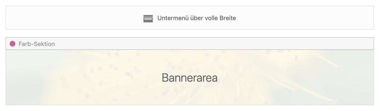
how did you load the cormorant garamond font?April 6, 2023 at 9:25 pm in reply to: Need to add a banner just to the homepage with a width of 100% #1403751But your banner scrolls away – or should it stay fixed under the submenu?
see: https://enfold.webers-webdesign.de/guychalk/
( the menu below is only to set in enfold option header )The banner: is just a color section with background-image
to have this responsive determine the aspect ratio of your banner image and give this relative height to the colorsection via quick css in percentage.
f.e. if your image is 16:9 format – set for the color-section height a height of 56.25% ( set 56%) .
 April 6, 2023 at 9:03 pm in reply to: change size and font family for “title” under images when lightbox is open #1403748
sorry – no private content area for me – i’m participant as you are.
Great !
Then we have to know more details – is Enfold Up to Date. What about WordPress Version.
Or just post a link to your page – if not possible on public – use the private content area for the mods.Please pull your svg logo to a browser window – to see if it is rendered by a browser.
this link : https://kriesi.at/documentation/enfold/example-of-logo-left-menu-center-widget-right seem to be long time ago when there was no support for svg inline logo.
Try to get rid of css that concerns to logo and logo img .
First just get rid of the logo size setting:.responsive #top #header .logo, .responsive #top #header .logo a, .responsive #top #header .logo img { /*! width: auto; */ /*! height: auto; */ align-items: center; align-self: center; justify-content: center; }inline svg needs absolute dimension settings – the auto will end in svg dimension 0px
-
AuthorPosts