Forum Replies Created
-
AuthorPosts
-
October 15, 2023 at 9:08 am in reply to: On mobile, Hide Header except for (Very Top) Phone number Bar #1422526
It depends a bit on what kind of header you have and what you want to achieve.
Is it a fixed header on desktop view? Where is your navigation etc.?
the header_meta should stay fixed in mobile view – and not scroll away…yes – the code is correct and seems to be achieved via the standard way using the google map share button on the map.
I am asking this because it sometimes happens that my fellow participants transfer something like this manually and then errors occur (like not closing tags).
I therefore think that you should first try to reinstall the theme (maybe something went wrong during the installation) – and at the same time perform an update (if not already done).or – have a look into the docu : https://kriesi.at/documentation/enfold/icon/#download-fontello-or-flaticon-icons-included-in-enfold-demos
hm – I have never attached any particular importance to it. But you are indeed right. It seems that the base.css (line 470ff) setting of the font is used there. It’s listed as HelveticaNeue, Helvetica etc. Since Enfold stores the fonts you set in options as a variable, you can set here:
#top .input-text,
#top input[type="text"],
#top input[type="input"],
#top input[type="password"],
#top input[type="email"],
#top input[type="number"],
#top input[type="url"],
#top input[type="tel"],
#top input[type="search"],
#top textarea,
#top select {
	font-family: var(--enfold-font-family-body) !important
}
or if you like to change it only for that input field:
#top #s {
  font-family: var(--enfold-font-family-body) !important
}
maybe this should be changed on default to inherit the font like all the other settings ( line 20ff)
(html, body, div, span, applet, object, iframe, h1, h2, h3, h4, h5, h6, p, etc. )is wp-block-heading a class ? Where’s the dot before?
next – you only want to change h1 headings with that custom class and all h2 ?can you post the code you inserted to that code-block ( use code tag here please to better inspect the code)
October 15, 2023 at 7:49 am in reply to: Warum sehe ich in meinem theme den Datei Edior nicht? #1422519Ich wäre davon ausgegangen, dass nur Admins dieses Recht besitzen!
Denn das hier ist die Ansicht, die ein Redakteur zu sehen bekommt:_________
I would have assumed that only admins have this right!
Everything else makes no sense either.
This is the view that an editor gets to see:
on default the value in that input field of max-width is 1310px – but i tend to set it to 1500 (or 1510px)
a totaly missing of max-width ( max-width unset ) looks strange ;)have a look at your code :
@media only screen and (max-width:1100px) { .responsive #top .av-main-nav .menu-item-avia-special { display:block !important } .responsive #top .av-main-nav .menu-item { display:none !important } /************** here is a missing closing curly bracket *******/ @media only screen and (max-width:1024px) { #header_meta { display:none } }if you got a css code error on quick css ( a missing closing bracket (often forgotten on media querries) , comma instead of semi-colon (or vice versa) , etc pp) the rest of your css could be ignored.
this enfold setting of container max-width is added after the quick css settings – so it will go back to the standard container width of 1010px (see: grid.css ) ./* Base sizes */ .container .av-content-full.units { width: 100% } .container .av-content-small.units { width: 73% } .boxed#top, .html_boxed.html_header_sticky #header{ width: 1010px; } .container{ max-width: 1010px; }Another approach could be the way to animate the grid box itself:
(real grid layout)as a participant I can’t see your links listed in the private window; I would also try with background images, but inherit them into a pseudo container, and then execute the hover styles with it. This has the advantage that the foreground content is not affected.
With parallax backgrounds I think you have an extra container anyway.by the way – the pseudo container is a good solution to hamper the behavior on safari browsers with attachment fixed.
see here: https://webers-testseite.de/jb84/
-
This reply was modified 2 years, 5 months ago by
Guenni007.
October 13, 2023 at 8:51 am in reply to: Warum sehe ich in meinem theme den Datei Edior nicht? #1422351hast du ein Sicherheitsplugin installiert? Sowas wie “iThemes Security” – dort gibt es diese Option ( unter WordPress Optimierungen ) es ein/ab zuschalten.
Etliche Security Tools haben diese Option.October 12, 2023 at 2:11 pm in reply to: Warum sehe ich in meinem theme den Datei Edior nicht? #1422233Einige Sicherheitsplugins unterbinden gerne den Theme-Datei Editor. Meist geschieht dies z.B. via wp-config.php Eintrag.
einer dieser beiden oder sogar beide könnten Einfluss nehmen:
define( 'DISALLOW_FILE_EDIT', true );
define( 'DISALLOW_FILE_MODS', true );
löschen oder auf false setzen
ok – today here it is:
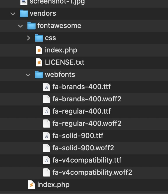
and it seems to come from float-menu plugin:

update that plugin or download it again- becaue on the neweset one they got woff2 inside the vendors folder:
So – it seems to work with the attribute of Ismael, just not when you insert it there afterwards via script.
It must be hardcoded in the class-form-generator.php ;)the attribute readonly works even if you add it via script.
have you a link to the dottie file your are talking about to check if it is not a matter of that file.
Today i do not see the errors concerning to FA. And believe me – I have to use the Developer Tools very intensively to investigate your site; but today this error message is no longer present.
It is not part of enfold. Did. You Upload it yourself?
after one cycle the transition is without this “blinking” – so probably Ismael is right – after loading the images of the first cycle everything is fine.
try that instead:
function remove_text_input_mode_on_datepicker(){ ?> <script type = "text/javascript"> window.addEventListener("DOMContentLoaded", function () { (function($){ $('.avia_datepicker').each(function() { $(this).attr('readonly','readonly'); }); })(jQuery); }); </script> <?php } add_action( 'wp_footer', 'remove_text_input_mode_on_datepicker', 20 );but i tested ismaels code – and it does not even add the attribute.
On reading a lot of articles – the only thing that works is to add this attribute:
function remove_text_input_mode_on_datepicker(){
?>
<script type = "text/javascript">
window.addEventListener("DOMContentLoaded", function () {
	(function($){
		$('.avia_datepicker').each(function() {
			$(this).attr('readonly','readonly');
		});
	})(jQuery);
});
</script>
<?php
}
add_action( 'wp_footer', 'remove_text_input_mode_on_datepicker', 20 );
PS:
https://kriesi.at/support/topic/date-picker-form-issue-mobile/#post-1422097if you need it now – you can have here a solution from ismael:
https://kriesi.at/support/topic/date-picker-form-issue-mobile/#post-1419995Yes – Mikes way to update is the way i prefer too! – if the versions are not so distant to each other. That is a big jump from 4.8 to 5.6
To have a rollback to this older version, I would use the following update procedure.
https://kriesi.at/support/topic/some-hints-and-advice-to-update-enfold/#post-1056107i can not confirm this. Even on a iPad Mini 3 (iOS 12.5.7) it works!
Only annoying thing is that the keyboard opens on that to input – but this is allready in the next update fix ( 5.6.7):tweak: added inputmode=”none” to datepicker in contact forms to hide default mobile keyboard
next hint: if you open a page on a device with touch screen options : you will have on html a class: touch-device
so if you like to style those devices with touch – you can use that btw. if you use it as :.responsive:not(.touch-device)you can set stylings for non touch devices.
PS: denke aber auch daran, das selektoren nur dann wirksam sind, wenn die Spezifität höher als die existierend Regel ist – siehe z.B.
https://kulturbanause.de/blog/css-spezifitat/du siehst, das ID’s mit 100 Punkten und Klassen nur mit 10 Punkten.
man sollte nicht allzuhäufig zu der Nutzung des !important übergehen. Oft reicht es wenn die neue CSS Regel einige ID’s beinhaltet.
wie die ID am body tag: #topthat is why i have added the comment in the css code-
/****** hover Verhalten abschalten für den responsiven Fall ********/
/****** bei Querformat iPad Pro 12,9inch = 1367px / bei iPad Pro 11inch = 1195px ********/
/****** bei Querformat iPad  10,2inch = 1081px / etc. pp ********/
your tablet has: 1080px width in landscape mode
so replace that line:
@media only screen and (max-width: 989px) {
to:
@media only screen and (max-width: 1081px) {
because you want that it will work on 1080px___________________
What do you think will happen if you don’t put all your CSS in a media query?
So you don’t put the 1080px limit there?
Then I think it will apply everywhere – for all screen widths ;)
(remember to remove the last bracket if you want to do it that way).@media only screen and (max-width: 1081px) { /***** the codes inside the media query ****/ } /**** the closing bracket *****/by the way: you should replace your font-awesome icon fonts with newer ones – the woff2 are missing and lead to error logs on console.
can you please try this in you quick css:
( all here with your custom-class – if you want that globaly – ask).referenzen .grid-content a { pointer-events: auto; } .referenzen .grid-content:hover { opacity: 1; transform: translate(-50%,-50%); transition: 1s all ease; } .referenzen .grid-image .image-overlay { z-index: 0 !important; display: none !important; }and this to your child-theme functions.php:
(and because this should only affect portfolio grids that are set to lightbox, here is the selector with grid-links-lightbox class.)function open_non_lightbox_links_in_portfolio_grid(){ ?> <script type = "text/javascript"> window.addEventListener("DOMContentLoaded", function () { (function($){ $('.grid-links-lightbox .grid-entry a:not([href^="#"])').on('click', function(e){ e.preventDefault(); var externalLink = $(this).attr('href'); window.open(externalLink, '_blank'); }); })(jQuery); }); </script> <?php } add_action( 'wp_footer', 'open_non_lightbox_links_in_portfolio_grid' );you see what the code does?
you have set the portfolio grid to open all links in a light box.
But your e-mail or links to external Links are not from the type: href=”#…” – the attribute selector above excludes these links to popups – and only prevents the function of the lightbox script where the links do not start with a hash (#).PS: if you like to open those links not in an additonal window replace _blank with _self
now i see – sorry – this is a portfolio grid – and you changed the grid-content to an overlay via custom css
you would have to hamper the Lightbox link of the inside link like this:
(function($){
  $('.grid-content a').on('click', function(e){
      e.preventDefault();
      var inlineLink = $(this).attr('href');
      window.open(inlineLink, '_blank');
  });
})(jQuery);
so it has the chance to open a normal link. we will see later on how to solve the link over background link problem
-
This reply was modified 2 years, 5 months ago by
-
AuthorPosts