Forum Replies Created
-
AuthorPosts
-
this solution i guess is still working – but a bit more complex than other snippet solutions.
And i guess that this will only work for selfhosted html5 videos!
And I really don’t know why it’s still working because I’ve had a lot of upgrades since that trials from 2018/19 and no customization of section.php nor child-theme section.php. So maybe you start trying it without that changing.for video-bg in color-section:
https://webers-testseite.de/mute-unmute/
for video-bg in slider:
https://webers-testseite.de/mute-unmute-video-slide/for a video element ( not as background ) , you may be able to extract from the code how the mute/unmute can be influenced by a click event. I could also imagine that a small button next to the video ALB element could accomplish this.
February 2, 2024 at 5:30 am in reply to: How to add a button to Easy Slider that is consistent on all slides #1432781sorry just to mention – my first solution will work with both – see again that example page
you only have to get rid of that overlay ( or have a less z-index for it – and higher z-index for the button-wrapper.Unfortunately, I can’t help you keep the different codes of the different solution approaches apart. My solution – as you can see on the example page – works.
https://webers-testseite.de/easy-slider/
_______________
maybe for your solution to put the button code to caption input area – it is also enough to get rid of overlay or to have a different z-index:
#top .av-slideshow-caption .av-button { z-index: 5; } #top a .image-overlay { display: none !important; z-index: 4 !important; }Danke – Lernen durch Lehren ;)
(Seneca – Mutuo ista fiunt, et homines dum docent discunt.). :lol
Es gibt hier Fragen auf die ich nie gekommen wäre, auf die aber auch Kunden kommen könnten. Es ist immer gut, dann nicht herumzudrucksen, sondern mit einer Lösung direkt zu antworten. Das ist quasi Eigennutz ;)Sag mal Bescheid ob es mit dem svg als Logo nun nicht mehr ganz so “blurry” ist. Bei sehr kleiner Header Höhe befürchte ich, das die sehr kleinen Schriften trotz der theoretischen Schärfe nicht mehr lesbar sein werden ( Bei Header Height 150px sollte aber das ok. sein ). Das liegt dann am Rendern der Browser – und an der Auflösung deines Endgerätes. Ich staune manchmal was alles noch lesbar auf meinem iPhone oder dem iPad mit Retina Display ist.
February 1, 2024 at 7:10 am in reply to: How to add a button to Easy Slider that is consistent on all slides #1432668you never mentioned that the images have a link too. Do you need that besides the button inside?
i do not find any of my settings: neither those custom classes nor the hidden button.Of course, this is also possible within a 1/1 column.
Therefore, I also assumed that the slider should be realized in a non 1/1 column. Because the fullwidth slider cannot be placed within another ALB element.PS: although with a 1/1 container I don’t understand why you would want to use the Easy-Slider. I think it is easier to bring a full-width slider to content width and style the buttons of that “fullwidth-slider”
see the bottom slider at that example page: https://webers-testseite.de/easy-slider/
you then can use Ismaels code to style those button. See css code too on that example page.
PS: here you have that option that each button could have a different link/style etc. but if it should be allways the same button:
Create first one slide – style it as you like to have. – Then duplicate those slides – and replace the images afterwards. That will save time to edit. ;)January 31, 2024 at 6:01 pm in reply to: How to add a button to Easy Slider that is consistent on all slides #1432633Did you set all custom classes mentioned on the linked page?
may i see your page – think of that i’m participant as you – so i do not see private content area.
It it has to be not in public – send me an e-mail (see links on avatar.)Lade es dir aber nochmal runter, ich habe die Farben noch einwenig verändert.
https://webers-webdesign.de/AB-SP.svgGemäß deren Logo : https://www.spitex.ch/img/spitex2022/ch.spitex2022/logo_de-hcB8186EFD.svg
PS : beim Nachbau habe ich natürlich nicht darauf geachtet.
Aber ich denke, man schreibt “Alle” im Spitex-Logo groß.Frag mal ob Du das ändern sollst. Dann melde Dich nochmals. ;)
January 30, 2024 at 8:31 pm in reply to: How to add a button to Easy Slider that is consistent on all slides #1432544yes the function comes to child-theme functions.php
( be carefull if you put something into child-theme functions.php – the leading first line (<?php) had to be preserved )
the css code to quick css.you see the layout under the example – and with some comments on how to set the custom classes.
the styling button is inside the same container as the easy-slider.ich lösche jetzt mal wieder die Testseite – OK ? – wenn du es gesehen hast.
das letzte hochladen, und als logo einsetzen.
wenn ich sowas nachbauen muss, dann schaue ich zunächst auf deren Seiten ob da pdfs existieren. PDFs sind auch Container Formate. Und die Bilder etc. sind eigentlich meist als solche einzeln auswählbar ( im Acrobat ) bzw – wenn man denn die Sachen im Illustrator öffnet auch!!!
Wenn man Glück hat, war da mal jemand dran den es auch stört schlechte png/jpgs in Dateien einzubetten. Also sind meist die Logos als vektoren vorhanden. Das Glück hatten wir nun bei beiden Seiten, dort konnte ich pdfs ziehen, die eingebettete Logo in Vektorform hatten.Leider setzt der Illustrator defaultmäßig für die Gruppen die Standard Klassen st0, st1 etc.
Da muss man also ran – damit es nachher auch via css gut ansprechbar bleibt, muss man sinnvolle Gruppen setzen.Öffne doch mal das svg mit einem guten Editor. Oder schau dir das mit den Developer Tools mal an:
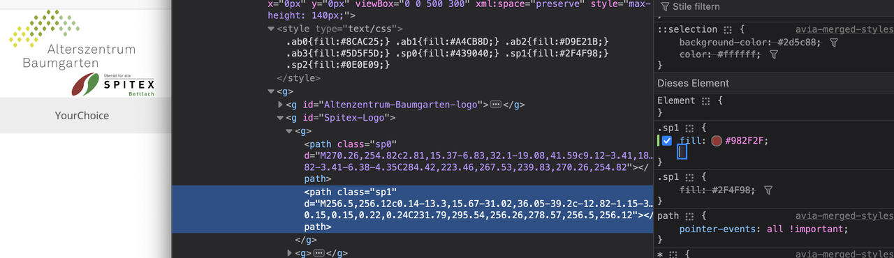
du siehst, ich habe die beiden logos in separaten Gruppen und du könntest nun die Sachen auch per quick css umfärben.
the svg is not a vector logo ( data image inside ).
That would probably be a painstaking task, with many elements being repeated, and the font will also have to be found.
https://webers-webdesign.de/AltBaum.svg
https://webers-webdesign.de/Spitex.svg
ich glaube übrigens nicht, dass in deinem original jpg – die Farben stimmen. Da hat einer beim cmyk nach rgb nicht aufgepasst. ;)Den Rest könnte man jetzt auch noch machen.
Schrift ist : AkkuratStd
bei Spitex dürfte es eine DINPro sein.PS : die Svg könnt ihr gut mit einem Texteditor ( ein guter – nicht word : also SublimeText oder notepad++) bearbeiten.
Die Klassen könnt ihr dann durch die richtigen Farbwerte ersetzen.

may a participant as you are – see that logo ?
or see that logo solo without the page may help too.f.e. The logo of your site, for example, is predestined to be used as a vector. ( svg file ) pure font and mathamatical curves.
A vectorbased logo is in all dimensions sharp.January 30, 2024 at 8:53 am in reply to: How to create a text box next to an image where both resize together #1432463you now can see different demos under that example page with 2/3 – 1/3 columns and 3/4 – 1/4 columns.
1/3 x 1.25 = 0.416This construction only works – if the text block needs less space than the image block !
January 30, 2024 at 8:37 am in reply to: How to create a text box next to an image where both resize together #1432461The point is that the image should have a width of 2/5 due to your column setting – so that the image is now displayed as a whole, the height must inevitably correspond to the aspect ratio. Since the height of the image is 1.25 times the width – and the width of the image is 2/5 of the total width – the color section must then be 1/2 as high as it is wide. In other words, 0.5 times.
With your setting of 1310px (min-width content; I have 1510px there on the example page), the height is therefore predefined for screen widths greater than this width.
However, the shrinking of the content starts earlier due to the standard padding of Enfold (left and right 50px each).
The content itself only has the total width minus these 100px.If you do not change the aspect ratio of your image, or the relationship between the columns, then this fundamental principle remains the same.
So if you want the image to be smaller, you must switch to 3/4 1/4, for example – or select a different image section.January 30, 2024 at 7:58 am in reply to: How to add a button to Easy Slider that is consistent on all slides #1432454Did you belong to my post or to the others?
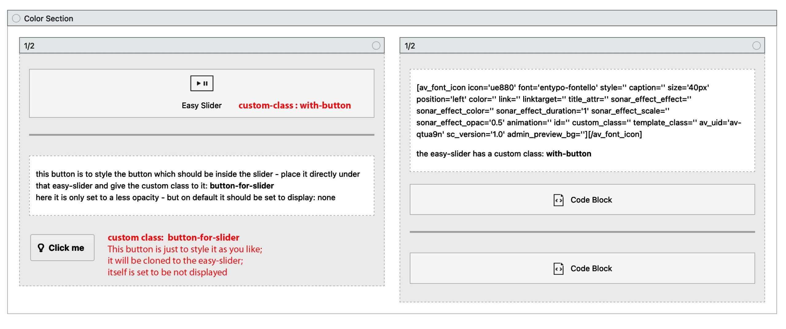
Because my workaround is based on creating an enfold button on that page directly under the easy slider element. This button will be set to display none via quick css – but is the Source for the buttons inside the slider. It will be cloned. So every styling you do to the source button will be the styling of the slider button!see an image of the layout under that example page: https://webers-testseite.de/easy-slider/
________
btw. if you do not append that cloned button to : av-slideshow-caption – but to : avia-slide-wrap
you can place that cloned button absolutely to every place you like in that slider.ja – die menu items erhalten eine eindeutige ID. Da musst du also mittels der Developer Tools rausfinden was der Menupunkt bekommen hat.
Du kannst aber auch mittels “abzählen” den Selector spezifizieren.#avia2-menu .menu-item:nth-of-type(2) { color: #cc0033 !important; font-size: 1.5rem; animation: pound 3s infinite alternate; }hm – but i do not see it on your site?
by the way – if you had choosen to load jQuery in your footer – it might be necessary to set for the snippet a priority. Because it has to be loaded after jQuery has been loaded.
in this case the last line should look like this:
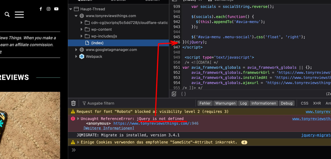
add_action('wp_footer', 'ava_custom_script_mod_social', 999);this error log is typical to a function that needs jQuery but is running before jQuery is loaded:
(click to see)
 January 29, 2024 at 3:49 pm in reply to: How to add a button to Easy Slider that is consistent on all slides #1432402
have a look at: https://webers-testseite.de/easy-slider/
January 29, 2024 at 12:43 pm in reply to: How to create a text box next to an image where both resize together #1432380your image has an aspect ratio of 5/4 = 1.25
the column on the left is 3 units wide – and the column on the right 2 units – so the height must be 2*1.25 = 2.5
above your 1310px ( keep the padding left/right of 50px in mind ) etc. …see with css on : https://webers-testseite.de/gatehealing/
you see that below approx. 1000px, the height of the text determines the overall height – and the background-image on the right is cropped then.
January 29, 2024 at 11:43 am in reply to: How to create a text box next to an image where both resize together #1432368ok – now i understand – but: a basic principle of a column layout is that the column that has the most content determines the height. Otherwise you would have an overhang.
This is the reason for a background image. It then adapts to the growing content when “cover” is selected, but the content of the image is then also cropped.
If the content of the column with the text is not the determining element of the height, then it could be set by calculation so that the background image determines the height.
see here ( a bit different to your request ) how to calculate the setting: https://webers-testseite.de/isp/
pull the screen width to narrower width and see – that as long the content of the text cell is less – the background image resizes with the rest responsively.
Many of the suggested changes to the theme here on the board – are a lot easier to realize if you set up a child theme. That’s why I strongly recommend doing this.
However, there are probably also good plugins that can insert code snippets like the one above without a child theme.try ( if you do not like animation eliminate that part )
#avia2-menu #menu-item-4542 { color: #cc0033 !important; font-size: 1rem; animation: pound 3s infinite alternate; } @keyframes pound { to { transform:scale(1.1) } }i would layout four 1/4 columns inside a color section with a custom class f.e.: special-sixth-grid
and then place this to your quick css:
( fr is abreviation for fraction – means part – so if there are for 100% = 6fr : 1fr 2fr 1fr 2fr that is your setting of 1/6 2/6 1/6 2/6 )#top .special-sixth-grid .entry-content-wrapper { display: grid; margin: 0; gap: 20px; grid-auto-flow: row; grid-template-columns: 1fr 2fr 1fr 2fr; align-self: stretch } @media only screen and (min-width: 768px) and (max-width: 989px) { .responsive #top .special-sixth-grid .entry-content-wrapper { gap: 20px; grid-template-columns: 1fr 2fr; } } @media only screen and (max-width: 767px) { .responsive #top .special-sixth-grid .entry-content-wrapper { gap: 20px; grid-template-columns: 1fr; } } #top .special-sixth-grid .entry-content-wrapper:before, #top .special-sixth-grid .entry-content-wrapper:after { display: none; } #top .special-sixth-grid .entry-content-wrapper .flex_column { width: unset !important; margin: 0 !important; }see an example page ( only the top part – i added to an existing example page ): https://webers-testseite.de/4on1-flexbox-model/
January 28, 2024 at 11:00 pm in reply to: How to create a text box next to an image where both resize together #1432318something like this: https://kriesi.at/support/topic/text-around-an-image/
January 28, 2024 at 6:27 pm in reply to: Which multiple image sizes are safe to disable and delete #1432287and by the way – Enfold has a no compression level on those recalculated images – that will cause some unnecessary big file-sizes f.e. it might happen that the big sizes 1500×630 and 1500×430 are bigger in file-size than the uploaded original!
screenshot from enfold default setting:
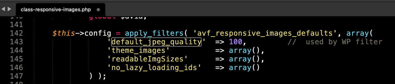
so after erasing some image-sizes – and before recalculating the preserved image-sizes – put this snippet to your child-theme functions.php (change the 55 to what you like to have):
add_filter("avf_jpeg_quality", "avf_set_quality_mod", 9999, 1); add_filter("avf_wp_editor_set_quality", "avf_set_quality_mod", 9999, 1); function avf_set_quality_mod($quality) { $quality = 55; return $quality;}put this to your child-theme functions.php:
function ava_custom_script_mod_social(){
?>
<script>
(function($){
  $('#header').one('click', '.av-main-nav-wrap', function() {
      var isMobile  = $('.av-burger-menu-main').css('display'),
      isHeading = "Social Bookmarks",
      social    = $('#header_main .social_bookmarks').clone(true).addClass('sub-menu'),
      mobileMenu  = $('.av-burger-overlay');

      mobileMenu.find('#av-burger-menu-ul').append('<li class="only-burger menu-item-social av-active-burger-items"><a itemprop="url" alt="Social Bookmarks" style="" href="#"><span class="avia-bullet"></span><span class="avia-menu-text">'+isHeading+'</span><span class="avia-menu-fx"><span class="avia-arrow-wrap"><span class="avia-arrow"></span></span></span></a></li>');

      if( social.length ){
        mobileMenu.find('.only-burger.menu-item-social').append(social);
      }
    });

    var htmlString   = $('#socket .social_bookmarks').clone().find('li a'),
    socialString = [];

    htmlString.each(function() {
      var socialClass = $(this).parent('li').attr('class'),
      socialItems = $(this).wrap('<li class="'+ socialClass + ' menu-item menu-item-avia-special menu-social"></li>').parent().unwrap();
      socialString.push(socialItems);
    });
    var socials = socialString.reverse();

    $(socials).each(function() {
      $(this).appendTo('#avia-menu');
    });

    $('#avia-menu .menu-social').css('float', 'right');
})(jQuery);
</script>
<?php
}
add_action('wp_footer', 'ava_custom_script_mod_social');
if you do not like to have a heading on those bookmarks
replace that one line in the snippet above:isHeading = " ",then this to your quick css:
#av-burger-menu-ul .menu-item-social > a {
  pointer-events: none;
  margin-bottom: 10px;
}

#av-burger-menu-ul .menu-item-social a .avia-menu-text {
  font-style: italic;
}

.html_av-overlay-side-classic #top .av-burger-overlay li.menu-item-social a {
  border: none !important
}

.responsive #top #av-burger-menu-ul .social_bookmarks.sub-menu {
  margin-left: 30px;
  overflow: visible;
  float: left !important;
  display: block !important;
  height: auto
}

#av-burger-menu-ul .social_bookmarks.sub-menu li {
  display: block;
  margin: 3px 15px;
  float: left;
}

#av-burger-menu-ul .social_bookmarks.sub-menu li a {
  padding: 10px !important;
  display: table-cell !important;
  float: none !important;
  border-radius: 0 !important;
}

#av-burger-menu-ul .social_bookmarks.sub-menu li a:before {
  position: relative;
  font-size: 1.8em;
  top: 2px !important;
}

#top #wrap_all #av-burger-menu-ul .av-social-link-facebook a { padding: 10px 13px !important;}
#top #wrap_all #av-burger-menu-ul .av-social-link-facebook:hover  a{color:#fff; background-color:#37589b!important; }
#top #wrap_all #av-burger-menu-ul .av-social-link-instagram:hover a{color:#fff; background-color:#a67658!important; }
#top #wrap_all #av-burger-menu-ul .av-social-link-youtube:hover a{color:#fff; background-color:#a72b1d!important; }
if you do not want to have the burger nav horizontally centered :
#top #av-burger-menu-ul {
  vertical-align: top !important;
  padding-top: 150px !important;
}
result should be:

see here a comparison of normal and italic font of montserrat ( just chaning it in developer tools to render the normal font as italic )
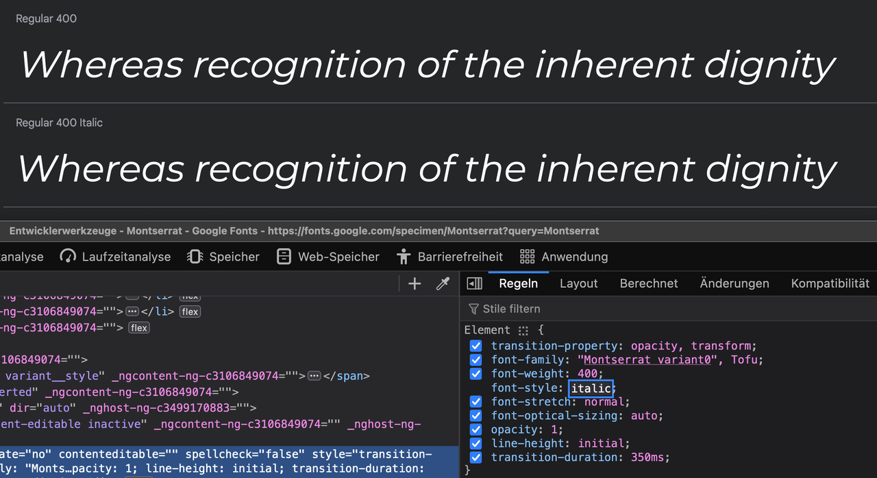
Yes – the small “a” is different !
some serif fonts do have more specific differences in comparison. On performance reasons – do not upload those italic font-styles.

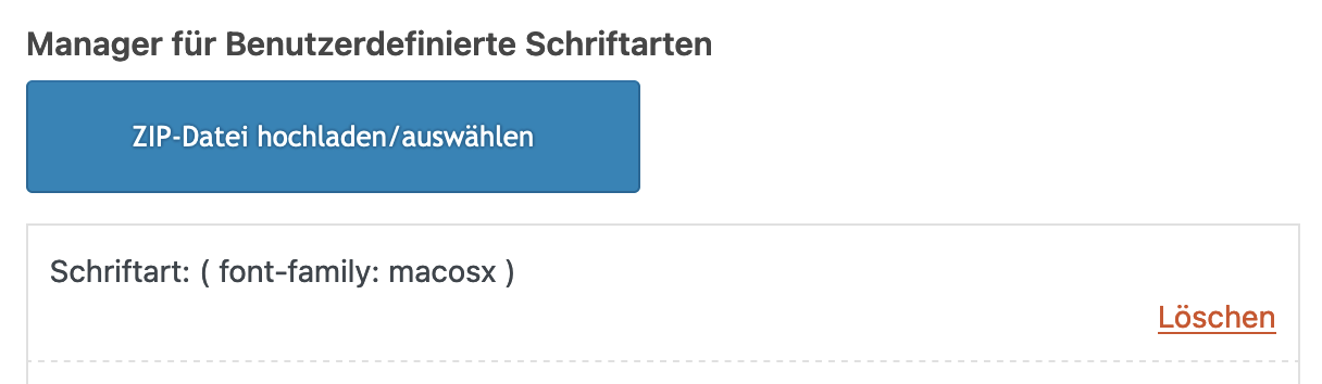
the package you can download from google on fonts that have “variable fonts” contains a subfolder with those static fonts.
Enfold could handle variable fonts – but you had to know how to work with those variable fonts.if you only like to upload those static fonts – pull this folder form that zip file to your desktop – rename it to “Montserrat” and (important) zip it for PC ( not including the invisible OSX files generates with their compression options.). Betterzip f.e. has a drop-window where you can choose for what system you zip it.
Why this is important. if you upload that zipped file you will have an additional font in there:
__________________
Next : Google does only offer ttf files for you. but it might be better to upload woff2 files ( brotli compression ) as font-files.
( less loading times on woff2 ). So it might be good to have both woff2 ( for modern Browsers ) and ttf (for older browser support)
see: https://kriesi.at/support/topic/host-web-font-yourself-some-info/#post-1364066
use transfonter to generate woff2 and ttf files – put them in one folder – rename the folder to your needs ( Montserrat ) – and upload that.
As mentioned there – think if you realy need an italic font to upload – because browser rendering might do a good job to of normal font.can you test in your quick css:
@media only screen and (min-width: 480px) {
  .responsive #top #header .main_menu .social_bookmarks {
    z-index: 5;
    line-height: 90px;
    margin-left: -40px
  }
}

@media only screen and (max-width: 479px) {
  .responsive.av-burger-overlay-active #top #wrap_all #header .social_bookmarks,
  .responsive.av-burger-overlay-active #top #wrap_all #main .av-logo-container .social_bookmarks {
    display:  block;
  }
  .responsive #top #header .main_menu .social_bookmarks {
    z-index: 5;
    line-height: 90px;
    margin-left: 20px;
  }
}
but i guess you had to think about a different position for those social bookmarks – maybe the header_meta is a good place for it. Because on screens smaller than 1400px your main menu overlaps your logo and the social bookmarks nav floats into a second line.
-
This reply was modified 2 years, 2 months ago by
Guenni007.
-
This reply was modified 2 years, 2 months ago by
-
AuthorPosts