Forum Replies Created
-
AuthorPosts
-
As far as i can see : https://www.microsoft.com/en-us/download/details.aspx?id=106087
You can download it from Microsoft – but the included Eula Text is not clear enought if a web-font usage is allowed.If you own that font – maybe you should be clear what you like to use as font-weight. Even the normal Aptos got a lot of different font-weights (regular, light, semibold, bold, extrabold, black). My recommendation is to use a selection only on performance reasons – f.e. (light, regular, bold)
To have a better modern browser support – take the ttf files and convert them to woff2. (f.e. on https://transfonter.org/)
Put all font-weights (ttf and woff2) in a folder f.e. “Aptos” – and zip that folder for uploading it to the enfold font-manager.
After that – you can choose that font at the end of the drop-downlist for Body font and headings.Aptos from Adobe or from Microsoft ? Serif or Sans Serif ?
If it is from Adobe – does your customer own the rights to use it for web?try a combination of both filters:
function avf_masonry_entry_content_mod($content, $entry, $config) {
    // Remove all br tags within <ul>...</ul> blocks
    $content = preg_replace_callback('/<ul[^>]*>.*?<\/ul>/is', function($match) {
        return str_replace(['<br>', '<br/>', '<br />'], '', $match[0]);
    }, $content);

    // Reduce duplicate/multiple br tags outside of ul tags to a single one
    $content = preg_replace('/(<br\s*\/?>\s*){2,}/i', '<br>', $content);

    return $content;
}
add_filter('avf_masonry_entry_content', 'avf_masonry_entry_content_mod', 10, 3);

function my_avf_masonry_loop_entry_content($loop_excerpt, $entry) {
  $loop_excerpt = strip_tags( ($entry->post_excerpt) , '<br><ul><li><strong>'  );
  return $loop_excerpt;
}
add_filter('avf_masonry_loop_entry_content', 'my_avf_masonry_loop_entry_content', 10, 2);
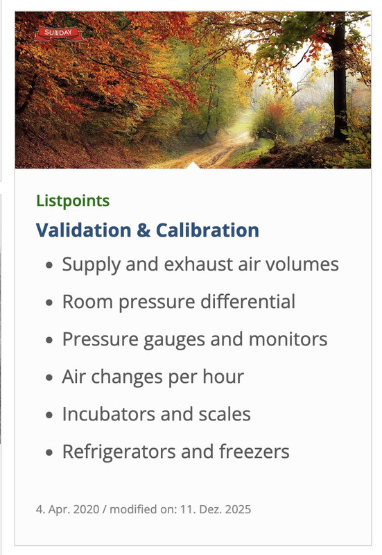
with these snippet you can now insert to excerpt input field:<strong>Validation & Calibration</strong><br> <ul> <li>Supply and exhaust air volumes</li> <li>Room pressure differential</li> <li>Pressure gauges and monitors</li> <li>Air changes per hour</li> <li>Incubators and scales</li> <li>Refrigerators and freezers</li> </ul>December 15, 2025 at 9:14 am in reply to: Burger Menu Logo Showing In Main Navigation/Footer Menu #1492518next hint:
you can have it for smaller screens this way – and only for very small screens in a single row.
@media only screen and (max-width: 767px) {
  #footer-template .entry-content-wrapper {
    display: flex;
    flex-flow: row wrap;
    justify-content: space-between;
    gap: 20px 0
  }
  #footer-template .entry-content-wrapper:before,
  #footer-template .entry-content-wrapper:after {
    display: none;
  }
  #footer-template .entry-content-wrapper .flex_column {
    flex: 0 1 48%;
    width: unset !important;
    margin: 0;
  }
  #footer-template .entry-content-wrapper .flex_column.first {
    flex: 1 1 100%;
  }
}

@media only screen and (max-width:449px) {
  #footer-template .entry-content-wrapper .flex_column {
    flex: 1 1 100%;
  }
}
December 15, 2025 at 9:03 am in reply to: Burger Menu Logo Showing In Main Navigation/Footer Menu #1492515btw. with your semi-transparent flacon at the bottom – maybe it is nice to have the burger overlay semi-transparent.
.html_av-overlay-side #top .av-burger-overlay-scroll {
  background-color: rgba(255,255,255,0.7);
  backdrop-filter: blur(10px)
}

#av-burger-menu-ul .only_mobile img {
  filter: drop-shadow(1px 1px 2px #aaa)
}
December 15, 2025 at 8:51 am in reply to: Burger Menu Logo Showing In Main Navigation/Footer Menu #1492514there is still something wrong:
I’ll try again – please read it carefully
The menu you see above as a text menu and the menu you see in the hamburger menu have the same source but different selectors. So you don’t need to set up a media query to hide the logo in the top text menu. This is particularly advantageous in your case, as given the nature of your text menu, it would certainly be better to display the hamburger menu earlier (1085px) than would be possible at 768px. Your text menu overlaps the main logo long before it displays the hamburger icon.for having an earlier hamburger icon you only need here a media query setting:
@media only screen and (max-width: 1085px) {
    #top #header .av-main-nav > li.menu-item  {
        display: none !important;
    }
    #top #header .av-burger-menu-main {
        cursor: pointer;
        display: block !important;
    }
}
Remove all media query settings for your only_mobile logo from your Quick CSS, with the exception of the existing global rule.
(This is why it already works for the footer area.).only_mobile { display: none; }you now only have to show it again for the hamburger menue:
#av-burger-menu-ul .only_mobile {
  display: block;
}
thats all.
btw: here are the selectors for your logos inside your menues:
top text menue: #avia-menu .only_mobile
hamburger menue: #av-burger-menu-ul .only_mobile
footer menue: #menu-main-menu .only_mobilebut – you can have both by css– let the animation stay at slide (slide sidewards or slide up/down)
slides comes in by sliding – but buttons fade in: (maybe with delay).avia_transform #top .av_fullscreen .avia-slideshow-button, .avia_transform #top .av_slideshow_full .avia-slideshow-button, .avia_transform #top .av_fullscreen .avia-slideshow-button-2, .avia_transform #top .av_slideshow_full .avia-slideshow-button-2 { opacity: 0; transform: translate(0,0); } .avia_transform #top .av_fullscreen .active-slide .avia-slideshow-button, .avia_transform #top .av_slideshow_full .active-slide .avia-slideshow-button, .avia_transform #top .av_fullscreen .active-slide .avia-slideshow-button-2, .avia_transform #top .av_slideshow_full .active-slide .avia-slideshow-button-2 { visibility: visible; animation: caption-top 1s linear 2s 1 forwards; }the shortform of animation means:
animation:
	animation-name: caption-top;
	animation-duration: 1s;
	animation-timing-function: linear;
	animation-delay: 2s;
	animation-iteration-count: 1;
	animation-fill-mode: forwards;
if you do not like the delay – just remove or change that value to your delay ( f.e. 1s)
see: https://webers-testseite.de/slider-with-kenburns/
PS: you see – you can even address them differently the first button can fade in – the second one comes sliding in …yes – the checked status is for having not a fixed header_meta (top bar)
December 13, 2025 at 7:04 pm in reply to: Masonry Title direct under the image so the images are not cut #1492489you can see (including a snippet for child-theme functions.php ) a different solution – where the margin-bottom value is ruled by a script.
Only for masonry galleries – not for Masonry Entries
This code fixes caption overlay issues in Enfold’s Masonry elements by:
– Flexible Masonry: Places captions below images instead of overlaying them
– Perfect Grid: Dynamically calculates margin-bottom based on caption heightsee: https://webers-testseite.de/masonry-with-captions/
PS: for pefect grid and automatic grid – there are sometimes timing problems . Maybe i find some time to correct it in the script. For flexible Masonry this solution works very good.
All my attempts to remove these automatic br tags failed. So you could just use it like this:
<strong>Validation & Calibration</strong><ul><li>Supply and exhaust air volumes</li><li>Room pressure differential</li><li>Pressure gauges and monitors</li><li>Air changes per hour</li><li>Incubators and scales</li><li>Refrigerators and freezers</li></ul>we do not want to get rid of intentionally set br tags – but the automatic set br tags are a problem _ thats why i set on my testpage that oneliner !
The bullits are set on my test page because the ul and li elments do have them – no manually placed bullits.
i do not know why it does not work on your installation.by the way. heebo and poppins are both google fonts – so you can use them for your page – if you want.
for your logos – you can use f.e. svg files see: https://webers-testseite.de/Bookkeeper.zip
https://webers-testseite.de/bookkeeper.svg
Inside is an illustrator file too – with the use of those google fonts.the included svg for transparency in the zip file will have the fonts at white – so it will show on a dark background:
 December 12, 2025 at 9:42 pm in reply to: Burger Menu Logo Showing In Main Navigation/Footer Menu #1492471
please do clear all cachings
do not rule it by media query but only with the different selectors
you have still this inside your css: – please remove it
@media only screen and (max-width: 767px) {
  .responsive #top .av-main-nav .menu-item {
    display: none;
  }
}
this works great on DEV Tools for your staging page – if you got different selectors or settings for the page itself – then you have to give us the final link
#avia-menu .only_mobile { display: none; } #footer-page .only_mobile { display: none; }uncheck it
 December 12, 2025 at 8:08 am in reply to: Burger Menu Logo Showing In Main Navigation/Footer Menu #1492450
and do not rule it by media query but only with the different selectors:
#avia-menu .only_mobile {
  display: none;
}
and for the footer:
#menu-main-menu .only_mobile {
  display: none;
}
/ *** or ***/
#footer-page .only_mobile {
  display: none;
}
because the menu on desktop got an ID and the burger menu is inside .av-burger-overlay and got the id: av-burger-menu-ul
by the way: I can understand it in the case of the hamburger menu, because here it is a copy of the main menu.
But you must have created your footer menu as an extra menu. Why did you put the logo there?because on the a-tag the class lightbox-added is missing – there must be a wrong setting – or somthing that hampering the normal magnific-popup script.
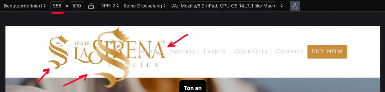
The Demo: enfold-business-flat has on all pages a transparent header. !!!
The transparency logo is shown then. So did you have inserted an alternate logo on :
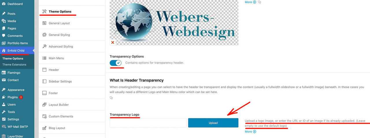
on the rest of your pages you do not see any logo because the default logo for transparency on that logo is white – and all pages of your page have a white color-section on top.
and you have inserted that snippet to your child-theme functions.php:
function my_avf_masonry_loop_entry_content($loop_excerpt, $entry) {
  $loop_excerpt = strip_tags( ($entry->post_excerpt) , '<br><p><ul><li>'  );
  return $loop_excerpt;
}
add_filter('avf_masonry_loop_entry_content', 'my_avf_masonry_loop_entry_content', 10, 2);
But why does it work on my test page? And not on yours?
PS
you do not need the bullits on a ul li elemtent – it is allready there.PPS: where can i see the page you belong to. on https://aabc.com ?
You now like not to use the masonry portfolio ?
-
This reply was modified 4 months ago by
Guenni007.
Unfortunately, WordPress is very stubborn when it comes to automatically setting br tags. You could use the following in the excerpts:
<strong>Validation & Calibration</strong>
<ul>
	<li>Supply and exhaust air volumes</li>
	<li>Room pressure differential</li>
	<li>Pressure gauges and monitors</li>
	<li>Air changes per hour</li>
	<li>Incubators and scales</li>
	<li>Refrigerators and freezers</li>
</ul>
All my attempts to remove these automatic br tags failed. So you could just use it like this:
<strong>Validation & Calibration</strong><ul><li>Supply and exhaust air volumes</li><li>Room pressure differential</li><li>Pressure gauges and monitors</li><li>Air changes per hour</li><li>Incubators and scales</li><li>Refrigerators and freezers</li></ul>see on “listpoints” post : https://webers-testseite.de/masonry-blog/
on masonry – try:
function my_avf_masonry_loop_entry_content($loop_excerpt, $entry) {
  $loop_excerpt = $entry->post_excerpt;
  return $loop_excerpt;
}
add_filter('avf_masonry_loop_entry_content', 'my_avf_masonry_loop_entry_content', 10, 2);
or maybe a bit stricter what is allowed (or better which is not influenced by strip_tags)
function my_avf_masonry_loop_entry_content($loop_excerpt, $entry) {
  $loop_excerpt = strip_tags( ($entry->post_excerpt) , '<br><p><ul><li>'  );
  return $loop_excerpt;
}
add_filter('avf_masonry_loop_entry_content', 'my_avf_masonry_loop_entry_content', 10, 2);
the point is that on the class-avia-masonry.php (or legacy inside: av-helper-masonry.php) the loop-excerpt is set to :
$loop_excerpt = strip_tags( $entry->post_excerpt );do you replaced the “your-cpt” with the name of your CPT. (f.e.: event …)
by the way – for blog:
function custom_blog_cpt_with_sticky($query, $params) { $query['post_type'] = array('post', 'portfolio', 'your-cpt'); $query['ignore_sticky_posts'] = 0; return $query; } add_filter('avia_blog_post_query', 'custom_blog_cpt_with_sticky', 10, 2);And you used the new code of ismael ? – because the ( ‘post_type’ => ‘any’,) is important for using it with CPT …
or explicitly name it as a post type:how did you embed your cpt to masonry?
function custom_masonry_cpt_with_sticky($query, $params) {
    $query['post_type'] = array('post', 'portfolio', 'your-cpt');

    $query['ignore_sticky_posts'] = 0;

    // Optional: if you like to adjust it
    // $query['posts_per_page'] = 12;

    return $query;
}
add_filter('avia_masonry_entries_query', 'custom_masonry_cpt_with_sticky', 10, 2);
and then try:
function custom_masonry_sticky_first($query, $params) {
    $query['post_type'] = array('post', 'portfolio', 'your-cpt');

    // Sticky Posts first
    $sticky = get_option('sticky_posts');

    if (!empty($sticky)) {
        $query['post__not_in'] = isset($query['post__not_in']) ? array_merge($query['post__not_in'], $sticky) : $sticky;

        $query_sticky = $query;
        $query_sticky['post__in'] = $sticky;
        $query_sticky['ignore_sticky_posts'] = 1;
        unset($query_sticky['post__not_in']);

        $query['_sticky_query'] = $query_sticky;
    }
    $query['ignore_sticky_posts'] = 0;
    return $query;
}
add_filter('avia_masonry_entries_query', 'custom_masonry_sticky_first', 10, 2);
enter your CPT for ” your-cpt” in the snippets.
try:
add_filter('avia_masonry_entries_query', 'avia_masonry_entries_query_mod', 10, 2);
function avia_masonry_entries_query_mod($query, $params) {
  $include = array();
  $sticky = get_option( 'sticky_posts' );

  $args = array(
    'taxonomy' => $params['taxonomy'],
    'post__not_in' => $sticky,
  );
  $posts = get_posts( $args );

  foreach($posts as $post) {
    $include[] = $post->ID;
  }

  $include = array_merge($sticky, $include);

  // convert values of the $include from string to int
  function sti($n)
  {
    settype($n, 'int');
    return $n ;
  }

  $include = array_map("sti", $include);

  $query['post__in'] = $include;
  $query['posts_per_page'] = 6;
  $query['orderby'] = 'post__in'; // sort items based on the post__in value
  return $query;
}
see Ismaels post on : https://kriesi.at/support/topic/sticky-posts-not-displaying-forst/#post-1230187
next the first section of your homepage
I can’t quite understand how it was set, because it gets completely out of hand in responsive cases.
maybe you have set a column to a min-height value that is not good for mobile view.but if it is that lonestar page – you had to adjust a lot of different things.
First : you might better switch to hamburger menu on wider screens – even wider than the other option of 989pxf.e.
@media only screen and (max-width: 1399px) {
    #top #header .av-main-nav > li.menu-item  {
        display: none!important;
    }
    #top #header .av-burger-menu-main {
        cursor: pointer;
        display: block!important;
    }
}
or you use a combination of hamburger switch adjust and on enfold option :
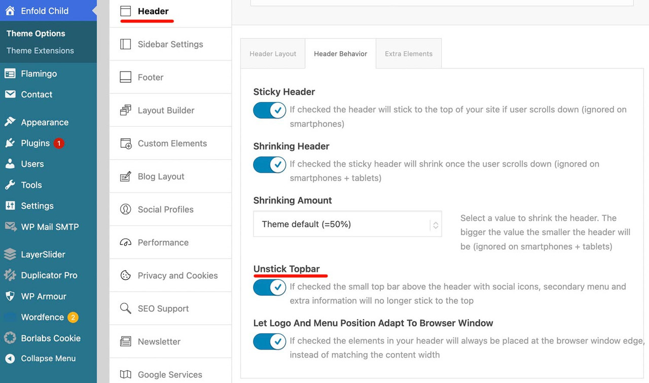
header – header behaviour – : Let Logo And Menu Position Adapt To Browser Windowtry – and read comments:
@media only screen and (max-width: 989px) {
  /*** depends on if a header_meta is present and the height of it ***/
  /*** header_main plus header_meta height value is needed ***/
  #header {
    position: fixed !important;
    height: 120px !important;
    max-height: 120px !important;
  }

  /*** synchronise with header height value ***/
  .responsive.html_header_top #top #main {
    padding-top: 120px !important;
  }
}

/*** necessary – because your header_meta will then have two lines   ***/
@media only screen and (max-width: 521px) {
  #header {
    position: fixed !important;
    height: 140px !important;
    max-height: 140px !important;
  }
  /*** synchronise with header height value ***/
  .responsive.html_header_top #top #main {
    padding-top: 140px !important;
  }
}
Ismael’s rules don’t work properly because a selector that I also thought was present is not there: html_mobile_menu_tablet
My notes on this case of sticky headers on mobile devices always included this selector too.ok – thanks for response – i romoved now the link to your video on my testpage. and replaced it by a video with 1920:800 aspect-ratio
https://webers-testseite.de/lara-video/it is the place where you have entered the text for that button.:
Open the slide itself – a new popup then will show the options for that slide. Click on the advanced tab. There should be a link settings – on the right side of the label there is the color of that button. Sadly there is no custom color with color picker option – but a lot of alternatives to your given choice.
If you have set the on styling tab to show “Use first slides caption as permanent caption” then you had to open the first slide.
_______________If that’s not enough, you would have to set the background color via CSS.
better way is to do it via a custom class on your slider – but try:#top.page-id-1104 .avia-slideshow .avia-slideshow-button { background-color: #026538; } #top.page-id-1104 .avia-slideshow .avia-slideshow-button:hover { background-color: #719430; }try :
@media only screen and (max-width: 989px) {
    #top .header_bg {
        background-color: var(--enfold-header-color-bg) !important;
    }
}
adjust media-query width to your needs
It probably wasn’t that important ;)
-
This reply was modified 4 months ago by
-
AuthorPosts