Forum Replies Created
-
AuthorPosts
-
if you have sound on that video – There will be (for the lightbox video) a button ( if you set muted ) to activate sound – or if you set without muted – the vimeo video will play with sound!
on the preview videos it will make no sence – if there are more than one Video. – Real cacophonyI fear that this would have to be decided by YouTube (Google) alone. Many of the previously valid parameters no longer have any influence on video events. YouTube is particularly keen to push through related videos. And this is probably the crux of the matter. They earn money with such links and don’t care about user-friendliness. I’ve long had a Vimeo account with a weekly 5GB upload to get around all this.
It runs with your video on iPhone – but the loop not. After the video the related Videos are shown.
see https://webers-testseite.de/youtube-background/
After you have inspect it – i will remove your video from my pagePS: if i remove the playlist parameter ( see bottom color-section) the video stops playing on iPhone – but does not show those related videos allways :
see screenshot from iPhone:if it is that Relax Page – on my iPad it restarts (loop) the video. On my iPhone the relative Videos are shown.
try to add as Parameter:&rel=0PS: i tried it with many other parameters. But your video always shows at the end the relatives.
some videos do not – i don’t know why.on inserting your video id on Youtube there is an automatic add behind the VIDEO-ID. : ?si=_2iiQuHBWVJZQ8s6
Did you upload that with an existiing playlist?
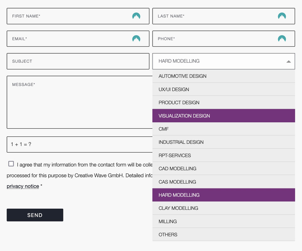
you can only influence the select box ( as check boxes, radio buttons etc. ) by replacing the original html by a different html structure.
put this to your child-theme functions.php:
( it is specific to your form – because the selector for that form element is given by the ID: #element_avia_6_1
on other form elements it might be a different ID )function style_select_options(){ ?> <script> window.addEventListener("DOMContentLoaded", function () { (function($) { $('.avia_ajax_form #element_avia_6_1').addClass('custom-select'); })(jQuery); var x, i, j, l, ll, selElmnt, a, b, c; /* Look for any elements with the class "custom-select": */ x = document.getElementsByClassName("custom-select"); l = x.length; for (i = 0; i < l; i++) { selElmnt = x[i].getElementsByTagName("select")[0]; ll = selElmnt.length; /* For each element, create a new DIV that will act as the selected item: */ a = document.createElement("DIV"); a.setAttribute("class", "select-selected"); a.innerHTML = selElmnt.options[selElmnt.selectedIndex].innerHTML; x[i].appendChild(a); /* For each element, create a new DIV that will contain the option list: */ b = document.createElement("DIV"); b.setAttribute("class", "select-items select-hide"); for (j = 1; j < ll; j++) { /* For each option in the original select element, create a new DIV that will act as an option item: */ c = document.createElement("DIV"); c.innerHTML = selElmnt.options[j].innerHTML; c.addEventListener("click", function(e) { /* When an item is clicked, update the original select box, and the selected item: */ var y, i, k, s, h, sl, yl; s = this.parentNode.parentNode.getElementsByTagName("select")[0]; sl = s.length; h = this.parentNode.previousSibling; for (i = 0; i < sl; i++) { if (s.options[i].innerHTML == this.innerHTML) { s.selectedIndex = i; h.innerHTML = this.innerHTML; y = this.parentNode.getElementsByClassName("same-as-selected"); yl = y.length; for (k = 0; k < yl; k++) { y[k].removeAttribute("class"); } this.setAttribute("class", "same-as-selected"); break; } } h.click(); }); b.appendChild(c); } x[i].appendChild(b); a.addEventListener("click", function(e) { /* When the select box is clicked, close any other select boxes, and open/close the current select box: */ e.stopPropagation(); closeAllSelect(this); this.nextSibling.classList.toggle("select-hide"); this.classList.toggle("select-arrow-active"); }); } function closeAllSelect(elmnt) { /* A function that will close all select boxes in the document, except the current select box: */ var x, y, i, xl, yl, arrNo = []; x = document.getElementsByClassName("select-items"); y = document.getElementsByClassName("select-selected"); xl = x.length; yl = y.length; for (i = 0; i < yl; i++) { if (elmnt == y[i]) { arrNo.push(i) } else { y[i].classList.remove("select-arrow-active"); } } for (i = 0; i < xl; i++) { if (arrNo.indexOf(i)) { x[i].classList.add("select-hide"); } } } /* If the user clicks anywhere outside the select box, then close all select boxes: */ document.addEventListener("click", closeAllSelect); }); </script> <?php } add_action('wp_footer', 'style_select_options');after that for quick.css:
/*the container must be positioned relative:*/
.custom-select {
  font-family: inherit;
  text-transform: uppercase;
}

.custom-select select {
  display: none !important;
}

#top .select-selected {
  background-color: var(--enfold-main-color-bg);
  border-color: var(--enfold-main-color-primary);
  border-width: 1px;
  height: 41px;
  font-size: 12px;
  color: var(--enfold-main-color-primary);
  opacity: 0.7
}

/*style the arrow inside the select element:*/
.select-selected:after {
  position: absolute;
  content: "";
  top: 18px;
  right: 10px;
  width: 0;
  height: 0;
  border: 6px solid transparent;
  border-color: #666 transparent transparent transparent;
}

/*point the arrow upwards when the select box is open (active):*/
.select-selected.select-arrow-active:after {
  border-color: transparent transparent #666 transparent;
  top: 12px;
}

/*style the items (options), including the selected item:*/
.select-items div,
.select-selected {
  color: #FFF;
  padding: 2px 15px 2px;
  border: 1px solid transparent;
  border-color: transparent transparent rgba(0, 0, 0, 0.1) transparent;
  cursor: pointer;
  user-select: none;
}

/*style the items (options), including the selected item:*/
.select-selected {
  padding: 5px 15px 2px;
}

/*style items (options):*/
.select-items {
  position: absolute;
  background-color: #ddd;
  top: 100%;
  left: 0;
  right: 0;
  z-index: 99;
  font-size: 12px
}

/*hide the items when the select box is closed:*/
.select-hide {
  display: none;
}

.select-items div:hover, .same-as-selected {
  background-color: #7d2a7e;
  color: #fff !important;
}
Looks then this way – but you can now style each option and pseudo states to your needs:
-
This reply was modified 1 year, 11 months ago by
Guenni007.
by the way: vimeo and youtube now offers for a while gif creation for preview.
That gif ( up to 8s ) should not be to big in dimension ( f.e.: 260px width) – you can use it as featured images.
See: https://webers-testseite.de/masonry-blog/and click on “Excerpt” post
can you try this solution: https://kriesi.at/support/topic/portfolio-items-on-click-navigagte-to-external-website/
but i guess it is only for portfolios …
see the comment:
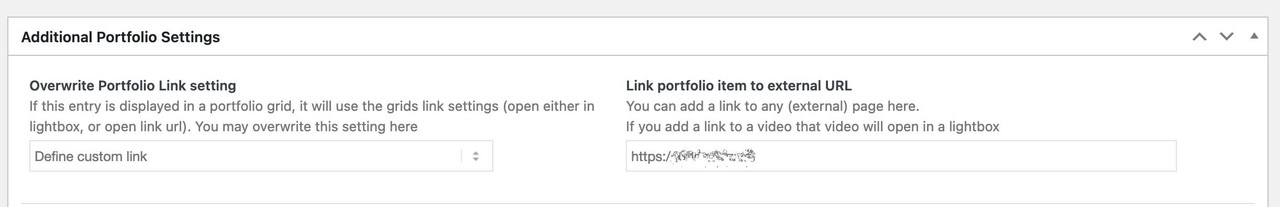
Link portfolio item to external URL
You can add a link to any (external) page here.
If you add a link to a video that video will open in a lightbox… for posts you then had to set the format to “link”
see playerparameters: https://developers.google.com/youtube/player_parameters?hl=de for Youtube.
so rel should work – but if you set a playlist – and a loop – it will not stop – so same result.
see – example page: https://webers-testseite.de/vimeo-bg-video/
as long the parameter muted is set – it will autoplay on mobile iOS devices.
but if you do not need all those features of advanced layerslider – you can use color-section background video option as well.
just put in that inputfield :https://vimeo.com/917970783?badge=0&autoplay=1&muted=1&loop=1
maybe with parameter ( do not track )&dnt=1see here the player parameters of vimeo videos : https://help.vimeo.com/hc/de/articles/12426260232977-%C3%9Cberblick-%C3%BCber-Player-Parameter
I have found that pages simply load faster without the layer slider.
Thanks for digging into this for me. I can see that works but the odd thing is that this is the same setup as this website and we use that plugin with no issues.
See if there are different settings for that plugin – the pf-content div wraps all content inside #main. On the working page not!
F.e. on “Select content using”
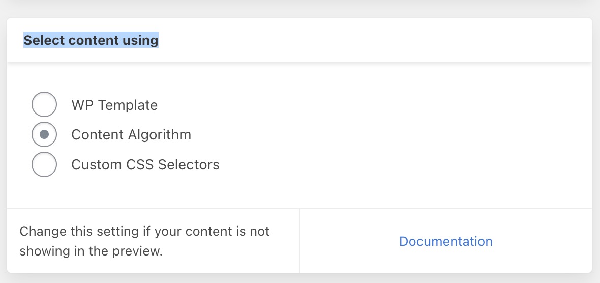
see: https://support.printfriendly.com/wordpress/customize-content-selection/
if i set your video with the given settings of muted !!!
https://webers-testseite.de/vimeo-bg-video/You have this button to toggle between mute and unmute – so I’m guessing that’s the culprit – that you try to have sound. That is something only desktop browsers will support as bg-video
where does that “div.pf-content” comes from. It is a wrapper that does not exist in the working constallation.
May 20, 2024 at 3:54 pm in reply to: Portfolio Items on click navigagte to external website #1444750open that single portfolio – there is an option to show “Additional Portfolio Settings”
if you like to open all external links in a new tab/window – put this to your child-theme functions.php
function open_external_links_in_newtab(){ ?> <script type="text/javascript"> (function($) { var url = window.location.origin; $('a').not('a[href*="'+url+'"], a[href*="mailto:"], a[href*="#"], a[href*="tel:"], a[href*="javascript:;"] ').attr({ 'target':'_blank', 'rel': 'nofollow noreferrer', }) })(jQuery); </script> <?php } add_action('wp_footer', 'open_external_links_in_newtab');the sidebar is not inside the div.container ( child ) – it is a sibling of that container
so div.container has closed to early. I do not know why it is happening on the one page. Try to rebuild that page – maybe just duplicate the page and have a look if that new page shows the same behaviour.Try to set the option “play muted” to

But you are talking about a background-video with audio?
For me, as background these videos are muted and can be played automatically, except on a mobile device – but this is not an Enfold setting – it is a browser-dependent agreement not to unnecessarily increase traffic nor power-consumption from mobile phones.so – you can try to force muted by adding playerparameters
on youtube for example:?autoplay=1&mute=1&playsinline=1so the inserted video is for example:
https://www.youtube.com/watch?v=81hhkBaIvNM?autoplay=1&mute=1&playsinline=1by the way – if you have set a loop for the youtube video – then the ID had to be added as playlist:
&playlist=81hhkBaIvNM
but the parameter “playlist” seems to be removed by Enfold at data-original_url for data-videoid
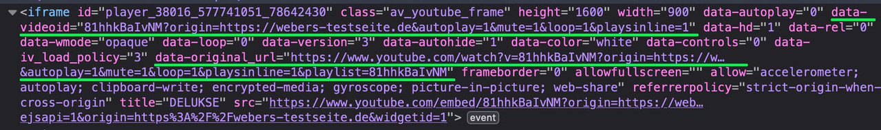
See: https://webers-testseite.de/youtube-background/
Password is : Enfoldbut nevertheless – it seems to work on f.e. ipad
May 5, 2024 at 7:20 am in reply to: erledigt – Frage zu #1439344 – anderes Logo bei Mobilversion #1442320by the way: you are using on desktop version a svg logo. Why don’t you use an edited svg file for mobile too.
The font is lufga i guess. So it is easy to get in illustrator.
you can find your mobile logo here: Link
upload that – and on list view inside the media library look for the ID of that file. f.e. 456then replace it via:
function av_change_mobile_logo($logo){
    if(wp_is_mobile()){
      $logo = 456;
    }
    return $logo;
}
add_filter('avf_logo','av_change_mobile_logo');
Your png file got a bit different color – is that a wanted style – i styled it now like your desktop svg file.
But you can fill it a different way by quick css.and btw. you decided to preseve the header visible on mobile view.
then adjust the padding-top of main to@media only screen and (max-width: 767px) { .responsive #top #main { padding-top: 80px !important; } }there are pages that use a slightly different snippet – if the last snippet is not what you want.
I think it’s more accurate what is allowed to be displayed in the search results:
( of course – such snippets are intended for the child-theme functions.php. )add_filter( 'pre_get_posts', function( $query ) { global $woocommerce; if ( ! is_admin() && $query->is_search && isset( $query->query_vars['s'])){ $query->set( 'post_type', 'product' ); $query->set( 'wc_query', 'product_query' ); $tax_query = $query->get( 'tax_query' ) ?: []; $tax_query[] = [ 'taxonomy' => 'product_visibility', 'field' => 'slug', 'terms' => 'exclude-from-search', 'operator' => 'NOT IN' ]; $query->set( 'tax_query', $tax_query ); } return $query; });i use this snippet to include some custom post types to the search:
try:
function wc_only_search_filter_pages($query) {
    // Frontend search only
    if ( ! is_admin() && $query->is_search() ) {
        $query->set('post_type', 'product');
        $query->set( 'wc_query', 'product_query' );
    }
    return $query;
}
add_filter('pre_get_posts','wc_only_search_filter_pages');
May 5, 2024 at 6:17 am in reply to: CSS File Merging And Compression and Javascript File Merging And Compression #1442317have you tried the test the other way round?
disable siteground optimizer and activate “use minified …”Clear all cachings before you deactivate siteground optimizer – i think that tool comes with a caching addon.
merge all css an js means – combine all css and js in one file each. I guess that this is what a lot of optimization tools do too.
Now Enfold offers the usage of minified Versions of their core files. That seems to be a better way. Especially for TTBF (time to first byte)May 5, 2024 at 5:48 am in reply to: Section Content duplicating and other sections of the same page disappears #1442316Firstly – to get your content back: What do you see in the top right editor of the page – are there any revisions to this page?
If so – click on the link : browse.
If you now hover the timeline you will see the backup times. Then choose the one that restores your old content (the time just before the text was edited)you can do it that way too – with 5 iconboxes inside one 1/1 column.
css code on that page:
https://webers-testseite.de/iconboxes2/hm – if i use the code snippet from here
this is the result all tags are closing the right way – but only with div.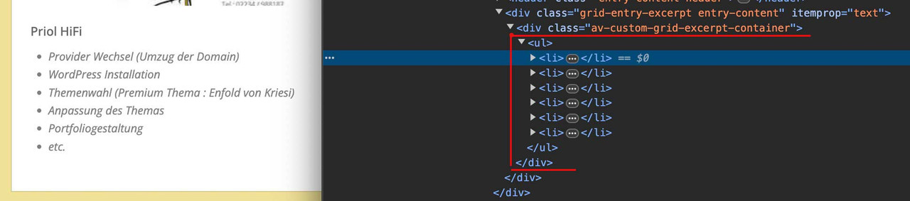
if i use f.e. the p-tag:
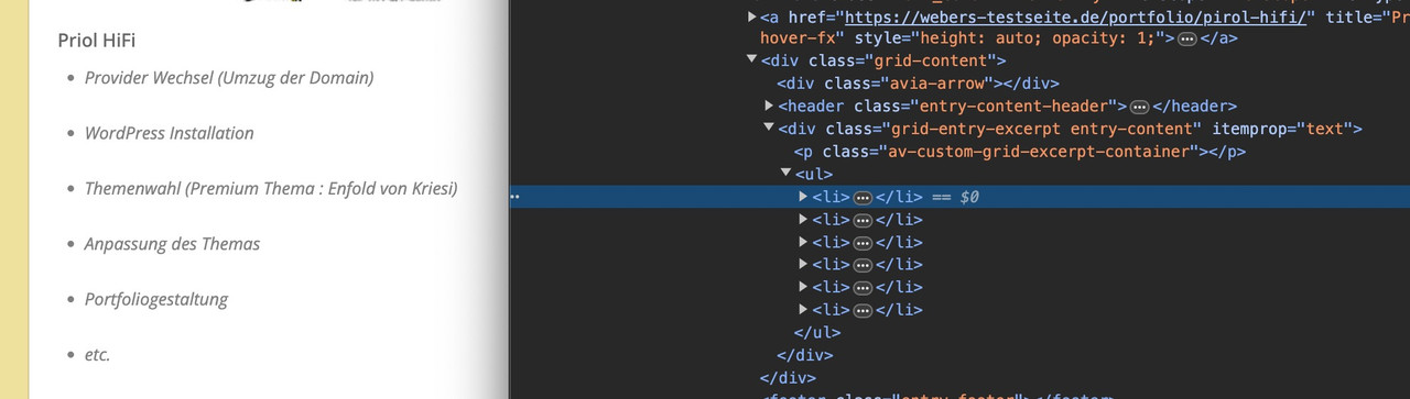
or – the way you noted the snippet and that is the way i learned it too:
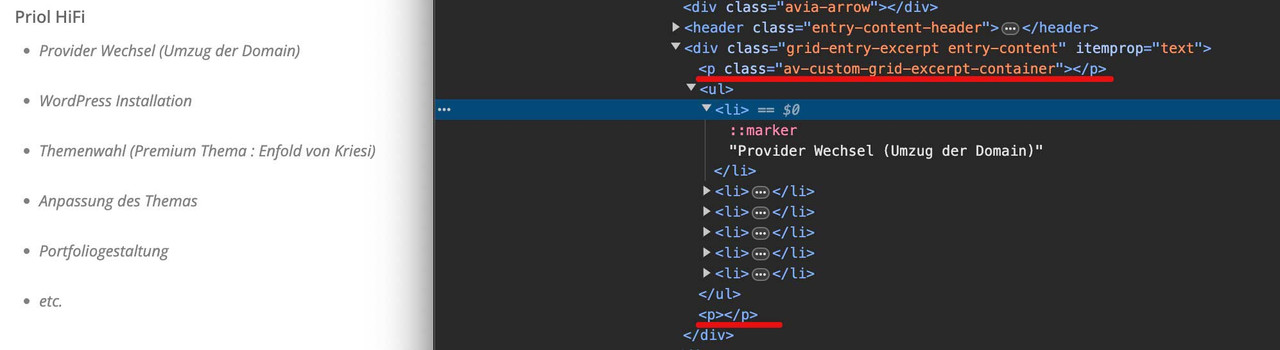
but i guess it is only a problem here with the p-tag ( span is working )
a remove of the filter wpautop does not bring success.
– i can live with the div!go to the editor and open the first 1/3 column – you can find there on “Row Margins” : custom margins – and a negative value.
the whole column line is now shiftet to top by that amount ( 60px). For the effect to make sense, they will have a higher z-index, overlapping your heading.If you like to preserve that behaviour – pull your Heading into a 1/1 container and shift this to top. And get rid of the settings on your first 1/3 column. To obtain this looking i guess there is a no “Space Between Columns” defined.
May 3, 2024 at 12:15 pm in reply to: How to add packages with free symbols / Icons in enfold #1442142Would be perfect if i can use it like that!
of course – that’s why I uploaded it for you to download. – If you need more icons for replacement – let me know.
btw: have a look at this: https://www.svgrepo.com/vectors/solar-panel/monocolor/the columns are the same height – but you do not see it. What you see is the icon-box background – and the height of them is different due to content amount.
You can see here what the crux is: https://webers-testseite.de/equal-height/ – look to the bottom columns.maybe you decide to not use the iconbox – but: https://webers-testseite.de/iconboxes/
hi @ismael : this is one of the interesting trends of the last time
that pseudo element :hashttps://css-tricks.com/the-power-of-has-in-css/
the first selector that belongs to a parent if a child is present. More and more browser will support it.
and it’s finally time for that. You had to laboriously toggle classes on the parent element via script to get a selector that then takes effect.-
This reply was modified 1 year, 11 months ago by
give a unique ID to your color-section – here in my case it was: randomized
this is for only one page of mine so there is the is_page conditional.
upload the images via ftp into a given folder ( here it is a folder on uploads-folder: random-images
then put only the image-filenames into the array.function randomize_bg_image() { if(is_page(34024)){ ?> <script type="text/javascript"> (function($){ var images = ['o2-7.jpg', 'o2-1.jpg', 'o2-2.jpg', 'o2-3.jpg', 'o2-4.jpg', 'o2-5.jpg', 'o2-6.jpg']; $('#randomized').css({ 'background-image': 'url(/wp-content/uploads/random-images/' + images[Math.floor(Math.random() * images.length)] + ')' }); })(jQuery); </script> <?php } } add_action( 'wp_footer', 'randomize_bg_image' ); -
This reply was modified 1 year, 11 months ago by
-
AuthorPosts