Forum Replies Created
-
AuthorPosts
-
and by the way : could you please add the ecver=2 attribut for yourtube videos.
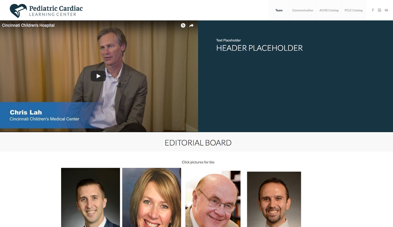
it is responsible for getting rid of advertising on pause videos.you can see it on a test page here from another participant: https://www.cnmdev1.com/team/
look what happens on pausing the vidoe on the top lefton wider screens it is ok now isn’t it ?
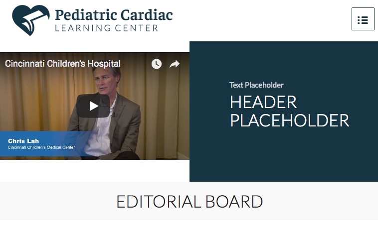
you erased the rule for smaler screens when hamburger menu starts to work:@media only screen and (max-width: 768px){ .page-id-948 #av-layout-grid-1 { height: inherit !important; display: inline-block !important; } }change the code to
maybe it is necessary to set it to important.page-id-948 #av-layout-grid-1 { height: 28.12vw !important; display: inline-flex !important; vertical-align: top; }and you did that for your page-id ?
page-id-948
-
This reply was modified 7 years, 11 months ago by
Guenni007.
can you please try:
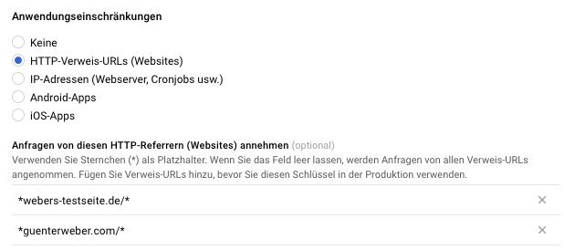
*movetobeauty.be/*and please give it a bit time 10min to be active
well you can answer the question yourself. ( on stretched layout – otherwise we could work with % values)
Your video has an aspect ratio of 16:9 and your grid cell has a width of 50% of videoscreenwidth called : 50vw ?
what if the height of grid-row is 28.13vw ( 50×9/16)see here: https://webers-testseite.de/mimic/
the fatal thing is the setting of grid-row to display as table-cell !
so in my case it is for that page:
.page-id-32038 #av-layout-grid-1 {
    height: 28.13vw !important;
   display: inline-flex !important
}
the only thing now to decide is when should this break back to table-cell – that depends on the amount of content in your right cell !
f.e:
@media only screen and (max-width: 768px){ .page-id-32038 #av-layout-grid-1 { height: inherit !important; display: inline-block !important; } }to 1) you must have set the rule yourself – you set the floating behavior to none !important – please try:
(find the code and erase it )you set:
.responsive .logo {
    width: 300px;
    height: 100px;
    margin: auto !important;
    float: left !important;
}
get rid of margin auto and change it to:
.responsive .logo { float: left !important; }oh no – i answered to a topic with uppercase heading . https://kriesi.at/support/topic/please-stop-writing-capitalized-it-is-no-good-netiquette/
what do you mean by footer
#footer or
footer #socket
if #footer where exactlyyou like to have it in a footer widget – maybe the shortcode method is something you can do: Link
do you want to have it always or only if you have choosen breadcrumb on page/post editior?
do you want to have it even if you have a transparent header ?Well Rob – look now to the site ;)
that a chrome does not start the autoplay is due to their new policy : https://developers.google.com/web/updates/2017/09/autoplay-policy-changes
https://webers-testseite.de/youtube-shortcode-for-enfold/and please have a look what happens if you directly start a video in content withour stopping the video on top ! ;)
and you have installed the plugin ? Plugin-link
https://webers-testseite.de/table/
PS there must be a space sometimes – you see in my table that with the p-tag – if there is no space between ###lt### and p and dito with gt it will not recognize the special character
The settings and css and is place in the /wp-content/uploads/dynamic_avia folder so not in the enfold folder. !
if you have things changed in functions.php of parent folder – this will be lost.
Thats why a lot of people use child-themes.
But you don’t need to erase it – just rename it to enfold-old. Upload the new one as enfold and see what happens.by the way – wasn’t the caption text in former versions hided under the non overlayed part of the image ?
The lightbox shows the title tag of the image or what else is source of the lightbox link
the function looks for a child that has that specific class and takes the pure text of it and set it as title.
you can style it via : div .mfp-title
try this in functions.php of your child-theme:function accordion_title_fix(){ ?> <script> (function($){ $(window).load(function() { $('a.aviaccordion-slide-link.lightbox-added').each(function(){ var lin = $(this).find('.aviaccordion-title').text(); $(this).attr('title',lin); }); }); })(jQuery); </script> <?php } add_action('wp_footer', 'accordion_title_fix');see here: https://webers-testseite.de/accordion/
that : “Is the top full-width blurred photo a video? It does not play on Chrome…?” was a joke – isn’t it.
No it was no video – just a casual introduction to a dry topicmaybe this could be a nice topic for you: https://kriesi.at/support/topic/playing-only-one-youtube-video-at-a-time/
Some notes about using videos on websites:
I can understand that you do not want to upload any video that you run as a background in a loop to foreign hoster, but company profile movies or longer movies have nothing to do as self-hosted videos. It is not good for the performance if longer movies are hosted by your own server. There are a number of settings to supress advertisements and cookies from eg Youtube. i do create a shortcode for youtube videos that implemented all settings to avoid loading relatives etc. pp.
see here: https://kriesi.at/support/topic/youtube-shortcode/
I’m of the opinion that it should work, of course – for small blurry films of a meeting as background for the content (some kb big) – yes.you only had to be familar with clip-path and polygones:
i updated at this testpage just to see if it works on Enfold 4.3.1: https://webers-testseite.de/elegant/
you see that the png isn’t realy good masked but for demo that is enough.On clip-path there you dont’t need that extra container to mimic the slant-
but sadly there was some troubles with mobile devices and fixed positioning too-
This reply was modified 7 years, 12 months ago by
Guenni007.
you can avoid interpreting phone numbers by your browser if you set the link as it should be:
some browsers do it right some are not williing to do it – many browsers to interprete a IBAN as Phone number etc.<a href="tel:+492289768293">every thing you like +43 0006458172 154254</a>have you a link for us?
seems to be a similiar problem to : https://kriesi.at/support/topic/background-video-on-layerslider-youtube-no-longer-plays/ ;)
-
This reply was modified 7 years, 12 months ago by
Guenni007.
it is just because of your logo isn’t finished at left border – it is a png with even on left hand a lot of space.
Things could be easier to have a logo with its outer dimensions end at the bordercan you please insert this to your quick css and have look if your troubles are gone:
.special_amp { font-family: initial !important; font-size: inherit !important; color: inherit !important }i’m now on my first test-page : https://webers-testseite.de at Enfold 4.3.1
and only the sliders got into conflict with the old versions – seems to fit for icon-list, icon-boxAnd if it is not an alb with that feature the code here will work too:
What does the code : you give a custom class to the container (mostly a parent container) : clickable – it finds the first link in that container and tranfer the link option to it. And if there is no link in it – it will not have the option.
you only have to give to the clickme class a hover style – like cursor or anything else – see here: https://webers-testseite.de/3-4th-centered/function transfer_link_from_child(){ ?> <script> (function($){ $(".clickable").each(function(){ var theLink = $(this).find("a:first").attr("href"); if (typeof theLink !== "undefined"){ $(this).addClass("clickme"); $(this).on("click", function(){ window.location.href = theLink; }); }; }); })(jQuery); </script> <?php } add_action('wp_footer', 'transfer_link_from_child');One advantage of the code: if you have accidentaly given the class clickable to an element – or you eliminated the links in an element with that class – the element does not get those attributes.
You see althought the 1/2 column on the left bottom with the code element got the clickable class – id does not get the settings.-
This reply was modified 7 years, 12 months ago by
Guenni007.
by the way did you see this on the page of Josue: “Created 2 years ago”
and in addition: for all 4:3 videos : see https://webers-testseite.de/youtube-shortcode-for-enfold/
( by the way we don’t need the width height – even for 16:9 too)function youtube_4zu3 ($id){ return '<div class="avia-video avia-video-4-3" itemprop="video" itemtype="https://schema.org/VideoObject"> <div class="avia-iframe-wrap"> <iframe title="YouTube video player" src="https://www.youtube-nocookie.com/embed/'.$id[0].'?enablejsapi=1&ecver=2&showinfo=0&loop=1&color=white&rel=0" frameborder="0" allowfullscreen> </iframe> </div> </div>'; } add_shortcode('youtube43', 'youtube_4zu3');this is not so important – it is just i’m playing with the filters – and it is also for the pages, which I create here as a demonstration for other comrades. Sometimes then one has a boxed layout and then I do not always want to change the setting globally on my testpage to demonstrate something.
No hurry on that -
This reply was modified 7 years, 11 months ago by
-
AuthorPosts


